
Summer is over, the leaves are turning colors and there’s a chill in the air. What does all this mean? It means it’s time for our 2014 Fall gadget giveaway! We have more than $650 worth of great prizes for one lucky winner. So click through to get the full details on how to enter. Hint: It’s easy!
Prizes:
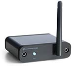
B1 Bluetooth Music Receiver from AudioEngine – Streams your music farther and better than other Bluetooth streaming devices. We’ll be having a review soon! $189.00 list price.
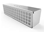
Mbox Portable Bluetooth 4.0 Wireless Stereo Speaker from Mpow – Portable Bluetooth speaker that features bass booster, speaker phone and a 10 hour battery life $99 list price.
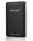
RP-PB22 Deluxe 13000mAh Portable Charger from RAVPower – Smart and fast charger that can charge an iPhone 5s almost 7 times, a Galaxy S5 over 4 times or an iPad Air once. $99.99 list price.
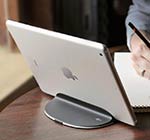
Magnus Air stand from Ten One Design – Super cool aluminum magnetic stand for the Apple iPad Air. iPad Air not included. $39.95 list price.
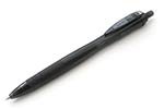
Pentel EnerGel X Metal-Tip Retractable Gel Ink Pen from JetPens – $1.35 list price.
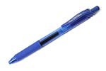
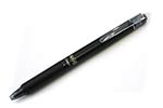
Uni-ball Jetstream RT BLX Ballpoint Pen from JetPens – I love Uni-ball Jetstream pens. They are inexpensive pens that write so smooth. Check out my review. $2.60 list price.
Morning Glory Mach 3 Roller Ball Pen from JetPens – This pen features a window that shows the ink level. $2.00 list price.
Kum PenCut Pen-Style Scissors from JetPens – Pen sized pair of scissors that fit in a pocket or bag. $15.25 list price.
Zebra Surari Emulsion Ink Pen from JetPens – This pen has a new ink type that is smooth like oil-based ballpoint inks but has the vibrant colors of a gel ink pen. $1.65 list price.
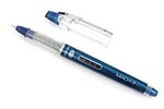
Pilot FriXion Ball Knock Retractable Gel Ink Pen from JetPens – Like ink pens but don’t like when you make a mistake? No worries with this one because you can erase the ink! Check out our review. $3.80 list price.
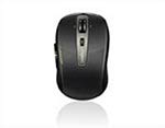
3920P Wireless Laser Mouse from Rapoo – 5 GHz wireless mouse with 800 DPI. $39.99 list price.
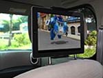
Universal Headrest Mount from Satechi – Headrest mount for smartphones and tablets which is capable of being rotated 360 degrees. $24.99 list price.
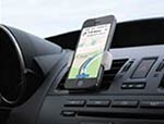
Airframe from Kenu – Portable universal smartphone mount attaches easily to any car air vent. Check out our review. $24.95 list price.
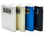
Hue Pro from Juno Power – 10,000 mAh portable battery with dual USB ports and a built in flashlight. $59.99 list price.

Toddy Wedge from Toddy Gear – Microfiber silk stand that props up and cleans your devices. $14.99 list price.
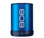
Canz from 808 Audio – Ultra-portable, Bluetooth speaker with 6 hr battery life. $34.99 list price.
How to enter (please read carefully – any missed steps and your entry will be disqualified):
1. This past weekend I changed the site’s theme (most noticeable is the home page) in an effort to get back to a minimal, easy to use, easy to read website. I’m looking for your input on this change. So between now and 10/05/2014 11:59PM EST leave a comment on this page telling me at least one thing you like and one think you don’t like about the current layout of the website. Feel free to elaborate or provide even more input. I always love reading your ideas.
2. (optional) Get a 2nd bonus entry by tweeting:
Win a huge gadget prize pack from @thegadgeteer http://wp.me/p3LRkH-HnC
Make sure you come back and leave a 2nd comment on this page with a link to your tweet.
3. At some point on 10/06/2014, I’ll pick 1 random winner using random.org. The winner will be contacted by email and will have 48 hrs to claim their prizes. If I do not receive an answer to my emails in that time period, I’ll do other random.org drawings till the prizes are gone.
Rules:
1. Only one entry per person (warning: I check IP addresses).
2. Gadgeteer writers, family members and close friends may not enter this contest.
3. the-gadgeteer.com is not responsible for any lost packages or incorrect shipping addresses.
4. the-gadgeteer.com is not responsible for the winner not accepting their prize within 48hrs. The winner will be posted on the contest page, contest comments and will be emailed. Check your spam folder.
5. Winner must have a US shipping address (sorry, this isn’t my choice…).
Update:
The winner is comment #57 from Luis Velez. Congrats to Luis and thanks to everyone who entered and to the sponsors. I’m now going to take all your comments and get busy implementing some of the ideas to make The Gadgeteer better.
THIS CONTEST IS NOW CLOSED
Gadgeteer Comment Policy - Please read before commenting
I love the simple page layout. It allows quick review of the subject matter, without distractions. On the flip side, sometimes the “distractions” provide useful info. But that’s very minor.
tweet: https://twitter.com/pescokid/status/517488666114273280
I like the categories menu, which allows users to find a set of related articles/reviews together.
Once a category is selected and the list of articles is shown, it might help if there’s a small image shown of the gadget since sometimes that’s all I can remember from the article.
https://twitter.com/rorydlp/status/517490414920949762
I like the new design – its very simple. The only thing I am maybe not crazy of is the tag cloud, but thats a personal preference thing.
Like the simplicity of the top navigation bar, few categories and lots of sub info to chose from.
Dislike the colors of the same navigation bar, hord to read particularly in low light conditions
I like the simple, fast loading website. It actually loads in my mobile browser, unlike some of the other blogs sites that have tried to add too much and broke the ability to even view their site within feedly.
What I do NOT like is how BIG some of the ad space is. I understand (and agree with) the need to make money, but the ads all over the place are a bit much, especially the big one on the right side.
Like: The site now works on my tablet (an old HP Touchpad) in ‘standard’ mode, instead of serving it a reduced ‘mobile’ mode.
Dislike: Less content density: I can only see one story at a time, and I have to scroll to see more.
I like the clean look and the fact that you show the review currently in progress.I’d like to see some of your other writers’ gear, too.
Thanks for the chance to win.
Like: Minimalistic approach. Easy to read, clean, crisp.
Dislike: Tag cloud. Probably a personal gripe, but I can’t stand tag clouds. Some people like them, other don’t. To me, they just look out of place and chaotic.
Tweet:
https://twitter.com/Earl_Acton/status/517525579504300033
They use to call me Mr. Gadget when I was a kid, so when I found your site I have been reading it daily for the last three years ! The things I purchased after reading this website are great in numbers and COOL !! Thanks for the daily tech items !!
The new look is very reminiscent of the old look. It allows me to scroll and enjoy the brief read throughs on various items. However, the multi image page did make it easy to do a quick look over of the various items that were being reviewed.
I like the nice, big pictures, and the spacing makes it easier to read without all the distractions.
When you do a search it might help to have small pictures with the article titles.
https://twitter.com/LindaHP/status/517528630399078400
I do most of my web viewing on my iPad, and I think the new layout is perfect for that. Each article takes up a full screen and it’s easy to scroll down. I’m a new iPhone owner, so I would like to see more smartphone related items. Thanks…..
Good choice with the “clean”, less cluttered look. Proportions seem a bit large to me and there’s too much scrolling when using my desktop. I zoom out to 75% and that feels better.
https://twitter.com/dbng/status/517535636102737921
It looks cleaner. I like it.
The new look is cleaner and simpler. It has a linear flow, which feels good, and reduces the density of information. The old site presented more stories in a more compact layout, but meant that a viewer may take one glance at the page and move on. The new layout makes us scroll through, which means we can concentrate on one topic at a time, and means we spend a bit longer on the site. More white space too. Cons? Maybe that the new layout takes longer to scroll through the topics. It’s both a pro and a con, depending on your perspective.
https://twitter.com/Nokaoi59/status/517587489264246784
Easy to see current layout rather than before. I like it.
Adv. area may need to be smaller…
Loke the white space
Don’t like, the headers for items.
Honestly Julie I like the new page (old page). Brings back memories of the early days of the-gadgeteer. As you say, very simple and easy to navigate. On the flip side it it was quick to view gadgeteer reviews with the old page. So, I like that this page brings back the history of the-gadgeteer. What I dont like is very gadgets on the page at one time.
Like: Ease of use. That was Julie’s goal. Accomplished ! Dislike: Wish there was new content when I come back every 2 hours. I understand Julie also has a day job. (I’ve been here since the original Palm Pilot with AAA batteries ! Great site.)
https://twitter.com/crossstick/status/517616733130346496
Love – The clean, minimal style of white background with a large photo and black text is very easy on the eyes for quick browsing.
Dislike – The one thing I had a bit of hard time finding was the Search bar. It seems a bit out of place in the right column rather than up in the navigational header. Great job overall on the overhaul, though! I like it!
https://twitter.com/knight_cjg/status/517635028579528704
Love: return of the previous layout.
Dislike: nothing.
I like the new layout.
I’m running against the crowd here, but I don’t like having to scroll so much just to get back to a review that’s only three products down the page.
I liked the more condensed format.
Meanwhile, I have a gripe about something that has been around all along. It’s very nice that in reviews you can click to make the photos bigger. But the photos are huge! Much bigger than they need to be.
Also, I have my browser set so if I just rollover a photo it expands. I have to be really careful when I visit the Gadgeteer as the photos are constantly taking over my whole screen.
I like that everything is a lot simpler and less cluttered, but the all white is very bright. Maybe I’m missing something because IE8 at my office screws with a bunch of things.
I like that there are less banners/ads at the top of the page.
I usually arrive a this site through Feedly if I see an article I’m interested in. So, while I don’t view The Gadgeteer on a daily basis, I do appreciate the simpler, more clean layout. Spacing, text size, and images look good on Chrome. I don’t use tags, however, but that’s probably just me.
I do like the simple look – but with my Chrome browser the top menu just shows “=menu” and “>menu” so I’m not sure what is supposed to be there.
(like) The reviews are easy to see and scroll with lots of detail without having to click.
(dislike) The menu does not translate well into a tall skinny display. The menu selections are not directly visible until you click on menu or zoom out.
I do love the new clean look, the home page is very simple and straight forward, I much prefer it to the clutter from before.
I guess I’d like the righthand sidebar to be smaller, or the ability to minimize it out of the way.
Here is my tweet https://twitter.com/iguru42/status/517664843193933824
I like the simple layout but feel the font/text are a bit to big. I’m on a 27″ iMac. Also, the white usage is fine but I feel everything just flows into one another. Maybe you could box each article within grids or use color backgrounds for each article so our eyes can distinguish each different article while scrolling?
I like the clean simple look of the page. Don’t really have any dislikes.
My tweet
https://twitter.com/Joan_1969/status/517675244434505728
I like the headers and the spacing. I don’t like the scrolling.
Less is more. Like the change.
I like the simple layout…as others have said, it’s easier on my mobile browser without sacrificing readability on a full computer.
Not a fan of tag clouds, but that’s just me…I’m sure others find them very useful.
I like the simple layout and that it’s not completely overrun by ads
https://twitter.com/nicholesylka/status/517696682793107457
I do prefer the new/old style. Guess I’m old school where vertical scrolling is the norm, versus the horizontal then vertical of the old/new version.
If I were to make one criticism of the new/old site is the size of the posts. They are a bit, large. I have a 1080p display and only see one entry per screen. Bit annoying to have to scroll to see if the next entry is one I’ve already ready.
Like: The colors and layout. Easy to read, non-obtrusive or obnoxious “other stuff” everywhere.
Dislike: The secondary navigation is in all caps, while the top is not.
https://twitter.com/the_real_nikkig/status/517702933870571521
Not a ton has changed, but the amount of white space makes it easier to view and, graphically, is much cleaner. There’s not too much not to like, it’s simple and informative. Maybe there can be a “Top 10” gadgets decided on by page views, or a ‘wish list’, etc.
Great site. Great stuff.
I really like the “What review is Julie working on right now?” I think it’s a nice feature and I think it’s a great idea to give your readers a heads up. Maybe we’ll notice you doing a review and can give you feedback on what we’ve found on devices we’re using.
Julie – I am so grateful for the change to a single column layout for the articles! At first I thought it was a browser malfunction and kept waiting for it to revert back to the former layout. In fact, just before making my daily visit I said to myself “man, I hope The Gadgeteer doesn’t rever back to that other layout.”
I think the reason I didn’t like it was because I had lots of issues with the layout displaying correctly with scrunched text and articles overlaing each other.
So, bless you. I vote in favor of keeping this layout.
I like the site, I have always looked to your reviews and buy products based on them, you might add a sidebar to direct you to a specific review instead of scrolling all the way down.
What I like about the new layout is that you can scroll right down through new articles to quickly pass through and by anything you may not be interested in. On the flip-side, I dislike the fact that I can’t see all the new reviews in a dashboard style so I can just do a quick look and walk off if nothing in particular is interesting.
Samir
I love this look to the Gadgeteer web site. I was disappointed when it went away a while back because the this version was so perfect. It works great on my PCs as well as my mobile devices. I only use the tag cloud in rare instances when I am looking for a review and don’t remember where it was kept.
Loads quick, the ads take too much space though. I like simple quick loading sites!
Bob
I like the clean layout, but dislike all the wasted blank space on the right side.
Really like the new layout. Great use of spacing. Works so much better on my tablet. The older layout was quick to browse on a large monitor as I would scan all the photos and stop where the image caught my attention.
As a suggestion, if there were a really good shopping engine, it would be great to have a link with each product review that fed the product into a shopping bot that would list the best sources on the web. Buying from the mfg is usually the most expensive source.
Gadgeteer is one of my default tabs on the desktop.
Told my little corner of the world. https://twitter.com/mryanaz/status/517763322469285889
I am happy to see you returned to the previous format. Positive and Suggestion Comments:
1. I like looking at each “review” as an individual paragraph. The page seems cleaner, and gives more info before deciding to click on each individual review.
2. I do wish you had more info on the side panel regarding past reviews/gadget categories: i.e. audio; charging gadgets, smartphone/pad cases etc.
BTW, great giveaways. Wishing everybody a happy, healthy fall season!
Jane P.
I like the new layout as it shows more text under each photo and can be easily read by just scrolling down the page. However, do miss the thumbnail photos, as they catch my attention quicker, and as a faster way to get to an item I want to find out more about. Keep up the good work!
I like the simpler layout.
I did like being able to see the preview of a bunch of things at once and then picking which looked most interesting for more details.
I like that the left side is easy to scan for cool gadget content.
I don’t like the excess white space on the right side, under the ads. Seems wasted space that could be occupied by more gadget reviews or links to prior reviews.
I love the information that you put on the website. For people who might not have basic knowledge of new gadgets. But the site seems pretty basic. Jazz it up a little to make more people attractive to your site. Also look into sponsors more.
Like: The layout looks nice and simple. Clean. This makes it easier to read.
However…
Dislike: The description of each item is quite long. Although the new layout is supposed to make the page appear “minimal, easy to use,” the amount of space each review takes up actually contributes to the more clustered look.
Like the simplicity – much easier to scroll through. But I scan really quickly. Maybe two columns of posts would let us scroll through even more quickly without being too busy.
I’m on a older phone so my site complaint may be my fault. Pro – The site loaded very fast and its easy to leave a comment. Con- The page will not scroll fast. The screen will only move a little at a time.
Like the new layout. Easier to read!
I like all the white space in the design – clean and uncluttered. My complaint would be mobile viewing, it definitely doesn’t look as nice on a phone.
I like the clean and simple design. My favorite sites follow that model.
I’m on an iPad and at the very top are Menu & Menu. That’s a bit confusing.
I like the minimalist new layout.
But I think I’m a minority that like the single pane look, where i can see the updates without scrolling.
https://twitter.com/jae77BMC/status/517876694586494977
While I realise you were going for a minimalistic look with the website, I feel like the sidebar creates too much whitespace and pushes everything over to the side, once you’ve scrolled past the few things in the sidebar. Whenever reading comments or other posts on the homepage it all seems cramped over at one side with very little to distinguish one part from the next.
Comments on mobile version.
Like: simple, uncluttered design
Dislike:
– no pics as you’re scrolling through (would be nice)
– pages vs infinite scroll
New design is clean and legible.
Looks kind of generic though, like a template.
like the look…had a little trouble figuring out how to join…was afraid of the word “subscribe”!!!
I like the new layout — you can read some detail before deciding to click on a link for full article.
I wish the advertisements were a little smaller especially the one in right column.
I like the new layout, but I do find myself scrolling a lot more.
Julie – you are going to chuckle OR pull your hair out – I liked the recent version as you could more quickly see more things on a page ))) The current layout is attractive but a good deal more scrolling … you can’t win, huh! I love the site in any event. Regards, Tim
I love how simple the layout is. I do not like how detached the menu at the top of the page looks.
My Tweet https://twitter.com/J_In_finity/status/518005224423030784
Cleaner looking
Too much scrolling
Prefer the original setup where I could see more with a glance
i like the simpler look – much cleaner.
I dislike all the scrolling.
https://twitter.com/scatyGil/status/518010657724440576
Clean, easy-to-use, without a lot of extraneous clutter. I also like the by-line font.
I love this site period, whether its small design or full design. The info and reviews you do make it all worth while. When I need to check on a gadget I check to see if you reviewed it. I also love it when you introduce us to new gear.
Sorry there is nothing I don’t like
https://twitter.com/halfwiteinstein/status/518014618284064768
Love it much more than what it was before. Easy to get around and find items. I love everything. Needs no changes.
Here is my tweet: https://twitter.com/tammy1999/status/518018944511139841
Nice, clean layout. It’s easy to read, and communicates well.
I like the simple clean layout. I prefer a little more deal in the top menu or. Nav bar. Thanks
I like the added white space but feel the web site needs a more structured look to it.
I like the clean look of the new home page.
I wish you had more dropdowns like the one for gadgets.
I love the white background which makes reading easy. I also find the categories easy to navigate. The one thing that bothers me is the pictures are so large, they almost fill the monitor. They could be cut down in size by a quarter of the size of the super large ones.
I just upped my security settings in IE11 and sometimes doing this breaks web sites so when I saw your site I thought I broke the site for the better, but now I know it was you. I do like the change it’s more comfortable and I do have a suggestion: At the top of your homepage the banners – Home, About, and Julie’s Favorite Gear and of course The Gadgeteer would be permanent and inside a rectangular box with a photo in the background, a technology, Nature, Your picture that would change on a weekly, monthly basis. There seems to be plenty of room up there for some great photos and maybe even something that we can save-as or download to use for our screen wallpaper. Example: https://www.behance.net/gallery/18863007/my-msn Thanks for Listening and Reviewing
-Likes: I like the clean white background. I like the fact that the sides of the pages are not bogged down with extra distracting ads.
-Could be better: Categories dropdown – the list is just too long. Maybe add a few sub-categories across the top of the black bar, and then give each of those a smaller dropdown list.
Although this is definitely nice and clean and simple, the previous version allowed me to scan the articles quicker to see which ones I was interested in to read in depth. The new format requires a lot of scrolling. There also seems to be a lot of white space on the right. Have you considered putting two articles side by side?
I do like the new layout of the website, it has a cleaner feel. Quickly see what the latest reviews are. Don’t care much for the ads linked to my browsing history.
Thanks for all the great info!
https://twitter.com/VelcroJesus/status/518065925858529280
I think you have provided a significantly better and less cluttered design. Appreciate the attention to the drop down detail. Clean and Clear.
Ease of use/navigation is great, and the simple, minimalist layout is perfect. I don’t like a cluttered page.
Nick Pav (@NICKatKNIGHT) tweeted at 0:26 PM on Fri, Oct 03, 2014:
Win a huge gadget prize pack from @thegadgeteer http://t.co/WwthxHGzsj
(https://twitter.com/NICKatKNIGHT/status/518074606507536384)
I agree with most of the comments liking the simpler design. I like to use my Galaxy 10.1 2014 tablet at night while surfing the net. It would be nice if you had a toggle on the Web page for a dark or bright layout. All that white page in a dark room is hard on my eyes.
I would suggest that you change your menu tags to something like “Info” and “Categories” “Menu”). I also want to see the Gadgeteer logo at the very top of the page (not someone else’s ad at the top). I understand that the ads bring in money, but they shouldn’t get the top billing on your homepage. Overall a clean and easy to use site, perhaps just a tad too simple for your great articles. Thank you Judy.
It’s my first visit to your site. I like the layout. It’s clean and unobtrusive.
https://twitter.com/michaeldemone/status/518081020974080001
I actually liked the previous page design better. I don’t like all that space at the top for the ad and that the name of the site starts so low-down. Funny, but all I can think of is things I don’t like but if I have to come up with one, for some reason, it seems to be a longer column with the stories like there are more reviews.
https://twitter.com/GadgetGirl2009/status/518079954891075584
I like the everyday approach to tech reviews, without the hype cycle and Bay Area airs. I wouldn’t mind a really compact index page of recent reviews – one line each.
Although I love graphics and pictures, I’m glad that you’re employing smaller photos on this page now. To be picky, I thought the prize list was oddly ordered, had thought the prizes would go from most expensive to least expensive, but that’s just me, and in no way do I not love The Gadgeteer! (Simpering suck-up, I know!) Really, your site is always interesting and I love reading about the latest inventions, even though I’m probably way over the age norm for your users (think: Granny), and I really enjoy your newsletters each day.
I rather like the blue theme over all, it is my favorite color. Very vibrant.
I would prefer the search window to be on the header bar instead of sandwiched in between two ads, it almost looks like part of the add.
https://twitter.com/twoloszynek/status/518094100990803968
I like the simply look . Very straight forward and easy to find things
This is my first visit, but I like the layout. It’s uncluttered.
https://twitter.com/poqeteer/status/517702352514859008
I like the simple, clean design – it is really easy to read and navigate
Like: Much better and simpler layout that matches almost identically your mobile site.
Dislike: The menu dropdown. It doesn’t render that well with my browser (most likely *MY* fault for not updating in a while).
I tweeted here:
https://twitter.com/forspom/status/518129634891005952
First time visit. Zite brought you to me. Love the gadgets. Format straightforward. Easy to follow. Good connection to each gadget makes getting it a snap.
Like: The color scheme. The dark blue with the light blues/grays works.
Don’t Like: This is just a personal preference, but I’d like your top menu items (About, Contact, Featured Reviews, etc.) along the left side of the screen. Maybe that shows my age in liking the old-school blog styles of yesteryear…
For 2nd chance, tweeted here:
https://twitter.com/HalloweenAddict/status/518169493613596672
Like: clean layout, colour palette
Not like: dropdown menu for ‘Categories’ ruins the page aesthetic. Categories and Featured Reviews should be transposed so that the Categories dropdown menu is aligned to the left page margin.
My Tweet:
https://twitter.com/huangsonone/status/518172145449713664
I like the categories drop box on top, but I would rather the subscription box be right in the side bar, rather than clicking the link at the top.
tweet
https://twitter.com/Kellydpa/status/518172730290880512
I love the colors , not distracting and i like the fact that even though you have ads they are not in th way or anybit annoying popping up at the bottom of the screen!
I like the simpler layout, it’s easier to navigate on my mobile devices
I really like the ease of navigation…especially the popular tags (I’m a headphone geek…makes it easy to find the relevant articles!). I thought that your search bar is a little hard to find (just type & hit enter…alot of people will likely search for the “send” or “search” button.
Here’s my tweet!!
https://twitter.com/AntKimball/status/518221156621357056
I do like the new look, it looks cleaner with no fuss.
As I am still catching up from my vacation I have not had much time to view all of the site so I can not comment on any negatives.
https://twitter.com/Lakeywhite/status/518250761054982144
The ‘new’ site appearance is great, for me, it is less clunky. Much easier on the eye. So thanks.
This is great….
Like the minimalistic layout. I’m usually on a reader app and click into articles, so not very familiar with the old layout.
I like the older format. You could quickly scan all the new items on one page instead of having to scroll through them.
Is very intuitive and easy to browse and read. I not like the categories drop-down menu, It must be in a column to the right
Love the clean look, it’s uncluttered and allows your content to stand out.
I like the simplicity of the layout and the ease with which the page loads. I like your ‘What review is Julie working on right now?’ feature. No social media link buttons?
I tweeted – https://twitter.com/rusthawk/status/518503843215454209
I haven’t been on the website for a while but the layout of this website is alot cleaner than I remember. The colours are nice. The website is really inconvenient to navigate, I have to scroll to the top to access the menu. Perhaps you can incorporate something that resembles an app where the menu appears and you scroll up but disappears when you scroll down.
Keep up the good work.
I like the use of the san serif font — nice and readable. I think the the dates should be in a more universal format (e.g., 5 OCT 2014). That’s all for now.
Simple, clean, loads fast. These are always the best pages on the internet. I like the idea someone mentioned about toggling light/dark layout. Too much white space can be a head killer sometimes.
tweet tweet!
https://twitter.com/therealajaycee/status/518633552582541312
Love the new format — simple and straightforward, especially on the mobile platform.
I like the top menu bar being so unobtrusive. The two rows with the drop down menu on the bottom row feels like you’ve cleared out the top of the site and draws the eyes to the first article.
Tweet tweet, tweet tweet, ya!!!
https://twitter.com/bryanspellman/status/518747916866166784
Very clean, say to read.
Like: I’m a fan of the minimalist approach…it makes for a clean look and easy navigation.
Dislike (really a minor quibble): The layout verges on almost too minimalistic…it doesn’t grab my attention and scream “read me.” Luckily the posts and reviews more than make up for it.
I like the clean look and use of white space.
From the mobile experience, on the home page where the postings are listed, it would be nice to see the first picture for each post/entry. The title and preview of the body is great, but could be enhanced with the first picture in the post perhaps.
1 Like: Less busy look.
1 Dislike: Need to provide hover text (more info) when mouse is on menu items.
Have grown to like the new format, looks better on my tablet.
I love the minimalist layout. The new format makes it even easier to navigate on a smartphone or tablet.
http://twitter.com/tonester99/status/518811679421788160
Like everyone else, I think the uncluttered look is nice. I’m not crazy about the black and dark blue combination of menu strips at the top, though. Might be nice to change the dark blue to the same blue as your Gadgeteer logo. That’s a better color with the black, and it would make the page seem even cleaner.
I’m on mobile and it looks really mice and simple! Menus are clean and coherent.
I like the clean layout and easy navigation, but the page is a bit bright for me.
https://twitter.com/TheSweetums/status/518831767542067200
I like the minimalist layout and the unencumbered background.
I don’t like that I need to scroll all the way down to look at the different articles… it would be nice to have a quick link section or a category area to see articles of interest instead of having just a search bar.
It is easy to navigate, but seems a little busy to me.
Great site!
Very IOS Positive. Please expand into other Smart Phone operating systems.
I like your honesty in your reviews, continue
User interface is good.
Advertising is a bit too much or big.
I like the clutter-less format the best, along with the ease of quickly finding a particular catagory that interests you, if you’re down for browsing. Although I have to agree the search box is a bit too simple for some.
I like the current layout with everything on one side, vs it being ‘flip-flopped’ from one side to the other.
Much simpler!
(I understand there must be advertising – it could be placed wherever, it does not matter)
Unfortunately, I can’t think of anything I don’t like!
Keep it just like it is.
https://twitter.com/JackBoeth/status/518857573249089536
Like: minimalist design is very clean, scrolling page makes the site look less cluttered.
Dislike: Just a few minute details. Why have the Gadgeteer logo beneath the page banner? Seems a bit out of place.
Keep up the good work, and thanks for hosting the giveaway!
Zite brought me here. Nice site.looked around and found it easy to navigate. I love gadgets, will check back more often! No negatives.
I love the clean design and simple colors. But fonts are too big for my taste.
Two things I really like about your layout:
1)Very clean “magazine” format
2)Convenient categories dropdown (has most subcategories I could ask for)
Only complaint I have is that I have to scroll back to the top to select a different category.
Love how much mobile friendly the website is. I was surprise how quickly it loaded. Just wish the font size was adjustable for those with less than stellar eye sight.
https://twitter.com/_d_Shea/status/518914674482757632
I find the new layout great; it’s easy to navigate and has little clutter.
https://twitter.com/BGreene9369/status/518919514554400768
Looks good.
I do like the Categories.
I would like to see the photos with the review when looking at the categories.
Great picture quality, you should bold the menu icon
I like that more information is available for each post, making it easier to decide whether to click through. However this change allows for fewer posts per page, requiring additional page navigation to see more total posts.
Basic layout is eye pleasing and the simple format is easy to navigate. I like it.
I like how well organized everything is and how easy to find things are.I don’t like how everything is laid out on a white background without separating the articles, the tags, the trending articles, etc., and also I find the font to be slightly too large for the articles and comments.
The layout of each article or review is good.
The archive portion really is not useful as you would have to scroll thru thousands of pages to find anything.
Looking good!
Good simple and clean.
Bug-when you hover over items in menu bar they become white and underlined, but the Home stays underlined and white all the time.
The good stuff – tags, categories and such..
Suggest under featured items to define what featured means.
thanks
I like the format overall. It is definately minimalist. However, your comments are uneven. Some tell us only that you like something without saying WHY.
The paged errored out when I tried to submit. This first one errorwed and I lost everything I typed. The second one errored for duplicate info but I can’t find my feedback. Trying again.)
Your site sure is easy and simple. I really appreciate your commentaries! It keeps the story not too long and not too short. Packed with actual real life scenarios with things like had to send phone back; didn’t work here; testing this long; even down to reevaluating a gadget for what it’s potential really can be instead of leaving it at a “no good” status. It also brings home the simplistic real life ordering ordeals helping those of us who are “I want it now” people back to reality that there is always a process.
I found myself lost in one article after another. (This is a good thing because most sites are the actual company or one sided reviews and although I work in the medical industry and read more then I did in school and don’t like reading, I did not find myself scrolling through an article.) Instead I found I was hitting the bottom of an article and was reading things I had no idea even existed or going there were other gadgets like the ones I was reading about! (This was spot on!)
I liked the related articles at the bottom!
The one thing I noticed was in drilling down from one article to another reading I was not sure where I was in the site. I may have missed it but a link at the top and bottom for home or a “content” menu would be excellent actually awesome a category of gadgets! Then you could almost stay in that same category or the likes and read away! Definitely a top menu would be nice to go back to at anytime and see maybe a content menu? I’ve bookmarked this page!
Twitter.
https://mobile.twitter.com/gregoryc911/status/518973159023050752
The winner is comment #57 from Luis Velez.
Congrats to Luis and thanks to everyone who entered and to the sponsors.
I’m now going to take all your comments and get busy implementing some of the ideas to make The Gadgeteer better.
THE CONTEST IS NOW CLOSED
The new layout (AKA, the old layout) is better than the previous NEW layout (which you know I never liked) Glad to see it back, makes reading easier and consumption easier. Also, I think there’s now maybe a bit fewer junky items on the page, either frivolous reviews or scraped content.
Trust me, you’ll get more traction this way..
@tivoboy can you please elaborate on what you mean by “I think there’s now maybe a bit fewer junky items on the page, either frivolous reviews or scraped content.”?