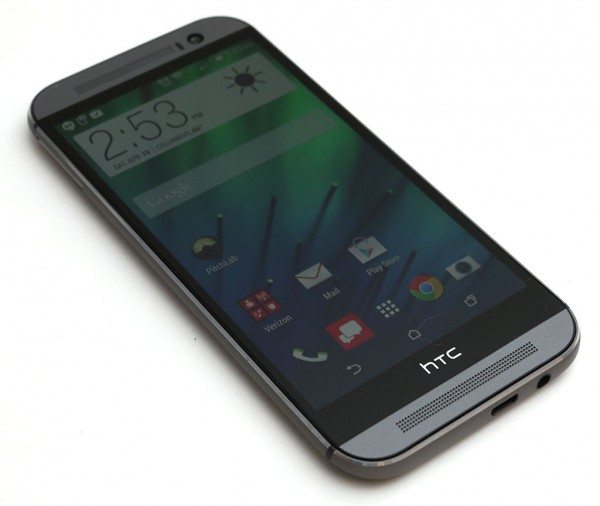
The new HTC One M8 smartphone is one of the sleekest Android smartphones currently on the market. Once again HTC has skipped the slick plastic case that people often tag with the word “cheap” and decided to go with a premium designed metal case that looks good and feels great in your hand. But is this phone all looks and no brain? Let’s find out.
Note: Images can be clicked to view a larger size.
Hardware specs
Processor: 2.3 GHz quad core Snapdragon 801
Operating System: Android 4.4 & Sense 6
Memory: 32GB on board memory + 2GB RAM, Supports up to 128GB microSD Card
Network: LTE Band 13/4 (700/1700 MHz), CDMA/1xEVDO Rev. A (800/1900 MHz)
Global Network: EDGE/GSM (850/900/1800/1900), HSPA/UMTS (850/900/1900/2100)
Display: 5″ Full HD Super LCD3 Corning® Gorilla® Glass 3 Touch Screen Display
Camera (rear): HTC Duo Camera™, f/2.0, 28mm wide angle lens, 2x LED, Smart Flash,
Camera (front): 5 MP
Wi-Fi, Bluetooth 4.0, NFC
Headset: 3.5mm Audio Jack
Battery: 2600mAh (Non–Removable Battery)
Dimensions: 5.76” (H) x 2.78” (W) x .37” (D) inches
Weight: 5.64 oz
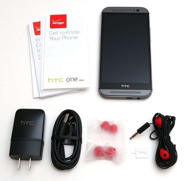
Package Contents
HTC One M8 Android smartphone
USB AC adapter
micro USB charging cable
Earbuds with extra buds
SIM removal tool
Info sheets
Style and design
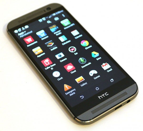
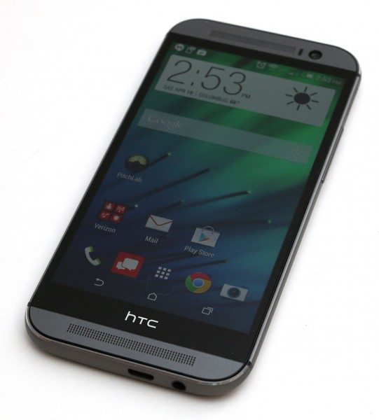
The M8 looks very similar to last year’s HTC One which we reviewed back in September. It features the same curved back with a brushed aluminum case that has smooth rounded edges that make the phone feel cool and solid in hand. The phone is available in 3 colors from Verizon Wireless. I was sent the grey version. Silver and gold versions are also available.
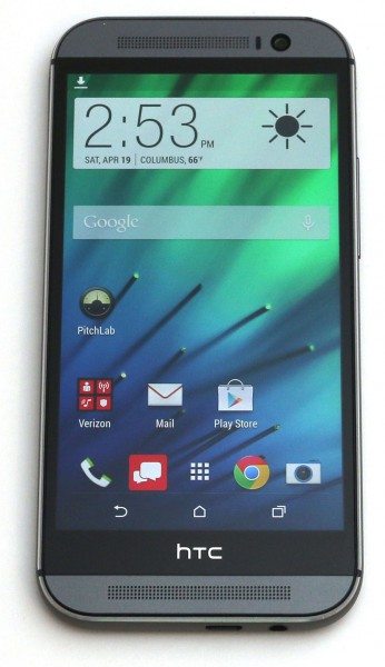
The front of the M8 has a 5 inch display with dual front–facing speakers and a 5 megapixel front facing camera. A tiny notification LED is hidden in the top speaker grill. It glows amber while charging and blinks green for notifications like text messages.
The display is very nice. It is eye meltingly bright, crisp and has vivid colors. It has a very wide viewing angle which makes it easy to see info no matter how you hold it. Even though the display is larger than last year’s phone, the pixel density is not as high. Does that mean the screen is worse? Nope, it is gorgeous and if you can see individual pixels, you’re not human.
One thing to note, the soft navigation buttons aren’t located on either side of the HTC logo at the bottom of the display like they were with last year’s HTC One M7. They are now located above the logo bar on the screen itself. They appear and disappear as needed.
Just like the previous model, the M8 does not offer a wireless charging option or a user replaceable battery. However it does offer a microSD card slot which is usually only found in Samsung phones.
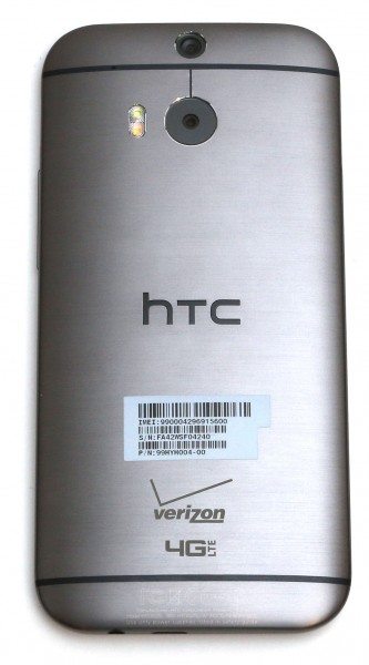
The back of the M8 has the dual camera lenses and an LED flash.
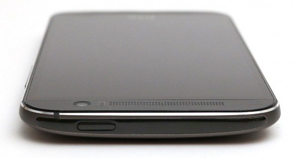
On the top edge of the phone you’ll find the power button and the IR lens for controlling devices like your television. I don’t like the power button because it’s small and almost flush with the case. As a Samsung Galaxy Note 2 user, I found myself wishing the M8 had a physical home button that I could use to wake the device. At least that’s how I felt until I tried out the M8’s motion features. Some of those motion features include:
- Pick up the phone and double tap the display to go to the lock screen
- Pick up the phone and swipe left to right to go straight into the BlinkFeed news app
- Pick up the phone and swipe right to left to wake the phone at the home screen
- Pick up the phone in landscape orientation and press and hold of the volume buttons to launch the camera app
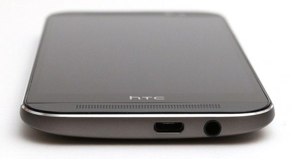
The bottom edge of the phone has the micro USB connector and 3.5mm headphone jack.
On the left side you’ll find the nano sized SIM card slot.
On the opposite side you’ll find the microSD card slot and volume buttons.
In hand this phone feels very solid. It doesn’t complain at all when I put the old Gadgeteer squeeze to it. I didn’t notice any flexing, creaking or cracking. It feels like a solid slab of metal and glass. The brushed metal case is pretty slippery, so care should be taken when handling the M8. I have not dropped it, but I’ve come close.
The style and design of the HTC One M8 is very nice, but I found one thing that annoyed me about it the entire time I was testing it for this review… The narrow screen bezel. Why would a narrow screen bezel annoy me? Because the phone would often not respond to my taps and swipes while I was gripping it my hand. For several days I thought something was actually wrong with the capacitive touch screen. Then I realized that either my finger tips or my pudgy palm was touching the edge of the display when gripped in one hand. This would either cause the screen to freeze and disregard all taps and swipes from my other hand, or it would cause weird behavior while texting or using apps. I can’t recall ever having this problem with other phones, so it’s just something to be aware of.
Camera
HTC decided to stick with the UltraPixel camera from the previous HTC One model. UltraPixel translates to about 4 megapixels. When most high-end smartphones these days offer at least 12 megapixels, it seems like HTC’s choice to stay with their “the number of pixels doesn’t matter” stance is starting to catch up with them. The camera is probably the main complaint I’ve seen when reading about this phone. I don’t think the news is as bad as it sounds though. I snapped quite a few pictures and for the most part I wasn’t unhappy with the results. The camera actually performs really well and is very fast at focusing and capturing images, letting you concentrate on framing your shots instead of waiting for it to catch up with you so you can take the next one.
Take a look at a few sample images:
The one issue with the camera that I noticed right away was that some images appear to be too dark. This is obvious in the image of the daffodils above on the right. I took this picture on a bright sunny day… but it doesn’t look like it in the picture. The weird thing is that I would get different results taking consecutive pictures of the same subject under the same lighting conditions. There’s hope that a software update might fix these exposure problems.
Thanks to the unique dual lens configuration, the images are sharp and detailed. The smaller lens on the back of the camera is there just to provide depth info to captured images, allowing you to post process using different focusing filters.
Here you see an example of the Ufocus filter that allows you to refocus the image by clicking different areas of the picture and then saving to create a new image. The first image is normal. The second one has the chick in focus and the third image has the cup in focus.
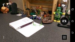
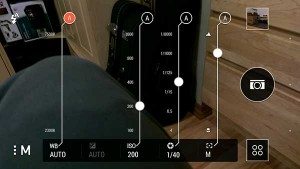
Another issue I noticed is with the camera app itself. If you tend to stick with default auto settings it’s not a problem, but when you want to fiddle with some of the manual settings, it’s a pain in the rear to find things. Not only that, the touch controls are tiny and can be frustratingly hard to activate.
Sound
I remember being impressed with the audio experience of last year’s HTC One. Beats Audio is history though, the M8 has a new technology called BoomSound. BoomSound is supposed to be 25% louder than last year’s HTC One. With its front facing speakers, this phone offers a great audio experience. You won’t be selling your stand alone speakers anytime soon, but for listening to tunes, gaming, sharing videos with friends and speaker phone calls, you’ll be very happy with the audio quality of this phone.
Software
The HTC One M8 runs on Android 4.4 KitKat and Sense 6.0. It comes with a decent software bundle including:
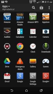
Verizon Preloaded Apps: Accessories, Amazon Suite (Appstore, Audible, IMDb, Kindle, Mobile, MP3), Caller Name ID, Cloud, Emergency Alerts, Isis Mobile Wallet, My Verizon Mobile, NFL Mobile, Slacker, Verizon Messages, Verizon Tones, Visual Voicemail, VZ Navigator, VZ Protect, Game Portal
HTC Preloaded Apps: Calculator, Calendar, Camera, Clock, People, Tasks, Scribble, Car Mode, Messages, Kid Mode, Parent Dashboard, Gallery, Music, Email, Help, Memo, My Files, POLARIS Office 5, Settings, HTC TV, Video, Voice Recorder
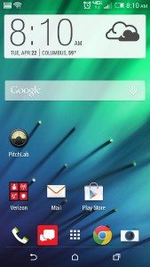
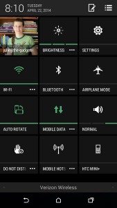
I’m not going to go into much detail about this version of Android or HTC’s Sense interface. Add-on interfaces like Sense or Touchwiz for Samsung phones customize the stock Android interface to change things like the lock screen, settings interface, home screen, app lists screen, etc.
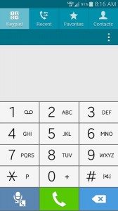
I prefer Samsung’s Touchwiz to HTC’s Sense 6.0 interface and their versions of the stock apps like Calendar, phone, etc. In my opinion Touchwiz is more finger friendly, with larger buttons and better layouts. One example of that is with the phone app. You’ll notice the narrow ribbon bar in the left most image above. You have to scroll that ribbon left or right to change the contacts view. I don’t have large fingers, but I constantly had troubles interacting with that on screen control. Compare that with the Touchwiz version of the phone app in the right most image. See how the buttons are bigger and have a better layout? Just little things like that make a difference.
Update: It was brought to my attention that the phone app’s interface can be switched to have larger buttons.
Call quality
I didn’t have any problems with the HTC One M8’s call quality. Audio on both sides of the conversation were clear and loud. I did have some connectivity issues though. As I’ve already mentioned more than once, my main phone is a Samsung Galaxy Note 2. I often receive calls in my basement office and the Note 2 does a fine job keeping the connection even when I only have 1 bar of signal strength. The M8 seemed weaker in that regard. On more than one occasion I had experienced dropped called from my basement office. However that’s the only location that I noticed this behavior. I had no dropped calls or connection issues elsewhere.
Performance and battery life
The M8 is a snappy phone. It launches apps quickly, smoothly scrolls through long lists and has to problems switching between apps. To be honest, it’s really hard to find a sluggish smartphone these days. I can’t really say the M8 feels any faster than my older Samsung Galaxy Note 2. But it most assuredly doesn’t feel any slower.
During my time with the M8, I was pretty impressed with battery life. With light use I was easily able to get 1 to even 2 days of use from one charge. With heavier use, 1 day seemed to be the limit. I noticed some slightly wonky behavior charging the phone with one of my existing USB AC adapters that I use all the time with other phones. The display kept popping on while charging. I’d turn it off and a few seconds later it would pop back on. This did not happen with the included AC adapter, one of my other existing AC adapters or even just a USB cable plugged into a computer.
One of the features I was looking forward to trying was the extreme power saving mode. Unfortunately, that feature isn’t available yet on the Verizon Wireless version of the HTC One M8… grrrrrrrr. (Update 04/23/14 from Verizon: “It’s on the roadmap for future updates, date is tbd.”) The idea is that the extreme power saver mode turns almost everything off (including data) and only allows you to do basic functions like calling and text messaging. This mode is supposed to give you a substantial boost in run time.
Final thoughts
I keep seeing article after article about the HTC One M8 stating that it’s the best android smartphone ever… I agree that it’s a very very nice smartphone. I’m not sure I agree that it’s the best one ever though. Maybe if the camera were improved, it offered wireless charging and the screen bezel issue I experienced was resolved. As is, this is a great phone with a stellar display, good battery life, great audio quality and a snazzy metal case. I can and will recommend the M8 to anyone currently in the market for a new phone, but I can’t say it’s the best phone I’ve ever tried…
For more info about the HTC One M8, visit HTC and Verizon Wireless.
Zip Ties Assorted Sizes(4”+6”+8”+12”), 400 Pack, Black Cable Ties, UV Resistant Wire Ties by ANOSON
(as of April 30, 2026 12:00 GMT -05:00 - More infoProduct prices and availability are accurate as of the date/time indicated and are subject to change. Any price and availability information displayed on [relevant Amazon Site(s), as applicable] at the time of purchase will apply to the purchase of this product.)STREBITO Electronics Precision Screwdriver Sets 142-Piece with 120 Bits Magnetic Repair Tool Kit for iPhone, MacBook, Computer, Laptop, PC, Tablet, PS4, Xbox, Nintendo, Game Console
(as of April 30, 2026 12:00 GMT -05:00 - More infoProduct prices and availability are accurate as of the date/time indicated and are subject to change. Any price and availability information displayed on [relevant Amazon Site(s), as applicable] at the time of purchase will apply to the purchase of this product.)Product Information
| Price: | $199.99 with 2yr contract, $599.99 with no contract |
| Manufacturer: | HTC |
| Retailer: | Verizon Wireless |
| Pros: |
|
| Cons: |
|







Gadgeteer Comment Policy - Please read before commenting
I had the HTC One M7 and now a proud owner of the HTC One M8. I love the upgrades that they did this time around. The sound output is an improvement. The best part is the battery life does last a whole day on heavy usage. The larger screen size is great for movies and viewing websites. The duo-camera is pretty interesting. Focusing after you take the photo is pretty good. Low light is always great with the ultrapixel camera.
@Julie – I never had the screen freeze when gripped. Maybe you got a faulty review unit?
@Jackie If my fingers or palm wrap around the screen just enough to touch the edge of the display, it will cause problems for me.
@Julie – Like Apple says “You’re probably holding it wrong”.
It’s a weird prob… one I’ve never noticed before on all the bazillions of phones I try…
Great review, Julie…
I agree that it’s difficult to call this the best smartphone (or even the bet Android Smartphone) ever, but the speed with which it does every task leaves me wondering if it just may be. Hardware wise, it’s equal to or near the latest Sammies and it definitely looks and feels amazing in comparison.
The S5 looks just like my Note II, which is not a bad looking phone, but to be honest, the cheap quality is off-putting. The M8 feels like something that I would pay retail for and not totally regret. My largest concern was whether or not the smaller screen would be sufficient to sketch on, as my phone is usually where I come up with my first design or mockup before moving to my iPad or PC. The M8 has acquitted itself nicely so far.
Having had the M8 since launch day, I can say that I’m not impressed with Sense 6.0, though it IS leaps better than Touchwiz of any iteration. I’ve replaced that with Nova Launcher (as I always do) and along with the customization options, it also gives me additional gesture controls that I’ve gotten used to.
To address your concern about the lack of Wireless Charging, I found a workaround that seems to work quite well; A MicroUSB Qi Reciever Pad. It plugs in to the MicroUSB port on the phone, which does make it a little more challenging to plug into my computer, but then, I don’t do that very often. Charge rates are relatively slow, but I’ve found that putting it on my Tylt Vu Cradle charges it quickly enough and without significant heat (which was my main concern about this functionality).
I used this receiver:
http://www.amazon.com/gp/product/B00I1D4DXS/ref=oh_details_o05_s00_i00?ie=UTF8&psc=1
Due to my concern about heat, I also wrapped the back of the phone with a clear Skinomi wrap which I then (badly) trimmed to hidden in the Nillkin Case. The combination of the two do little to interrupt Qi charging. I also added a tempered glass screen protector to give that beautiful LCD a little more protection.
Taking off the case a couple of times recently shows absolutely no sign of damage or discoloration.
Link to pictures attached (let me know if the link doesn’t work) :
https://drive.google.com/folderview?id=0B7R82bORbSokVDFFUVcxdG1ubjg&usp=sharing
Alester
In addition, you CAN customize the Dialer App. From within the Dialer, you can access it’s Settings and enable a “Large Dial Pad” view. Also, used the “Edit Tabs” menu to remove the Favorites and Groups tabs.
Also, you can swipe anywhere on the screen in the Dialer, I didn’t realize thatfor a while….drove myself crazy with the darn Ribbon Bar!
@Alester Thanks for the info on customizing the dialer app. I completely missed that ability.
Your wireless solution is interesting. I wouldn’t want to have to put a case on the M8 and cover up that nice metal case though 🙂
I’m now testing the Samsung Galaxy S5. I do miss the feel of the M8…
I agree fully. It is a gorgeous phone. I thought the M7 was beautiful, but the rounded edges on the M8 add just the right amount of “organic” feel. I have a coworker with the S5 and after playing with it for 5 minutes the frustration started to set in. Had to run back to my M8 to feel right again!
I suspect my coworker thinks she made a mistake after she saw my phone without it’s case.
Julie,
Thanks for the review on the M8! I just wanted to make sure you caught the more important point that Alestar made about ‘swiping’ as it is an android design guideline.
A lot of times, when you see a ribbon at the top of the screen, instead of touching a section of the ribbon to select, you can swipe the whole screen left or right and that will take you to the option to the left or right of the centered ribbon option.
You shouldn’t have to go through the trouble of enlarging when you can just swipe. The only problem with this is that it may not be immediately obvious.
from Android Design Guidelines:
(http://developer.android.com/design/patterns/app-structure.html)
“Fixed tabs
Fixed tabs display top-level views concurrently and make it easy to explore and switch between them. They are always visible on the screen, and can’t be moved out of the way like scrollable tabs. Fixed tabs should always allow the user to navigate between the views by swiping left or right on the content area.”
finally, may I suggest using a Nexus device for several months as it will help you better understand how the android core software functions and gives you a basis of understanding of what manufacturers do to customize android for better or worse.
@Oz I have a Nexus 7 2013 tablet. I never knew about the whole page swipe method for ribbon bars. Thanks to you and to Alestar for schooling me! I added an update to the review in that section.
On that phone call screen, you’re doing it wrong. You don’t have to swipe that little bar, you can swipe left or right anywhere on the screen and it will “turn” the display to the next window.
I just bought my M8, previously had an M7 for a year and before that the first HTC One.
The palm-touching-the-screen-and-disabling-the-touch screen issue that you describe happens when holding in my right hand (one-handed). This issue might very well be a show stopper for me as that is how I hold my phone when I don’t want to hold with both hands.
HTC customer service said I was holding it wrong, and when I mentioned that the M7 didn’t have this issue, they had no comment.
I asked if they were considering adjusting the touch sensitivity via software patch, and of course they said there were no plans because there was no problem.
I so want to keep my M8…. might go back to AT&T to see if anther phone might respond differently.
@Michael Thank you so much for posting this comment. I thought maybe I was the only one with the palm-touch problem since I haven’t heard anyone else complaining about it. It drove me nuts… I’ve never had that issue with any other phones and didn’t have it on the Samsung Galaxy S5 that I just finished reviewing a few days ago.
I just bought the m8 almost 2 weeks ago, and I keep having a problem with Facebook, google, games, etc.always freezing up on me, in fact my m8 is currently frozen on a bingo blitz page, and has been now for almost 6 hours. Can’t turn the phone off, can’t make or take calls, or text messages. Phone is completely frozen!
Julie! Great to see you’re still on the tech scene. Don’t know if you remember me from back in the Palm days, but I still have my Palm T3. It was not retired until April of 2014 when I finally found a phone I liked enough to pass the baton to, which was an HTC One M4. Problems with cracking led me to upgrade to the M8, and I’ve been very happy. The camera is a sore spot for almost everyone in the universe, except for me and about five other people, lol. I need low light performance for work, and shots in dim restaurants without flash turn out pretty good. But if the camera was critical, I’d probably look elsewhere. Being an audio engineer, the sound is what first got me interested in HTC, and it’s great being able to place it on the desk in a hotel suite and it sounding good enough to enjoy, not just tolerate. Not a speaker replacement, as you say, but great for traveling. Well, got to go now, as the wife just asked to watch a movie from the phone on our TV (Yay for direct video out). Great to see you again, and I’ll be back!
Paul
(aka Altema)
@Paul Good to see you on the site! That’s amazing that you were still using a Palm device until last year. It’s funny you should say that because my better half just retired her Palm Zire and upgraded to my old Samsung Note 2. She complains about the size, but I think she’s getting used to it 🙂