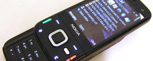
The Android G1 was a cool phone, but you and I both knew that I wouldn’t stick with it very long. What can I say, I get bored easily. So, this week I’m going to be trying out the Nokia N85 smartphone. It’s been awhile since I’ve had a newer Symbian phone, so I’m excited to see if it will keep me interested enough to stick around after the week is done.
Day 0
This first post, otherwise known as Day 0, will provide a short tour of the physical features of this phone. The rest of the series will delve into more detailed usage of the these features.
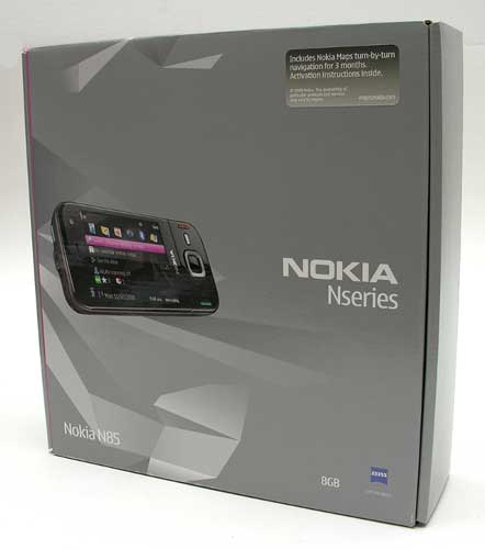
Hardware Specifications
OS: Symbian 9.3 S60
Bands: Quad-band EGSM 850/900/1800/1900 MHz, WCDMA 850/1900/2100 MHz
Data: GPRS/EDGE/UMTS/HSDPA/WiFi
Memory: 74 MB internal, 8GB microSD flash card included
Display: 2.6″ 16 million color QVGA Active Matrix OLED, 240×320 pixel resolution
Camera: 5 megapixel (2584 x 1938 pixels) with Carl Zeiss optics, autofocus and dual-LED flash
Video: 640×480 VGA, up to 30 frames per second
Bluetooth: 2.0 with Enhanced Data Rate and A2DP
WiFi: 802.11b, 802.11g
Audio: 3.5mm stereo headphone jack
Battery: 1200mHa, Estimated 4 hours talk time, estimated 12.5 days standby time
Size: 4.o5 x 1.97 x 0.63 inches (103 x 50 x 16 mm)
Weight: 4.5oz (128g)
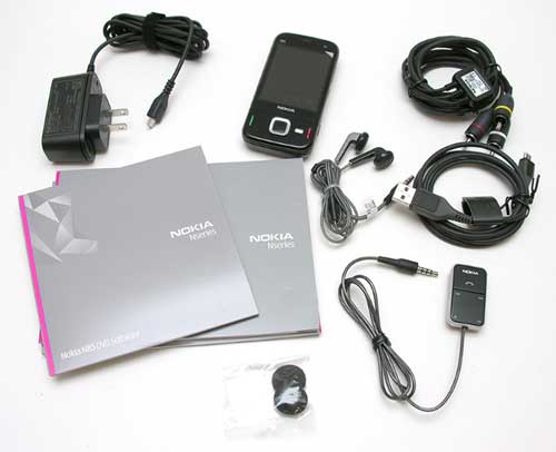
Package Contents
Nokia N85 Smartphone
Battery
AC Adapter
micro USB cable
Video connectivity cable
3.5mm earphones and controller
Getting started guides
Out of the box, I was impressed by the size of the N85. It’s very close to the same dimensions as the Palm Centro as you can see from the image below.
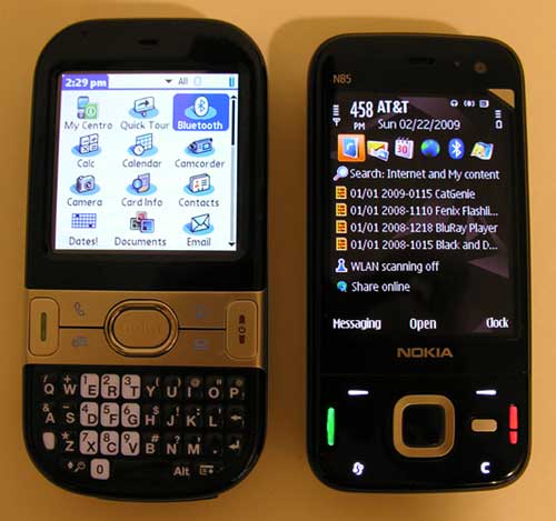
For me, this size is pretty much perfect because it is comfortable in both your hand and your pocket.
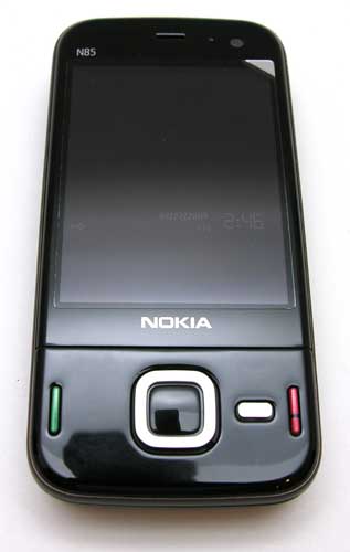
The N85 has a shiny Black plastic face that attracts fingerprints and smudges like flowers attract bees. The non-touchscreen display takes up most of the front surface of the phone. Above the display is the speaker, light sensor and a front facing secondary camera.
Below the display is a collection of 9 buttons. The buttons that you can actually see include Call and End keys, the Navi wheel / scroll key with the center select button and to the Right of that is the small multimedia key.
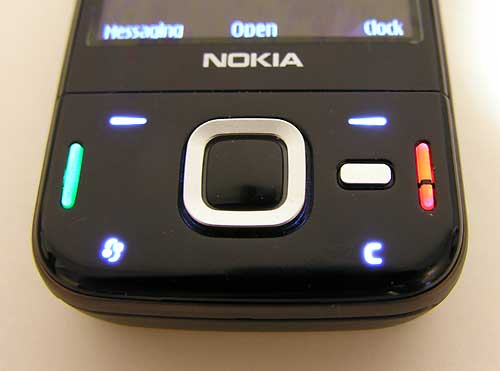
The four buttons that you don’t see when the phone is in idle mode are the two buttons that map to the bottom screen menu items, as well as the Menu key and Clear key C which are located along the bottom edge. To activate these buttons, you just press the case in that area.
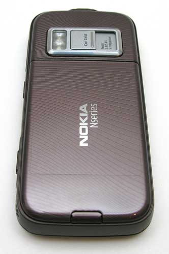
On the back side of the phone, you will find the easy to remove battery cover, the camera lens and LED flash.
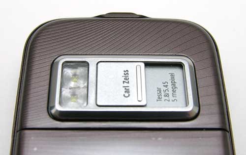
There’s a protective slide cover for the camera lens. Sliding this cover open exposes the lens and also launches the camera application.
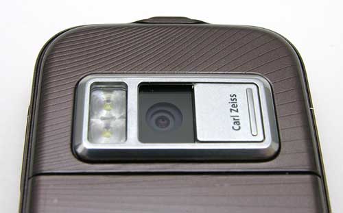
I really like the fact that sliding the cover open will immediately start the camera application and will allow you to capture images straight away without having to navigate various menus in order to launch the camera application.

On the Left edge of the phone, you will find the microSD card slot and lanyard attachment point.

On the opposite edge, you will find two speakers for stereo sound with 3D effects. There is also a camera shutter button, key lock switch and the volume / zoom button.
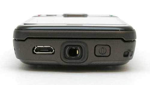
The top edge has the micro USB connector for charging and syncing. Next to it is a 3.5mm stereo earphone jack and the power button.

To access the numeric keypad, you slide the display upwards. The sliding mechanism feels like it has a spring assist, which makes it pretty easy to slide it open and closed.
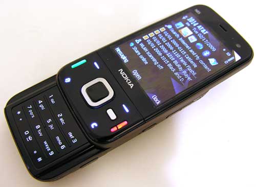
The only issue I have with this design is that to slide the display up, you have to use your thumb on the screen to move it. That means smeary fingerprints all over the screen.
Sliding open the screen will ‘wake’ up the phone if it is in idle mode and will not require that you press the screen unlock buttons.
It’s important to note that the keypad does not have individual keys. Instead, it has one flat surface with the buttons under it. It has good tactile feedback and is backlit, but I personally prefer separate keys. That’s just me though…

The numeric keypad isn’t the only keypad on this phone. If you slide the screen in the opposite direction, it will expose four short side keys.
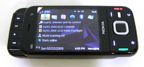
These keys have different functions depending on the application that you’re in. In the image above, you can see that the keys have play/pause, stop, next and previous track functions for the music player. When using the web browser, they can be used to zoom in and out as well as to play/pause and stop music that you may be listening to in the background. They can also be used in game mode.
So far I’m loving the size of this phone. It’s perfect for sliding in my pocket when I take walks at work. The phone is solid, has a good heft to it and feels good in my hand. It does exhibit some creaking noises when I apply my ever popular gadgeteer squeeze test on it.
My main complaint so far is the flat keyboard. I’ve never been a fan of that style and am not sure this phone will be the one that changes my mind.
That’s it for the hardware tour. I’ll be back with my Day 1 and 2 impressions, which will include:
- First impressions of the user interface
- Making and receiving calls
- Browsing the web


Gadgeteer Comment Policy - Please read before commenting
I was looking at this phone last week. I can’t wait to hear what you have to say about it. I have always liked the symbian OS and Nokia.
Can you tell me this. there are different reports out there saying the build quality was poor and others said it was great. Does the plastic face feel too plasticy or is the build comparable to other plastic type phones?
Does that make sense?
Any ways, cant wait to read the rest of the weeks’ reviews!!
@Ryan: The build quality of the N85 seems to be on par with other good quality plastic phones. I would compare it to various Sony Ericsson candy bar phones for example.
I like the way it looks but i dont think i will ever get another phone that doesn’t have qwerty. (or at least touch screen keypad) sorry. just cant do it anymore.
I have an N85-3 and I have some mixed feelings about it. I also want to note that I’ve had almost every good N-Series phone out including the n95 n95 8gb n82 n96 and n73. The N85 has a the most solid feeling slider out all the dual slider nokia phones. It feels a lot more rigid and the build quality is really good for a nokia. My only gripe is the shiny black plastics they used, which are very easy to scratch. I take VERY good care of my phones and this thing still managed to get tons of little scratches, which really upsets me. I wish they used the soft black paint like they did on the N95 8GB.
I kinda agree with Ava – It is a great mobile phone, but no qwerty and no touch screen….not sure about it then
I wish you had reviewed the E63, but look forward to the rest of this review.
A camera phone with a lens cover. Sweet mother of pearl.
Just wondering, where is the rest of the review?
@ucfgrad93 The rest of the review is coming. I just had a really busy week last week and no time to write. I’ll have another part posted soon. 🙂
Thanks, Julie.