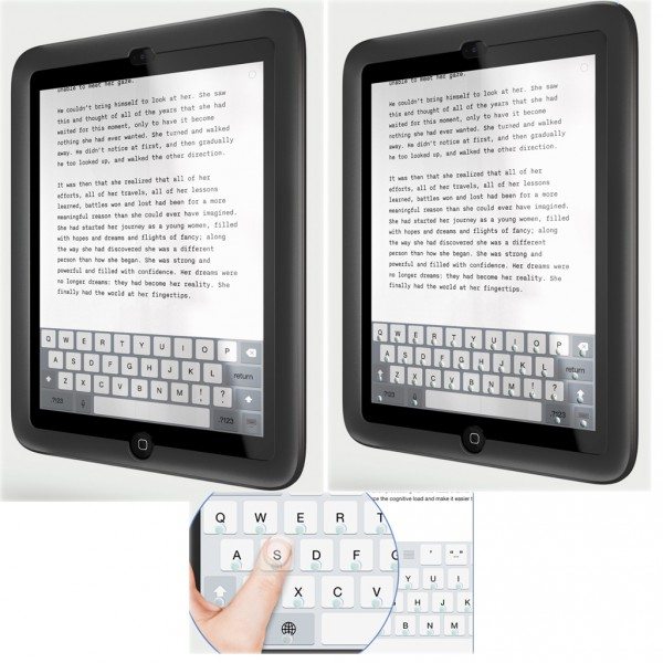
Typing on a touchscreen is more difficult that typing on normal keyboards because the smooth, flat screen offers you no physical clues to let you know if you’ve even touched a key as you type. The Phorm case changes that by overlaying physical clues on the touchscreen when you need it. Slide a switch on the back of the case, and a keyboard guides emerge when you need it; slide the switch back, and the keyboard disappears. The case needs no power, so the keyboard doesn’t drain the devices battery, nor do you need to remember to charge the case. The keyboard works in the portrait orientation, and the finger guides allow you to more easily find the virtual keys. Phorm says typing will become so fluent in this case that eventually you won’t even have to look as you type.
You can currently pre-order a Phorm case for the iPad mini for $99 plus $5 shipping. You can also place yourself on the waitlist for an iPhone 6 Plus case, and there’s a poll on the Phorm website to help decide if their next case will be for the iPhone 6, iPad Air, Samsung Galaxy 5/6, or the Nexus 6.


Gadgeteer Comment Policy - Please read before commenting
It’s a good idea to try to fix the flat aspect defects of tablet keyboards. But even limiting this to the portrait orientation doesn’t help completely.
I find some variations in how the keyboards are laid out.
And as far as not having to look, I’m not too sure I trust the keys, especially when switching to numbers or symbols.
Its technically a clever idea but in the practical world I can’t see it making inroads. I don’t know anyone who would type so much on an Ipad rather than a notebook. Even with this device it will not be anything like as good as a real keyboard. I’ll pass but kudos to the designers.
Personally happy with the Logitech Ultra Keyboard on my iPad mini. But I wonder if this would help people with vision impairment ?