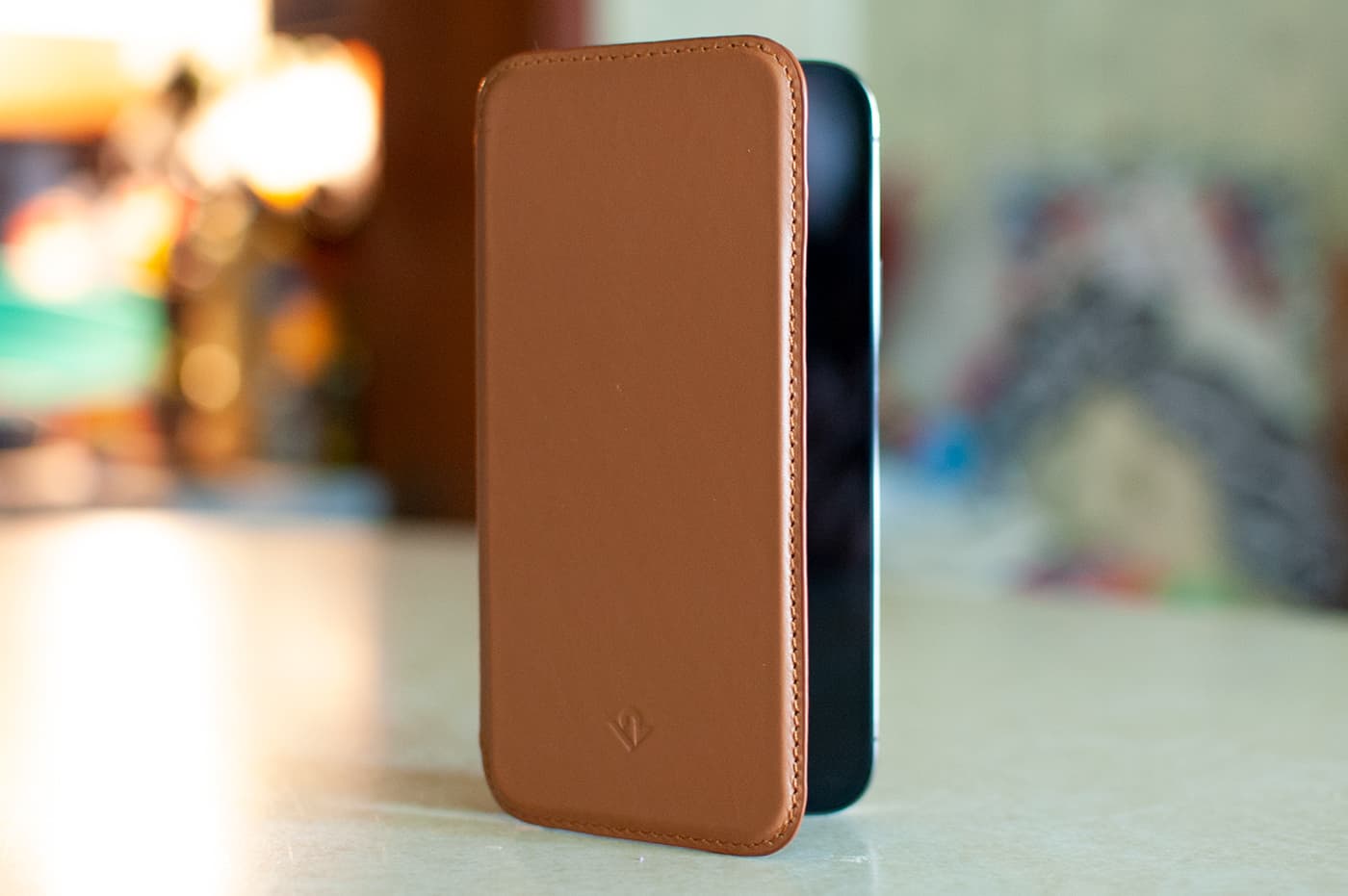
REVIEW – My eternal hunt for a perfect minimalistic iPhone case brought me back to one of my favorite Apple accessory makers, Twelve South. Today, we’re looking at their SurfacePad for iPhone 12.
What is it?
The SurfacePad is a slim, MagSafe compatible leather cover for the iPhone that wraps around from back to front to offer 360º protection. It features two card slots on the inside front cover and repositionable adhesive.
Hardware specs
- Ultra-slim cover that protects the surface of iPhone
- Fully MagSafe compatible with cards attached
- Crafted from luxuriously soft Napa leather
- Two interior pockets for ID / bank cards
Design and features
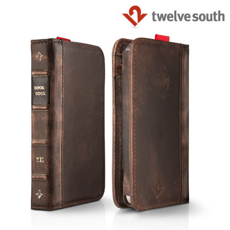
Seeing the name Twelve South pop up in my feeds or email always puts a little smile on my face. I’ve been using their products since the iPhone 4 days with their handsome little BookBook Case that essentially wrapped the iPhone in a small leather book cover.
Fast-forward 10 years later where the iPhone 12 is slim, nearly bezel-less, has magnet-aided wireless charging and an array of cameras on the back. While it’s the spiritual successor to the industrial design marvel that was the iPhone 4, I really can’t bring myself to wrap it in a bulky case.
Twelve South has been adapting their cases right along with the changes of the iPhone, finally arriving at the SurfacePad for iPhone 12.
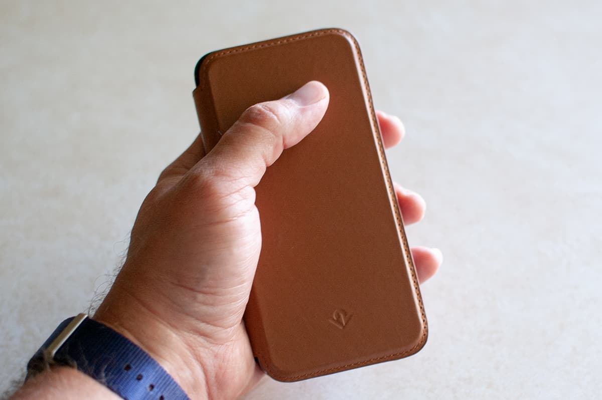
While the larger BookBook still exists for modern phones (and believe me, despite the bulk, I’ve taken a hard look at this case in the past) the SurfacePad is Twelve South’s take on a more minimalistic case.
The case consists of handsome, soft Napa leather on the outside, bordered with nylon stitching that appears good and strong. I noticed a couple of areas where the stitching was knotted, probably an end point in the thread, and it happened to be right in the areas where my hand comfortable held the phone. I didn’t attempt to trim or melt the thread, but that was one minor imperfection that probably varies per case.
The case is nearly featureless, just smooth leather with a small logo on the front and two volume button indicators on the side so you can tell where to press to increase and decrease the volume.
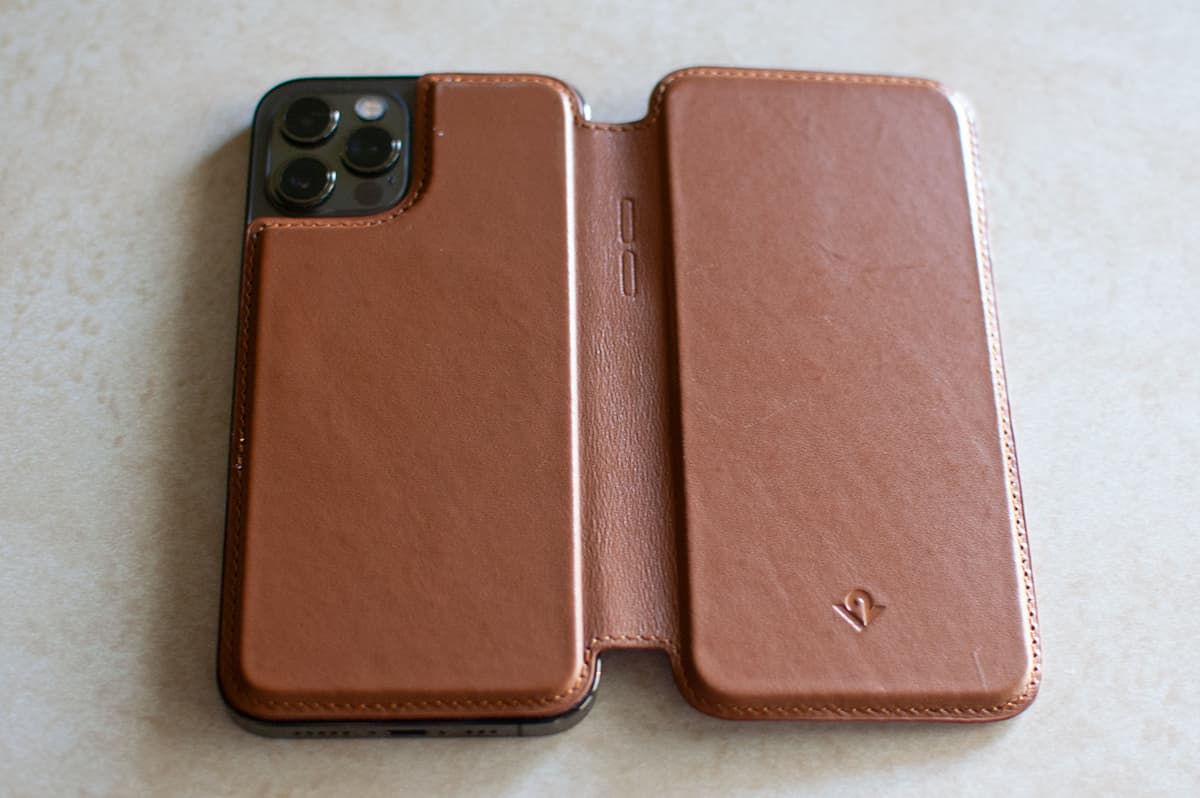
On the inside front cover of the case, the material that rests against the screen is a soft felt. This is also the side of the case that houses two card slots, both of which seem to have a tiny bit of depth to surround the card shapes.
The inside back cover features a sticky, repositionable adhesive for placing on the back of your iPhone.
There’s a bit of magnetic material on the case, much like any MagSafe case you may have experienced. I think those are the positioning magnets for the MagSafe peripherals, like chargers and stands, so that you can use them with the case on. Indeed, you can easily slap on a MagSafe charger without removing the case and it works just as well as it would with a naked phone.
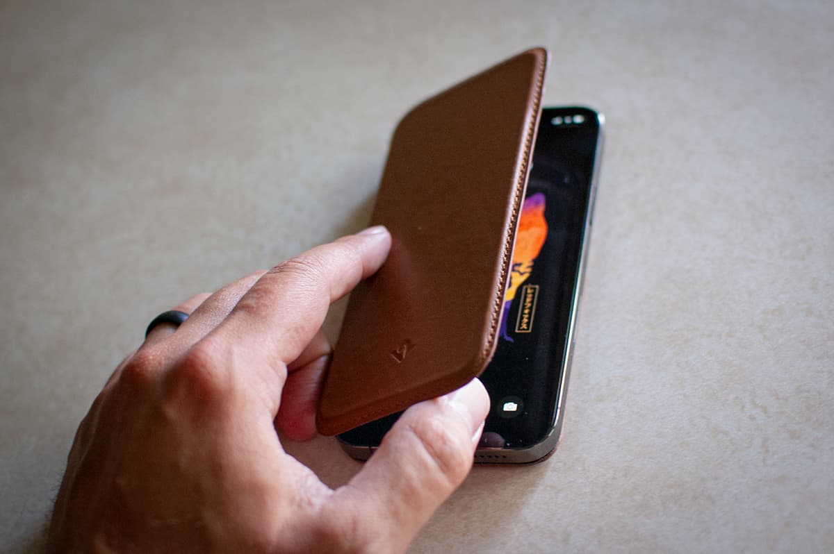
One thing worth mentioning, the case is flush with the sides of the phone, so there is very little in the way of protecting the top, bottom, and right sides of the phone. I really like this, though. It furthers the impression that the case is integrated with the phone.
Setup
There’s little in the way of setup other than peeling off the backing from the adhesive (which Twelve South smartly mentions you might want to keep, in the even you do remove and store the case) and placing it on your phone.
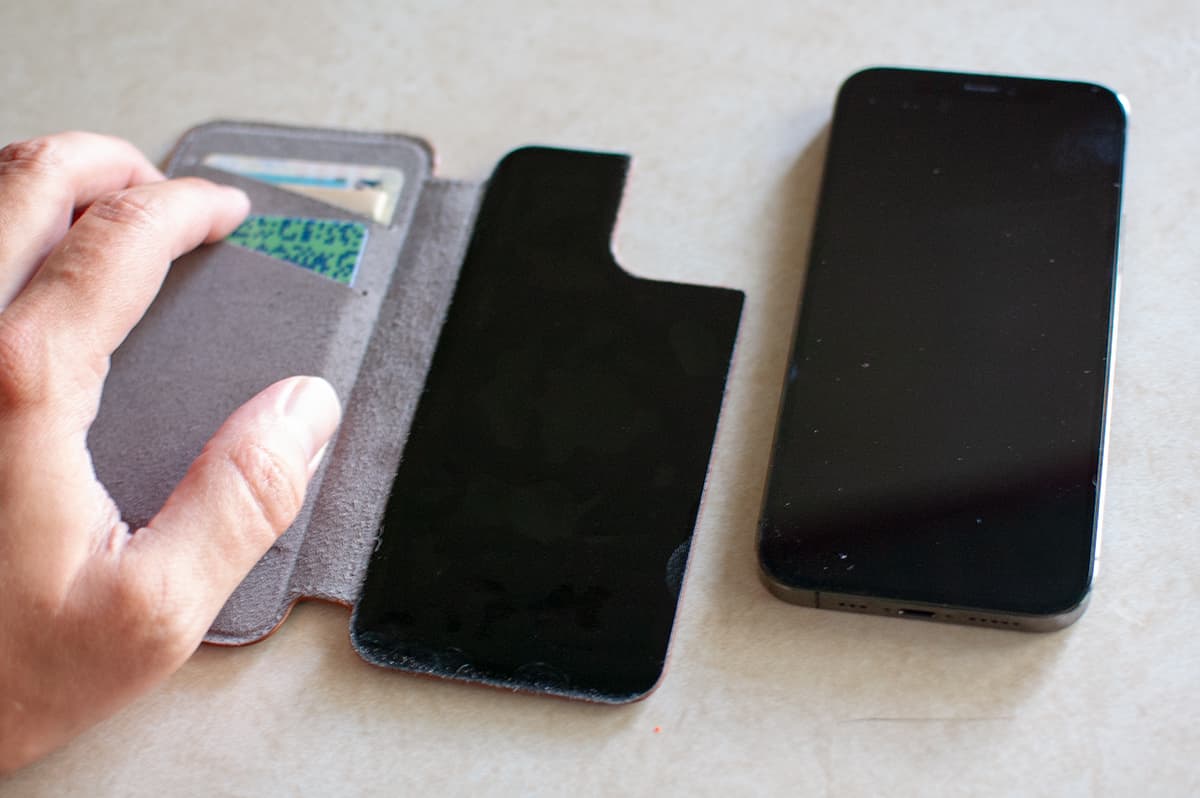
Luckily, it’s very easy to peel off during your attempts to get the case positioned juuuust right. The case itself is almost the exact height and width of the iPhone itself, so it’s very apparent when the case isn’t perfectly flush with the edge of the phone.
I managed to get it right after 2-3 tries. The adhesive is strong enough that you really don’t have to worry about it accidentally shifting or coming off. In fact, after a week or so, it was somewhat difficult to peel the case off the back of the phone.
Performance
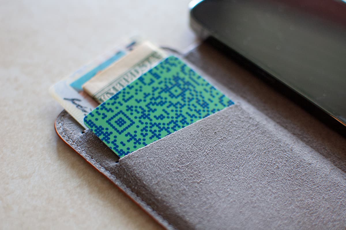
This is indeed a minimalistic case. To full embrace the spirit of the SurfacePad during the review period, I managed to trim down the contents of my wallet to a mere two cards — one credit card and my ID. Naturally, both cards slipped into the card slots easily and didn’t seem to add to the overall bulk of the case, since the front cover has that “depth” built in, meaning it would still be just as thick with or without cards. Might as well use those slots.
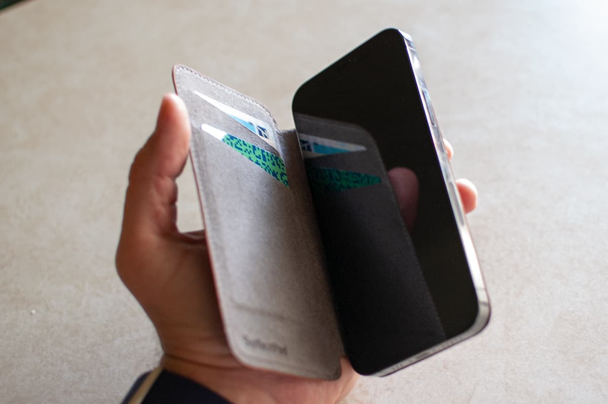
I slipped a twice-folded emergency $20 bill behind my ID as well, but aside from this and the two cards, the case and my phone were all I carried, no additional wallet needed. I’ll admit, with the empty space where my wallet would normally be in my pocket, it felt like I was forgetting something for about a week or so. But it was liberating. All I needed to remember was my phone and keys and boom, good to go.
That’s not to say you couldn’t still carry a wallet — you could put your two most-used cards in the SurfacePad case and keep the lesser-used cards in your pocket. But it really does make you start to wonder what you need to carry with you. The fact that I could go wallet-less a lot of the time really speaks to the number of things that typically exist in a wallet that are now digital, like Apple Pay and barcode membership cards.
The card slots are rather deep, and since the case is so thin, it sometimes made fishing a card out of the slot a bit awkward. I started inserting my credit card a little less than all the way down and that helped.
The front of the SurfacePad must have some NFC shielding to it. I wasn’t able to get a checkout reader to trigger the purchase while waving the case above it, which is probably a good thing.
While the SurfacePad gets very high scores from me in terms of its looks, easy carry, and wallet functionality, it still doesn’t solve the problem of using your phone with a full wraparound case attached to it.
You can hold it like a book, but the cover flap isn’t rigid enough to hold it just by that flap without your phone falling to a weird angle. You can fold the cover around the back of the phone, but it doesn’t lay flush against it, making a sort of acute triangle shape with the curved spine and cover, effectively doubling the thickness of the phone at one side.
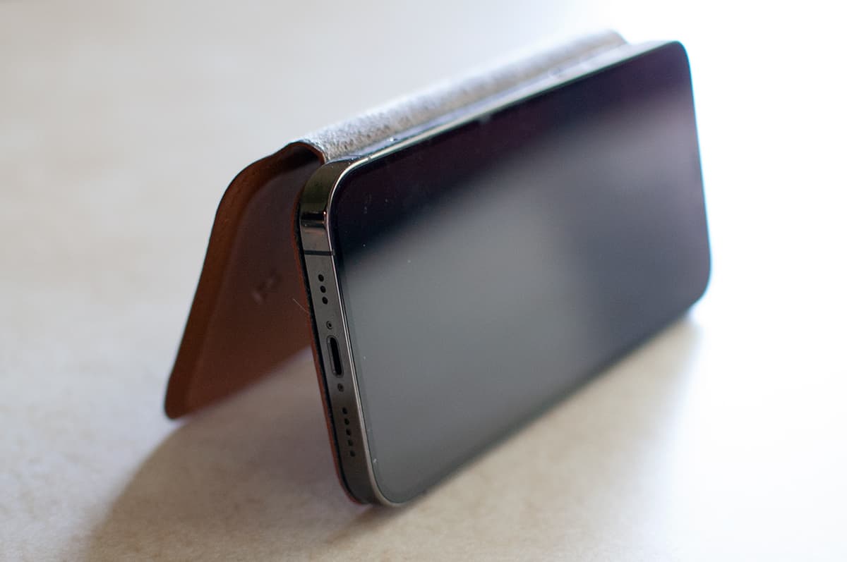
You can also hold the phone with your right hand and leave the cover sort of dangling to the side, but then you can’t wrap your fingers around the side of the phone because of the spine. There’s not a natural-feeling way to hold it. You can get used to it, but I did start to long for the way I could firmly clutch my case-less iPhone in either hand without extra material jutting out from the side. Certainly that’s a personal preference, but it’s one that leads me to eventually abandon nearly every case I’ve ever used.
What I like
- Extremely thin, minimalistic case
- Attractive color, really matches with the iPhone aesthetic
- Might be all you need to carry with your phone!
- Still works with MagSafe accessories
What needs to be improved
- Couple small snags on the stitching, but that’s being very picky
- Only two card slots may be a non-starter for some
- Can be awkward to hold for an extended time
Final thoughts
Aside from some of the inherent awkwardness that comes with using a full wrap-around phone case, the SurfacePad case is an amazing entry from one of my favorite Apple accessory makers. Its handsome leather, minimal approach and MagSafe compatibility far outstrip the minor complaints I could come up with.
Price: $49.99
Where to buy: You can buy the SurfacePad for iPhone 12 directly from Twelve South.
Source: The sample of this product was provided by Twelve South.


