
To celebrate the holidays, we are giving away some awesome products including a messenger bag from WaterField Design, a rugged Bluetooth speaker from Jam audio, a carbon fiber wallet from Identity and many more. And this time we have two sets of prizes so that more than one person gets a chance to win. Entering is easy! Just for answering three questions in a comment at the bottom of this post. And if you’re willing to jump through a few extra hoops, you can get up to three additional entries which greatly increases your chances of winning. Please click through to read the details on the prizes and to submit your entries for a chance to win our Holiday gadget giveaway prize pack!
Prizes:
First place: One person will win a prize pack consisting of 1 of each of the 11 products shown below:
WaterField Design Vitesse Messenger Bag
The Vitesse Messenger is an elegant bike-friendly, work-appropriate waxed canvas messenger bag with functionality and style to spare. A vast main compartment includes a pocket for a laptop in a sleeve plus organizational pockets for small items. Front zippered pockets are great for easily accessible items and a hidden scratch-free phone pocket keeps that necessity safe and ready.
Winner chooses the color.
Price: $159.99
Website: https://www.sfbags.com/

Frostguard
This is a specially designed car windshield cover that makes winter more bearable. No more scraping frost and snow off the windshield first thing in the morning.
Price: $24.99
Website: https://www.frostguard.us/

Paracable: MicroUSB Cables
Premium MicroUSB cables constructed of the highest grade materials wrapped in braided paracord ensuring durability and longevity
- Compatible with thousands of mobile phones and electronic devices including Android, Blackberry and Windows
- Wrapped in stunning ’32 bit’ paracord fabric and features sleek and durable aluminum end housing
- Capable of 2.0+ amps of charging power
- Available in 3.2 feet and 5 feet to accommodate a variety of charging scenarios
- 6 styles including Continuum, Gecko, Glacier, Magma, Matrix and “1.21 Giggawatts”
- 30 day satisfaction guarantee and 1 year hassle free warranty included
Price: Starting at $15.95
Website: paracable.com

Identity wallet
Carbon fiber minimalist wallet
- Comfortable front pocket carry
- Holds up to 8 cards
- Easy card access
Price: $35.00
Website: identitywallet.bigcartel.com

Circle: Circle with Disney
World’s first custom monitoring system to protect your family on the Internet
- Device pairs wirelessly with home network and instantly detects devices paired with local Wi-Fi network including: smart phones, gaming systems, laptops, tablets, smart TVs, etc.
- The companion Circle with Disney app (currently available for iOS 8 or later and Android), gives parents full control over which content is viewed and the time spent on each device
- Through the dashboard, parents can create unique profiles for each family member with specific parental control settings such as:
- Time Limits – Allows for complete control of screen time usage between a variety of apps, platforms and web-based programs
- Bedtime™ – Automatically disconnects and reconnects devices from Wi-Fi at scheduled times
- Filter – Set individual age and interest filters for each family member
- Pause – Ability to turn off and turn on network Wi-Fi at any time
- Circle Go extends all of the features and functionality of Circle in the home to any network (wireless or cellular) to outside the home
- Extends all of the features and functionality of Circle in the home to any network (wireless or cellular) to outside the home
- Intuitive insights allow parents to track and compare online usage from week to week, month to month, per site, by interest or category
- Security at its core, Circle uses end-to-end encryption and ARP spoofing to keep data secure
- ARP spoofing automatically monitors all traffic on the home network, and based on the pre-set parental controls, will allow or deny access to the users’ device
- Circle with Disney app also recognizes guest devices and can apply a family’s home setting to visitors’ device and block ads from any device on the network
- Fully compliant with Children’s Online Privacy Protection Act (COPPA) standards
- Simplistic design means Circle seamlessly blends into any home aesthetic
- No software per device to install
- Ethernet cord available for those with bandwidth concerns
Price:$99; Circle Go: $9.95/month
Website: www.meetcircle.com

Zivix: AirJamz
Connected toy that makes music and sounds with your movement
- Bluetooth-enabled pick connects to iOS devices to brings sword fights or laser battles to life with accurate sounds
- Any user can mimic the strumming of a guitar to “play” guitar riffs and power chords with backing track without any prior musical knowledge
- More than 100 unique instruments and sounds to play as well as 25 full songs with up to 4 players
- AirJamz Music App: Allows up to four players to play with simple gestures
- Easily changeable coin cell 3V battery
- Available in either black or white modules with either black or red picks
Price: $49
Website: playairjamz.com
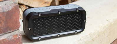
Jam Audio: JAM Xterior Bluetooth speaker
Rugged wireless speaker that’s dust proof, drop proof and water proof
- Rubberized exterior
- Can be used as an external battery pack
- Rechargeable battery provides up to 10 hours of play time
Price: $119.99
Website: https://www.jamaudio.com

Tackform device mounts
Set of 5 different high-quality magnetic device mounts that include:
- Tackform Revolver Magnetic Tripod Mount
- Tackform Low Pro Stick-On Magnet Mount
- Tackform Swivel Stick-On Magnet Mount
- Tackform Suction Cup Magnet Mount
- Tackform Magnetic Vent Mount
Price: $64.91 (combined value)
Website: https://tackform.com

808 Audio: Canz
Ultra-portable Bluetooth speaker provides BIG sound in a small package
- Listen to your music for up to 6 hours on a rechargeable internal battery
- Mobile speaker connects to any Bluetooth enabled device for crisp, clear sound
- Streams music from up to 30 feet away with 3.5mm input for multiple connecting options
- Ultra-portable design with non-slip bottom
- Available in blue, white, red, black and purple
Price: $34.99
Website: www.808Audio.com

Coloud: No. 4
Highly durable pair of earbuds that knows how to power up the sound
- Angled earbuds and multi-sized caps give the perfect in-ear fit, delivering direct sound and powerful bass
- Magnetized earbuds snap together around your neck for easy reach and secure, on-the-go access
- Proprietary ZoundLasso creates a tangle-free life
- Engineered for the active youth, with an emphasis on great design and lightweight, durable construction
- Available in Black/Grey, Blue/Yellow or Grey/Splash
Price: $19.95
Website: www.coloud.com

GEAR4: Piccadilly
With a classic Gear4 design, Piccadilly offers the world’s first Metallic D3O technology to perfectly color match your iPhone
- Slim-fitting design adds superior protection without the bulk
- Clear PC case features first ever Metallic Color Match D3O® material inside to show off the original color of your iPhone
- Made with unique patented D3O® technology, a material used by Olympic ski teams and the military, to deliver superior impact protection through advanced shock absorption
- Injectable D3O® delivers more impact protection per cubic millimeter than other leading materials
- Scratch-protected with UV coating for a classic, clean look
- Easily access all ports
- Available in Gold, Rose Gold and Silver for iPhone 7 and iPhone 7 Plus
Price: $34.99
Website: www.gear4.com
Second place: One person will win a prize pack consisting of 1 of each of the 2 products shown below:

Tackform device mounts
Set of 5 different high-quality magnetic device mounts that include:
- Tackform Revolver Magnetic Tripod Mount
- Tackform Low Pro Stick-On Magnet Mount
- Tackform Swivel Stick-On Magnet Mount
- Tackform Suction Cup Magnet Mount
- Tackform Magnetic Vent Mount
Price: $64.91 (combined value)
Website: https://tackform.com

Identity wallet
Carbon fiber minimalist wallet
- Comfortable front pocket carry
- Holds up to 8 cards
- Easy card access
Price: $35.00
Website: identitywallet.bigcartel.com
How to enter (please read carefully – any missed steps and your entry will be disqualified):
Between now and 12/21/2016 midnight EST leave a comment on this page answering the questions below which will help me with a Gadgeteer site redesign that I’m starting to plan.
- Which site’s front page and article page layout/look and feel do you like the best: 1, 2, 3, 4, 5 or 6 and why?
- Which site’s front page and article page layout/look and feel do you like the least: 1, 2, 3, 4, 5 or 6 and why?
Get a 2nd bonus entry by subscribing to our newsletter:
You’ll receive 3 emails a week with latest post info. Subscribe here.
Get a 3rd bonus entry by tweeting:
Celebrate the holidays and win a giant prize pack of 11 gadgets from @thegadgeteer http://wp.me/p3LRkH-Stk
Get a 4th bonus entry by linking to The Gadgeteer home page on Facebook.
Make sure you come back to this page and leave a separate 2nd comment stating that you subscribed to the newsletter, a 3rd comment with a link to your tweet and a 4th comment with a link to your Facebook post. To get the links for Twitter and Facebook, just click the time stamp of your post and it will give you the page with that post so you can grab the link.
At some point on 12/20/2016, I’ll pick 2 random winners using random.org. The winner will be contacted by email and will have 48 hrs to claim their prizes. If I do not receive an answer to my emails in that time period, I’ll do other random.org drawings till the prizes are gone.
Rules:
1. Only one entry per person (warning: I check IP addresses).
2. Gadgeteer writers and their immediate family members may not enter this contest.
3. the-gadgeteer.com is not responsible for any lost packages due to incorrect shipping addresses.
4. the-gadgeteer.com is not responsible for the winner not accepting their prize offer within 48hrs. The winner will be posted on this contest page, in the contest page comment section and will be emailed using the email provided in the comment section. Check your spam folder.
5. Winner must have a US shipping address.
Update 12/22/16
The winners are:
1st place is Steven (comment #28)
2nd place is K. Koenig (comment #119)
Thanks to everyone who entered the contest and to all of our sponsors who provided the prizes!


Gadgeteer Comment Policy - Please read before commenting
Like 1 the best, nice clean and pleasing to look at. Like 6 the least, just too black and white.
Subscribed to newsletter
1) #3 Android Central – Love the wide edge to edge layout with big eye catching graphics.
2) #6 Hackaday – Way too dark of a theme.
Subscribed to newsletter
https://twitter.com/debugy2k/status/810158472088129536
https://www.facebook.com/debugy2k/posts/10157914756825111
best – 5 stuff i’m interested in
lwast -1 – site too jumbled
2nd post..
just didn’t want a reply to invalidated my entry
#3 best, android central – great site too
Worst
#6 Hackaday, but its nearly a tie with #5 theawesomer
I’m sure ALL these sites have great information, but I’m so turned off by their UX that I’m not interested to dig in and or come back.
Favorite is #6 — i like the contrast of the black background and the main stories about 2/3 on the left
least favorite is #1 — it seems busy with all the different sizes of information
I like The Verge (#2) the best because it is very bold and shows a large number of articles. I like The Awesomer (#5) the least because it is too busy on top, doesn’t give a large choice of articles immediately, and the previous and next buttons take up a huge chunk of the page on the bottom.
Best – Awesome – cleaner and not too busy
Worse – too busy
I like clean simple pages
I just subscribed to the newsletter
I think #6 is the best as the layout makes it easy to preview the articles and information available without having to sort thru a lot of graphics and “busy work”. The colors are eyecatching, but don’t hide the information or detract from the content the way some of the other sites do.
I think #5 is the least useful as the layout doesn’t give a lot of choice on the main page and it’s annoying to have to work to find interesting articles.
4 is the best homepage; I can find my content most easily (5 and 6 are pretty good as well).
1 homepage gives me a headache.
Of course, I ‘read’ your site through an RSS feed, so the homepage doesn’t mean much to me. All of the ‘content’ pages were fine.
And newsletter subscribed.
I like number 5 the best. I like a pic and short summary to decide whether or not I want to read further.
I like number 1 the least. Too boring–too similar to how many web pages are set up.
I subscribed to the newsletter!
I tweeted! https://twitter.com/pescokid/status/810246824502104064
I like 3 the best because it’s easiest to navigate. I like 5 the least because of the black background and the layout.
I like # 3 the best as it is attractive but allows me to immediately jump into content. I like #4 the least as it seems small and off balance.
I would gather that your posting a survey is an effort to gauge the views towards the site layout. I like the one you have now but understand the desire to keep up with the ever-changing design standards. In that light, here are my thoughts:
BGR is my favorite. I like the clean screen, easy to read and works well on my mobile. I am not a dark screen kind of guy. I am not sure how you work ads into the content other than to make the ads look like articles. I am OK with that provided the ads are labeled as ads.
Neatorama is my least favorite. Too similar to the existing site thus not worth the effort to make the change.
Tweet happened here: https://twitter.com/mryanaz/status/810284945029664777
Subscription updated
My favorite is Number 2 as I like to scroll through the different articles and click on what interests me.
My least favorite is Number 1 as each block takes up space and are not the same size. The content is jumbled and forces one to look at all these squares with less order.
Here’s the FB Post: https://www.facebook.com/mryanaz/posts/10211502886111587
I like 2 the best – it is a clean layout and grabs my eye right away.
I like 5 the least – it seems a bit confusing and hard to scan easily.
I like #4(neatorama) the best as it doesn’t seem to clutter with big images. It shows just enough content for you to click into to see if you want additional information.
My least favorite is #5(theawesomer) as there is way too much content crammed together in small text and space.
I subscribed to the newsletter.
Here is the Twitter link: https://twitter.com/joparksc/status/810306393748176896
Subscribed to newsletter
https://twitter.com/steven_tsou/status/810307307846402049
I liked the best, #4 (the Neatorama website), the best because it doesn’t have an advertisement at the top that shifts the main content down when it loads. More often than not, the ads are slow to load. So, as you are reading the main contents it suddenly shifts down when the ad finally completes loading. Or, if you are about to click on a link in the main content, the content shifts down and you miss clicking on what you want and end up clicking on something else. It’s so irritating. It also has a compact form (no large images), fitting more articles on the site with the least scrolling.
I liked the least, #2 (The Verge website), because it had the largest shift in contents because of the advertisement at the top.
Like #3 best. It’s not so busy looking. I like 1 least. There’s too much going on for me. It feels very overwhelming.
I subscribed to the newsletter and tweeted https://twitter.com/infopal/status/810335911061979136
I like 6 the best, the ads are not intrusive into the article content. Although on my mobile, it still has a desktop layout which is probably not ideal.
Conversely (or inversely?) I don’t like 5 because the ads are as big or bigger than the articles, but the mobile layout is large enough to read without zooming in.
The front page layout style I prefer the most I think is called List Format, where reviews/stories are in an descending/ascending order. Easy to scroll on PC and phone and Verge has that style after they clean-up the oversized boxes on top just under the header. A style I also like I think is called Grid Format (Boxes) BGR, Androidcentral, and The Awesomer are sites I will return to (Thanks for two new links to me).
Hackaday and Neatorama are layouts I just didn’t like, Hackaday was too busy as a layout but I will return and already go to, and I’m sorry to say I think Neatorama doesn’t interest me visually.
Get a 2nd bonus entry by subscribing to our newsletter,
Subscribing Done, Don’t Facebook or Tweet. Thank You
I like Hackaday the best (6). It’s simple, clean, and legible. I find it easy to browse and see the articles I want to read.
I dislike the Awesomer (5). It’s busy, cluttered, and unfocused. too much and all over the place.
Like the best: #1 (bgr.com) because it’s clean, fits a good amount of content without too much scrolling.
Like the least: #5 (theawesomer.com) because it feels cluttered, too much going on.
Thanks Julie!
Given ONLY these choices, Android Central is choice for what’s best. Honestly, they all look so similar (text/icon selection ribbon across top – Android Central has 2!), right handle column of “Hey, look over here at what’s hot, since we couldn’t grab your attention with the main content”.
What I really appreciate is less graphics as imho, it’s lost it’s uniqueness (every site is rich with pictures). And I value being able to visit a site with my mobile devices and it can be a real pain to have to wait for things to load. I’ll sometimes just move along to something else.
And for least favorable, the awesomer.com. Just didn’t like the organization with Ads being placed where they were.
Mike O
P.S. Tweet Complete!
I really like #4 (neatorama). It has the best balance of compact information without compromising on screen real estate. I don’t care for #2, the verge. It has way too much wasted screen real estate, in an attempt to generate eye candy.
Like #1 the best. Light color scheme, easy to read, feels like something I could see everyday without being annoyed by some tiny design tic.
Like #6 least – the dark color scheme looks muddy to me. Don’t want to spend the time dealing with it.
Like best: 3 – Android Central – it seems easy to navigate. A couple of highlights with everything else below.
Like least: 2 – The Verge – Too many different colors, shapes and sizes.
Tweeted
https://twitter.com/Michael4RE/status/810601619746357253
Subscribed to the newsletter.
Facebook share:
https://www.facebook.com/mikebw/posts/10154080144223038
style 1 (BGR) – cleaner and easier to navigate. If I go to a website and have to scroll down past headers and other junk just to see content, then I immediately assume it’s just spam/click bait and leave
I dislike the verge, but also most of the others. Too much clutter/noise. annoying ad placement, and incongruent color/design schemes
Subscribed and tweeted! Happy Holidays!
subscribed
tweeted https://twitter.com/smgearmail/status/810608108791857156
FB Liked and Linked
Hi Julie-
My first pick of site is #1, the BGR tech site. It’s clean and easily readable. It has general links across the top of the page directing you to a specific type of info,and as you scroll, offers key articles and a quick list of hot topics. Great for a quick browse. If you continue scrolling, cleanly arranged articles with clear descriptions are on the page.
My least favorite is #4, Neatorama. It’s busier and less intuitive, and loses almost half the screen as you scroll due to a constant ad that follows you down. I get the need for ads, but it takes up far too much real estate. The reader is also forced into scrolling even further to see key articles but each has a large cartoon. It doesn’t really grab my attention- it aggravates me I have to scroll more and more just to reach the next article.
Thanks for reaching out to the readers!
I subscribed and confirmed for the newsletter. Thank you!
Thank you! https://www.facebook.com/Craftmatic/posts/10154852659189451
Thank you! https://twitter.com/JesusLaughsToo/status/810620548069859329
I liked #1 best because it was clean and contemporary. I would’ve liked #3 second best due to the equally clean layout and look, but the popups are a instant turn-off. I definitely didn’t like any of the designs with dark backgrounds because they’re harder on my eyes and feel dated.
I like (#3) the most because I’m familiar with this site (Android Central) and looks big and clean to me. And like (#5) the least because it feel like an online shop to me, crowded in small space.
1) Like #1 the best, because it’s clean and simple
2) Like #5 the least, because it’s dark and confusing
I like number 3 the best. It is easy to read and loaded very quickly. I could see how easy it would be to find all of the things reviewed. My least favorite is number 4. It reads more like an article and I think it would be hard to easily find different products.
I am already subscribed to your newsletter!
3… good use of space and well organized
5… white on black is hard to read and it looks really cluttered
I like number 3 the best. Clean, easy to navigate. Number 2 I like the least. Too choppy too much scrolling to keep up with stuff.
Like 3 the best
don’t like 6 and 5 to much going on.
Subscribed to email.
I like Hackaday.com’s design the best – you can see a blurb under each article, the links are big and easy to click, and the content is laid out in a logical way. Unfortunately, it doesn’t seem their site is very responsive to different sizes.
I like the Verge the least – their website offers just headlines. Headlines can be misleading (not that Gadgeteer would be of course!) and I hate how much screen real estate it takes up. Also, historically the Verge has been the least mobile friendly site because of how heavy it is, but it is responsive.
I like #4 (Neatorama) the best – the rest are so busy it hurts my eyes just to look at them.
The one I like the least is #1 – not only is it busy but there is almost no content “above the fold” and I hate scrolling to try to see the latest info.
2nd comment – I subscribed to the newsletter.
Here is the link to my tweet: https://twitter.com/rossruns/status/810876861924392960
I like the first site the best – you can tell with a quick glance what you want to dive into deeper. Think the last one is the last one – too dark for my taste.
thanks,
joni
1st Comment
Best front page and article page layout/look and feel: 3 – Android Central – I like a simple easy to follow same-size grid layout, versus grids where each article grid is a different size.
Least favorite front page and article page layout/look and feel: 5 and 6 – I dislike dark themed sites. I can’t pin exactly what it is, but it’s harder on the eyes and seems less professional.
2nd Comment
Subscribed to the newsletter. Yay!
3rd Comment
Tweet Tweet – https://twitter.com/knight_cjg/status/810887485366603777
I like #3, Android Central, the best. It’s clean and easy to follow. However, the top blue border could be much smaller to not take up so much space. Maybe a mix between #1 and #3.
I dislike #5 the most. I don’t like black and it’s way too busy.
Also, what I dislike about your current page are the semi-porn ads. Particularly when viewing on my phone. “Better than Viagra…”, etc., are disgusting. Tech gadget ads are much better.
I hear you loud and clear about the questionable mobile ads. I have a 3rd party that handles the entire mobile site and will complain to them again about this matter.
Subscribed to the Newsletter:
“Thank You For Subscribing to the The Gadgeteer Daily Digest Newsletter
Your subscription has been confirmed.”
Tweeted:
BJ Swanson @BJSwanson now
Celebrate the holidays and win a giant prize pack of 11 gadgets from @thegadgeteer http://wp.me/p3LRkH-Stk
Facebook link:
“BJ Swanson likes The Gadgeteer.
Dec 19, 2016 9:12am”
I like #5 the best because it is neatly organized, and has a descriptive paragraph for each entry. I can quickly and accurately figure out which I want to click on for more detail.
I like #2 the least because it is all picture, no substance.
I like #6, not because of the colors but because I like being able to read the beginnings of that latest 5+ articles to decide which I want to click through. I dislike sites that are just (usually clickbait-y) headlines and usually don’t want to click through to see what’s really going on. So dislike #1
I like #6 — I like the thumbnails with just enough info, hate the black & white tho
My least favorite is #1 — too busy with all the different sizes of information
I’m already subscribed to the newsletter.
tweet: https://twitter.com/bettywiderski/status/810927948509446144
I liked #2 (The Verge) the best due to its large banner area for the logo, its clean navigation bar, and its layout for its featured articles and reviews.
I disliked #6 (Hackaday) the most due to its monotone color scheme and overly basic layout.
Subscribed to your newsletter
#4 for the first question – I appreciate the smaller graphics with more actual text on the page.
#3 for the second – too many large graphics making it harder to navigate to what I want.
Admittedly, I’ll likely subscribe via RSS that will take me right to an article of interest so the redesign is moot.
I like # 5 the best. It just looks cleaner. I dislike # 1 the most. It seems boring.
I like 4, Neatorama the best. Clean,easy to navigate. One story at a time.
I like 5 Awsome Stuff the least. Don’t like black background and multiple stories across the page.
The most appealing to me is #4. I can grab a lot of info right from the front page. It’s neat and easy on the eyes. I like the article scroll function at the top.
The least appealing is #2. Way too loud, the colors are horrible, the font is too large, the page itself is jarring and assaults the reader. Very little content at first look.
I am one of your newsletter subscribers.
My FB share – https://www.facebook.com/rusthawk/posts/1178834475498436
Tweeted – https://twitter.com/rusthawk/status/811060354444763137
I liked #6 by far the most, because of the easy layout, with bright, large headlines that immediately draw your interest, with smaller topics in a column to the right. I think The Gadgeteer would look GREAT in this format!
Disliked #4 the most. It was too fancy-schmancy, hard to follow links, all crammed together, and a lot of the time, their fonts were VERY small and hard to see. They also used a lot of cursive and italic fonts, which came off as snobby to me.
I am subscribed to your newsletter.
Tweeted: https://twitter.com/Mattus_Manatee/status/811088843822792705
My Facebook share: https://www.facebook.com/IronTalon/posts/1258572370848456?pnref=story
Most: 6…neat, clean graphics, fast loading, not overwhelmed by huge images/graphics
Least: 2…literally the opposite of #6
Subscribed…
Like #2 the best the way the info was laid out.
Dislike # 6 it was dark .
#4 neatorama is the best. No multiple story boxes on each level of the page.
#1 BGR is the worst Multiple story boxes on each level and they are DIFFERENT SIZES!!
#2 Story boxes, inconsistent site layout as you scroll down
#3,5 Story boxes, but at least the layout is consistant as you scroll
#6 Hey a normal site….scroll….BOXES!
1. I prefer the layout of #6. It just feels clean and uncluttered. Keep it simple.
2. I like #2 the least. It just feels loud. It’s hard to explain. It feels overbearing.
The sites definitely demonstrate the value of good UX/UI design! Six was definitely a winner for me as it provided me the ability to see everything without scrolling on the screen and the screen on mobile was a much better experience. The one I liked the least was #4. It felt like more of a hodge-podge of advertisements rather than valuable information. (2) I am signed up for the newsletter (3) I retweeted your post on the giveway (which is awesome by the way!). (4) I am connected on Facebook. Thanks again and happy holidays!
I like #3 – Android Central: clean & easy to view
I don’t care for #6 – Hackaday: too dark & cluttered
I like 6 the best – I like one article per row and the dark theme is nice.
I like 1 the least as it just feels too jumbled.
I do wish that each site would make use of more of my screen real-estate (specifically I have way too much white space on the edges).
I like Hackaday’s landing page. The dark background makes the titles of all articles stick out. The individual segments are well organized too.
Neatorama’s home page is my least favorite. It looks like a site made in 2005. Only about 50% of my screen is being utilized. I didn’t buy a large monitor to only use a fraction of it.
I like 5 the best, as it’s easiest to navigate to past reviews, and get more in a single view.
I like 4 the least, as it requires too much scrolling.
https://twitter.com/jae77BMC/status/811322557093662720
Merry Christmas!
#1 is best. Friendly, loads quickly, no pop ups. Fairly easy to navigate.
#6 is worse. Scary and in your face.
Long time subscriber, daily visitor to Gadgeteer.
#5 is best. Friendly, loads quickly. Nice UI.
#1 is worse. Too plain.
Subscribed
tweeted
tweeted
https://twitter.com/xaryc
linked
https://www.facebook.com/gadgeteer/posts/10157914265795371?notif_t=like¬if_id=1482282260867523
1 — clean and easy to skim.
3 — busy and difficult to skim.
I like 1. Clean and simple. I dislike 3, as this site does not lend itself well to segregation and division
Subscribed
Link: twitter.com/kentjhall
3 the best, clean, clear would like the top stories to be smaller pics so you can get 6-8 boxes in. 1 the least.. hard for the eyes to follow
subscribed to the newsletter
Shared on my FB timeline
https://www.facebook.com/profile.php?id=100010686609081
story_fbid=362586010774283&id=100010686609081
https://www.facebook.com/permalink.php?story_fbid=362586010774283&id=100010686609081&pnref=story
I prefer layout #3 — The site branding is minimal but consistent and it puts content front and center, without being so big and bold (like the Verge) that it makes places one story above all others. Plus, the pages aren’t cluttered with navigation.
I dislike #4 — there’s no delineation of importance; no visual clues for the reader to know what’s most important. It’s just a mishmash of sameness. #5 is a close second — way too many navigation buttons clutter the page and distract from the content and overwhelm and confuse the reader.
#1 is the cleanest on a mobile device. Graphic layout with text is easiest to view.
#6 is the busiest and hardest to read on a mobile device. Too cluttered.
Subscribed
Tweeted: https://twitter.com/pchung03/status/811595432199593984
Wording didn’t paste properly the first time for Twitter… https://twitter.com/pchung03/status/811602237541728260
KK (@dogedenkk)
KK (@dogedenkk)12/21/16, 11:39 AM
New Tech gadgets wp.me/p3LRkH-Stk
Like #3, clean easy layout that works well on desktop and mobile.
Least #2, not a fan of the tiled layout. It’s too big on the desktop.
subscribed to the newsletter
Like most: 1. It’s clean, clear, bright and easy to navigate.
Like least: 5. Too retro and appears like ‘not so great’ site design.
Thanks for entering me !
… and I subscribed to the newsletter, Thanks !
I liked #1 the best. Partly because there were a number of links that I’m going to go back and read – they looked interesting!
#6 was awful to look at on my screen (MacBook 2009 using Firefox). I’d never bother going to a site like that again. It required scrolling back and forth sideways to read the screen. Ugh.
Like most: 1. Small title across the top. The different colors under each link section are a nice touch, compliments the white space but helps break up different sections/links. The same colors follow in the Trending Box–subtle visual key to topics–and the section headings further down the page. Good use of three columns and white space, images not too big or too small mixed with enough text. Not crowded. The top fits well together and flows attention down the rest of the page.
Like least: 2 and 3 tied. Title and/or headlining images take up top half of browser window, forcing an immediate scroll just to start seeing whats on the page. Images are too big. Didn’t feel invited to scroll down the rest of the page.
(subscribed to newsletter too)
I like layout #1 the most. I quite clean and balanced I think #5 is rubbish though. It’s very 2009 and just isn’t the cleanest
And I’m already subscribed to the newsletter
#1- clean, bright simple, not too busy
#5- so busy, dark, choppy and not easy to read. I was not drawn in.
I like #4 or #5 the best. With #4 you could write more about a gadget, or post an accompanying video. plus the categories of each post would still be above each story just like your sites current layout.
I like #1 the least all those squares everywhere just looks busy and a bit disorganized.
By the way I just subscribed to your newsletter.
Question 1 – I like #5 the Awesomer the best because of the smaller sections in the layout and the cleaner look. However, I don’t like the black background. I would make that white.
Question 2 – I dislike #6 the most because of it’s blockiness, balck background and logo. It’s not visually appealing.
I subscribed to your email newsletter.
I liked and follow your facebook page
Here is the link to my tweet
https://twitter.com/mkoskenoja/status/811984301638254592
1.Which site’s front page and article page layout/look and feel do you like the best: 1 article layout is best to view
2.Which site’s front page and article page layout/look and feel do you like the least: 6 article layout is a least easy to view
Update 12/22/16
The winners are:
1st place is Steven (comment #28)
2nd place is K. Koenig (comment #119)
Thanks to everyone who entered the contest and to all of our sponsors who provided the prizes!
Woo hoo thanks Julie!!