Smart watches are becoming more and more popular. It’s intriguing to think of having a Dick Tracy-style watch that shows you the time and keeps you in communication with your world. There are already several smart watches on the market that sync with your phone so you can see who’s calling or texting, let you get alarms and notifications without having to pull out your phone, and some, like the Martian Watches G2G that I previously reviewed, serve as a Bluetooth speaker/microphone so you can take calls from your wrist. Back when Phosphor started a Kickstarter campaign to fund this Touch Time watch, there weren’t as many entries on the smart watch market. Phosphor touted the watch as having smart phone-like apps without requiring a smart phone; they said it wasn’t a smart watch, but a smart-er watch. They actually raised $314,581, many times over their $50,000 goal; funding ended September 30, 2012. After funding was met, more than a year was spent in developing, adjusting, and testing the watches. Shipments finally started on March 18, 2014.
I was sent a Phosphor Touch Time watch to review. Let’s see what a smart-er watch gives us.
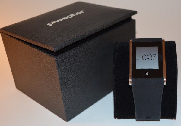
Like the Phosphor Appear watch I reviewed a couple of years ago, the Touch Time comes in a sturdy black box. The watch is displayed on a velvet cushion (see lead photo), and the box also contained a small user’s guide and warranty information sheet.
The watch has a stainless steel case, and it’s available with orange, black, white, blue, or pink silicone bands. These are considered the unisex versions. There are also two models with metal bracelets that are designated men’s models. As you can see, I received the silicone model with a black band. When I was editing these images, I started out trying to Photoshop out all the dust and lint. I eventually stopped removing it, so you’ll see in some images that the black strap tends to attract lint, hairs, and dust.
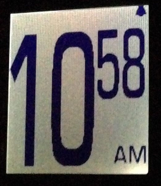
Phosphor says the Touch Time has a “low power, high resolution (144 x 168) LCD display that is ‘always on'”, and they say the watch has a “bright, white” backlight. The face appears somewhat brighter in these photos that it appears to my eye in normal use. I think the backing must be a bit reflective. It actually looks a bit like an eInk screen looks, with a darker background and lower contrast. I had to take a picture of the backlight with my iPhone, because I couldn’t get the Nikon to work quickly enough to take a shot before the backlight went off – while I held the watch in one hand and held and operated the camera in my other hand.
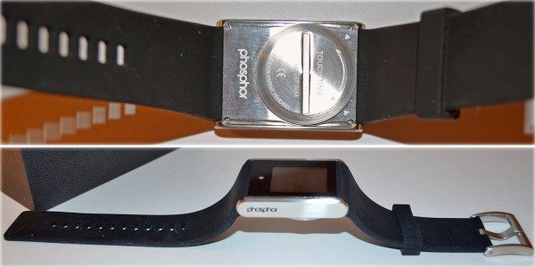
The stainless case is about 1.75″ long X 1.2″ wide X 0.35″ thick (including the battery compartment cover). You can see that the watch and strap won’t lay flat, so it was hard to measure the length. It’s about 9.5″ from end to end. The watch weighed 3.1 ounces on my digital kitchen scale. That doesn’t sound like much, but the watch feels very heavy on my wrist. My husband, Butch, tried it and found it to be more comfortable than I did.
The upper image shows the battery compartment on the back of the watch. Phosphor says you’ll get up to a year with a single CR2450 coin battery. You may not be able to read it through the glare, but the back also states the watch is water resistant to 30m (3ATM).
The Phosphor name is etched into one side of the stainless case. There’s no other branding on the front of the watch.
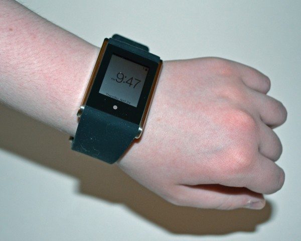
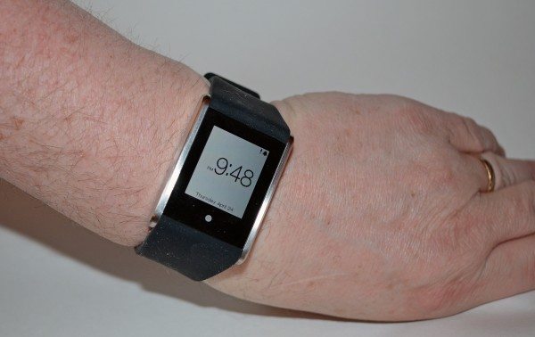
Here’s the watch on my daughter’s arm and my husband’s arm, for size comparison.
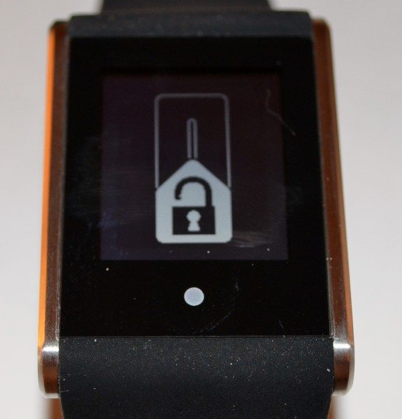
Phosphor calls the silver dot at the bottom of the face the soft key. It’s completely flat, with no tactile feedback. Tap it twice to turn on the backlight. Tap and hold to unlock the screen so you can enter setup or select other functions. The lock slider requires you to run your finger up the screen to unlock it. The Touch Time has a capacitive touch screen, but it is not as responsive as the screens I’ve become accustomed to on phones and tablets. You have to slide your finger slowly and deliberately, or your touch won’t register. Sometimes it takes a couple of tries, no matter how carefully you swipe.
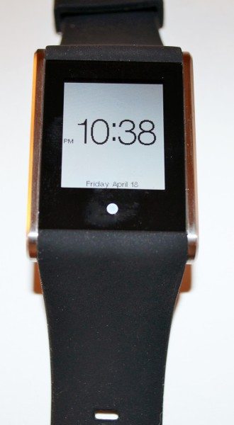
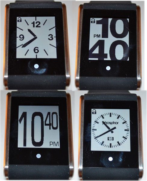
Once the screen is unlocked, you can select a watch face by swiping your finger up or down the length of the touch screen. A couple of the faces show the date; see the lead photo and the bottom, right image just above. The face in the lead image also shows the day of the week.
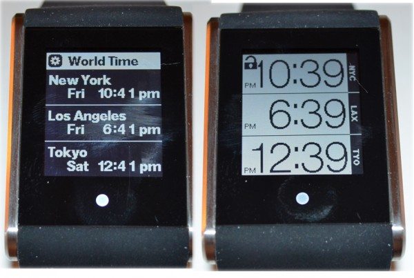
The sixth face is the world time face, seen on the right in this image. The left image is the setup screen for selecting the three time zones you want displayed on the world time face. Unfortunately, the world time watch face doesn’t show the date or day of the week.
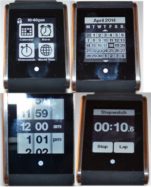
If you swipe left or right on the touch screen, you can select another of the watch functions. Here you see the calendar function. It’s not interactive at all. You can’t add appointments or even click on a day to see appointments. The current day is highlighted, and you can swipe up or down to see past and future months.
The bottom left image shows the dial for setting an alarm. This dial is like the one used to set the time, and this is the feature I like best. It’s much easier to set a time by scrolling the dial than by a complicated series of button presses like many digital watches use. You can set up to six alarms. The alarm chime is very quiet. It’s discrete enough to not disrupt a meeting, but it’s so quiet it wouldn’t wake me from sleep, even if I was lying with my ear on the watch, and you may not hear it in a noisy environment. Also, the chime used to alert you to alarms and reminders is a tone only; it does not vibrate at all. You can snooze an alarm, and if no action is taken, the alarm will repeat every 10 minutes for an hour.
The stopwatch can be used as a lap timer with up to 100 saved lap times, which you can review later, or as a countdown timer. If your laps are longer than a minute, the watch screen will lock, and you’ll have to use the soft key to unlock the screen before you can mark your next lap.
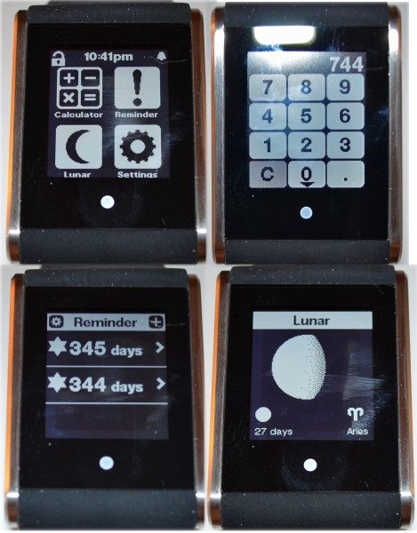
There’s also a simple four-function calculator. You can see the number keys and display field are on a separate screen, and you’ll have to slowly swipe up to see the operator keys. Once you select the operator key, the focus jumps back to the number keys. Because it’s sometimes difficult to get the touch screen to respond to your swipes, you may find that you press keys unexpectedly instead of changing screens.
The reminders function lets you set up to six reminders. I used the same icon in my two examples, but there are a variety of icons to choose from to indicate what happens on that day – a wrapped gift, a Christmas tree, martini glass, airplane, and a few other – but you cannot enter a title for the event. You use dials to select the month and the date. You cannot choose a year for your event.
The lunar function shows a representation of the current phase of the moon, the number of days until the next full moon, and tells you what the current zodiac sign is.
Just FYI, when you are in these screens, you may have to swipe from left-to-right to return to a previous screen.
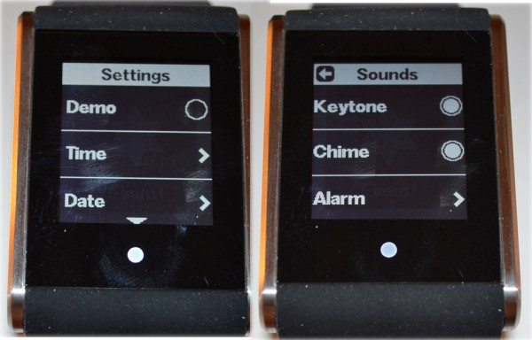
The final app is settings. There’s a demo mode that continually scrolls the watch through all the watch faces and “apps”. To conserve the battery, demo mode functions only between 9:00am and 9:00pm. It seems this would work better as a sales tool, but the watch can be unlocked and used even in demo mode. You should turn it off for normal operation.
You use dials to set the time (hours, minutes, am/pm) and date (date, month, year). It’s much easier to set these functions using dials than using the buttons on any other watch I’ve ever owned. You can also select a time zone and turn daylight savings time on/off.
In the sounds option: The Keytone, when on, sounds a tone each time you interact with the unlocked touch screen. Chime sounds a tone on the hour. You can set up to six alarms.
The appearance option lets you reverse the screen display color. I have selected the light background with dark letters; the other choice is light letters on a dark background.
The last setup option is language. Select from English, German, French, Spanish, Swedish, Italian, or Norwegian.
I find that the Touch Time watch is stylish enough, especially in some of the colored silicone band versions. It looks similar to many smart watches on the market and like many normal digital watches, minus the function buttons, of course. It feels a bit chunky and heavy to me, but that seems to be the style currently. Although Phosphor calls it a smart-er watch, I’m afraid it’s not smart enough now. Other than the touch screen, it doesn’t really offer much more than typical digital watches do these days. For only $50-100 more, you can get a Martian Watches G2G that offers much more than this watch does – text and email notification, caller ID, camera controller, and even a Bluetooth speaker/microphone. And I’m sure there are other smart watches that I haven’t gotten to try that offer more functionality for about the same price as the Touch Time. Maybe if Phosphor could have gotten the Touch Time to market shortly after the Kickstarter funding was met, it wouldn’t seem like too little, too late.
L39 Ultra Slim UV Protective Filter for Leica Q3 43 Q2 Camera with Moisture-Proof Case & Removal Tool 19 Layers Mulit-Coated UV Ultraviolet Filter 99.3% Light Transmission Water Oil Scratch Resistant
(as of March 15, 2026 23:31 GMT -05:00 - More infoProduct prices and availability are accurate as of the date/time indicated and are subject to change. Any price and availability information displayed on [relevant Amazon Site(s), as applicable] at the time of purchase will apply to the purchase of this product.)Ruilogod 32" 2-in-1 Light Mulit Collapsible Disc Reflector 80cm Silver Gold
(as of March 15, 2026 13:58 GMT -05:00 - More infoProduct prices and availability are accurate as of the date/time indicated and are subject to change. Any price and availability information displayed on [relevant Amazon Site(s), as applicable] at the time of purchase will apply to the purchase of this product.)Product Information
| Price: | $159 - 209, depending on band and case color |
| Manufacturer: | Phosphor |
| Retailer: | Phosphor |
| Requirements: |
|
| Pros: |
|
| Cons: |
|


Gadgeteer Comment Policy - Please read before commenting
As a backer of the Touch Time, it goes without saying that the communication during the project was spotting at best.
Then after shipments started it became apparent that the product was changed, two watch faces were eliminated, and the backers were never advised of such during the project.
There were technical difficulties with the RAM on the MCU that caused the development team to drop the faces…….and I was and am not happy.
The watch faces were dropped to include a count down timer, which was not part of the original project plan. This was added at the request of a few.
I ordered two watches and so far still waiting for one.
I ordered a Kick Starter Green variant which was supposed to be serialized engraved as it was a limited edition. It was not.
I also ordered a Gold variant which is supposed to be serialized as well and I expect it won’t.
The watch is fine – but as a project leader and finished product – lacking in what was promised for the product and lacking in communication as the project progressed painfully slowly and 14 months overdue.
It sounds like for about $10 less you could get a Pebble with more functionality. (Reminders, alerts, etc.)
Fished my touch time out of the basement today. So sad. I sent back the original one I got for another because of super fast battery drain issues. The second watch was no better. And that’s why it wound up in the drawer in the basement. Now I got it upstairs on its way to the trash bin. So sad because I did kind of like it, but not the two day battery life.