 I recently reviewed the iPhone app from Vook, the ebook format that combines multi-media content with text. I bought two Vook apps and tried them out on my iPod Touch. I did not like these Vooks. I found them buggy and lacking features that I think are very important – like remembering your place when you close the app. I also found that most formatting was constant between the two Vooks I bought, but something basic like turning pages was different in the two titles. Matthew at Vook commented on my iPhone Vook app review, and said they would be incorporating my remarks into improving their product. He also said he would give me, and any Gadgeteer readers who buy a Vook and send him a copy of our iTunes receipts, access to the web-browser version of our titles until Monday, November 23rd so we can compare the formats. I took Matthew up on his offer. He quickly sent me access information to all four of their Simon and Schuster titles, two novels and two non-fiction titles. He also gave me access to a self-help book called “Crush It” that he thought was a good use of the Vook format.
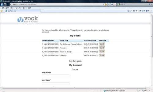
I’ve spent many hours exploring the web-based app and the titles for which I have access, but I haven’t yet read any title in its entirety in this browser version. I’ll concentrate more on the Vook functionality in this review. First, I’ll discuss the access methods and the common formatting. To access your Vook titles, you go to the Vook web site and log in to your account (found on upper right of the screen). Once logged in, you see a list of your purchased Vook titles. I like this “librarian”-style approach. I can quickly see all my titles and easily open the title I want by clicking the launch button. The “My Account” option stays on the screen while you are accessing a title, so you can easily return to the librarian screen to switch to a different title. I like this much better than the iPhone format using individual apps.
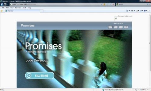
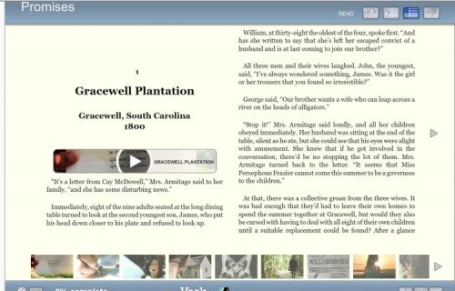
Formatting is uniform in all the titles. You have the same screen viewing options, videos work the same way, and page turning works the same. Again, I like this much better than the iPhone apps. The Vook title still opens up on a splash page that works as the book cover. When you move on from the splash page, you always go to the beginning of the Vook – this version doesn’t remember your place, either. Because we are not limited to the size of the iPhone screen in this version, the content area is bigger, and it is capable of displaying two pages of text at a time. There are three viewing formats that you access using buttons at the top of the content area.

In all these viewing screens, use the left/right arrows at the sides of the reading area to turn pages. Also, at the bottom of all the viewing screens is a chapter index – a horizontal scroll bar with thumbnails. Clicking these thumbnails moves you to the chapter associated with the image. If the chapter has an embedded video, the thumbnail is the static image for that video. If there is no video in that chapter, the image will just be a picture. This confused me at first. I didn’t realize that the pictures didn’t always represent a video. I first thought I was having problems accessing the videos in some chapters, but I finally realized that was not the case. If the chapter does have a video, an embedded control will show where the video fits in to the text.
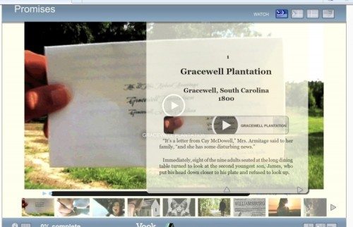
The first viewing option is “Watch”. In this mode, a video-viewing pane occupies most of the content area. A translucent single page of text is dropped down over the video. Use the up-arrow at the bottom of the text page to move it so you can watch the video. You can then drop the text page back down and read, if you like. If the chapter contains a video, the video pane will update to display it.
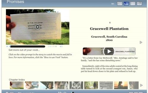
The second viewing method is “Mix”. The content area is divided into a dedicated video page and a text page. The left side of the screen has a video-viewing pane that appears similar in size to my iPod Touch screen. Tips or notes from the Vook are displayed under the video. The right side of the content area is text.
The third viewing method is “Read”. The content area is set up as a two-page, book-like view. When you click on an embedded video control, you automatically switch to the “Watch” viewing screen with the large-size video. After you’ve watched the video, you have to click on the “Read” button to return to the two-page format.
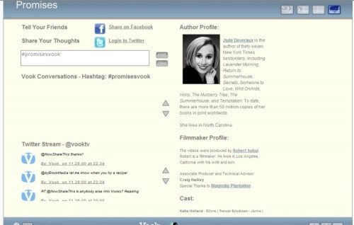
The fourth button opens the “Connect” screen. Just like in the iPhone app, you see Twitter information, Facebook info, and links to the author or publisher web sites. You also see an author bio and credits for the videos.
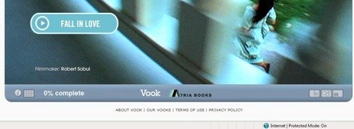
More control buttons are located at the bottom of the content area. At the bottom left, the circular “i” button displays book information, such as publisher, copyright, and similar data. There is also a button that pops up a table of contents. There are some important functions in the web-based version that I didn’t find in the iPhone app. There is still no page numbering, but the lower left side displays %-completed information. This percentage only updates at the beginning of the chapter. You could make a note of this information when you close the Vook title to at least guide you back to the chapter where you left off.
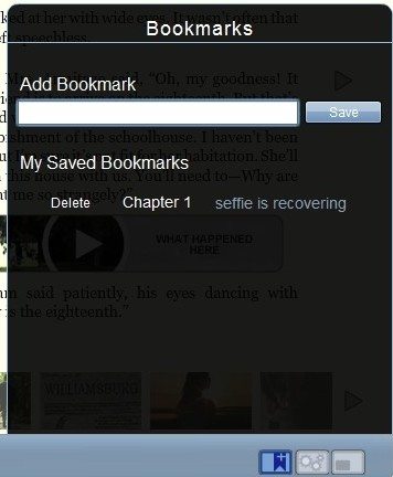
The bottom right of the screen has three buttons. One button toggles to full-screen format. Another button is the “Setup” button, which displays a slider to change font size and radio buttons that let you choose a serif font or sans-serif font. The last button is the most exciting; it’s a book mark button! This multi-purpose function allows you to make a new bookmark and name it with a short text description, see a list of your bookmarks and select one to move to that portion of the book, or delete a bookmark. I decided I’d use the first few words of the paragraph where I want to resume reading as the bookmark title. Unfortunately, the bookmarks were the biggest source of frustration I had with the web-based Vooks.
Since I had read “Promises” in its entirety with the iPhone app, I started with it. Chapters flowed beautifully with just a page turn. I could also use the chapter index scroll bar to jump effortlessly between chapters. The application never once crashed, and I had put it through its paces by the time I finished my hours of digging around. I tried making a bookmark, and my problems began. I made a bookmark, saved it, then I exited the Vook and logged out of my account. I logged back in and was happy to see the bookmark was still there, and it took me directly to the page where I had left off reading. I tried deleting that bookmark and creating another. I was never able to save another bookmark in my “Promises” Vook. It seemed to work. I’d create a bookmark and save it. I’d open up the bookmark function, and it would still be there – until I closed the book and then opened it back up again. There would be no bookmarks when I reopened the book. That defeats the purpose of having bookmarks. In “Promises”, I had trouble even keeping the bookmark function open at times. Sometimes I’d be typing in the name for the bookmark when the window would just close. Sometimes I’d click the bookmark button and the window would just flash open and closed immediately. These problems are repeatable, and they occurred on more than one day of using the Vook.
I had a bit more luck saving bookmarks in the other Vooks. I tried making bookmarks in all the Simon and Schuster books, and I could make the first bookmark with no problem. The bookmarks would still be there when I came back, and they worked to take me back to the correct place. The problems I had in the other books involved making the second bookmark. I moved to a new place, entered the title and saved the bookmark. I immediately popped up the bookmark window again, and both my bookmarks were there. Once I left that Vook then returned to it, only the first bookmark remained. I found that creating two identical copies of the second bookmark (for a total of three in that Vook) would result in all three remaining in the Vook if I closed it then re-opened it. If I then deleted one of the duplicate bookmarks, I’d find that I had only the first bookmark when I closed/re-opened that Vook. This is also repeatable.
As for the content, I still found the videos in “Promises” to be very irritating because I did not like the style the filmmaker chose. The videos played well; I just thought they were a distraction from the book. I thought they added nothing but extra cost to the Vook. I watched the videos in the second fiction Vook I was given access to. Again, I thought the videos in “Embassy” by Richard Doetsch did nothing to enhance the book. They were filmed in a style that I found much easier to watch, but they still didn’t advance the story – they were just atmosphere.
My problem with these videos in fiction books is simple, and it’s the same reason I always like the book more than I like the movie based on the book. I prefer the pictures in my head. When I read, I have my ideas of who the characters are and what the action is like. The monsters in my head never have zippers on their backs. I think the videos in the fiction Vooks simply added to the cost without adding to my experience. In the case of “Promises”, I felt more of the cost of the Vook went into the videos and less into getting Jude Deveraux to actually create a plot and do character development. The only multimedia content I might find acceptable in fiction would be in the form of mp3 files. To borrow from the news of the moment, in the “Twilight” series of books, we learn that Edward writes a song for Bella. I would think that hiring someone to write a little song, record it, and add it to the book would cost a lot less than filming a one-minute video. I think it would add to, and not detract from, the reading experience.
As for the non-fiction titles, I thought the videos in “Return to Beauty” by Narine Nikogosian were pointless. The book’s purpose was to teach us to make and use natural skin-care concoctions. The videos simply showed a pretty woman – I assume it was Narine – telling us things like winter weather will dry out your skin and showing us pictures of fruits and vegetables. There was nothing here that couldn’t be conveyed in a nice color picture.
The last non-fiction Vook I looked at is a different story. “The 90-Second Fitness Solution” by Pete Cerqua is why Vooks were created. This exercise and nutrition book had fabulous, short videos that demonstrated the exercises in a clear, quick way. If a picture is worth a thousand words, videos in this type of book are priceless. Sometimes, even a series of pictures fail to demonstrate how to do an exercise correctly. These videos worked perfectly for that. He also had a few videos about selecting nutritious foods and proper nutritional supplements that I thought worked well. I feel you need both text and short videos to convey this type of information. Just a DVD would leave you needing to take notes, like attending a lecture. If you wanted to review something, you’d have to hunt for it on the DVD instead of just flipping a few pages. I loved this Vook, and this is one I’d happily purchase in the web-based version.
Lastly, I looked at “Crush It!” by Gary Vaynerchuk. This is one of those motivational, change-your-life books. I am not the audience for this book. I found the loud, machine-gun-style of talking and the quickly changing scenes to be more irritating than motivating. I’m sure there are many people out there who would love the little pep-talks, so I’ll just leave it at that.
I realize my opinions of the value and desirability of the videos in these Vooks are simply that – MY opinions. Other people will disagree, and their opinions are just as valid as mine. I do see the need for these multi-media Vooks, but I personally think it lies more in the non-fiction field. I truly think Pete Cerqua’s book is perfect for the Vook format.
I greatly prefer the web-browser version of these Vooks. Operation is more consistent and less buggy than the iPhone Vook apps I tried. There are important functions present in the web-based version that are lacking in the iPhone apps – like bookmarks. But the bookmarks do have problems that need to be fixed. (All the Vooks I saw had problems with bookmarks, but strangely those problems were slightly different from title to title. This makes me wonder if a lot of the reader functions are incorporated into each Vook. It would be easier to fix bugs and provide software updates if all functionality were in a Vook-reader program and the titles themselves only contained the text and videos – but hey, I could be completely wrong about what they are doing here.) I still would like it to remember my place without me having to create a bookmark or write myself a note about what percentage I had completed when I closed the Vook. I like the librarian feel of the web-based Vooks, but I don’t like that I won’t have a copy of the Vooks I purchase on my computer. A big draw of ebooks for me is that I can take them with me and read wherever I am, even if I don’t have internet access. I could read these Vooks on a laptop or netbook wherever I am if I had copies of them on my computer.
And I realize the people at Vook didn’t ask me, but I think something like the Android-based Alex by Spring Design would be the perfect platform for Vooks. You could read on the eInk screen, and watch the videos on the LCD screen, which is a nice size and shape for videos. Wouldn’t that be great?
I’m glad I got a chance to try out the web-browser version of Vooks. I like this approach better than the iPhone apps, but I think either could work well with non-fiction titles. I’d love a home-repair manual in this format.
Amazon Kindle Paperwhite 16GB (newest model) – 20% faster, with new 7" glare-free display and weeks of battery life – Black
(as of March 27, 2026 00:53 GMT -05:00 - More infoProduct prices and availability are accurate as of the date/time indicated and are subject to change. Any price and availability information displayed on [relevant Amazon Site(s), as applicable] at the time of purchase will apply to the purchase of this product.)Amazon Kindle 16 GB (newest model) - Lightest and most compact Kindle, now with faster page turns, and higher contrast ratio, for an enhanced reading experience - Matcha
(as of March 27, 2026 00:53 GMT -05:00 - More infoProduct prices and availability are accurate as of the date/time indicated and are subject to change. Any price and availability information displayed on [relevant Amazon Site(s), as applicable] at the time of purchase will apply to the purchase of this product.)Product Information
| Price: | Varies. Titles usually are about $5 to $7 for the web-vased version |
| Manufacturer: | Vook |
| Pros: |
|
| Cons: |
|

Gadgeteer Comment Policy - Please read before commenting
Janet,
Thank you so much for taking a second, considered look at Vook and focusing on our browser based product. I really appreciate your feedback and I’m glad you found this version much more appealing.
I would like to let all your readers know that we are offering our Breakaway Japanese Kitchen Vook for only .99 cents for a limited time, so that we can make sure everyone gets a chance to try the new Vook format. They can try it here for themselves and see what they think of Vook:
http://vook.com/product.php?book_id=6
Again, your feedback has been really valuable to us. We have noted all of it and discussed it at length.
Keep checking in on us and we’ll stay in touch and share our new titles with you.
Best,
Matt Cavnar
Sr. Director of Content
Vook