Product Requirements:
Desktop:
486 MHz PC or higher (Windows 98, Windows ME or Windows 2000)
Apple Macintosh compatible computer with PowerPC processor (Mac OS 8.1 or later)
CD-rom
Handspring’s much anticipated color device is now
available. The aptly named Visor Prism has a 16bit LCD screen capable of displaying over
65,000 colors and the fastest processor yet for a Palm OS device. Is the Visor Prism better than a Palm IIIc? Let’s see…
Hardware Specs:
Operating System: Palm OS version 3.5.2H
Processor: 33 MHz Motorola Dragonball VZ
Memory: 8 MB
Display: 160×160 pixel, 16bit Active Matrix TFT 65,536 Color display
Size: 4.8″ x 3.0″ x 0.8″ (12 cm x 7.5 x 2.1 cm)
Weight: 6.9 oz (194 g)
IrDA port
Built-in Microphone (Enabled by Springboard modules)
Springboard Expansion Slot
Battery: Internal Lithium Ion Rechargeable (Life is 2 weeks or 6 continuous hours)
AC Adapter: Input: 100 – 240V ~ 50/60Hz 350mA Output: 5.9V 2000mA
At first glance the Prism might be mistaken for the original Visor model. The body has the
same basic style and shape. But of course, there are some major differences so let’s check
this new unit out.
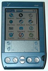
The front of the Prism looks pretty much identical to the original Visor except for three
things. The most noticeable is the power button which is now on the right side of the unit.
This new location is hard to get used to after having used other Palm devices all these
years. I’m constantly trying to press the left side without thinking. I’m very puzzled
that they did this. The Prism looks like a mirror image of the Visor Deluxe. I don’t see
why they couldn’t have put the power button on the left like it has always been.
A new addition is a very small LED directly across from the microphone hole. This green
LED blinks when charging in the cradle and glows steady when the battery is fully charged.
Too bad they didn’t include an option to allow the LED to blink when an alarm goes off in
addition to or instead of the speaker. I think that would have been a nice touch…
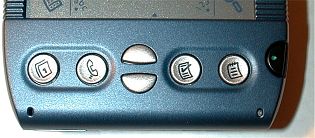
The other difference is with the silk screen area. The background color is now kind of
silvery instead of green. Also, the printing is now a blue color to match the case. The
background color is fine, but I wish the printing was black instead of blue. It just seems
harder to see… This is more of a personal preference though due to the fact that it
takes about 10 secs to memorize what and where each of the silkscreen icons are.
As with the previous Visor models, the buttons have very good tactile feedback and click
when you press them. The buttons are a little different than the Visor Deluxe though. The
application button tops are all concave instead of just the middle of the buttons like on
the Deluxe. The application buttons are the same size as previous models while the up and
down scroll buttons are just the slightest bit bigger.
The IR port is still located on the left side of the PDA. I really prefer IR
ports to be located at the top of a PDA, but this is just personal preference. I
was able to beam an address from a Palm IIIc to the Prism a maximum of 6.5 feet.
The stylus silo is still on the
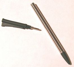
right side of the PDA. One nice touch is that the stock stylus is better than most. It has a polished
metal body and two screw off ends. The stylus tip end screws off to reveal a reset pin
while the top of the stylus unscrews to reveal a tiny Philips screw driver.
The Springboard slot is still in the same location as previous
models. All the current Springboard modules should fit and work just fine in the
Prism.
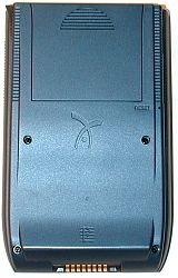
The back of the PDA is the only part of the case that has been significantly restyled.
The back is thicker and curved at the bottom. Due to this change, the Prism will not fit
in cases made specifically for the Visor Deluxe because the new unit is just too fat. In
addition, the snap on cover does not fit on the back of the unit.
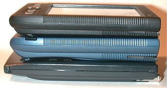
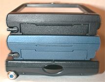
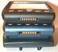
Top to bottom: Visor Deluxe, Visor Prism, Palm IIIc
Even though the case is thicker, it still feels comfortable to hold and use. Holding
both a Visor Deluxe and the Prism, I didn’t find the Prism’s larger size to be that
noticeable in my hand. The sides are rounded so it doesn’t feel like a brick. It is a bit
heavier than previous models but the added weight is negligible. If you wear your PDA on
your belt, I don’t think you would be able to tell much of a difference between the Prism and the Deluxe as
far as size and weight. But, if you carry it in a shirt pocket, you will probably notice a
difference. Over all the Prism feels solid and well made. It doesn’t creak or crack when
you squeeze the case.
Size:
| Length | Width | Thickness | Weight | |
| Visor Prism | 4.8″ | 3.0″ | 0.8″ | 6.9 oz. |
| 12cm | 7.5cm | 2.1cm | 194g | |
| Palm IIIc | 5.06″ | 3.17″ | 0.67″ | 6.8 oz. |
| 12.9cm | 8.1cm | 1.7cm | 193g | |
| Visor Deluxe | 4.8″ | 3.0″ | 0.7″ | 5.4 oz. |
| 12cm | 7.5cm | 1.8cm | 153g |
Something that most people might not know is that the color display that the
Prism uses is the exact same display that the Palm IIIc uses. However, the Palm IIIc uses
a different controller so that it only displays a maximum of 256 colors while the Prism
can display a maximum of 65,536 colors.
Screen dimensions:
| Length | Width | |
| Visor Deluxe | 3.19″ | 2.40″ |
| 8.1cm | 6.1cm | |
| Visor Prism | 3.18″ | 2.38″ |
| 8.1cm | 6.0cm | |
| Palm IIIc | 3.15″ | 2.33″ |
| 8.0cm | 5.9cm |
Just out of the box, you really don’t notice that the Prism has a 16 bit display. If
you look at a Palm IIIc and a Prism side by side, the displays look pretty much the same
in all the built in applications. The have the same brightness and contrast. If you didn’t know that you had a 16bit display capable of showing over 65,000 colors, you wouldn’t know it… There have been no changes to the OS to take advantage of color. Even the built-in Datebook+ app which is a version of
the popular Datebk application is black and white.
The current shareware version of Datebk has been colorized for months now. The only app built into ROM that uses color is the lite version of City Time. But even it doesn’t look as good (in my opinion) as the full version that is available for download.
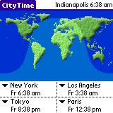
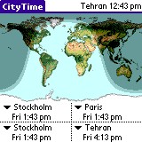
Left to right: Prism’s City Time, Full version of City Time
Below are some pictures that I took of the screen indoors without using flash. As you can tell, even with the extra colors,
the Prism screen still shows somewhat pixilated images. No matter how many
colors you have to pick from, you only have 160 x 160 pixels to display at once.
What the Prism and Palm IIIc need is a larger screen. I’ll be happy when the day
comes that they do away with the dedicated silkscreen area and use an on demand
input area like the Pocket PC.

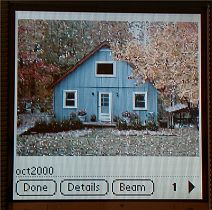
The additional colors that the Prism can display is a nice feature, but it
doesn’t make the PDA a must buy Palm device in my opinion. For one thing, when
you take the Prism home and open the box, you don’t get any really cool color apps
(except City Time, and Calc…..woo woo). But, you can download two apps
from the Handspring website. One is a photo album which is used above to display
my dog (Kasey) and my house. I can’t tell a huge difference between the photos
in this program and the same photos using the Club Photo software on a Palm
IIIc.
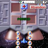
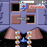
The other program is a shooting game called Zap 2016. Below are two
pictures of two versions of the Zap shooter. The left picture is a screen shot
from the Prism and the right picture is a screen shot from the Palm IIIc.
Although these are screen captures and not actually photos of the screen, they
are pretty much true to what the screen looks like while playing this game on
both devices. I think these pictures give you a really good idea of the
difference that the extra colors on the Prism make. Yes, the Prism looks
smoother and more 3D-ish. But, right now these two programs are the only ones
that you can get for the Prism that show off all the colors. Personally, I don’t
find the differences to be that fantastic.
Now
for the bad news… My Prism has the most horrible digitizer problem that I have
ever seen. It recognizes 1 out of 10 graffiti characters. I’m very good at
graffiti, so it isn’t by any fault of my own 🙂 I know it’s a digitizer problem
because I’ve read that quite a few other Prism owners are also dealing with it
and it appears to be a somewhat common defect. It is VERY annoying. I had a
similar problem with a Palm IIIc. I ended up getting a refurb from Palm that
fixed the problem. I’m going to do the same with this Prism.
**
This problem has been fixed with a software patch that is available on the
Handspring website. I downloaded the patch and it fixed my digitizer problem.
The speaker on
the Prism appears to be the loudest speaker yet for a Palm OS device. It is definitely
louder than both the Palm IIIc and m100.
The Prism uses the same type of serial port as the older models, but it will not fit in
the older cradle because of the thicker case and plastic fin at the bottom. I’m not sure
why they did this. It looks like that the fin is unnecessary to me…
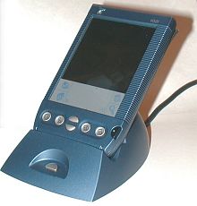
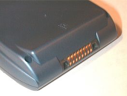
The new cradle is pretty similar to the previous one. But, I like the newer cradle
much better because they did away with that annoying little hook in the back.
Now, the PDA
just rests in the cradle and can easily be lifted out without having to hold on to the
base. It’s crazy, but little things like that make me happy 🙂 Because the Prism is
thicker and has the ‘fin’, it will not fit in the older cradles. But, older Visors will
fit in the new Prism cradle.
I noticed one small feature that has been removed from the Prism. You can no
longer set the PDA to always be turned on while in the cradle. Some people like
to leave their PDA on and use it as a clock while it is in the cradle. You can
just set the auto-off to 30 sec, 1, 2 or 3 minutes max.
The power cable for recharging the battery plugs into the USB plug. Unfortunately, the
PDA doesn’t have a port to plug the AC adapter into directly. So, if you travel a lot,
you’ll have to bring both the cradle and AC adapter with you.
Battery-wise, I had no problem with the rechargeable battery in the Prism.
When I first got the Prism, I fully charged it up the first time which only took
2hrs and then did not charge it again until a whole week (7 days) later. It was
down to about 25% full, but it did not give me any warnings. During the 7 day
period, I was beaming back and forth, installing programs etc.
What about overall system speed? Well, this is where the Prism shines. The Prism
processor is a 33 MHz Motorola Dragonball VZ. In comparison, the Palm IIIc uses
a 20MHz Motorola Dragonball EZ processor.
Benchmarks using Neil Bridge’s Benchmarking
program:
Visor Prism 204%
Palm IIIc 127%
Visor Deluxe 145%
Palm Vx 112%
For day to day tasks, I don’t think you can really tell that the Prism is
faster than the Palm IIIc. I did a few tests just to get a feel for the
differences. The Prism is a little faster at painting the list of apps in the
application viewer / launcher. This isn’t a significant speed increase though…
My next test was to use AportisDoc to search thru a 173k DOC file for the word
“joe” which didn’t occur anywhere in the file. I did this on both the
Prism and Palm IIIc. The Prism completed the test in ~8 seconds while the Palm
IIIc completed in ~11 seconds. In another test, I used jFile to sort on three
fields of a 56k database of 669 records. The Prism finished the sort in ~4
seconds while the Palm IIIc finished in ~4.1 seconds. So as you can see, there
isn’t THAT much of a difference in speed with the Prism.
As far as the software goes, you don’t get much in the way of bundled goodies.
All you do get is a few ROM built-ins.
City Time
This is a clock program that allows you to view the time in several cities around the world. The main screen shows a map of the world.

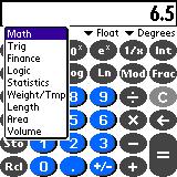
Calc
Calculator with basic and advanced functions including unit conversions.
Date Book +
Very similar to the regular Date Book app but with extra features such as a week
view, year view, and appt. list view.
So, you’re wanting a color Palm OS device and don’t know if you should buy
the Palm IIIc or the Prism. I think the Prism is a nice color unit, don’t get me
wrong. But, at its current price, I think that the Palm IIIc is really the
better deal. However, with that said, I would also say that the Prism is better
than the Palm IIIc for 2 reasons. If you currently have a Visor with several
Springboard modules that you want to continue to use, buy the Prism. Also, if
you want to use your PDA with the Stowaway Folding Keyboard and a Springboard
modem at the same time, the Prism is the one to buy.
Either way, both the Palm IIIc and Prism are great color PDAs. Just spend
wisely.
Price: $449
Pros:
65,000+ colors
Fast processor
Loud speaker
Springboard slot
Cons:
Thicker and heavier than previous models and Palm IIIc
Digitizer problems ** Fixed with software patch
available at Handspring.com
Expensive
2-Pack LED Video Light Kit, NiceVeedi Studio Light, 2800-6500K Dimmable Photography Lighting Kit with Tripod Stand&Phone Holder, 73" Stream Light for Video Recording, Game Streaming, YouTube
(as of March 25, 2026 10:59 GMT -05:00 - More infoProduct prices and availability are accurate as of the date/time indicated and are subject to change. Any price and availability information displayed on [relevant Amazon Site(s), as applicable] at the time of purchase will apply to the purchase of this product.)NEEWER Basics 2 Pack LED Video Light Panel Lighting Kit, Bi Color Dimmable Portable Studio Lights with Stands & Filters, 3200K-5600K 750lux CRI95 for Video Recording Live Streaming Photography, BP66
(as of March 25, 2026 10:59 GMT -05:00 - More infoProduct prices and availability are accurate as of the date/time indicated and are subject to change. Any price and availability information displayed on [relevant Amazon Site(s), as applicable] at the time of purchase will apply to the purchase of this product.)Product Information
| Price: | $449.00 |
| Manufacturer: | Handspring |
| Pros: |
|
| Cons: |
|


Gadgeteer Comment Policy - Please read before commenting
Post your comments here on the Covertec Case for the Palm Tungsten | T.
http://www.the-gadgeteer.com/tt-covertec-review.html
Just click the POST REPLY button on this page.
I had ordered a Covertec for my T|T based on another review that I read, and was really glad to see this positive review. When I got it the other day, it was perfect. Slim, functional, AND able to hotsync in the case — everything I wanted.
Great case.
Cheers,
Leo
I recently purchased this beautiful case for my T/T and was surprised to find that my one real concern about its design has been addressed by Covertec since Judie’s review!
My concern, after studying the photos in the review, was that the cover would press against and activate the hard buttons on my T/T when closed. In fact, an otherwise glowing review of this case on another site said this was a real problem–and now Covertec has responded.
Look at the second photo down in Judie’s review–where you can see the entire case opened flat. What they’ve done is to insert an elevated, molded ridge in the space between the embossed Covertec name and the top edge of the cover. (In fact, I think they’ve moved the Covertec name down a bit in this latest production run, to allow a bit more space for the ridge.) When you close the cover, that ridge now rests on the flat metal area just below the hard buttons, elevating the cover just enough to prevent the buttons from being activated, even with a vigorous push. But the fit is so perfect, you would never even know the ridge is there. Bravo, Covertec!
If you’ve been searching for a truly luxurious, top-quality case that offers protection without compromising the sleek and gorgeous industrial design of your T/T, then look no further and buy a Covertec today! It’s truly brilliant, and a downright bargain, to boot!
I have an old Visor. It stopped working and I have important data that
I cannot access. What do I do.
Wes
i have a handsping visor but don’t no how to use it