ARTICLE – Last week we posted part 1 of a Gadgeteer team group article where we show our phone home screens and talk about the layout we’ve chosen. Now it’s time for part 2. Enjoy!
Bill Henderson
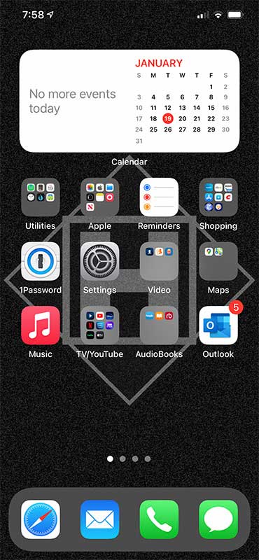
I try to organize my home screen so I know where everything is. The problem arises when anything moves or shifts because of an app displacing other apps or folders. Then my muscle memory gets all messed up and I have to move things back to their original positions on the screen. I’m OCD that way. I keep seldom-used apps a few swipes away so I don’t see them. I use a widget, but I still don’t completely understand how they work. As knowledgeable about Macs as I am (since 1989), iOS always confounds me.
Brooke Miller Hall
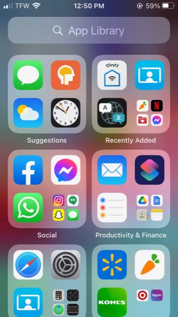
I don’t use a lot of apps, and a lot of those on my phone (Mario, Snap Chat) were put there by my kids. I have a secondhand iPhone 7. I don’t have everything arranged nicely, instead if I need an app, I go to my App Library.
Andy Chen
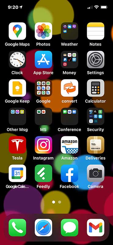
Different year and phone of course from before, but totally different way of life with a pandemic.
I never used FaceTime in the past, and sadly I still don’t. Zoom has overtaken many things, so I created a folder just for conferencing apps, including FaceTime and Microsoft Teams.
I also never thought I’d have an app for my CAR, but I got a Tesla Model 3 in September 2019, which now feels like an eternity ago.
Joe Porletto
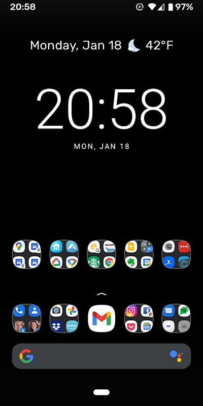
I’m all about minimalism and conserving battery power and my home screen conveys it. I’m using a Google Pixel 3, running Android 11 on the Google Fi network. I have nine folders that include my most-used apps, contacts, and driving destinations. By keeping everything on one screen I’m never swiping looking for apps. I rarely change the layout of the folders and each one has a specific theme (utilities, communication, shopping, social media, etc…). The black background saves on battery even if it is a little boring.
Guanshan Fix
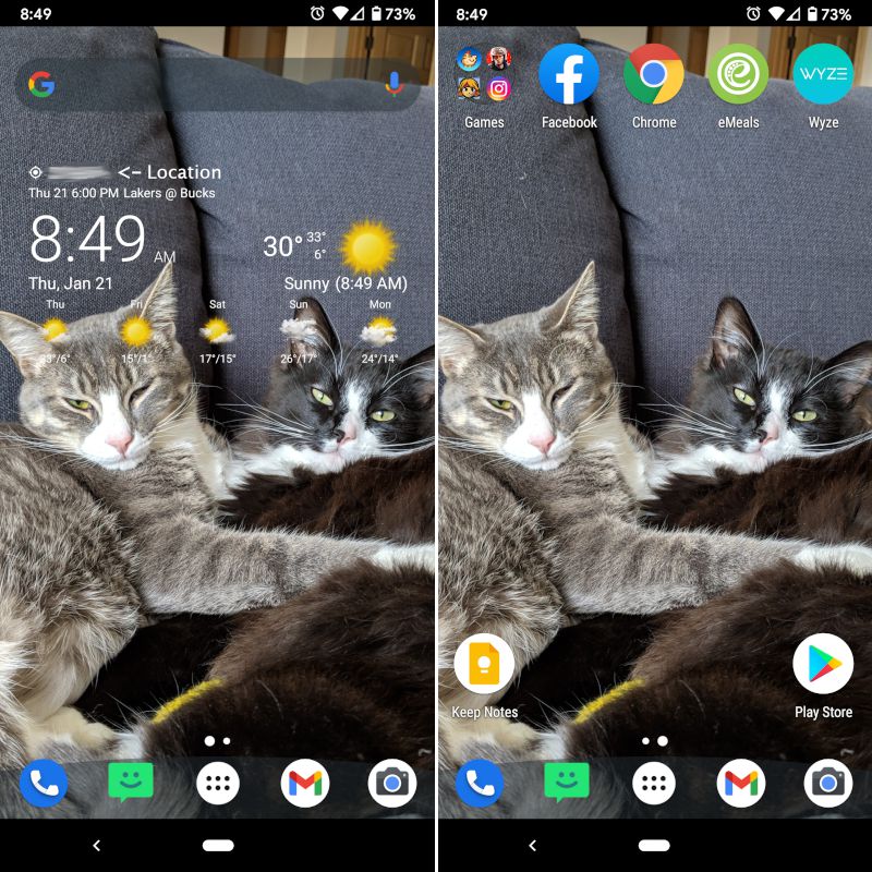
The home screens on my Google Pixel 4 are really simple. My main screen is just the free version of the Transparent Clock & Weather app. I like to have the time, daily forecast and my next event showing. My secondary screen has the other apps I use most frequently with a small folder for some games and entertainment. I prefer to keep my screens as clean as possible, so I can see my cute fur babies. I use the free version of Nova Launcher rather than the built-in Google Launcher. Other than that, my phone is pretty simple and unmodified. I don’t mind having to open the app tray to find an app as the rest of the apps I use pretty equally so to have them on a home screen would be very cluttered.
Bob Patterson
I’m an illustrator, so I always grab my latest drawing and capture it as my home screen. I’m constantly looking to improve on my work, so this motivates me to reconsider the artwork I do and how to make it better.
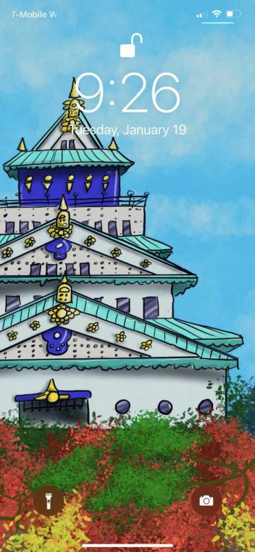
When it comes to organization, I usually have more apps that I am playing with than my sanity can handle. To balance order and chaos, I keep a set of folders on my home screen with my most used apps so that I can quickly find the important stuff.
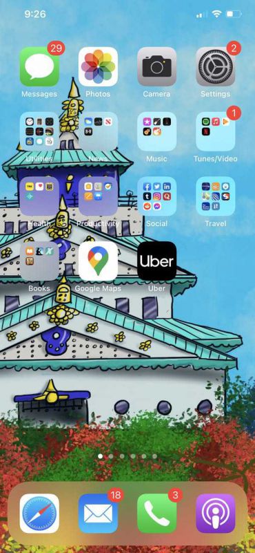
Once you get past the home page, you’ll find a sea of chaos. That’s where I keep all the apps for new gadgets I am testing, games I may be playing with, or apps that I am evaluating. Once an app gets to the point where I find myself going to it on a regular basis, it gets promoted to a folder on my home screen!
Kathleen Chapman
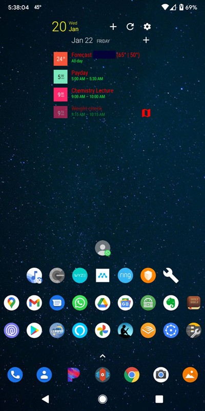 I’ve changed a few things on my Pixel 2 XL’s main home screen since the last Gadgeteer post on this topic, but one thing has remained the same – I continue to love the Android OS because it is so customizable.
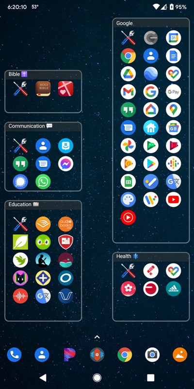
On my main home screen, I have placed all my most commonly used apps as shown in the screenshot above. The blue musical note icon is the “Now Playing” history. It runs in the background at all times and if it detects and recognizes a song that is playing, it displays the song title and the artist in this list. I have also created a couple of shortcuts. One shortcut (the wrench icon) launches my System UI Tuner settings to further customize my status bar – I can show or hide icons on the right side of the bar like the Bluetooth icon, WiFi icon, Mobile data icon, etc. The other shortcut (the WhatsApp icon located at the top of all the others) allows me to immediately text my husband. I also like to use Keepass (the green lock icon) to manage my passwords, Fing (the blue icon with white-dotted ring) to manage the devices on my home WiFi network, and X-plore to manage the files on my phone.
Nova Launcher is my preferred launcher because it provides me with innumerable ways to personalize my home screens. I use the paid version to set up my dock icons (I can change the number of icons located on the dock), resize the grid on each of my screens, resize icons and change the theme and shape of my icons among so many other things. Holy cow, this launcher does everything!
I use the Business Calendar Pro app as well. I like the widgets for this calendar because I can customize the calendar views (Month, Agenda, etc. – I’m using the Agenda view), the colors of the font of my events and locations, the transparency of the widget, etc. And if I enter the location of the event in the calendar, the widget allows me to tap on the map icon next to the location information within the widget to immediately launch Google Maps. This has come in handy so many times when I’m in a rush to go somewhere new or just want to check the traffic along the route.
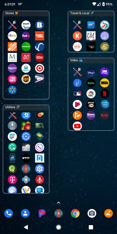
I also use the Folder Organizer Lite app and have done so for many years now. This app allows me to create resizable folder widgets using my own titles as shown in the screenshots above. I can see all the apps within each folder at a glance and immediately tap on an app to launch it (thus eliminating the need to tap on the folder to expand and view all apps in the folder and then tap on the app to launch it). It also allows you to choose a color theme for the folders or even create your own. The apps on my main home screen are placed directly on the screen and are not in a folder. All of my other apps are placed in folders as shown in the three other screens that I use.
I love my phone and I love personalizing it!
Dave Rees
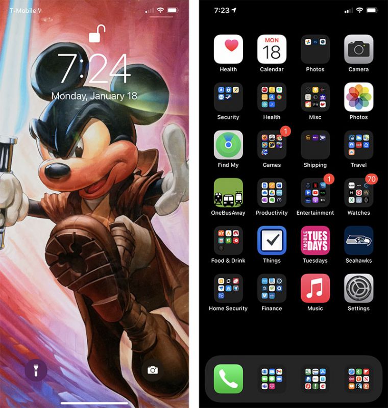
I continue to shoot for the most bland home screen award…perhaps even the most boring iPhone title. I changed my background to all black to match the infamous notch and with Apple introducing ‘dark mode’ I like it even more. I currently use a space gray iPhone 11 Pro Max in a flat black Pitaka barely-there minimalistic case. I prefer diving into folders to flipping thru screens so what you see here is all I use. Admittedly I should delete the apps I don’t use, get more organized, and clean up clutter a bit but overall this K.I.S.S. home screen design definitely works for me.
David Ferreira
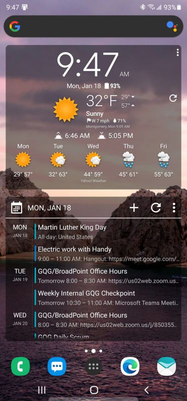
For me, it is all about information. I want a lot of it, I want it easily accessible, and I want it formatted the way I want to use it. I am currently sporting a Samsung Note 20 Ultra but I don’t use their launcher. I prefer Nova Launcher. At the moment I have 3 homes screens – you can see the first one above. I am running 2 widgets from Chronus – the time and forecast widget on top and the agenda widget below. The Google search bar is persistent, meaning it is on all screens in the same place. On my second screen I have a Talon widget (one of the best Twitter clients out there, if “best” is even a word that can be attached to anything Twitter these days) and a Google Keep widget so I know what my to-dos are, what I need at the grocery store (in the unlikely event I actually leave the house) and more. My final screen is a Series Guide X widget showing me upcoming shows I am interested in (because man does not live by gadgets alone) and a reminder of the good old days when I used to travel a lot – a TripIt widget with details of my upcoming trip. Sadly, it is empty right now.
There is a persistent dock on the bottom of the screen which gives me direct access to the dialer, messaging, the app drawer, Microsoft Edge (better than Chrome IMHO) and Aqua Mail, my preferred mail client for my two Gmail/GSuite accounts and my Microsoft 365 work account.
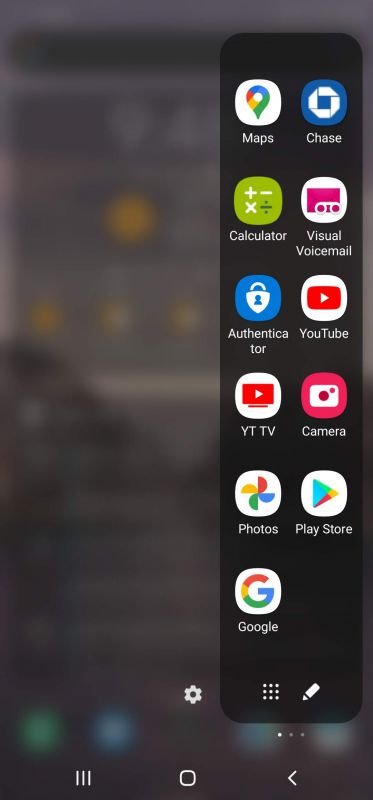
Because this is a Samsung phone and because Samsung is enamored with curved edge screens, I am taking advantage (?) of this with Samsung edge panels (I worked Samsung into this sentence 4 times, so I expect my royalty check any day now). Again, 3 panels for me. The first, above, is frequently used apps. The second is a direct dial panel that has the 12 most frequently called contacts, just one press away (assuming you don’t count the swipes needed to get to the panel). Finally, I have a compass panel because it is available. Never needed to use it for anything, but I sleep better knowing it is there.
Behind all of this is Wallpaper Changer, an app that changes my wallpaper every hour for both my home and lock screens. I have 10 carefully selected images that are synced with OneDrive via OneSync, a great little app that keeps selected cloud folders synced with my device(s). So I can just drop a picture, MP3 file, CBR file or anything else into OneDrive on my computer, and OneSync grabs it and puts it in the appropriate location on my device (as opposed to the normal OneDrive app which will keep the files in the cloud until you request them “offline”).
Howard Sneider
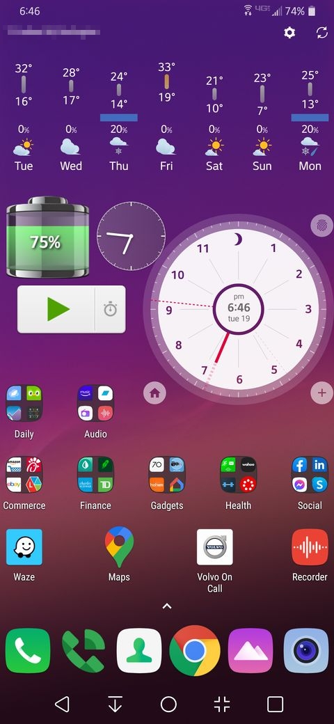
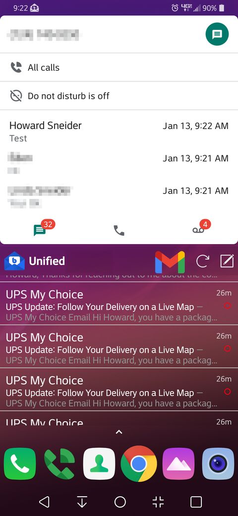
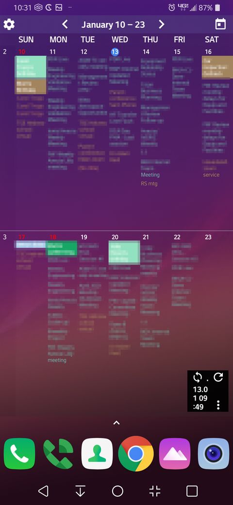
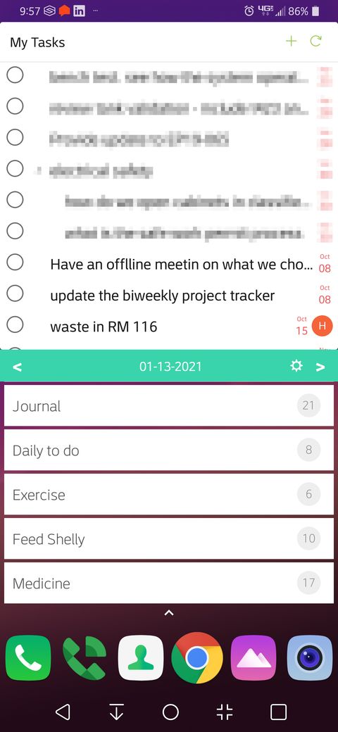
The last time we posted our screens I was an iPhone user on iOS that did not support widgets. Now I have an LG G7 Android running Nova Launcher 6 and I have 5 screens full of widgets.
Screen 1 has Weawow running across the top. The next row has Sectograph running on the right side. This program is great for seeing your next 12 hours of meetings in a single view. To the left side I have Battery HD, Clockwork Tomato, and below those two primaERP Time Tracking. Battery HD is needed because sometimes it is hard to see if the phone is mounted just right to charge wirelessly in the notification bar and this app has a nice big lighting bolt to indicate the charging status. The Clockwork Tomato is a Pomodoro timer and the primaERP timer is a great time tracking app that is free for a limited number of users. The remainder of this screen has groups of apps that I use most commonly.
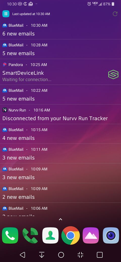
Screen 2 is entirely taken up by Recent Notification. This is a great widget and app to see which notification has caused the latest chime and it is useful for seeing when notifications were given even after the notification shade is cleared.
Screen 3 is split in two with the top half showing the Google Voice notifications and the bottom half showing the unified mailboxes of BlueMail. I also have a superimposed Google Mail icon in the middle of the screen because sometimes this is a better app to use for applying labels and reading mail with multiple attachments.
Screen 4 is entirely taken up by Calendar Widgets. Even though the font is small I can still read it and know what I have planned in the next two weeks without opening any calendar apps. The base of the screen has the iCal Import/Export CalDAV Pro status widget so I know my family’s iCalendar is syncing with my phone
Screen 5 is split in two with the top half showing Quire‘s to do list and the bottom half showing HabitHub‘s to do list. I find that these are the best apps to keep my daily reminders and also all of the projects that I’m working on.
Lynn Lopez
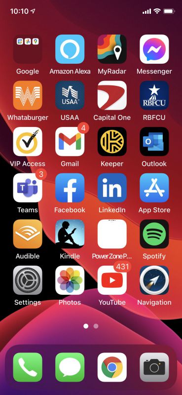
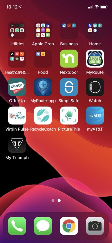
For the first time in a very long time, I am on IOS. I switched to an iPhone 11 Pro last September after a series of frustrations I had with my Galaxy Note 10. I like to say I finally came over to the dark side! That being said, I am very happy with the apps and how well it integrates with the Apple Watch and Air Pods. I am not happy at all with how I can structure the home screen. I have my work Outlook and Teams applications on this phone. It is all added via another third party app. On my previous Android devices, I was able to create widgets for my Outlook calendar. I was also able to create a widget for Audible, where I could click the play button on the home screen and start my book at any time with a single click. That is not available on IOS. If anyone knows how to add an Outlook calendar widget please let me know.
So all the whining aside, let me talk about what I have on my phone. The one folder I have on my home screen contains the three key Google Apps I will use. I still use Google Photos extensively as a quick and easy way to get to my pictures on my computer. I also use Google Maps and not Apple Maps. The last app I have in that folder is my Google Calendar. That is where I keep my personal recurring dates like birthdays and anniversaries.
In the first row I use Alexa for my shopping lists and managing all of my home devices, MyRadar is one of the best radar apps I have found and I am a huge weather geek and Facebook Messenger. (I have friends that still love to use that app). I then have a row of my banking apps. I highly recommend Capital One because I get notified of every charge on that card which is really nice. I also have the Whataburger app. I gotta support the place that pays me!
The second row has my VIP access key for one of my banking apps, Gmail, Keeper for passwords, and Outlook for my work email and calendar. The third row has Microsoft Teams for work. The rest of the apps are pretty self-explanatory. I have a website link to the PowerZonePack website where I keep track of challenges I am participating in on my Peloton. The Navigation app is a wonderful application I found from a company called MyRoute. This is a navigation application for motorcycles. It allows you to easily map out a route with stops and turns and then navigate it on your phone.
My second page contains the remainder of my folders and a few apps that I tend to use less frequently.
Michael Strange
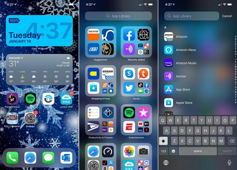
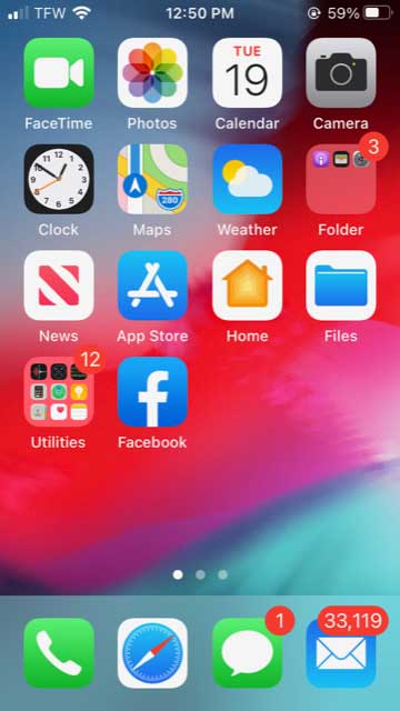
For the home screen on my iPhone 12 Pro Max, I have very few apps. There are just a couple, the Planet Fitness app and Spotify, that I use most frequently. There’s also a local weather app and apps for my Lockly smart lock and LaView ONE outdoor security camera.
I do like that Apple added the ability to use widgets in IOS 14. I use (Color Widgets) time and date widget, as well as the weather widget.
I change my wallpaper more than anything on my phone, and this time of year, they tend to be seasonal. My current wallpaper is a cool snowflake design that I liked. (I’m oddly obsessed with weather).
Another feature I like in IOS 14 and use a lot is the App Library. A quick swipe left from my home screen gives me access to all my apps. And they are all automatically organized into one simple, easy‑to‑navigate view. If I want a specific app, I can swipe down to bring up the App Libraries search function.
Theresa Villeneuve
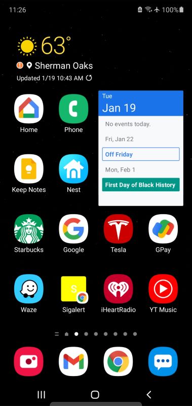
Homescreens say a lot about how you live and who you are, and I have to say, I feel a little like I’ve got my underwear on display here. But I guess I have nothing to hide, so here we go.
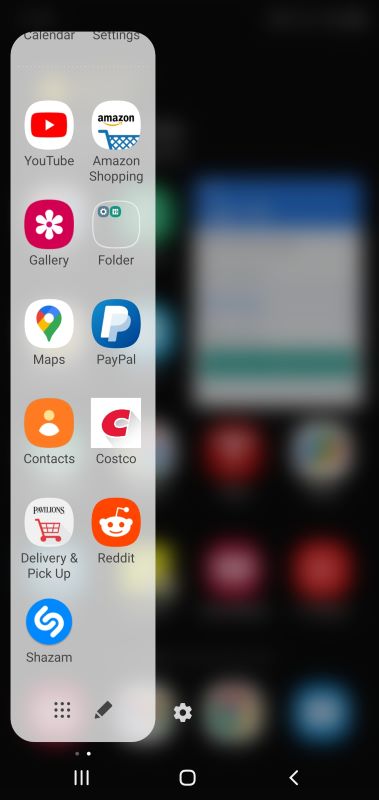
Mostly my home screen organization is dictated by my non-Covid lifestyle, which involves a 34 mile commute across Los Angeles. That accounts for my Tesla app (which is for my husband’s car – I drive a clunker) and the two traffic apps: Waze and SigAlert (which isn’t an app, it’s just a shortcut to the SigAlert map). Perhaps you haven’t heard but we have something of a traffic problem here ;). Most mornings I like to mobile order my Starbucks (on the app) as I leave the house, then stroll in there like I own the place and grab my coffee and go. Lines are for suckers! In the car and in my office I often listen to podcasts or the radio which is why I have the Youtube Music and iHeartRadio apps. Keepnotes rounds out the commute/work apps. I like having notes synched between my devices, and I really need those reminders sometimes.
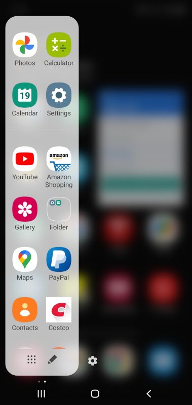
The rest of the apps are for the rest of my life. We have a fair amount of Nest products and some home automation, so I’ve got the Google Home and Nest apps handy. Google Pay is for paying off my poker debts and collecting my winnings. You might question why that would need to be on my home screen, but let’s just say there’s a fair amount of poker in my world. I call the quick pane “the mom zone,” because that where most of my mom chores go down. Amazon, Pavilions and Costco are for getting stuff we need to be delivered, which I often did even before the pandemic. Paypal is handy because I make regular payments for tennis and saxophone lessons for my son. The rest is for entertainment while I’m waiting for those lessons to finish, since I’m pretty much a taxi service at this point.
Andy Jacobs
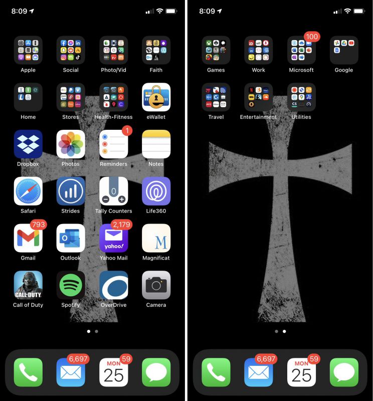
My current phone is an iPhone XR, and my “home screen” actually consists of only two screens, mainly because I’d prefer not to swipe through a bunch of screens to locate the app I need. Thus, the icons for my oft-used apps are on the first page and the ones for my less-used app on the second. On the first page, I keep the icons for the apps that access multiple times per day down lower on the home screen, because I can more easily reach these icons with my thumb during one-handed use. I’ve also kept the same four icons in the bottom dock that I’ve had since my first iPhone, due to both convenience and habit. I’ve only just started to play around with iOS’s new Widgets feature, and I expect I’ll be incorporating these more into my daily use. For example, I’ve relegated my weather app to a folder because I can now swipe to see it quickly as a widget. I typically try to keep my wallpaper somewhat simple and not so “busy,” which I find can be visually distracting and more challenging to locate icons more quickly. A rundown of my main apps is below.
- eWallet – Password manager that I’ve been using in some form since I had a Palm Vx PDA
- Dropbox – I mainly use this xfer photos for Gadgeteer reviews from my iPhone to my PC for editing
- Photos – For…you know…photos, pics, images, etc
- Reminders – I have a lot of stuff going on and this app at least partially helps me keep track of my “to-dos” and “honey-dos”
- Notes – I’m constantly jotting notes to myself and having this app sync through iCloud with my PC makes it even more useful
- Safari – Browser for visiting the World Wide Web (remember when we called it that? Ah, the Good Old Days)
- Strides – An app that helps build good habits or reduce bad ones, I use this to track my progress toward my goals in the various fitness programs I’m doing
- Tally Counters – I participate in monthly fitness challenges that are also fundraisers for veteran’s organizations through CharityChallenges.com and this helps me keep track of my daily rep counts
- Life360 – Helps me keep track of where everyone in my family is at any given time since they are out running around town all the time at school, work, etc, while I am most at home—been working from home since March 2020 and, well, lately I don’t get out much otherwise 😉
- Gmail – I’ve started to transition from Yahoo! mail over to Gmail for my personal email because Gmail and the suite of cloud-based Google products offer way more functionality than Yahoo!
- Outlook – This is my work-issued app for both my work email and my work calendar, and it works fairly well (see what I did there)?
- Yahoo! Mail – Yahoo! has been my personal email since the late 1990s, but until I complete my transition to Gmail, this guy continues to sit here
- Magnificat – This app has Catholic daily Mass readings, devotionals, and other prayers that I use on a daily basis
- Call of Duty Mobile – A guilty pleasure, I’ve become somewhat addicted to this well-done and impressively extensive first-person-shooter game
- Spotify – My main music app that I use during workouts and to play background music while I work
- Overdrive – This app gives access to my local library system and I currently use it mainly to listen to audiobooks (for free!)
- Camera – For…you know…taking photos, pics, images, etc
Raul Sanchez
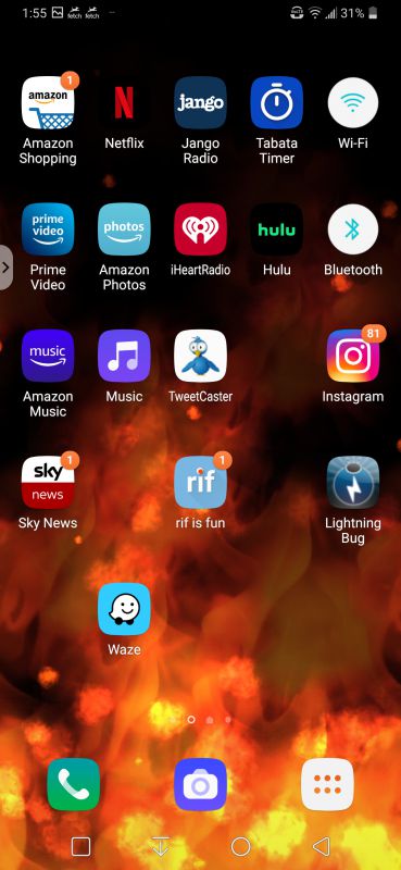
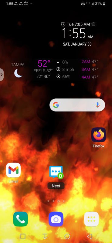
I have a very simple set up on my phone. I like Home screen to be very basic. My main Home screen just has my everyday common apps such as my camera, phone, Google Search Bar, Gmail, and my text messenger app, Handcent. It also has the Time and Date widget as well as a weather widget that I can glance at.
I have a Live Wallpaper that I have been using on my phones for several years. I never was that into wallpapers on my phone but when I had the ability to put one on my Android phone years ago, it just stuck. I can’t remember which phone I started with to be exact but I have had numerous Android phones through the years.
The Live Wallpaper I use doesn’t use much battery power since the frame rate is very low and is basically a simple moving fire images on a black background. I just like the way it moves. I find it rather soothing at times to watch. Well, sort of…
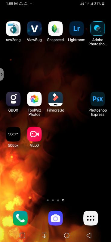
On the second screen I have several editing apps that I like to use to edit my photos and videos that I took with my phone. I also use the apps to add text or watermarks to my images which I share on my Instagram, Facebook, Linkedin, Viewbug, and other social media sites. I use the VLLO app when I want to make a quick video clip. I don’t use the FilmoraGo app as much as I used to especially since after one of their updates I found it not as user friendly anymore. I am thinking of deleting the app and searching for a different video editing app so I guess I will be searching the Play Store very soon.
On my third screen I have a mix of my social media apps, entertainment apps, news, GPS, and other various apps. I really like the Lightning Bug app. It is basically a rain noise maker. I like the sound of rain. You can customize the rain sounds with different environments as well as install Plug-In packs for even more sounds and more environments from beach sounds to city sounds.
Obviously, I have several more apps installed on my phone but these ones are the ones I used the most so I keep them handy on my phone’s screens. I like to keep the screen as tidy as I can. I don’t like too much clutter on them.
Also check out part 1 of this series.





Gadgeteer Comment Policy - Please read before commenting
I absolutely hate all the homescreen setups with a wallpaper picture. Nothing can beat a plain black background in my opinion.
It is also clear that the Android home screens are *much* more versatile than the iOS home screen.
Like Kathleen Chapman, I use Nova Launcher. But I didn’t know about Folder Organizer. It’s really a gem! It is quite similar to the Fences app (by Stardock) on Windows that I adore.
Thank you, Kathleen, for the great tip!
After reading all of that, the thing that stuck with me the most is that someone here works for Whataburger. Jealous!
David Ferreira…You are a comrade in arms…I swear that you and I have the exact same logic in how we want our home screens set up. I also have the Date, Time and Weather info (via widget) and then my calendar entries (via widget) underneath. I think your’s is the first that even looks like mine!!!
Mark