I’ll just come right out and say it. I’m a big fan of Bellroy’s wallets. I’ve tried their Slim Sleeve and their Elements Pocket wallets and have really liked both of them (I still have the Elements Pocket in my regular EDC rotation). When Julie gave me the opportunity to try out Bellroy’s latest wallet, the Note Sleeve, I was very interested. Let’s check it out! Gadget on!
Background
I’ve tried out a lot of wallets over the years in search of that elusive “perfect wallet” (for me at least). Big ones, small ones, ones in between. Over the past several years, I’ve gravitated toward the slimmer, more minimalist styles.
Specs & Info
Per the Bellroy site:
- Dimensions – 103mm x 85mm
- Materials – Premium vegetable-tanned leather
- Warranty – 3 years
Options
The Bellroy Note Sleeve is available in the following colors:
- Charcoal (reviewed here)
- Teal
- Arctic Blue
- Blue Steel
- Black
- Java
- Cocoa
- Burnt Orange
Also, the Note Sleeve is available in an RFID-blocking version in black only for $94.95 or non-RFID-blocking version (reviewed here) for $89.95.
Packaging
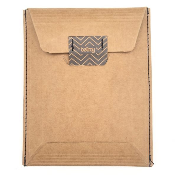
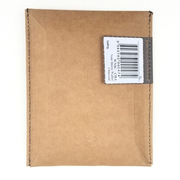
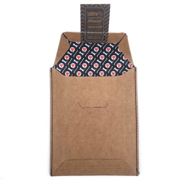
The Note Sleeve arrived in standard Bellroy packaging, which consists of a heavyweight cardboard envelope/sleeve with a tab-and-slot closure that protects the contents nicely, but is also able to be recycled. There is no window or other feature to allow the potential buyer to view the product inside, which I think packaging should have, if feasible.
Features, Functions, Performance
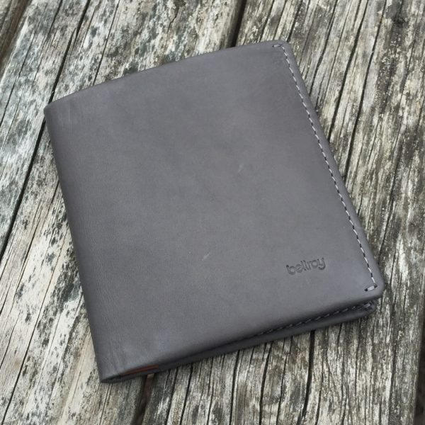
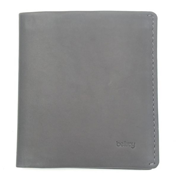
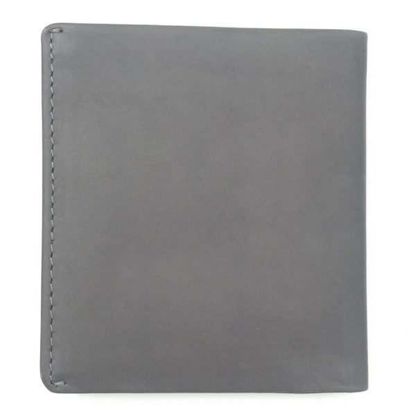
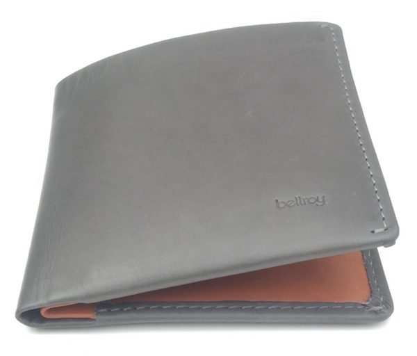
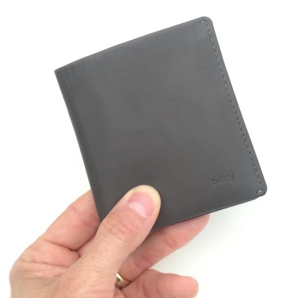
Upon removing the Note Sleeve from its packaging, my first impression was twofold: I loved the Charcoal grey color, and it felt very high-quality in both materials and construction, which has been the case with each of the Bellroy wallets that I have reviewed.
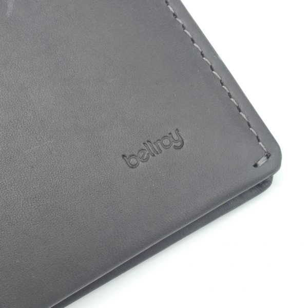
The closeup photo above shows a few things. The first and most obvious is the small, subdued Bellroy logo in the corner. One of the things I like about Bellroy, is that although they typically include multiple logos on their products, all of them are very classy and subdued, not obnoxiously large or garish. Also, the texture of the leather is visible, and it feels very rich and elegant, yet durable. Finally, the stitching. Like the other Bellroy products I’ve reviewed, the stitching on the Note Sleeve is impeccable. Not a lose thread or missed stitch anywhere, inside or out, which you will be able to see in the photos below.
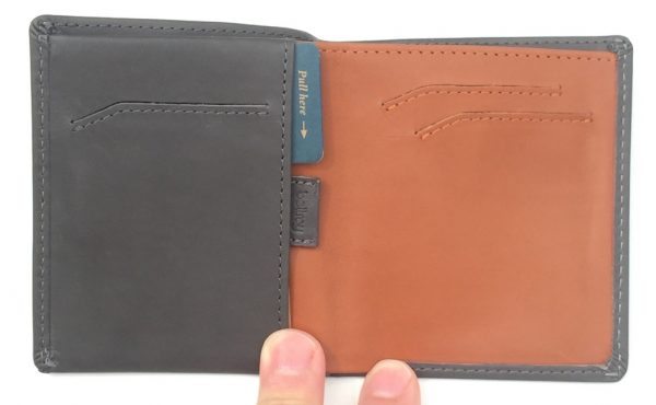
The Note Sleeve is, technically speaking, a bifold wallet design. However, you can see that the interior has a simple but interesting layout, which we’ll explore more below.
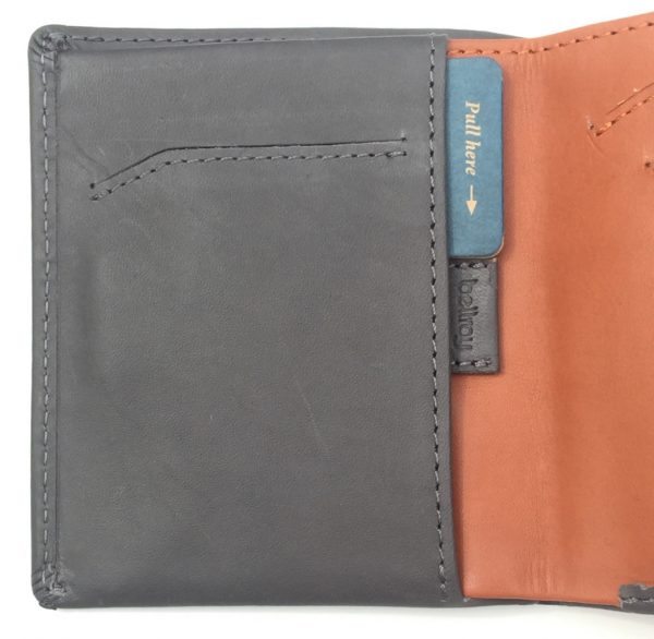
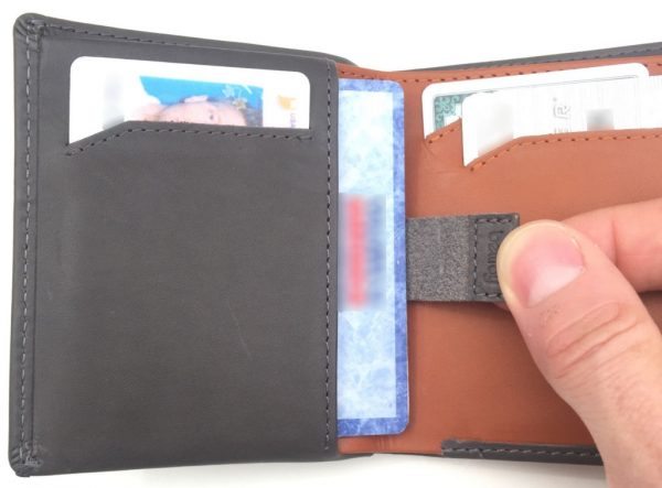
Starting on the left side, there is a single quick access slot pocket as well as a pocket behind it with a pull-tab (note the small Bellroy logo on the pull tab).
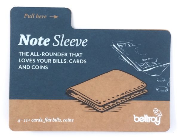
Bellroy thoughtfully includes the card above (which you can see tucked into the left pocket two photos up). It includes some additional details and hints about the features and functions of the Note Sleeve.
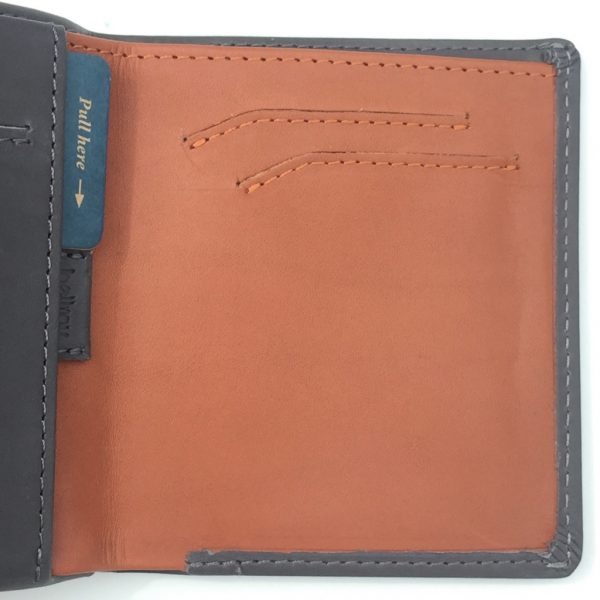
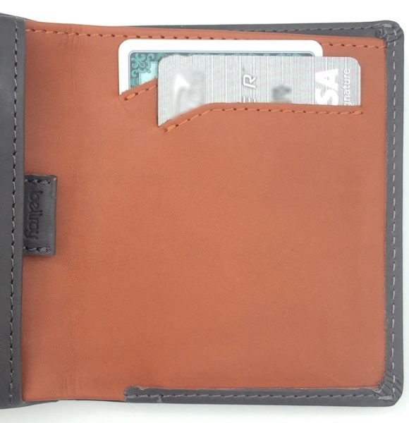
On the right side, you can see that the leather is a different color as the rest of the wallet, a rich brown color. There are two quick access slots as well. Simpler is better. 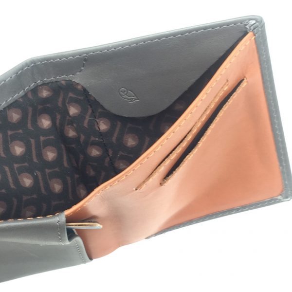
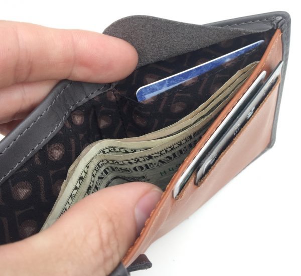
The bill compartment contains another unique and useful feature under the flap (note the Bellroy owl logo on the flap—small, subdued and classy). Also note the Bellroy-logo lining.
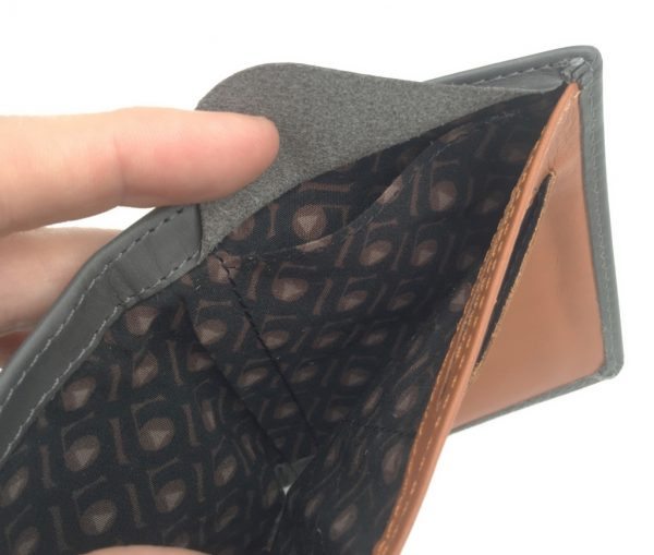
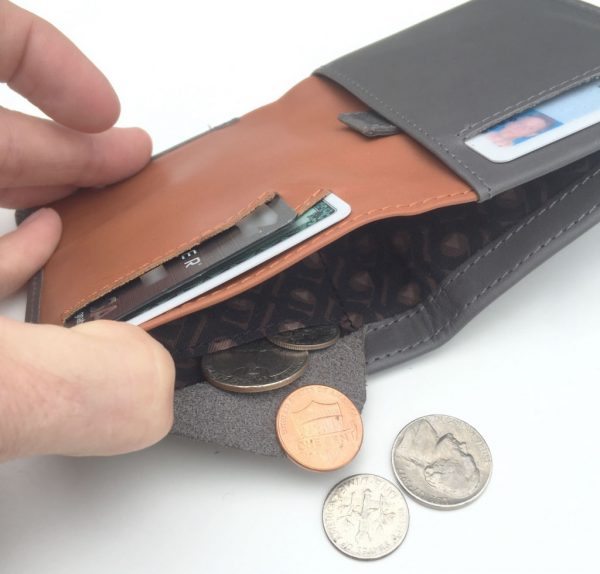
Under the flap is a small pocket which can be used for change or even additional cash or cards.
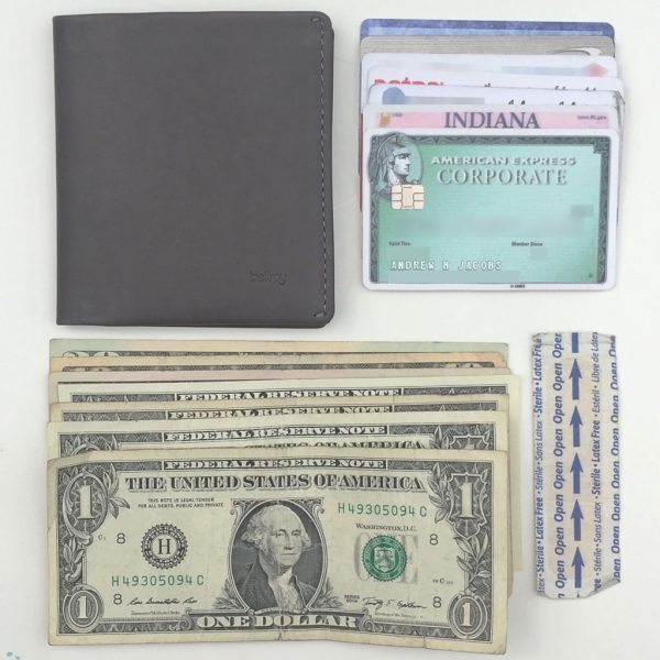
Now, let’s take a look at what the Note Sleeve can hold. I took all of the above items from my current wallet and placed them in the Note Sleeve. It’s a total of seven cards, seven bills and one adhesive bandage (yes, I’ve used this in more than one “emergency”). The above items are a fairly typically set of wallet contents for me, so this would give me a reality-based evaluation of the Note Sleeve.
Because of the Note Sleeve’s simple layout, loading all of the above items into it still kept it looking simple.
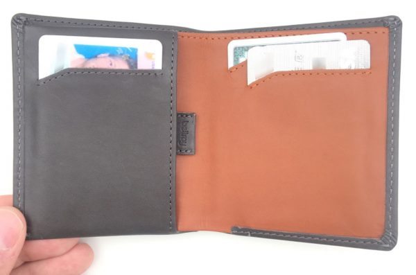
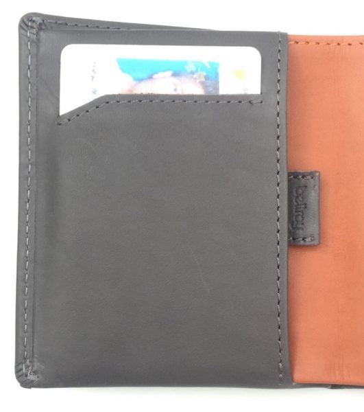
Looking at the left side, I placed my driver’s license into the single quick-access slot.
In the pocket bending the single quick-access slot, I placed several cards that I don’t use as often. The cards in this pocket are access using the pull tab, which think is a really handy feature. Pull the little tab and the cards just pop out, quickly and easily, then slide them back in. Easy peasy.
On the right side, I loaded my main two credit cards into the quick access slots.
Above, you can see the bill compartment. I’ve placed a total of seven bills in the main portion of the compartment. The small pocket with flap has some versatility. In the above photo, I’ve placed a few almost never-used cards, which are secured by the flap.
Another way to use the small flap pocket in the bill compartment is to hold your spare change. I think this is a great idea. I hate carrying loose change and coin-purses are a no-go. This little pocket with flap is a great way to secure loose coins but without adding unnecessary bulk to the wallet.
Above photo shows the Note Sleeve loaded up with the items shown above.
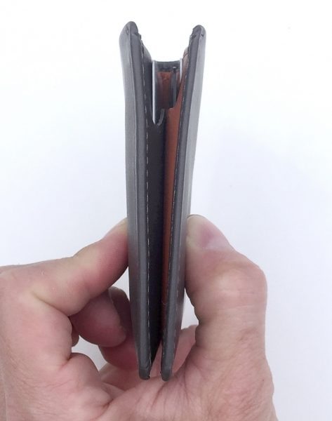
These contents obviously add bulk to the wallet, but not really all that much. Keep in mind that this is a “minimal”-type wallet. That means that you probably shouldn’t load tons of stuff into it like the classic George Costanza wallet and expect it to not be any thicker. If you are willing to scale back your items to the essentials that you really need to carry, then one of the great things about the Note Sleeve, and all of Bellroy’s wallets, is that their designs are so carefully though-out as to make the storage of those essentials even more efficient.
The footprint of the Note Sleeve is a good size for back-pocket carry, maybe a bit large for front-pocket carry though certainly this would not be out of the question. As bifold wallets go, it’s probably an average-sized footprint, but it is so much more efficiently laid out than a traditional bifold.
Conclusion
Call me a fanboy, but I have been impressed with the Bellroy wallets that I have tried, and the Note Sleeve is certainly no exception. This is not your father’s bi-fold wallet. I really like the styling that Bellroy has put into the Note Sleeve, but even more, I like the thought that has gone into making it simple but efficient to use. While it can still carry a pretty decent amount of cards and cash, it remains a slim, minimalist-style wallet. Its combination of well-placed quick-access slots, ability to carry unfolded bills and its flap pocket that allows loose coins to be secured is very impressive indeed. Bellroy’s wallets are a bit on the expensive side, but I do feel they are worth the investment. The Note Sleeve is currently in my regular EDC rotation and I expect it to remain there for some time to come.
Updates 03/28/18
As with all of the Bellroy wallets that I’ve reviewed to date, this is a very high-quality, well-designed and well-built wallet. It is very compact and holds a fair amount of stuff (cards, bills, etc) for its size. The Bellroy Note Sleeve wallet is a winner in my book.
Source: The sample used is this review was provided by Bellroy. Please visit their website for more information or to order.
HP 15.6" Business Laptop Computer with Microsoft 365 • 2026 Edition • Copilot AI • Intel 4-Core N100 CPU • 1.1TB Storage (1TB OneDrive + 128GB SSD) • Windows 11 • w/o Mouse
(as of February 27, 2026 13:09 GMT -06:00 - More infoProduct prices and availability are accurate as of the date/time indicated and are subject to change. Any price and availability information displayed on [relevant Amazon Site(s), as applicable] at the time of purchase will apply to the purchase of this product.)HP 14 Laptop, Intel Celeron N4020, 4 GB RAM, 64 GB Storage, 14-inch Micro-edge HD Display, Windows 11 Home, Thin & Portable, 4K Graphics, One Year of Microsoft 365 (14-dq0040nr, Snowflake White)
(as of February 27, 2026 09:26 GMT -06:00 - More infoProduct prices and availability are accurate as of the date/time indicated and are subject to change. Any price and availability information displayed on [relevant Amazon Site(s), as applicable] at the time of purchase will apply to the purchase of this product.)Product Information
| Price: | $89.95 (RFID version $94.95) |
| Manufacturer: | Bellroy |
| Pros: |
|
| Cons: |
|



Gadgeteer Comment Policy - Please read before commenting
The design as always is outstanding, but the wallet itself is not minimal or minimalist, it was made to carry a lot of cards and bills, and for people like me who carry 4 to 5 cards, a few bills, business cards and recepits its huge, the low down line is more appropiate in my humble opinion
You know, that’s probably true–Bellroy’s Low Down wallet does look a bit more “minimalist” than the Note Sleeve. However, I don’t think the Note Sleeve was intended to carry “a lot” of cards and bills, but maybe an intermediate amount. Not as much as a Costanza wallet, but more than just 2 or 3 items. I think “minimalist” is a term that has some latitude in how it can be applied.
I’ve been using the Bellroy Travel Wallet for some time now. I like that it’s ready for travel but not bulky when I’m home and not carrying my passport.
http://bellroy.com/products/travel-wallet/leather/mocha
I like the look of Bellroy’s Travel Wallet also. I travel abroad a fair amount and the Travel Wallet looks like would come in handy for carrying my passport along with other wallet and travel essentials. Hopefully I may have the opportunity to review one in the future.
Saw your review on the slim sleeve. How did this compare?
I really like both wallets, but the one feature I like more about the Note Sleeve is its ability to place bills in it without having to fold them down and increase the thickness of the wallet as with the Slim Sleeve.
Hello,
Are there 2 different designs of note sleeve?
I also found this one :
https://au.stuartslondon.com/bellroy-note-sleeve-java-wallet-59318020-p17479
Thanks,
Aviram