There was a time when I used a paper planner religiously to track personal and family appointments, events and celebrations, and even mundane things like when recycling will be picked up. Today I use apps on my iPad for these tasks, but sometimes I still miss the beautiful leather planner cover I had and the enjoyable activity of writing with a good pen on the good paper in my Levenger Circa calendar. There are some people who eschew electronics, and some who use electronics but still prefer tracking and scheduling their life on paper. Of course, there are a multitude of choices for calendars, but sometimes you just can’t find the forms you’d like to plan and track a task, to brainstorm, or to just make a simple note you can hand to someone.
Levenger has always had beautifully designed and printed agendas and some extra forms you can add for to-do lists and the like. Recently, they fine-tuned their system into a smartPlanner Master Agenda and a set of nine “paper apps” that Levenger says creates a system “that’s both loaded with productivity and fortified with fun.” Let’s give it a closer look.
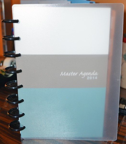
smartPlanner
The first part of the Levenger Smart Apps system is the smartPlanner. Like all notebooks in Levenger’s Circa line, the smartPlanner uses the Circa discs instead of snap-open binder rings. The paper is punched so that each page can be easily lifted out of the notebook and just as easily replaced or moved to a new location in the notebook. The smartPlanner comes with 1″ discs, which can hold about 150 sheets of paper. With the plastic covers, dividers, and calendar pages, the notebook is about at capacity. You can purchase bigger discs to increase the capacity of your notebook so you can add the paper apps pages, or you could use a separate Circa notebook to hold them.
The smartPlanner is available only in Levenger’s junior size, which means the pages are roughly 5.2″ wide X 8.2″ tall.
If you prefer a more polished look, you can insert this Circa notebook into one of Levenger’s Circa folios (smartPlanner folio is $129; other zippered folios start at $119) or simply replace the plastic covers with Levenger’s book cloth or leather covers.
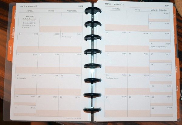
The picture, above, shows the month-at-a-glance calendar. This view also includes a tab to make it easy to turn directly to each month. Although the month view is spread out over two pages, there’s not much room for each day.
Because I don’t work outside of the home, I thought I’d get my husband, Butch, to give me his thoughts on these forms, too. He works for a Fortune 500 company and is responsible for huge projects, so his needs are different than mine, which involves a few review assignments and keeping up with the family calendar. I’ve just combined his thoughts with mine in the sections below.
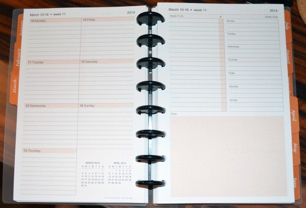
Each week in the year also has a week-at-a-glance set of pages. The first has all seven days compressed into one page. The second page has a weekly to-do list, weekly goals list, and an unstructured section for notes or sketches.
The week view style is a compromise on size vs. space, but it is probably the better calendar choice. Butch likes the addition of the weekly goals to each week’s space, allowing goals to be carried over from week to week and to keep them front and center. The weekly to-do list can work the same way, although it is really just a simple list. Of course, you’ll probably need to write your appointments and list items in pencil, so you can change them as your week unfolds. And if you do need to carry something from this week’s list to next week’s list, you’ll have to re-write everything on the next page. Or I guess you could cross out the date and move that page to the next week’s position in the calendar.
You’d also need to write each appointment or event on both the month view and the week view.
Organizational “Apps”
There’s a lot more involved with scheduling your job and life other than just keeping up with appointment times. If you work on or manage a project, you’ll need to keep up with a myriad of things: travel, project steps, project assignments, project dependencies, travel, meeting notes, etc. Levenger created nine paper Organizational “Apps” that you can place where you want in your master agenda. Five soft shades of color help you organize, plan, delegate, think, and create.
When they are different, both the front and back of each “app” page will be shown in the following images.
Travel Tamer
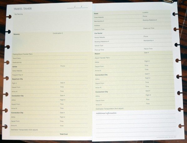
My job doesn’t involve travel, so I’ll defer to Butch for the Travel Tamer form. He says: “For people who like paper planners, this looks good. All the requisite information is there, including space for the airline/hotel/car rental websites (nice touch). My only complaint is that this will require a lot of duplicate effort to write and rewrite these numbers each time a trip is planned, but people who like paper planners won’t mind this. Overall this looks good.” Levenger says the Travel Tamer forms are a great reference for repeat trips and expense reports.
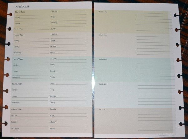
Scheduler
This appears to be a tool for very simplified task delegation, allowing names and tasks to be tracked a week at a time. This will likely work well for small groups or teams with very simple projects, or managers who have only a few resources to manage and relatively simple or rote tasks to assign. No way to track task dependencies, except the mental way (“don’t assign task B until somebody finished task A”). Or maybe the “reminder” space on the back side could be used for this. Butch can’t really see any circumstances where he would find this useful.
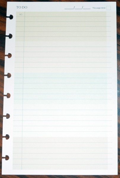
To Do
This app tracks to-do items in simple list fashion. It’s a nice touch to allow a sequence or id number to be assigned to each task for reference. Butch likes the checkbox at the top to signify that the page of tasks is done. He also thought it would have been nice to have individual check boxes to indicate which tasks are complete, and it’s always nice to have priority and/or due dates for tasks. I guess with the junior size books, space is at a premium.
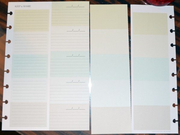
Keep and Share
The idea of the Keep and Share pages is that you can create a note or assignment and keep a copy for yourself and tear a copy out of the notebook to hand to the person who’s been assigned the task. The problem with this is that you have to handwrite both copies. It would have been nicer if the pages could produced a duplicate using carbon paper-free duplication paper. The shared section is perforated for easy removal; each page has five sections that can be shared. These are pretty small, so there’s not a lot of room for explanations of the assignment. They are also so small that I think they would be easily lost. Butch says he has no idea what he would do with this. I think this sort of information could be passed along much easier with email, and you’d automatically have your own copy without having to write everything twice.
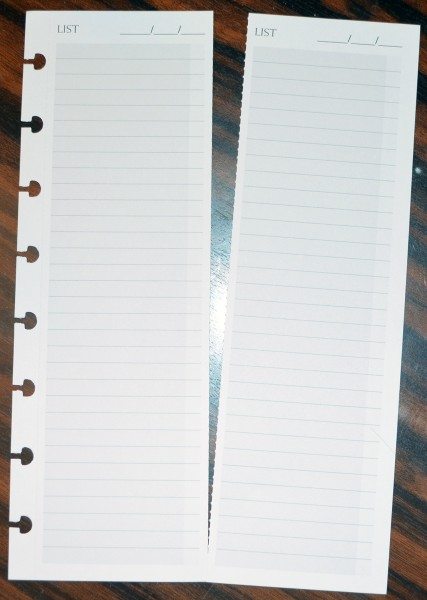
List
Each list page is the same front and back. It’s just a piece of paper to create a list on – shopping, to-dos to pass to someone else, etc. Butch says: “There are ALWAYS uses for simple list keeping. The date at the top is nice; I could use it to record the date I created the list, or the date when a deliverable based on the list is due. Lists do need titles, and there’s no explicit space for a title here, although I could use the first line for titles. This is something I could definitely use.”
Doodle
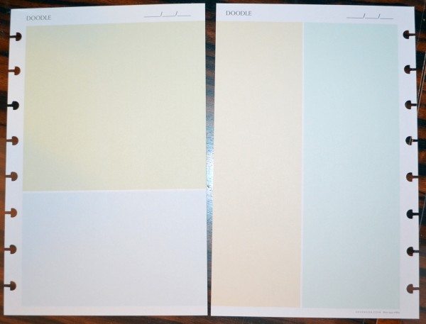
Levenger says the Doodle pages have “soft colors and different shapes that help you doodle your way to ingenious thoughts. Don’t doodle? Use as a sketch pad or to jot notes.” Butch says: “Love this idea. Of all the things involved in planning, meetings, etc. the one area where paper absolutely thrives is exactly this – diagrams, drawings, etc that need to be recorded, either as part of a meeting or to document a thought process or design process. I have yet to find an electronic means to capture visual ideas during meeting or design sessions that is as easy and effective as a simple piece of paper. The Doodle app has a date field (nice again), but then keeps everything else very simple to allow for maximum utility. Love it.” I don’t think I’d use this very much, personally.
Contacts
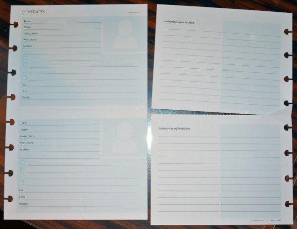
Levenger sees the Contacts forms as a smart way to back up your electronic contacts. Again, I’d use a pencil to write everything on these pages for easy updating if a phone number or email address changes. If you use ink and need to make a correction, each page is perforated so you can discard and replace a contact. Ripping up the pages will result in a set of contacts that are very hard to page through, because you’ll have to turn the top and bottom of the page separately. Also, large contact lists will take a ton of room in your agenda. Butch noticed that these forms are more suited for personal contacts than business; although they have a space for a work number, they don’t have room for the company name or the job title. He also says: “The spaces for URLs for Facebook, Twitter, LinkedIn, etc. are especially puzzling. I just can’t imaging why I’d want to carefully transcribe somebody’s application URL to a paper contact form, only to have to carefully type it in every time I wanted to use it.”
Meeting Notes
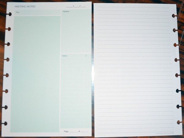
Anything I need to make notes of will fit handily on any piece of paper, but Butch’s meetings are more complex and involve more people. He says this form is also simplified, but in this case, it’s a home run. Everything important to the outcome of the meeting is here: The meeting topic is front and center, there’s plenty of room down the left column for extensive notes. Highlight or summary can be captured in the upper right, and Action items captured in the lower right. The check box to indicate completion of the action items is a nice touch, although a due date would be helpful as well. Again, the junior size probab;y forced this trade off. The back of the form has plenty of room for additional notes or even sketches.
Ideation Station
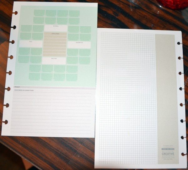
Levenger says you use this form to “map out ideas on a manageable size of paper (take some on the plane). Find solutions by connecting concepts.” Butch says he wouldn’t use these forms. I think these “guided thinking” methods don’t work for everyone. Because everyone thinks things through differently, a method or form that might work for me won’t always work for you. I personally wouldn’t ever use this form.
Conclusion
If you like to use paper agendas and lists, you’ll probably be in heaven checking out Levenger’s smartPlanner and paper Apps. If you have very large-scale, complex projects, these forms may not be sufficient for completely tracking progress and inter-dependencies. You may find that a subset of the Apps are just what you need to take meeting notes or track your to-do lists, but you may find that electronic methods will work better for other functions – like keeping your contacts or giving other people their project assignments. If you do prefer paper, you need to check out the nine Organizational Apps to see which might work for you. You can see them in person at a local Levenger store, or you can see them at Levenger‘s online store.
Gerber Gear Suspension 12-in-1 EDC Multi-Plier Multitool with Pocket Knife, Needle Nose Pliers, Wire Cutters and More, Gifts for Men, Camping and Survival, Grey
(as of May 10, 2026 18:45 GMT -05:00 - More infoProduct prices and availability are accurate as of the date/time indicated and are subject to change. Any price and availability information displayed on [relevant Amazon Site(s), as applicable] at the time of purchase will apply to the purchase of this product.)Gerber Gear Diesel Multitool Needle Nose Pliers Set, 12-in-1 EDC Multi-Tool Knife, Survival Gear and Equipment, Black
(as of May 10, 2026 18:45 GMT -05:00 - More infoProduct prices and availability are accurate as of the date/time indicated and are subject to change. Any price and availability information displayed on [relevant Amazon Site(s), as applicable] at the time of purchase will apply to the purchase of this product.)Product Information
| Price: | $62 for complete system; $39 (2014 version on sale for $24.95 now) for smartPlanner agenda only; $10 for each 2-pad app pack |
| Manufacturer: | Levenger |
| Pros: |
|
| Cons: |
|


Gadgeteer Comment Policy - Please read before commenting
Thank you so much for your comprehensive review of our best-selling agenda system. You have really nailed all the features that customers love. Now that the smartPlanner and apps will be available in letter size, too, as well as in a new six-month format, even more will be able to benefit from Circa smartPlanner convenience. Again, thanks so much for your support!
Butch will be pleased to know about the letter-sized format. Needing a little more room on some of the forms was his biggest concern.