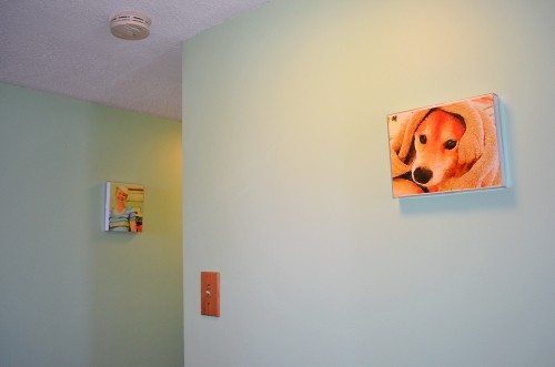
Why no, this isn’t a hallway in the Louvre! It’s my hallway displaying my new “watercolors” I just created. You’ll notice I said “created”, not “painted”. I can’t paint or draw, but I can use an app to turn my snapshots into watercolors. With the Waterlogue app from Tinrocket, LLC, I can easily convert any image on my iPad (or iPhone or iPod touch) into a watercolor-like image. Best of all, I don’t have to wade through a gazillion options and controls (Photoshop, I’m looking at you) to convert my image.
I’m not going to do an in-depth review of Waterlogue, but I wanted to give you an overview of a couple of the things I’ve created on my iPad mini since I bought the app a couple of days ago. I like how the app has given new life to some of my images. I’ve even had a few of them printed out and have hung them up in my hallway.
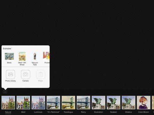 It’s easy to get started with Waterlogue. You just click the camera icon at the left to select your image from any album in your photo library, or you can use the iPad’s camera to capture an image. You’ll notice a few sample images are included for you to play around with.
 The first image I tried is this picture of Teddy. It was a good one to start with, because it was a close up of his face. There’s high-contrast in his face, too, and the background is of no interest. I didn’t change any settings in the app. It started with “Natural” settings.
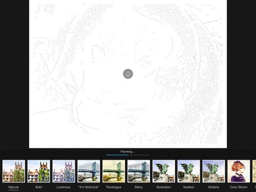
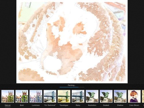 Once the image is selected, it’s analyzed and represented with a simple line drawing, as seen in the above image. As the image processes further, you’ll see a message that the app is “painting”. The colors fill in seemingly randomly. Granted, it doesn’t look so good here, does it?
 This is the final image produced by the Natural option. When it’s finished, you’ll see a heart icon at the bottom right of the image. Click that and you’ll be able to save it to your photos, mail it, or open it in another app. You can also send it to Instagram, Twitter, Tumblr, or have the Sincerely service turn your image into a 4″ X 6″ postcard and mail it anywhere you want in the world. I didn’t try that service.
I saved my watercolor to my iPad’s photo library, then I tried out a few of the other options.
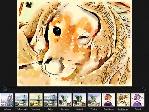 The Fashionable option emphasized the lines in the image, giving it an almost cartoonish look. Despite the heavier lines, the image has less detail, as you can see from Teddy’s now squinty left eye and vague suggestion of a nose. This option also gives the completed image a sepia tone.
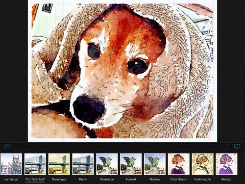 This is the “It’s Technical” option, which uses a gridded background. It adds more lines to the image while leaving the colors bright, and the delineation between colors is sharp. It almost looks like a draftsman drew it, if you know what I mean.
 There are other controls to try. Access them by swiping the watercolor icons out of the way. You can change the “brush size” with the leftmost options or adjust the darkness/lightness of the image. You can also choose a white border around the final image, as you can see in the “technical” image of Teddy, or you can have it produce borderless images. I prefer the border. It doesn’t leave a lot of white space around the image, but it does make it look a bit more like some watercolors painted by artists that I’ve seen.
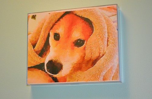 I uploaded my preferred image to the local Walgreens photo studio and had it printed as an 8X10. It looked good enough that I decided I’d get a simple frame and hang this image of Teddy and a few others in my still undecorated hallway.
I tried a few other images, but I’ll only show you one more of the four I had printed. (I may have downloaded a couple of images from the internet for the other two… )
 I love this playful picture of Rachel wearing a paper bowl on her head like a bowler hat, but I wasn’t crazy about the grainy, out-of-focus quality of it.
I had tried some other images with people, and I had been disappointed in the faces.
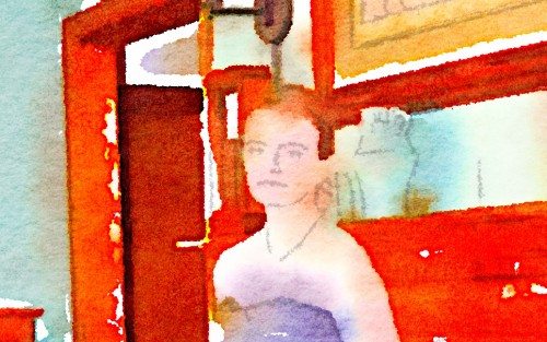 Most of the time, it seemed facial features were reduced to a couple of faint lines that seemed cartoonish and appeared to have been drawn with the lightest gray pencil possible.
 Other options resulted in hard, dark lines. Neither were pleasing.
 This picture worked much better, and it resulted in actual facial features, albeit blurred as you’d expect from watercolors.
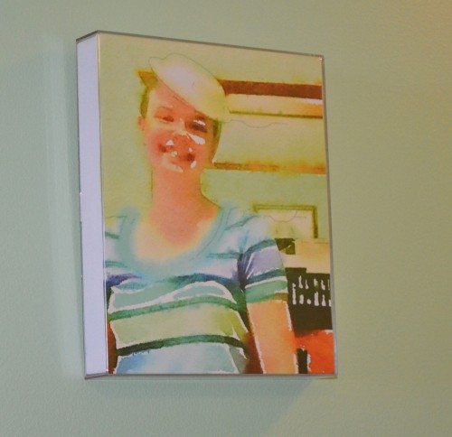 I liked it enough that I framed it and hung it outside my bedroom door.
This app may not manage your schedule and make your job easier, but it’s fun to play with when you have a few spare minutes. You don’t have to print out the images like I did, nor do you even have to save them to have fun playing around with the Waterlogue app. If you do decide to save them, you’ll find that some pictures that don’t have the high quality and resolution the pose and composition warrant now look good enough to hang on your wall after they are Waterlogued.
INIU Mini Portable Charger, Small 45W PD Power Bank, 10000mAh USB C in&Out Fast Charging Pocket Size Battery Pack, Travel Essentials Powerbank for iPhone 17 16 15 14 Pro Air, Xiaomi, Samsung S24 etc
(as of March 6, 2026 17:23 GMT -06:00 - More infoProduct prices and availability are accurate as of the date/time indicated and are subject to change. Any price and availability information displayed on [relevant Amazon Site(s), as applicable] at the time of purchase will apply to the purchase of this product.)Hagibis SIM Card Tray Removal Tool with Cleaning Brush, 2 in 1 EDC Portable Keychain Eject Pins Reset Needle Opener Cleaning Pen for iPhone Airpods Pro
(as of March 6, 2026 17:23 GMT -06:00 - More infoProduct prices and availability are accurate as of the date/time indicated and are subject to change. Any price and availability information displayed on [relevant Amazon Site(s), as applicable] at the time of purchase will apply to the purchase of this product.)Product Information
| Price: | $3.99 |
| Manufacturer: | Tinrocket, LLC |
| Retailer: | iTunes App Store |
| Requirements: |
|
| Pros: |
|
| Cons: |
|



Gadgeteer Comment Policy - Please read before commenting
I love using original artwork to decorate my walls. That’s all we have in our basements and as we remodel the rest of the house, I plan to add more. Great pix of Teddy and Rachel 🙂
Hello, Personally I much prefer the picture with ” the faded” lady in red background ”. I think it would look stunning in a 24×36 size frame.
@marianne I’m not sure which picture with “the faded” lady in red background you mean. Are you talking about one of the images in this review?
Your website is littered with ads! Please consider your readers and become little less greedy