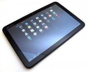
 Julie got the first look at the Xoom, and did a couple of excellent posts on it including a First Looks and the full review. If you are wanting the complete run down on the tablet I highly recommend these posts. And, as always on The Gadgeteer, the comments are full of great additions as well.
Julie may have received it first, but I got to spend a long time with mine, so I wanted to share my observations. Also, she did such an excellent job with the nuts and bolts, I will focus on more general observations.
The Xoom is certainly not the first tablet. There have been a few based on the Android OS that even predate the iPad, but it was the first that ran Honeycomb. This is designed from the ground up to be a tablet OS. If you are used to Android, it’s not a big change, but there are some adjustments.
There are no buttons on the front. The power button is on the back, and a rocker volume button is on the side. I like buttons, but I was all right with it after a while. You do have a toolbar visible at the bottom of every screen:
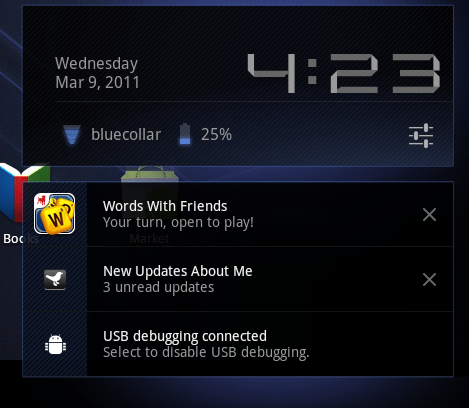
The first icon takes you back, the second icon takes you to the home screen and the third displays the recent applications. If the current page of the application has a menu, a grid icon can be touched to display the menu. On the right side you have icons for any notifications. On this screen the first is the debugging notice (I use that to grab screens), the second tells me Words With Friends is ready for my next move, then you have the current time, signal strength and battery level.
If you tap the settings, you can see more information:
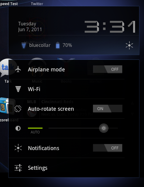
Tapping the settings icon (sliders underneath the time) gives you access to common settings.
So two taps takes you to a screen to control Airplane Mode, access Wireless settings, turn on/off auto-rotate, set brightness, turn off notifications and finally get to all the Settings.
The ability to turn off notifications is a great feature. Especially if you are using it as a reader. Late at night, my wife can deal with the glow of light, but is not a fan of the occasional alert tones.
Room to Breathe
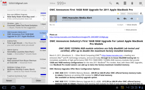
Apps designed to take advantage of the new real estate on the display really shine. Of course Gmail embraces it:
I really like the layout in landscape. I have my inbox on the left, and the contents of the e-mail on the right.
One of the first applications designed for tablets was the CNN app. Once again, a nice use of the layout:
Battery Life
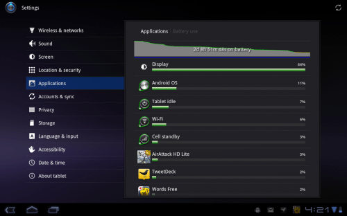
I thought the battery life was good. I mean, after all, I need to sleep sometime. Even while playing some intensive games (like AirAttack HD) I was at 2-1/3 days before wanting to recharge:
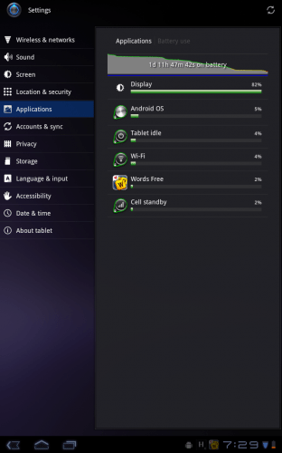
Reading actually took the most out of my battery, since the screen was on the whole time. This was one of the worse results:
One disappointing thing about the Xoom is you cannot charge via USB. This is a big deal for me, I have far too many adapters to track as it is. However, I think this is the current state of tablets. I assume the batteries are too big to efficiently charge via USB. I just wish it was an option for when you find yourself without the adapter.
The Home Pages
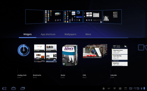
If you are used to iOS, you may be confused by the home screens in Android. With Honeycomb, when you download an application from the market it does add it to a page for you (unlike previous Android releases). But the icons you see on pages are just shortcuts, not the apps. Managing this is very easy, and I am still a widget fan:
Form Factor
You know what I want? A tiny tablet that will fit in my change pocket and expand to give me a 17″ display. Yeah, we are not there yet. To me this is always about tradeoffs. I love my Sony Reader that conveniently fits into my coat and jacket pocket. The Xoom won’t. But the screen real estate is great. I still would like to try a smaller tablet on for size. I am just not convinced I want one this big. It is also heavy. However, it has a great display and a sturdy feel. I am a big fan of the rubberized finish, and have become accustomed to the size. I’ve now borrowed and read most of the first three books of the the Songs of Ice and Fire series on the Xoom. So I guess that speaks to the form factor issue. However, since returning it I have returned to my PRS-700 Sony Reader, and have been enjoying its weight, size and portability. I am still a fan of e-ink for reading, but the display on the Xoom was very acceptable for reading.
Half-Baked?
One of the complaints about the Xoom is that it was rushed to market, and is half-baked. It does appear rushed, but I think it is more like 7/8ths baked. Yeah, I kind of made that up. But still, it would be nice if it shipped with 4G and the SD card enabled, however the fact that it can be upgraded to 4G and the SD Card slot will be activated with an update makes it less of a big deal for me. It did not ship with Flash capability, but that is already fixed. And 4G and SD card capability will never be coming to the iPad or iPad2.
Bottom Line
Is it worth it? Will I buy one? The answer to both is maybe. I like it more than I expected to. It is a great tool for surfing the web, working on e-mail, using twitter and reading. Do I need it? No. Do I want it? Yes. The issue to me is the cost. If you can justify the purchase I think it is a great choice in the tablet space. If I had the money, and had to choose one now, I would be getting this. Am I saying it is better than the iPad? No. I haven’t used an iPad for any length of time, and trying to label one “best” is pointless to me. It’s just a better device for me than the iPad.



Gadgeteer Comment Policy - Please read before commenting
nice review. i bought my xoom wifi last month and i love it. i wish it was as thin as the samsung galaxy 10.1 though. but the xoom has a nice manly heft to it. there isnt much apps designed for the honeycomb tablet, but slowly growing. some of the apps designed for the phone crash on the tablet. fonts are small and sometimes hard to read. overall, i love my xoom. not much i can say since i paid $589 for it. i am excited about the next upcoming ice cream sandwich tablet os.
I personally have the original iPad and now a Blackberry Playbook. I’m getting “tired” of always following Apple’s product line and I’m looking for a replacement tablet. The Playbook is good but was rushed out the door and feels like “1/4th baked”. What I did like on the iPad was the quality (not quantity) of apps. How are the quality of apps that’s available on for the Xoom (meaning made for that screen sized app and not stretched)? Also how are the selection of business related apps?
I’ve tried android back with it was 1.6 and hated it. And recently owned an android 2.2 phone which I returned back. Somehow the android os isn’t just sitting right for me compared to iOS and QNX. Any thoughts on that?
I like the apps designed for the Honeycomb. CNN, YouTube, Gmail all make good use of the real estate. Wish Tweetdeck had a Honeycomb-specific version (the regular version works OK). I really liked using OM Books (they have some Dr Seuss titles) on the tablet. I have not used an iPad, so can’t speak specifically to comparison of quality apps. All the reader apps were quirky at first (Aldiko, Overdrive, Kindle, Sony Reader), but they updated them to at least work fine with Honeycomb, even if they did not leverage it.
I really hesitate to comment on Android vs. iOS vs. QNX. I think personal preference comes in hard there. I used an iPhone 4 for two weeks. It was OK, but I was happy to return to my Droid X, but I would never claim that one was better for everyone. I will say that Honeycomb, to me, is a refined version of the Android OS.
@Bryan – Does it have a specific Honeycomb Skype app? Cause I really hate how iOS and QNX uses propitiatory webcam chat apps.
Not sure on the Skype app, and I had to return the Tablet. Maybe another reader knows.
@Jackie Cheng – There is no Honeycomb specific Skype app yet as far as I know, so still no Skype video chatting yet. Google Talk does do video now though, and it should work with GTalk users in Windows, Mac, and the web. (Haven’t tried it myself though… I don’t really want to be seen when I’m talking to someone 🙂
I got the Xoom back in April, and returned it today. I’m a big fan of what Android has achieved so far (particularly when combined with HTC), but the Xoom is simply not very good. Buggy (force closes), laggy (portrait mode), heavy and generally not stable. I know android is never going to be as polished as iOS, that’s not in it’s DNA, but there has to be a certain standard kept. Honeycomb is just dodgy. Compare it with 2.3 on the HTC Sensation, and you really get a feel for how incomplete it is. Coupled with hardware that is heavy, has an average screen, and is unable to utilise the power of it’s own processor, £500 was too much money to let that slide. I now have an ipad 2, which does in fairness, just work. It’s no less restictive than the Xoom when it comes to media, it’s lighter, slicker and just feels to me a much better product. I have a Mac mini as a desktop, and an HTC Desire (which I prefer to the current iPhone). I’m not a ‘fanboy’ either way, but the Xoom really was a huge disappoinment.
Thanks for the insight. I actually threw everything I could think of onto the Xoom, and had very few issues. I was annoyed by the apps that didn’t even scale (Like Google Scoreboard) but generally thought what I ran on the Xoom ran well. It is heavy. I forgot that until I returned to my PRS-700 Sony Reader for reading. I had adjusting to the size and weight, but LOVE how light my reader seems now.
The show stopper for me with iPad is no Flash. I am an Instructional Designer, and if I get a tablet, I want to be able to use it show off my work. I know that is not a big deal for everyone but is or me.
HTC’s sense UI is great. I never understood the hate some folks give it. If vzw had a large screen HTC phone when I bought my Droid X, that is what I would have.
I am not a hater, I own a lot of Apple gear, but I am amused by the “It Just Works” line. In my experience Apple should change it to “It Just Works, unless it doesn’t”. I am on my 3rd logic board for my MacBook Pro, and the Time Capsule will not let you FTP files through it to a web site. I don’t regret my purchases, though. Except for the Time Capsule. Biggest. Mistake. Ever.
The closing paragraph confuses me as to why this review should lead anyone to the Zoom over the iPad, and here is why:
“I haven’t used an iPad for any length of time… [The Zoom] just a better device for me than the iPad.”
No doubt “what you have read about the iPad” has influenced your closing sentence. But it would have been significantly more meaningful had your review followed extensive “personal experience” with the iPad, rather than online hearsay or a few touches in an Apple store. For the reason, the only thing I really get out of the review is that you are biased toward the Zoom primarily because it has Flash, whereas the iPad does not.
@James Well, since I wasn’t trying to lead anyone to picking the Xoom over the iPad, I guess mission accomplished. Honestly, I hope that I provide enough information even in a glowing review to help someone decide a gadget is not for them.
I was trying to point out that I have not used the iPad for any significant time, and to consider that when reading my additions to Julie’s very thorough and excellent reviews of the Xoom. Julie HAS used an iPad a lot, be sure to check them out. I, personally, like to get many different perspectives on gadgets before I buy them, but I am a bit obsessive.
I am not influenced by opinion I have read about the iPad as much as I am influenced by statements from Apple itself, and my brief use of the iPad (from friends, not stolen moments in the Apple store). In a perfect world we would get to spend significant time with all our options before we but them, but unfortunately, that is not always an option. (though I really think a couple months with a 911 turbo could really aid my car search).
I know people like to dismiss Flash, and I have a love/hate relationship with it myself, but being able to use it is a core feature for me on a tablet. Obviously, if you don’t need that, you won’t care. That is what I tried to be up front about that issue.
I’ll say again… I am VERY done with “This is the best XXX” mentality, because everyone has different needs and wants, but, for me, the Xoom meets more of my wants and needs than the iPad. I DO hope to get an opportunity to use and review an iPad, but it has not happened yet.
Thanks for reading and commenting.
hi guys,
how to upgrade the xoom to 4G and to activate the microsd card?
is there any application for the xoom that can be use as a cell phone to call or send sms?
thanks…
@nino I have not heard them announce the 4G availability, but my understanding is it will require you to send it in to get it upgraded. Not ideal, for sure.
On the MicroSD front, my understanding is that an OS upgrade will enable the slot.
@nino Verizon’s FAQ says you’ll have to send the Xoom in, and be without it for approximately six days.
For the microSD, if you’re comfortable with a bit of hacking, you can find instructions on XDA-Developers forums for how to root your Xoom and enable the slot right now; otherwise it looks like you’ll have to wait for the 3.1 update if you haven’t gotten it already.
As a general comment relating to Android tablets that is relevant to the Xoom (I owned a Samsung Galaxy Tab for a week), niche programs may not be as advanced than on the iPad (a refurbished iPad 1 owned for 2 weeks and continuing). I liked the Android o/s, but the Bible Study programs were not nearly as advanced or developed. Agreed, this is niche, but if you are into Bible study, as opposed to reading (both perfectly valid), then the Xoom would just not cut the mustard. Give it a year and perhaps, but maybe not, and Android will have caught up.
Richard, I am interest in hearing more about the Bible study programs you’ve used in the iPad. I currently use Online Bible for the Mac, and have for many years. I’ve yet to even purchase an iPad, so I am curious if there is indeed a good Bible study program comparable to Online Bible for the iPad. Something like that would make a tablet purchase worth it for me. (If you want to take your reply off-forum, just click on my name and send me a message via Retromaccast.)
Thanks
@Richard, that is why I am waiting impatiently for Laridian’s Android App. I used MyBible on the Palm for years, and like the PocketBible on the iPod Touch. I hear it is even better on the iPad.
It’s also interesting to follow the development on their blog. He is not enjoying the process. But also got hit hard by Apple’s 30% money grab on content.
@James, I would definitely give PocketBible a spin.
Bryan, thank you for the info. I found a video on PocketBible here:
http://www.youtube.com/watch?v=bApU2meQtyc
But it appears limited relative to Online Bible, which is shown here:
http://www.online-bible.com/maconlinebible.html
I have the Online Bible Deluxe CD which includes numerous Bible versions. But the real benefit is all the commentaries you get with it. It also includes Greek and Hebrew (not that I can read those languages), but if you double-click a word, it pulls up the Lexicon and defines it according to the original language.
All said, if anyone knows of an iPad app similar to the extensive feature set of Online Bible, I would certainly appreciate knowing.
Many thanks.