Lulu is a publishing house headquartered in Raleigh, NC. They provide a variety of services to authors to help them design, publish, market, and distribute their work. They produce hardcover or paperback books, ebooks, cookbooks, photo books, calendars, even CDs and DVDs. You can create a book for just yourself, or you can buy multiple copies to sell, or you can set a price for the book and let Lulu sell it for you. You get to keep 80% of the profit when Lulu handles the sale. Although they are located in the US, they distribute world-wide, so virtually anyone can purchase your book. You can even arrange to have your books sold through Amazon or the iBookstore. Lulu contacted Julie to see if The Gadgeteer would like to review their photo books. Since I’ve already done a couple of photo book reviews, Julie asked me if I’d like to give this one a try, too. I always enjoy photo books, so I was happy to give the Lulu process a try.
All of the photos in this review, including the top image, can be clicked for a closer look. Also, please note that I edited the photographs of the cover to remove Rachel’s middle name. Yeah, I know it’s strange, but I did it anyway…
Unlike with some photo book publishers, there’s no software to download to design your book. The Lulu photo book wizard is web-based, so you don’t have to worry about operating system or hardware compatibility. You do need a monitor with 1024 X 768 resolution or greater and Flash 9.0.28 or greater. Although it will work with dial-up, you should have broadband access so you don’t experience delays.
You’ll need an account at Lulu before you start the process. The account is free and requires an email and password. Once you are logged in, you can start designing your photo book.
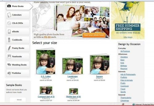
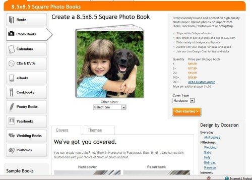
You first choose the size for your book. Each of these sizes contains 20 interior pages. You can add additional pages for $1.00 each (in the square size, at least). Choices are 8.5” X 11” portrait orientation (starts at $15.95), 9” X 7” landscape orientation ($14.95), 8.5” X 8.5” square ($9.99), 5.25” X 3.5” compact ($17.97 per set of 3), or 3.75” X 2.5” wallet ($15.96 per set of 4).
I chose a square format. Next I had to choose cover type. The square book was available in paperback or hardcover. The paperback has a full-color binding and 80# white silk stock interior papers. The hardcover has a full-color casewrap binding and 100# white silk stock interior papers. I chose the hardcover, which costs $19.95 for a single copy. There are increasing discounts if you purchase additional copies – starting with five copies.
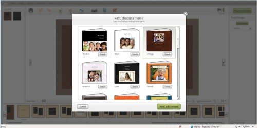
There are a multitude of pre-designed themes – wedding, baby, holiday, birthday, even yearbooks. You must choose a theme to start, but you can change the theme during the design process. I tend to be a minimalist when it comes to my photo albums. I don’t like busy background papers that compete with my photos, so I chose the blank theme. I did play around with some other themes before deciding on a final layout for my book. A theme has a series of pre-designed pages with background images and picture and/or text box layouts. For each theme, the book has a pre-defined arrangement of these designed pages. You can replace one of the pre-defined pages with another, but you cannot make modifications within a page.
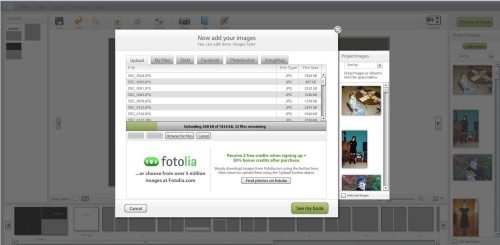
Now I uploaded my photos. I have a set of photos that I’ve used in previous photo book reviews, and I used them again for this book. There are 39 photos in this set that have been taken over the years using various cameras capable of various resolutions. The photos range in size from 68KB to 2.5MB; they totaled 34.2MB. It took 14 minutes to transfer all these photos. You can work on the layout while the photos upload, if you wish. I just let them copy before continuing. One thing I liked is that the Lulu wizard copied my pictures at the full size and resolution. I have used photo printing/photo-book publishing companies that default to “quick upload”, which reduces the resolution of your pictures to speed the upload process.
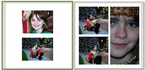
Once all my photos were uploaded, I started playing around with the layout. There is an auto-fill option that I tried first. This didn’t work well for a few reasons. The default layout for the pages required more photos than I had, so there were blank pages at the end. Secondly, there didn’t seem to be any discrimination in which picture was chosen for the design layout. The auto-fill resulted in low-resolution pictures that were stretched far too large, and high-resolution pictures that were wasted in tiny windows. Pictures were cropped badly in auto-fill. In some cases, Rachel was missing her head, or the photo would be centered in the small space so that only portions of the people in the photo showed on the sides with a blank wall centered in the middle of the photo box. Sometimes a landscape photo would be placed in a tall, narrow portrait box.
You could edit the photos in the auto-fill layout, but it wasn’t enough to correct these problems. You could rotate the image, reverse it (to its mirror image), or zoom in. You couldn’t zoom out to make more of the image fit the space, nor could you pan around to center the photo in the space to show the desired portion of the image.
I tried changing the theme to an autumn design and to a modern design to see if auto-fill worked better with those themes. It didn’t.
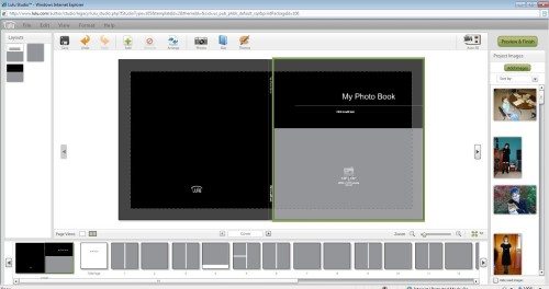
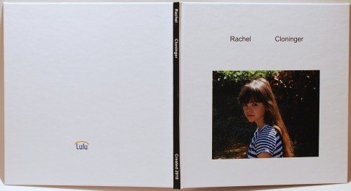
I decided to abandon the auto-fill option. I started over using the blank book theme. With the blank book, you have a white background on the cover. You can add text to a box on the back of the book. There are two text boxes along the spine of the book that you can edit. The front of the book also has two text boxes, and there is one photo box. The photo box has information about the size and resolution of the photo that will work best in that box.
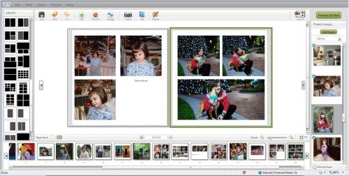
After I finished with the outside covers, I began work on the interior layout. Each page already had a photo layout selected for it, but I could easily change that by selecting a different layout from the scrolling list on the left of the screen. I added pictures to the layout by dragging my pictures (shown in a scrolling list on the right side of the screen) and dropping them in a photo box. Available layouts included a single full-page photo, photos and text, text only, or multiple photos on a page.
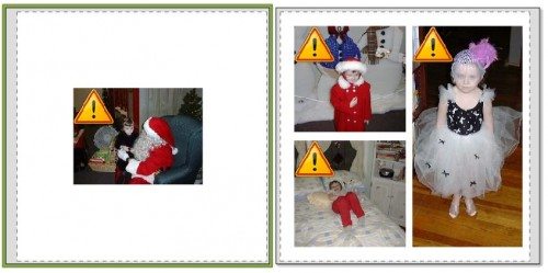
When you used a photo that wasn’t of sufficient resolution for the size of the box, you’d be warned by an exclamation mark inside a yellow triangle superimposed on the picture. You could replace the photo or select another layout with smaller photo box sizes, or you could just leave it as is.
As you work on your layout, you can see a preview of what your finished book will look like. You can save the book and come back for later revisions, if you want. After you have all your photos placed to your liking, you do a last preview, then you “publish” your book. Publishing means that the design is finalized and put into a format for printing. After this process is finished, you’ll be able to place an order, set the price for the book, and control access to the book: private (only you can access it), direct access (meaning others – friends or customers – access it directly by private web address), or general (meaning anyone can see the book through searching and browsing). I don’t want to make my book available for sale to anyone, so I marked my book private. I had a single copy printed.
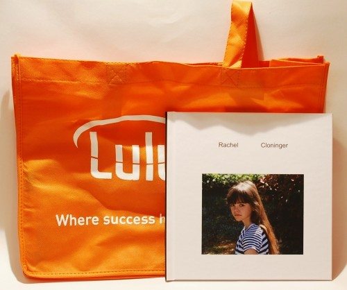
Because my book was being printed free for the review, I didn’t go through the normal ordering process. However, Lulu states their print-on-demand paperbacks usually print in 3-5 business days and hardcovers in 10-12 business days. When my book arrived, it came with a resusable tote bag printed with the Lulu logo. I don’t know if this is included with every book.
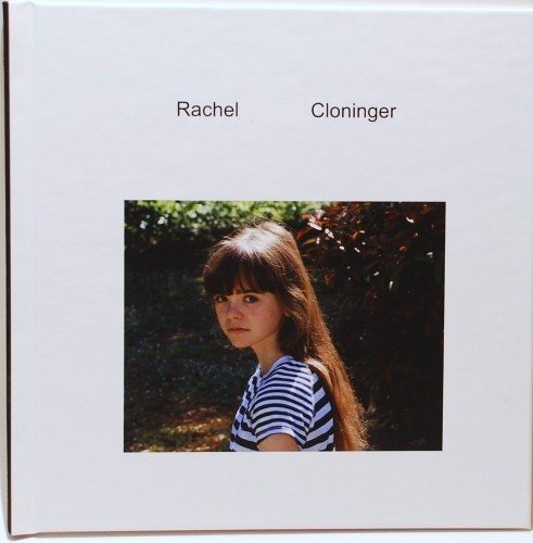
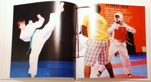
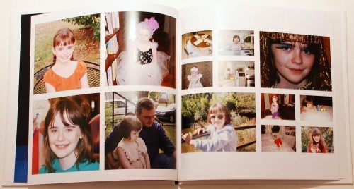
Here are a few photos of the finished book. The exterior of the book is nicer than most standard do-it-yourself photo books. The photo books I’ve had printed for myself usually have a fabric cover with an opening cut out to show a photo. These openings leave raw fabric edges that can ravel. This cover is smooth and has a bit of a sheen. It’s not glossy, but it doesn’t feel like raw paper, either. The background in the photo of Rachel is a bit dark, but she looks pretty good – and that’s what matters most. I like that the spine has a title printed on it. It makes it easier to pick the right one off a shelf when you have a title or date on the spine.
The title page inside says “My Photo Book”. I tried to change that when I was designing the book, but I couldn’t get it to let me edit the text. This may have been just a mistake on my part. However, I don’t like this title page. If it can be edited, the wizard should make it more obvious how to do it. If it can’t be edited, I’d rather just have a blank page there. This title page and a blank end page don’t count as part of your twenty pages.
The paper is a nice weight and texture. It’s smooth and has a bit of a sheen, but it’s not too glossy. Colors look nice and rich, with deep blacks and bright colors. Rachel’s skin tone and hair color look correct. I had a few pictures that were marked as having resolution too low for the size of the photo box. They printed okay, but I can see a bit of graininess in several pictures – and not just the marked ones.
The book pages are sewn together with big stitches using a heavy thread. There are two rough-textured end pages that are sewn in with the glossy pages and glued to the cover. The glued area is small, and seems to be just in the spine area. Hopefully this will hold.
All in all, I like the Lulu photo book. I like the cover more than those raveling fabric covers that are standard on many of the inexpensive photo books. I like that I can personalize the cover with a picture and with my own title. And I’ve already mentioned that I like having a title on the spine. The interior papers are sturdy, and the printing is good. I’m a little worried about the glue holding the book together, but only time will tell how sturdy that is. The Lulu photo books give your photo albums a little extra style over many other inexpensive photo books out there.
Liene M100 4x6'' Photo Printer, Phone Printer 100 Sheets & 3 Cartridges, Full-Color Photo, Portable Instant Photo Printer for iPhone Android, Thermal Dye Sublimation, Wi-Fi Picture Printer 100 Papers
(as of March 27, 2026 21:48 GMT -05:00 - More infoProduct prices and availability are accurate as of the date/time indicated and are subject to change. Any price and availability information displayed on [relevant Amazon Site(s), as applicable] at the time of purchase will apply to the purchase of this product.)KODAK Dock Plus 4x6'' Photo Printer, 50 Sheets, Docking & Bluetooth Smartphone Printer for iPhone & Android, Instant Color Prints, 4PASS Dye Sublimation
(as of March 27, 2026 21:48 GMT -05:00 - More infoProduct prices and availability are accurate as of the date/time indicated and are subject to change. Any price and availability information displayed on [relevant Amazon Site(s), as applicable] at the time of purchase will apply to the purchase of this product.)Product Information
| Price: | Varies. The book in the review was $19.99 |
| Manufacturer: | Lulu |
| Pros: |
|
| Cons: |
|




Gadgeteer Comment Policy - Please read before commenting
Were you able to compare Lulu’s interface and product to Blurb.com? I’d be curious to know which you thought was better.
@Jason No, sorry. I’ve never seen the Blurb.com product.
You can change the title page text by changing the project title (and authors) under File menu > Edit Title and Author(s). I found your review when I was hunting the answer. Eventually, I had to go to the live chat in the help section, so I thought I should come back and let everyone who sees this review know how it is done. It seems to be one of the best kept secrets on lulu.