I’ve been seeing a lot of headlines this afternoon about Google updating the web-based Gmail interface for the first time in years. I can’t remember any changes to Gmail since I switched to it as my only email client back in 2009. Software updates are usually something that I enjoy and look forward to, but today’s rumors are making me worried that a “new and improved” Gmail will wreck havoc on my productivity workflow.
I’ve considered myself a Gmail power user for almost 9 years now. I even wrote about the reasons why I love Gmail in a post from 2009. I still use all the features I talk about in that article to this very day and that’s why I’m worried… Other than labels, stars, and keyboard shortcuts, the other power user features I like to use are all Gmail Labs features which mean that they aren’t truly supported because Google considers them to be experimental.
Two of these features include multiple inboxes and canned responses. I could deal with not having canned responses because I can use an alternative like AutoHotKey on Windows or TextExpander on the Mac which is a program that runs in the background and expands certain keywords into pasted blocks of text for things that I type frequently. It’s a real time saver.

I read one rumor that Google will be bringing the same Smart Reply buttons that we have in the Gmail mobile app, to the desktop web interface. I do like that rumor and will be happy to see it happen, but I would still like to be able to create my own list of custom replies because I currently use a LOT of them.
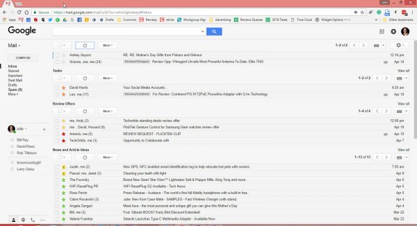
So although I wouldn’t like to lose it, I can live without the current canned responses feature. But if Google decides to ditch multiple inboxes feature, I’m not going to be a happy camper at all. Multiple inboxes allow me to easily see messages that I need to reply to or groups of messages that I use as a pseudo task management system. I like to see everything on one screen like you can see in the screenshot shown above. That way I don’t have to go searching for what needs to be worked on. If this feature is abandoned, I’ll have to create a new workflow and that’s not something I hope I won’t need to do.
In better news, other than the addition of Smart Reply buttons, Google is also saying that they will allow for messages to be snoozed so that they disappear from your inbox until a later time and will start offering offline access to mail.
Am I the only person who is more than a little anxious about what Google may decide to change or delete from Gmail? Do we need to make a sacrifice to the appease the Google gods so there will be a favorable outcome? Let me know what you’re thinking in the comments.


Gadgeteer Comment Policy - Please read before commenting
The feature I use the most and would hate to lose is the Preview mode. I’m a big fan of not having to physically open an email just to view its contents. Like other things, it’s not perfect, but I am so used to just clicking on a message in my list order to see it and deal with it that opening every email would drive me nuts.
Hmmm, I’ve never used preview. Now I have to go check it out before Google removes it! Just kidding – hopefully.
I can’t remember if it’s compatible with Multiple Inboxes. If you’re a big fan of the long line layout, then preview mode will disappoint you. I just think it saves time. 🙂
Am I the only person who is more than a little anxious about what Google may decide to change or delete from Gmail?…
No, there are more, I’m quite sure..
But really? More than a little anxious? It’s a matter of perspective… Children gassed in Syria, Gangs & murders in cities, record number of deaths from opioid…
Please. I bought a new pen last week but in light of gassings and murders I’ll return it out of guilt. This is a gadget and tech site. The authors review gadgets and tech stuff. Not as necessary as air and water but, let us be.
I currently see 2 different versions of Gmail running of my world. I support a number of individuals in a club environment. Some gmail addresses are running in an older version with a different layout.
I cannot see where you think there has not been any changes since 2009. The new version only came into effect in the last few years and is not fully cooked. In “Contacts” I need to switch back to the “old version” to do things like export contacts details.
I look forward to an update so everyone is on the same page.
I worded that wrong. I know there have been changes to Gmail over the years, but Gmail doesn’t look all THAT much different than it did back in 2009 when I look back at screenshots from my Gmail article that I linked to from back then.
I’m really excited for Gmail to get the Snooze and Reminders feature that Inbox has. Those are literally the only reasons I use Inbox over Gmail now. So I’m equally worried that somehow they won’t work the same and I’ll be disappointed! Also, there’s mention of Gmail integrating Google Keep, that would be nice since Inbox and Keep are always my first two tabs opened every morning, but that one isn’t as important to me.
I saw an article this morning on the Verge that shows screenshots. Apparently you can choose between Calendar, Keep, and Tasks for the right sidebar.
Yeah, I just saw that too! It could be really helpful if it all is implemented correctly. Fingers crossed, breath held…
I will be really curious to see how this plays out with desktop clients like Kiwi. They constantly maintain that they are a wrapper around the Gmail API’s, but they look more like managed windows than a replacement. I guess we will find out when the change starts to roll out.
Oh please don’t integrate Keep functionality into the new version of Gmail, but then scrap the standalone app and Web browser. I use it exclusively for my to do list/organizer. I don’t want it mucking up my email.
I always go back to the old gmail for that reason too. I just can’t live without multiple inboxes. It sortof works with the new layout but it just looks ugly.
I really hope google will integrate them in the new layout
I’ve not even been able to see/use the new layout yet because my Gmail is under Gsuite. From what I’ve been seeing, everyone will have the new layout by July.
My organization has always used the Multiple Inboxes lab, so I’m glad it persisted, but the problem is it’s wider now and we’re losing the ability to see the whole subject of messages in our primary inbox. (We use multiple inboxes on the left side of our screens)
I’m wondering if anyone else uses it this way and has found a solution?
That’s the way I used to set up mine too until I switched to having all the inboxes in a full width vertical scroll.