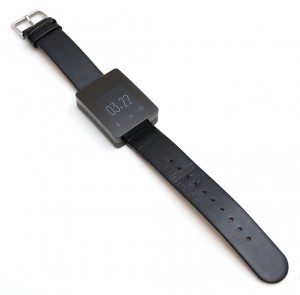
The Wellograph Wellness Watch is an activity tracker disguised as a fashionable wrist watch or visa versa. The Wellograph is a unisex watch that features a sapphire crystal, always on display and a heart rate sensor. Let’s put it through its paces and see how it shapes up. See what I did there?
Note: Images can be clicked to view a larger size.
Hardware specs
Screen: 1.26 inch low-power LCD with integrated backlight
Materials: Sapphire crystal, Stainless steel, and Aluminum
Strap circumference, 6 – 8.5 inch (15.2 – 21.5 cm).
Sensors: Tri-LED heart rate sensor, 9-axis motion sensor
Connectivity: Bluetooth 4.0 LE
Data Capacity: 4 month record for continuous use
Water Resistance: 5ATM water resistance (up to 50 meters or 160 feet)
Battery Life: 7 days per charge
Battery Capacity: 210 mAH
Watch Dimension: 42 x 33 x 12.5mm (1.65 x 1.30 x 0.5 inch)
Watch Weight: 3.52 ounce (55 grams)
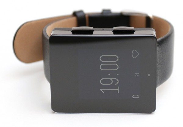
The Wellograph looks more like a smart watch than an activity tracker. The face of the watch has a white on black LCD that is easy to read even in direct sun. However, if you’re in the dark, you’ll need to press one of the buttons to turn on the backlight.
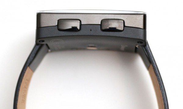
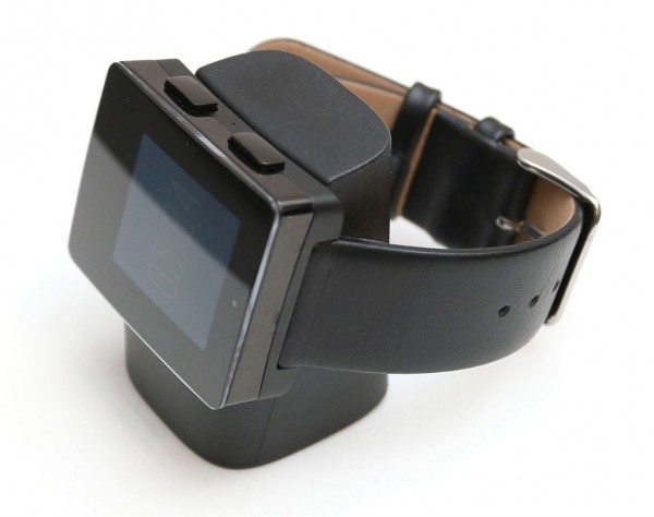
The two buttons on the side of the watch are large and easy to press, allowing you to quickly navigate through the various screens that show activity info and allow you to customize settings.
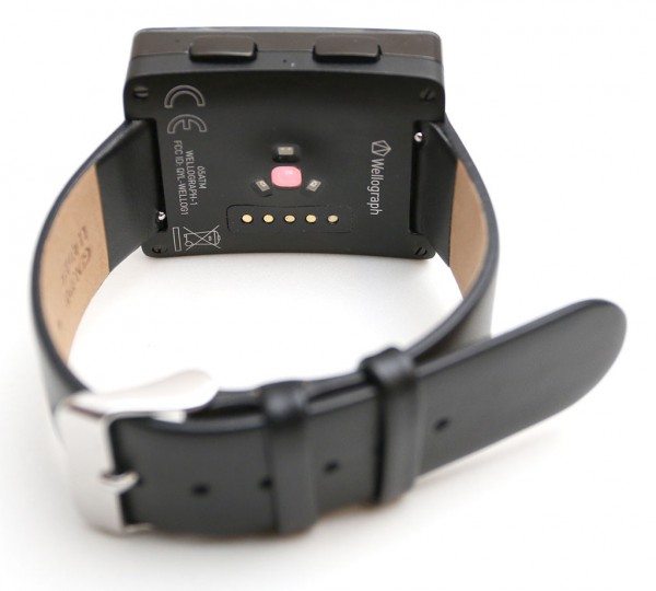
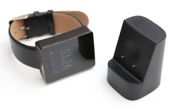
The back of the watch has a tri-LED heart rate sensor and a row of electrical contacts for the included magnetic charger.
The charger is nice and small and does not require much desk or tablet top space. You can connect one end of the included micro USB cable to the charger dock and the other end to a computer USB port or a USB AC adapter (not included).
To charge the Wellograph, you just set it on the charging dock and the magnets will help align the watch into the right position. While the battery is charging, the percentage charged will be displayed on the screen along with the time of day which is rotated so you can easily read it. It turns the watch into a little desktop clock.
Unlike most activity trackers and smart watches, this one has a long run time between chargers. I was able to use it for a full week before it needed recharging.
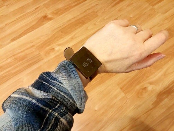
The Wellness Watch looks large on my wrist, but it felt smaller than other smart watches that I’ve tried. The included leather watch band is comfortable and easy to unfasten and refasten.
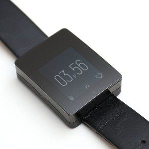
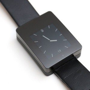
There are two clock faces for the watch. There’s a digital face that shows the time, battery level, date and a heart icon that fills in to show you how much you’ve used your heart for the day. I think the heart icon is a little silly since I’m going to use my heart all day thank you very much! 😉 But seriously, it’s just a way to see how active you’ve been for the day. The analog clock face shows the same info minus the heart icon.
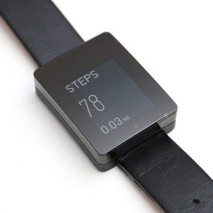
While you’re walking or active, the display will switch to the step count screen shown above on the left. You can also navigate to this screen anytime using the buttons on the side of the watch. Repeatedly pressing the buttons on the side will allow you to scroll through screens that show your steps for today vs. yesterday and miles for today vs. yesterday.
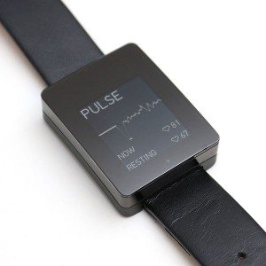
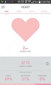
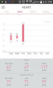
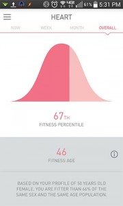
One of the best features of the Wellograph Wellness Watch is that it will check your heart rate manually when you switch to the pulse screen and at various times during the day when you’re at rest or active. It uses this info to get an accurate picture of your physical condition which it will show on the watch and app as your computed fitness age. This reading will change as your resting heart rate lowers with frequent activity.
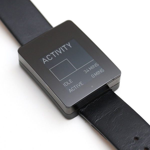
Another nice feature of the watch is that it will show your idle minutes vs. active minutes for the day. I do wish the watch would vibrate after a certain length of inactivity. As it is, it just switches the display to show how many minutes you’ve been idle. This is ok, but most people aren’t going to be looking at their watch every few minutes while they are working to see how inactive they’ve been.
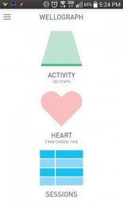
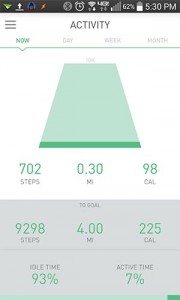
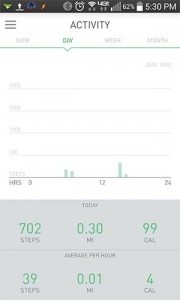
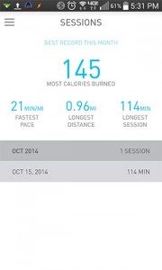
You can use the Wellograph Wellness Watch by itself without pairing it with an iOS, Android or Windows Phone device, but you’ll miss out on being able to view your health info on a larger display. I tested the app on my Android phone. It has a simple interface that shows your Activity, Heart and Exercise sessions info. The Activity screen shows the accumulated steps info for the current day, week and month along with miles walked and calories burned. By default the steps goal is set to 10000 steps. This can be changed in the app to be more or less.
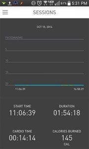
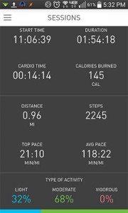
The sessions section breaks down your workout periods, providing a look into durations, calorie burn, pace and more.
Activity data syncs to the Wellograph using Bluetooth. Syncing isn’t automatic though, you have to initiate syncing through the Wellograph app. One odd behavior that I’ve noticed with the watch is that it does not keep Bluetooth turned on. Almost every time I try to sync, I find that Bluetooth has been turned off on the watch after no modification from me. I’m sure this is just a bug that will be fixed in a future firmware update. I’ve already received at least 3 updates since I’ve been testing the watch these last couple of weeks, so they are actively working on the software.
While I like the way the watch looks and its ease of use, it does lack a few features that I think would really elevate its functionality and improve the usefulness vs. price. I say that because the Wellograph is an expensive watch for what it does. With a price tag of $349, I would expect it to include features like sleep tracking, stairs climbed, alarms, and even alerts for incoming calls and text messages. As is, it only tracks steps, calories and heart rate info.
All that said, the hardware design, look and feel for this watch is definitely above average. It almost makes me think of the Apple smart watch as it looks like a high end Apple product. During my review period I had people see it and ask me about the watch, so it is noticeable – in a good way. Is the watch worth $349 though? That’s a tough one. As an activity tracker, I can buy other trackers that do a lot more for less than $100. Those trackers lack the style that the Wellograph Wellness Watch though. If you need an activity tracker that doesn’t look like the typical rubber wrist band style trackers, the Wellograph will pass for a high end watch and will not receive snobby looks when worn in the board room or fancy parties. It’s the activity tracker for the fashion conscious. I’m just hoping that they will be able to add more functionality to this watch as time goes by.
Source: The sample for this review was provided by Wellograph. Please visit their site for more info.
2-Pack LED Video Light Kit, NiceVeedi Studio Light, 2800-6500K Dimmable Photography Lighting Kit with Tripod Stand&Phone Holder, 73" Stream Light for Video Recording, Game Streaming, YouTube
(as of March 14, 2026 10:45 GMT -05:00 - More infoProduct prices and availability are accurate as of the date/time indicated and are subject to change. Any price and availability information displayed on [relevant Amazon Site(s), as applicable] at the time of purchase will apply to the purchase of this product.)ULANZI VL49 RGB Video Lights, LED Camera Light 360° Full Color Portable Photography Lighting w 3 Cold Shoe, 2000mAh Rechargeable CRI 95+ 2500-9000K Dimmable Panel Lamp Support Magnetic Attraction
(as of March 14, 2026 10:45 GMT -05:00 - More infoProduct prices and availability are accurate as of the date/time indicated and are subject to change. Any price and availability information displayed on [relevant Amazon Site(s), as applicable] at the time of purchase will apply to the purchase of this product.)Product Information
| Price: | $349.00 |
| Manufacturer: | Wellograph |
| Pros: |
|
| Cons: |
|



Gadgeteer Comment Policy - Please read before commenting
I’ll stick to my Pebble Steel with Misfit App until the Apple Watch comes out! $349 seems kinda steep to me for what it offers. Still, at the end of the day I am glad more and more of these products are coming out as this gives us better chance to get improved prices and more features down the road!
@Yeppers I didn’t realize that the Pebble could be used as a Misfit tracker. That’s kind of cool.
Seems kinda pricey, I may skip out on this product.
Wow, that thing looks HUGE on your wrist – thanks for the photo as it doesn’t look that big in the other photos. I think the size and the leather strap would lead me to want to take this off before many sports and other activities, which pretty much defeats the purpose, doesn’t it? If I ever get one of these, I’ll be looking for something that I can leave on all the time and will hardly notice it.
@Julie It was part of a recent update and it measures steps and sleep with a daily and weekly score. It works well…ish. It has crashed a couple of times.
I just don’t see the Bluetooth turning off as a big negative. Seems like it’s an obvious reason this unit needs less frequent charging. Same argument for this, how many times an hour are you going to check the app on your phone?
@Sue I just found it annoying that every time I wanted to sync the data that it would not connect and I would then realize Bluetooth had been turned off by no fault of my own. I can understand that it’s been done to conserve battery life, but there wasn’t an explanation to that fact, so it felt like a bug.
@ Julie, OK, I can understand that. Sounds fixable, though. Seems like the solution is making the bluetooth wake up and sync seamlessly “under the table” so to speak-though i suppose the sync would still be slower than with an always-on BT. Otherwise, it is a very attractive device, though pricy. 🙂
Sorry, I can’t picture this as a fashionable wrist watch.
this borrows a lot of design cues from the Pebble Steel…which is now priced at $199. The additional features doesn’t really justify $150 IMO. Even the Apple watch starts at $329
This review needs to be updated to reflect the major new firmware an app release. I have been looking for a good review to compare it with the Fitbit Surge and Basis Peak as they all do automatic activity and sleep tracking in addition to constant heart rate.