About 3 weeks ago, a box from Sprint arrived. Inside the box was a kitten. No, sorry…actually it was this nifty 7″ Android tablet from HTC, the EVO View 4G. After using it almost daily, and discussing it with everybody I could corner, I’m still somewhat conflicted about whether or not I’d buy one. By the end of this review, hopefully you’ll know what I mean.
HARDWARE
The EVO View’s full tech specs are available on HTC’s website, but the main highlights are a 1.5 GHz processor (single-core…sorry, gang) and 4G WiMax. Oh, and it has this interesting stylus, too, but more on that in a bit. Other hardware specs are very much in-line with most other 7″ tablets: a 1024 x 600 resolution LCD screen, 32GB of internal flash storage, front- and rear-facing cameras (1.3MP and 5MP, respectively), stereo speakers and mics, and all the usual ports (microUSB) and buttons (power and volume).
There are some touches that make the EVO View (and it’s non-Sprint 4G cousin, the HTC Flyer) interesting. For one, the ends of the tablet (left and right when held in landscape orientation) have these little plastic lips on them that give an excellent sense of grip to your thumbs and fingers. It’s almost like HTC took a cue from SLR designers in that regard, and is definitely an improvement (IMO) on the standard “slab” format of most tablets today.
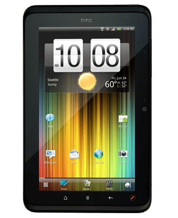
Another nifty bit is that HTC has made the extra effort to have the capacitive buttons (Home, Menu, Back, and Stylus) rotate from portrait to Landscape. When in portrait mode, the buttons illuminate below the screen (as above). But, if you rotate the device 90 degrees counterclockwise, the screen rotates AND the buttons move to the long edge now underneath the screen (i.e., the buttons shown above de-illuminate and new ones get illuminated on the left-hand bezel, which is now below the screen). It’s a small touch, but really helps with the overall user experience.
One thing I did not appreciate is HTC leaving off a dedicated capacitive button for Search, as every Android phone has. I’ve gotten quite accustomed to using that to initate searches, both within apps and in general, and not having it is aggravating.
Missing from the list of hardware features are an LED flash for the rear camera, an HDMI port, a kickstand, a removable battery, and, most surprisingly, a MicroUSB slot (so there’s no adding extra storage). [Edit: there’s a microSD slot behind the rear cover / thanks, Bruce!]
One thing you’ll notice about the EVO View is that it seems rather heavy for its size. Specs show that it weighs 15 ounces, 1.5 ounces more than the similarly sized Samsung Galaxy Tab, but in the hand, it feels substantially heavier. On the upside, however, the EVO View can be charged with a regular microUSB cable, so no proprietary nonsense there.
SOFTWARE
If there’s anything I’ve come to expect from HTC on its Android devices, it’s some interesting, and often useful, software enhancements. I’m a fan of Sense, and the EVO View has the latest version, 2.1, of HTC’s custom UI layer. With that, you get improvements like carousel-style homepage rotation, a very nifty lock-screen (which gives you immediate access to up to four apps), some updated widgets (including yet another gorgeous weather widget, at which HTC seems to be rather proficient), and a raft of tiny UI tweaks (e.g., up to 10 most-recently used apps listed right in the notification shade, and one-tab access to “Quick Settings” from within the notification shade).
HTC has also included its new Watch video rental service as well as HTC Likes (an app recommendation service), HTC Hub (a mini “store” for HTC apps, widgets, backgrounds, etc.), and HTC’s Reader e-book app. The EVO View does media sharing via DLNA and comes with Polaris Office for viewing and light editing of standard Office documents.
As has become the norm for Sprint’s 4G Android devices, there’s a widget to enable/disable 4G (when disabled, the device uses Sprint’s 3G network, which I’ve found to be generally quite adequate for normal use). Sprint has also graced the EVO View with a view of its own apps (some of which are of dubious value), including NASCAR, Raging Thunder Lite, Sprint Mobile Wallet, and TeleNav GPS Navigation (which is a reasonable alternative to Google Maps, at least for driving nav purposes).
The version of Android that comes on the EVO View is surprising: it’s Android 2.3.4. Putting Gingerbread on this instead of Honeycomb (3.0 or 3.1) might have enabled HTC to get it out the door more quickly, but it did make this tablet seem a bit dated even before it came out. I would not be surprised if the EVO View were to get Honeycomb in the near future.
STYLUS
One thing I like about HTC is that it’s more willing than most phone/tablet OEMS to experiment. Sometimes, it’s not so great (e.g., the HTC Surround, with a slide-out speaker (wha?)), but other times, it can be interesting, if not downright compelling. The stylus HTC developed for the EVO View (and Flyer), which they call the Scribe, made nearly everyone I showed it to perk up with interest. After all, it wasn’t that long ago that a stylus was an assumed accessory to every smartphone and PDA being sold.
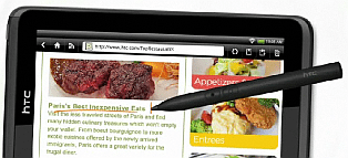
 The HTC Scribe is a capacitive stylus with a small, pressure-sensitive tip and two buttons, one for “erase” and the other for “highlight.” It’s powered by a single AAAA-sized battery. When the EVO View is triggered to accept stylus input, the stylus control “wheel” pops up in the lower right corner. From there, the user gets access to a variety of colors, drawing instruments, tip sizes, and functions (delete, undo, etc.).
The Scribe is integrated into the EVO View experience in three ways. One way is Scribble, which essentially lets you take a screenshot of whatever the EVO View is displaying at the moment and then annotate that screenshot using the stylus. If I was critiquing webpages or marking up photos a lot, that function might be useful…but I don’t.
The second way the Scribe is used is in the standard apps that you’d expect. You can highlight and mark up ebooks and it will save those marks on a separate layer within the ebook. You can highlight and markup Office and PDF files as well, just as you’d expect. And, those marked-up files get saved in the original format (a .doc stays a .doc even after being marked up, with the markups saved as individual objects, editable in Word). That by itself is pretty cool and something I’d consider using when reviewing & revising papers.
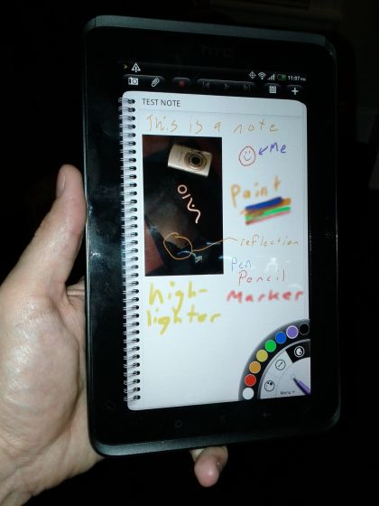
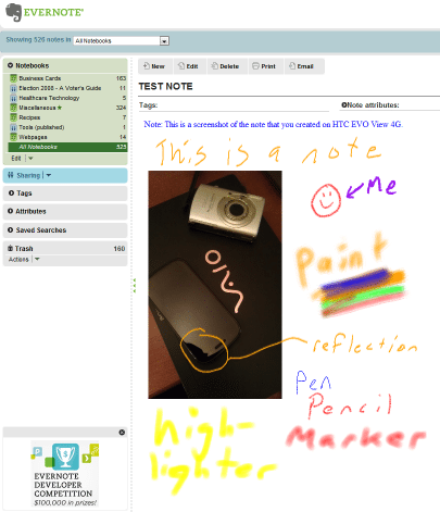
The third way is via the HTC Notes app. Notes is an all-purpose note-taking app that focuses on stylus input, but also accepts keyboard text and photos (direct from the camera or from the gallery). Plus, you can attach any document or file to a note, or attach a note to a calendar event. It’s a surprisingly nice app with a robust feature set. Also, Notes integrates directly with Evernote, so any note you make can be automatically saved to your account, uploaded to Evernote’s servers, and OCRed (my tests were impressive, with Evernote being able to make my scrawling handwritten text searchable about 90% of the time). Below is a photo of me making a note and the corresponding Evernote screenshot.
But (you just knew there had to be a “but”), as good as it could be, the actual experience was a little frustrating for me. For one, the screen still seems a little small to write on. While using a real pen on a piece of paper 6″ tall by 3.5″ wide (the EVO View’s screen dimensions) would be no problem, the EVO View doesn’t have the resolution to allow me to write as small or as clearly on its screen as I would on paper. So, the word “reflection” above is about as small as I can comfortably write without ending up with a nonsensical mishmash of scribbles. As a sidenote, Evernote was unable to OCR “reflection” or “pencil” above, but it did OCR correctly “marker” and “pen,” so there are limits to this input method.
Also, the sound of the stylus on the screen is, well, annoying. It’s tap, tap, tap, tap, tap….tap, tap, tap, tap. The Scribe’s tip is pressure-sensitive (to give control over line width), but that also makes it clicky, so any extended writing session is going to drive those around you to distraction…or murder.
Finally, there’s no convenient place to keep the Scribe. The EVO View (or Flyer) doesn’t have a stylus hole, and the Scribe doesn’t even have a clip. Moreover, because it’s metal, you don’t dare let it come in contact with the EVO View’s screen in a bag, so it has to go in a separate pocket. So, you end up with this stylus (which is perfectly round) rolling off tables, getting lost in pockets and bags, and generally not being handy. And that pretty much obviates the whole point, which is to make free-form text entry easy.
Notes is very good, but has some limitations. For example, when you insert a photo, it’s stuck there at that spot at that size. You cannot crop, resize, move, or alter in any way the photo, which seems silly given the app’s other thoughtful touches.
CONCLUSIONS
Overall, using the EVO View was enjoyable. It never seemed slow or laggy, and it’s been quite stable and well-behaved. Battery life has been very good…almost as good as the 7″ Galaxy Tab’s (which is stellar). Generally, I had no complaints about the hardware other than the weight and the lack of a MicroSD slot.
The HTC EVO View 4G on Sprint is a nice, small tablet. For some, it could be the ideal tool for their use case. For others, it will be too small, or too heavy, or not running the right version of Android. For me, the stylus was surprisingly well executed, but I think I’d need a bigger screen for it to be truly compelling. If a 10″ tablet is on the drawing board of someone at HTC, please do me a solid and include Scribe support. Thanks.


Gadgeteer Comment Policy - Please read before commenting
I have an EVO View 4G and, while I share some of your hesitation about it for the long term, I point out that is DOES have a microSD slot — it’s in the compartment at the top where the antenna is located — the cover slides off on the back and there’s the slot to install the microSD — for a GSM version (if there is one) the SIM card would be in this area as well.
Some reviewers treat the scribe (stylus) as a gimmick and pan the device pretty badly. Your review is more objective and I appreciate the points you make — it is definitely useful for those who want to use a stylus, although the inability to activate links or buttons can be frustrating (a necessary limitation if you write on the typical screen). I have a Xoom which I really like, but consider it a bit too heavy and I’ve found all the larger tablets, even the ipad2, too large for my typical use. I had thought the Flyer/EVO View would solve that issue (I had a Galaxy Tab for awhile and enjoyed it) but I’m not sure I like how small the widgets and other screen items become.
Thanks for a fair and balanced review.
I have the EVO View 4g and while the stylus is cool (The scribe and note app were big selling points for me) I’ve found that I am much more productive in the notes by just holding it and typing with my thumbs in portrait mode. I was surprised that I can type just as fast as I would normally text on my Epic. In a meeting with no table I couldn’t imagine writing in a notebook or typing on something larger like an Ipad on my lap. It’s just the right size. The scribe issue does need to be worked out. I have a case that has a slot for the scribe but its still awkward to remove and the roundness does suck. Overall I love the tablet. I shopped around and this still seems like the perfect combination of features for me.
I was wondering if using the stylus there was support for handwriting recognition as an alternative input method (similar to the old Palm Pilots) as I feel this has been one feature sadly lacking from most current tablets.
@David Not sure about anything specific to the Scribe/Flyer, but Graffiti is available for Android if you’re nostalgic for the old Palm devices 🙂 The FlexT9 keyboard also has a “writing” mode which is a one-letter-at-a-time gesture input that uses regular letter shapes. I don’t think I’ve seen any full blown handwriting recognition apps yet though… perhaps if styli become more popular some will show up.
I have the HTC Flyer and I can say without hesitation that it is a wonderful tablet. The single-core is very fast, with no lag at all compared to every other tablet I have tried. Even less lag than the iPad that I used for almost a year. The size is perfect, especially for email and reading articles in RSS feeds. I can fly through them with this gorgeous 7 inch screen. My complaints are few… as stated, no dedicated search button. I really miss that. Also, the screen is large, but you can only get 16 icons on the screen. I supposed this is because of rotating the screen to landscape… there would be no room for more than 16 buttons, but it just looks like a bunch of empty space in portrait.
Battery life is stellar. I got almost 3 days of battery with moderate use. I was forced to go a long weekend without a charger and just moderated myself. I was pleasantly surprised.
My wifi never disconnects, unlike my iPad which was constantly disconnecting and I had to press the ‘forget this network’ button all the time.
I also agree about not having a place to put the scribe… a hassle. But there are already multiple covers out there that solve this. I would rather have a thinner tablet than one with a slot for the stylus.
Craig: I enjoyed your post. We purchased the View two weeks ago and I have been putting it thru her paces as well. First annoying thing was that Sprint failed to ship the stylus (I purchased from a Sprint franchise store) and am still waiting for them to ship the stylus to the store. Secondly, I am absolutely miffed about why I can’t bring up video when I use Skype. I get sound but cannot view video image of the person I call and they cannot view an image of me. I would certainly welcome any readers input. Like you, I am very satisfied with the product. We have an IPAD but were frustrated by no adobe flash. Thanks for the post. Jim Melfi, founder, videotalks.org.
I forgot to mention in my earlier post that I purchased the stylus from Best Buy as well (at $80), which I wasn’t too happy about. Best Buy now has a bundle package where the stylus is free with the Flyer. I called them and they gave me a refund on the stylus purchase. Kudos to Best Buy.
@Jim I am not surprised about the Skype video not showing up. I am a Verizon customer and Skype video calls won’t work with all phones on Verizon. Verizon has to allow it and they don’t on all their phones.
Instead, I use both Tango and ooVoo for video calls, which both work with to any device… Android, iPhone, iPod Touch, etc. They are both good, with a slight advantage to ooVoo.
No one seems to mention about typing on the View. Is it a similar experience as typing on my Evo?
Typing is a joy. Imagine you EVO keyboard like 50% bigger. And with the landscape keyboard you aren’t stretching your hands like with 10 inch tablets..
Has anyone taken it overseas yet? I am going to China next month.
As an update to my earlier post, I learned from Sprint that in fact, Skype is only available in audio-only on the HTC View. However, I was told by the local Sprint store manager that he believes HTC will make the upgrade that will enable video as well. Jim Melfi