 One of the key differences with the Doid Eris is the UI that HTC has developed for their Android phones. The Sense UI provides a smoother interface to the stock Android interface. I am seeing this trend in a lot of phones. Motorola has the Blur, Samsung the Cube, and I am sure there will be more to follow.
Here I want to focus on what the Sense UI brings to the party. I’ll break it down to:
- UI Enhancements
- Widgets
- Core Extensions
- Extra Applications
I have mixed emotions on the current supplemental UI trend. On the one hand, anything that makes the phone more accessible has got to be a good thing, on the other hand, I am afraid that it fragments the market. Someone using an HTC phone may not take to the Motorola version as quickly. Of course, that is probably exactly why the handset manufacturers are embracing this trend.
Another issue, that is apparent with both the Droid and the Eris, is the delay in getting the latest Android OS. The Droid ships with Android 2.0 and without Motorola’s Blur interface. I can only assume this is because the Blur is not ready to work with Eclair. The Eris ships with Android 1.5 and the Sense UI, and I have heard they are working on updating the UI to work with 2.0. So if you want to have the latest and greatest, the UI add-ons are going to delay that for you.
UI Enhancements
First and foremost, the Sense UI means that the UI for your Android phone is going to look a little different.
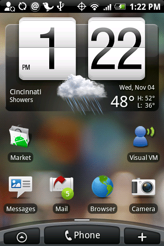
The Icons in the Notification bar are redesigned to be smaller, and also have a different look. Another change is the bottom of the screen. In the Standard Android OS you get a single centered tab that you tap to see the applications tray. With the Sense UI the center button is now the Phone button, used to launch the phone app, and the applications button is moved to the left with a new add button on the right.
The Phone button seems redundant on the Eris. One of the things I like about it is that it has the familiar green call and red hang-up buttons on the phone. You don’t ever need to tap the phone button on the screen. The add button is, well, a nice add. I know folks new to Android can be confused how to add things to the home pages, now it is more obvious. Experienced users can still use the long-press to add an item.
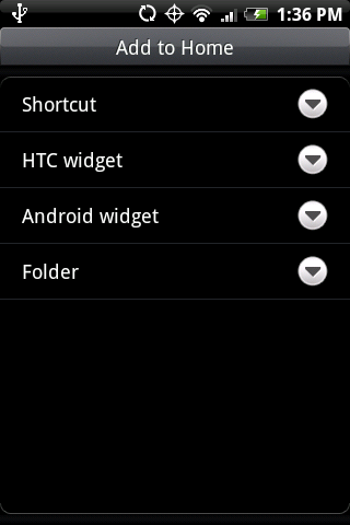
The home page now has Seven pages, rather than the standard three. This comes in really handy with the new widgets that HTC provides. When you go to add an item on a page, you get a number of options:
We’ll cover the new HTC Widgets later. Shortcuts are not actually changed in Sense UI, but it is helpful to look at what you can create. You can add shortcuts to a:
- Bookmark
- Gmail label
- Mail Inbox
- Music Playlist
- Person
- Program
I really like the ability to add a person. You can select how to contact them and create a direct dial to their mobile, home, work or even SMS them.
Other refinements I discussed in the First Looks: Droid Eris including improved media player interface, lock-out screen that lets you quickly control music player and enhanced widgets.
HTC Widgets
I could do a whole series of post on the HTC Widgets. I love the enhanced music widget, the mail widget, and the messaging widget. They take up a lot of real estate on the screen, but make your information quickly accessible. The Photo Frame is an enhancement on the Picture Frame widget in Android. You can tap on the picture to view it from the HTC widget. HTC also has a Photo Album widget that allows you to quickly browse through the pictures in an album by simply flicking up and down on the widget screen.
Core Extensions
These are the features you don’t necessarily see, but enhance the experience nonetheless. A big one is Exchange support. This did not exist in Android before 2.0. I like the implementation in the Sense UI a little better. Your calendar events appear in one unified calendar, no need to check a separate Corporate Calendar application. You can also set a signature for your Exchange, POP and IMAP accounts. You can’t do this in the stock Android 2.0 mail application. You can, of course, download a replacement mail application on the Market that would allow you to do it, but it is nice to have it built-in.
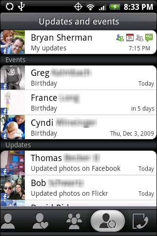
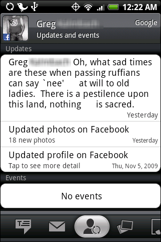
The Sense UI also takes Facebook integration a step farther and adds Flickr integration. You can attach your Facebook friends and Flickr contacts to your contact list. Now as updates occur to these contacts, you get a notice on your phone. Here you can see upcoming birthdays, and a list of updates folks made in Facebook and Flickr:
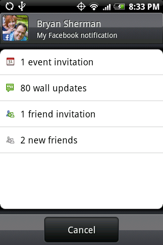
If I tap on my name I can see a summary of all my Facebook notifications:
If I tap on an individual I see the details of their update:
This has been one of the nicest features of the Sense UI for me. I will really miss this when I am back on the G1.
Extra Applications
HTC also includes some applications with the Sense UI. Two that I especially like are the Voice Recorder and Peep.
The Voice recorder is a very simple recorder for your phone. You can record on your phone, and set the recording as a ringtone, right from the application. Nothing fancy, and there are apps in the Market that do similar things, but a nice add.
Peep is my favorite, though. It is a Twitter client for your Sense UI Android phone. It is the smoothest Twitter client for Android that I have used. It does not have the multi-account features of other clients, but works wonderfully.
It provides simple tools across the bottom to access you Twitter stream, any mentions, direct mentions and favorites. You can choose among photo hosts for picture attachments and URL shorteners. Not an exhaustive list, but can choose from more than one.
Conclusions
I really like this UI. All things being equal, I would choose an Android phone with the Sense UI over one without. Of course all things are not equal. Unfortunately using the Sense UI today means being on Android 1.5. The only other negative I found was that the home page will not rotate to landscape view. Not a huge deal, and I am not sure this will change, some of the widgets would not fit in a landscape view.
I hope I get to try out some of the other UIs, but this one does show the promise of the enhancements.
Update
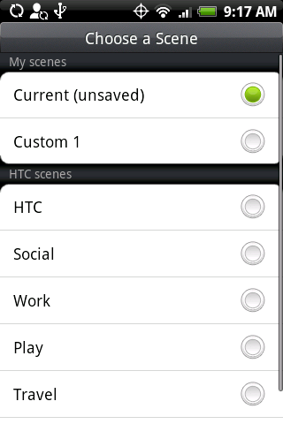
I forgot to mention another really nice feature of the Sense UI, Scenes. Scenes are alternate looks and arrangements of your 7-screen home.
Each theme has a different wallpaper and set of widgets that apply to the scenario. You can save and name your own layouts. It’s a really nice feature than expands the UI even farther.
Also, the Sense UI supports multi-touch pinch to zoom-out, spread to zoom-in in the browser and picture view.




Gadgeteer Comment Policy - Please read before commenting
i would really like to have more review on hardspecs for the eris. load times for pages, space for apps. if you have 7 pages for apps, and only room for a total of like 30 apps… whats the point of having the scenes for multiple layouts…
I just got the Eris last week, and I am in LOVE with this phone/PDA!!!! Absolute love!!!! Best phone I have ever had. And I’ve had cell phones for well over 15 years. I started out with one that was so big, you had to keep it in the car. Back then they were 3 watt, which could make a call from the moon.
But this phone, is just phenomenal!!! Just the GPS features alone make it unbelievable. Seriously, the size, the weight, the screen, everything is just awesome. The only critical thing I could say about it, is the battery doesn’t last that long. I can get a good day or so out of it if I’m using the mapping features, etc. But I am going to replace the battery with the extended battery when it comes out. But, I have a car charger so, it’s actually not that bad. Other than that, superb!
In the third paragraph the writer says that Sense UI is bad because its hard for someone to go from the Sense to Motorola’s interface.
So the interface has to be bad for it to be better? Nothing against the writer, but definately against the other phone manufactureres. They should build their interfaces better, not make one, of the best interfaces right now, worse
@Adriano
That’s certainly not what I meant. What I was trying to get at is that it makes transitioning between Android phones not as seamless. Which is likely a big reason why HTC developed it. I doubt they see the differentiation they created between their Android phones and others as a negative.
Given all the the Sense UI has to offer, I do not think it is a big negative, but I do think it is something folks should be aware of.
Seriously, this phone really whips the llama’s ace. I went into it solely on pricepoint, disappointed that I couldn’t get the Moto Droid big daddy, especially liked the idea of a real keyboard. The touch keyboard on the Eris took me about 10 minutes to get adjusted to, and I’m flying on it now. I played with the Moto Droid today after having used the Eris for a couple days, and I’m so happy my Wife’s a cheapskate. Definitely got the better phone, especially once the 2.0 upgrade releases Q1 2010.
I’ve had my Eris for a couple of months now, and I’m going to give it to my daughter and buy a Moto Droid instead. I miss a real keyboard, and the slow processor with soft keyboard has some nasty sharp edges – sometimes things hang while typing and then 2 seconds later you get a bunch of glitch characters. The fact that the keyboard doesn’t rotate except in *some* apps means the keys are too tiny much of the time. And it takes forever to rotate for some reason. Finally I want the Moto “dock mode” where it senses a magnet at its back and treats that as a dock, so you can do Nav apps etc. Finally finally the battery life is pathetic – maybe 1.5 days of standby and .5 days of heavy use. I love Android but Eris is just too hobbled to do the job for me, cute as it is.
I really gotta agree with Bob on this one, especially about the low battery life and slow keyboard. I work on a college campus that gets zero reception everywhere, so I put the phone in airplane mode to prolong the battery, but that also shuts off my WiFi, which we have campus-wide and is why I got this phone. As for the keyboard, I’m in landscape mode typing this right now, and the phone has misspelled about 10 words so far because it can’t keep up with me, even when I go quite slowly. Perhaps the 2.0 update will resolve these responsiveness problems.
i can’t figure out how to get notifications that I hear on my phone for twitter.
the home screen weather/ time widget do you know the name? I have been trying to find that for my nexus one! Thanks!