 Way, way back in early January at CES 2011, Motorola’s booth largely stole the show by featuring three massively exciting new products. While the DROID Bionic, a powerful Android smartphone headed for Verizon (hence the “DROID” moniker), was one of those products, it was largely overshadowed by the Atrix (an Android smartphone for AT&T that featured an innovative dock system) and the XOOM Android tablet. Since then, both the Atrix and the XOOM came out to mixed reviews and so-so sales, but the word from Moto was that the Bionic was getting retooled before a full launch.
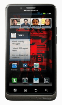
So now, after nearly 9 months of waiting, the DROID Bionic is finally available. It features a dual-core, 1 GHz OMAP CPU from Texas Instruments, 16GB of internal storage (for apps, photos, music, files, etc.), a 4G LTE radio (on Verizon’s blisteringly fast network), and a high-res 4.3″ screen. Full specs are available at Motorola’s website.
LOOK & FEEL
At 2.6″ wide by 5″ tall by .43″ thick, the Bionic is a big, substantial phone with Motorola’s now-familiar design aesthetic: edges and chrome. It has distinct angles on all sides that make it a little less hand-friendly than, say, some of Samsung’s devices. The Bionic’s edges and chrome accents make it a very masculine device, something Motorola has fully embraced with the entire DROID line.
On top, you have a power button and a headset jack. On the front of the device is the display, front-facing camera, and necessary audio openings. On the left edge, the two ports — micro-USB and micro-HDMI — are in a familiar spot for use with Motorola’s selection of docks. While other manufacturers seem to be moving to MHL ports, which adds HDMI output to what is essentially a microUSB port, Motorola is opting for dock compatibility. I’m not sure there’s a significant advantage to either approach. Personally, though, I’m not a fan of charging ports being placed on the lower half of the sides on any phone, as it makes it a challenge to hold when plugged in.
On the right edge is a rather small volume rocker, and there’s nothing on the bottom edge.
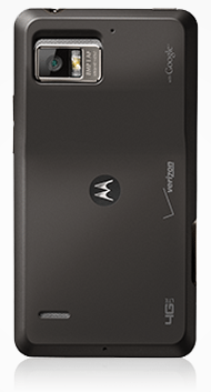
The back of the Bionic is surprisingly busy. In addition to several logos, there are stereo speaker grills, with the top one forming part of a rather handsome camera & flash module. Also, there are what appear to be two additional mics, for stereo audio recording when capturing video, but also for dual-input noise cancellation during phone calls. Cool.
Removing the back cover reveals a wafer-thin 1735 mAh battery, the microSDHC slot (a 16GB card is included), and the 4G LTE SIM slot, which is accessible only after removing both the battery and the microSDHC card.
As a package, the Bionic is a good-looking device that should appeal to anyone who is normally attracted to the DROID line. It feels very solid with minimal plasticy-ness.
PERFORMANCE
The device feels every bit as snappy in use as you’d expect a phone rocking a 1 GHz dual-core processor should. With one exception, there’s absolutely no detectable lag or hesitation in normal use.
The only time when I felt the Bionic could use a bit more horsepower was when I was using it in Webtop mode…more on that below.
DISPLAY
The 4.3″ LCD looks good to me, with excellent pixel density and good color and contrast. Sure, it’s not nearly as bright or contrasty as Samsung’s SuperAMOLED+ displays, but it seems in line with other top-shelf LCD screens (e.g., those on HTCs high-end phones). Off-angle viewing results in only minimal brightness drop-off and no color shift. On the multi-touch test, it supports at least 10 simultaneous contacts; after that, I ran out of fingers.
Some reviews have complained about the “pentile” display technology used in the Bionic’s screen (Google it if you’re curious). Personally, I don’t see the issue, so I suspect it’s not something most people are going to notice, let alone find troubling enough to consider returning the phone over.
SOFTWARE
The user interface (UI) layer Motorola offers on its Android phones used to be called Motoblur, but then they said they weren’t calling it that anymore, yet failed to say what it’s now called. So, I’ll just call it Motoblur, and it’s falling behind the UI overlays of its two main competitors. Both HTC’s Sense 3.0 and Samsung’s TouchWiz offer more customizability and an overall richer experience than Motoblur does. For example, Motoblur offers just 5 home screens whereas HTC Sense has 7. Samsung TouchWiz is the most flexible, letting the user decide how many home screens he wants, from 1 to 7. Also, both Sense and TouchWiz include color icons in the Settings menu, whereas Motoblur is monochromatic. It’s not a huge deal, but disappointing in comparison.
Motorola includes 33 different widgets as part of Motoblur, more than TouchWiz and with enough variety to likely entice a new user to start exploring widgets. But, compared to the aesthetic appeal of some of HTC’s widgets (e.g., weather), most of Motorola’s look a little uninspired. Motoblur does have a couple of features neither Sense nor TouchWiz offer (e.g., the app launcher rotates in landscape view), but inconsistencies largely undermine many of these benefits (e.g., the home screens do NOT rotate to landscape). One highlight is the “Recent Apps” launcher (reached by long-pressing the Home button), which shows a full page of app icons — far more than either Sense (8 apps) or TouchWiz (6 apps). Perhaps the most useful unique feature that Motoblur has is the ability to clear individual notifications…something that Palm’s webOS had and is very handy if you want to use your notifications as a sort of on-phone to-do list.
Other standard apps are fine. Mail, browser, etc. are all pretty functional but, like most OEM apps, generally not best in class.
TETHERING
For sharing the Bionic’s incredibly fast Verizon LTE 4G data connection, it offers both Wi-Fi Hotspot capability and USB tethering. The Hotspot function wasn’t authorized on my review unit, so I can’t say how well that works. However, the tethering worked fine. Sometimes it took a while — up to a minute — for my laptop to get attached to the LTE network once tethering was enabled. But, once attached, it maintained a reliable connection until I untethered the phone. Handily, the included My Data Usage widget provides your total data consumed right on a home screen (it also drops you into the useful My Verizon Mobile app, which provides all kinds of account details and controls).
CAMERA & VIDEO
The main (rear) camera is OK. It will make passable 8MP images, but certainly not as impressively as that the cameras on the iPhone 4S or the Samsung Galaxy S II. Photo effects include black & white, negative, sepia, solarize (a weird color remapping), and red-, green-, and blue-tinting (think festive monochrome). Several “scene” modes to choose from. In addition to the default “single shot” mode, it also offers an auto-panorama mode and a multi-shot mode, the latter of which takes 6 rapid-fire photos over the span of about a second (I found this difficult to time correctly as the phone didn’t seem to want to start taking the pictures right when I tapped the shutter button).
While full-featured, the camera did have its irritations. Perhaps most aggravating was that the camera was laggy at times…it could be unresponsive for a moment, which is frustrating, especially for a phone with this much raw horsepower. Also, you have to dig into the menu to change flash mode; three taps is too much if you need to do it quickly. Finally, the digital zoom function “zooms” slowly and does not provide instantaneous feedback, so you have to guess where the slider should be, wait for the zoom to move there, and then guess again if you wanted the framing to be wider or narrower.
Sample photos
Click the thumbnails to see the full-size, original pictures.
Video recording is similarly full-featured, offering a huge variety of options. Video can be recorded in 1080p, 720p, 720×480, VGA, CIF (352×288), and QVGA. Video effects include the same options as still photos above. The phone even offers different presets for capturing sound via the “audio scenes” option: everyday, outdoors, concert, narrative, and subject. And, of course, you can turn the LED on to illuminate nearby subjects (for when you want to film that remake of “The Blair Witch Project”). Video quality is borderline acceptable; I would hesitate to use this for any video that I really care about. Particularly annoying is the little modulation the image does when it refocuses every few seconds. Weird.
Here’s a sample video clip taken in my back yard. Please note that the rustling sound is caused by the base I had the phone on rubbing against the table. Also note that the video is in portrait mode, but that, unlike HTC’s camcorder app, the Motorola video recorder app isn’t smart enough to encode orientation into the video file, so players don’t know to rotate it correctly.
Switching between front and rear cameras as well as between still and video modes are easily done via two little toggles near the on-screen shutter button. It would’ve been nice to have a physical shutter button on the Bionic, but it’s likely not a deal-breaker for most people.
HD STATION
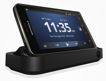
The HD Station dock is for hooking the Bionic up to a larger display. It can run a slideshow, mirror the screen, or run in Webtop mode, where it behaves more like a traditional PC.
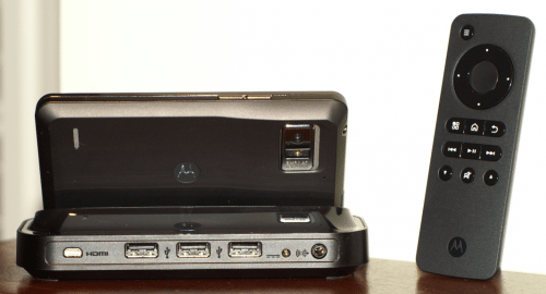
Physically, HD Station looks like a normal landscape charging dock, but is lousy with ports on the rear. There, it has three USB ports (e.g., for keyboard, mouse, and a flash drive), a micro-HDMI jack, a power socket, and a headphone audio jack. It also comes with a rather slick-looking remote control. Also included is a wall-wart power adapter with an extra-long cord (nice, Moto!). But not included is a micro-HDMI-to-HDMI cable, so you’ll need to pick one of those up on your own.
Mirror Mode does exactly what it sounds like: mirrors the device’s display out via the micro-HDMI port to any HDMI-equipped monitor or television. This is perfect if you want to show other people media files or presentations, or for games where you don’t need to see where your fingers are on the screen (e.g., driving games).

The Webtop App turns the Bionic into something akin to a desktop computer, if you plug a mouse and keyboard into the HD Station’s USB ports. A lot was written about this when the first Webtop-capable phone — the Atrix — came out, and I really do think it could be a big deal if Motorola works out some of the limitations and bugs. Overall, it works pretty well, but with two limitations. First, it’s pretty slow…slow to load webpages, slow to respond to movements of large amounts of screen contents (e.g., dragging windows), and slow to respond to mouse clicks. That last one was especially aggravating when trying to play the included demo of Let’s Golf 2…I kept missing the ideal swing spot because it lagged in registering my mouse clicks. The other limitation is, apparently, memory. On more than one occasion, trying to load a script-intensive webpage (e.g., Google+) resulted in the Webtop app complaining of low memory and then automatically closing the browser (Firefox). Needless to say, in a top-drawer Android phone targeting business professionals, memory shouldn’t be an issue.
That all said, I really do think the whole Webtop concept has a lot going for it. If Motorola can improve performance and reliability, both of which may just be limitations of today’s hardware, then docking may take on a hugely expansive role in the smartphone space.
BATTERY LIFE
So far, battery life has been very good. I’ve not turned 4G off and have easily gone a whole day of moderate/typical use. But, if you’re really good at draining batteries, there are extended batteries available.
CONCLUSIONS
The Motorola DROID Bionic is one heck of a powerful phone, but not without its compromises. The display is wonderfully high-res, but lacking in saturation and contrast. The phone is snappy and responsive when used in phone mode, but can be laggy when docked in Webtop mode. The cameras are functional, but not superlative. Motoblur isn’t very exciting, but it doesn’t seem to tax the processor much. The LTE radio offers crazy-fast downloads where Verizon’s 4G network is available, but the battery can be taxed if used heavily.
Arguably, this is the best 4G phone running Android on Verizon’s 4G network. Sure, the DROID Reveal might be a bit sexier, but it’s not available yet. Ultimately, the DROID Bionic is a powerful phone that is likely to be enjoyable to use for quite some time. Whether or not it will be upgraded to run Ice Cream Sandwich is still up in the air, but among Android phones currently available, the Bionic has to be near the top of the list for consideration. In that sense, it should help any new owner avoid the inevitable buyer’s remorse for longer than usual.


![[MINI SIZE. PRO POWER.] 45W. 10,000mAh. Smallest on the planet. Roughly the size of an AirPods Pro case, this portable charger packs days of power into an impossibly small footprint. Slide it into your skinny jeans or a tiny crossbody bag for a night...](https://m.media-amazon.com/images/I/41DHQjzn7BL._SL160_.jpg)

Gadgeteer Comment Policy - Please read before commenting
Love the phone hate the battery. I plug it in nightly and when i get to work. It will not last from morning till the commute home without the charge. That is with just sitting at my desk no usage. Maybe I am doing something wrong with the settings. Who knows. Paid a fortune, for a great phone, terrible battery life. Speed great, 4g great, all other stuff great. Battery poor.
@Charlie..some ideas for saving battery life on your Bionic. Download an app like Task Killer to shutdown apps you do not use throughout the day. Also keep in mind that not all areas have 4G service yet. Your phone will search for this constantly unless you choose the CDMA only network mode vs CDMA/LTE. Get the car charger for those times you could be recharging insteading of peaking at your power meter while driving 🙂 Lastly, price the extended battery options..most come with the bigger battery cover included. There are other things, but these should help for now
I have a droid bionic and just bought a charging docking station and it came with a remote
control which doesn’t seem to do anything, I can’t find anything on the internet that says
what it will or will not do, how it works, maybe the battery is no good, like I say, don’t know what
the remote is used for. can anybody help on this