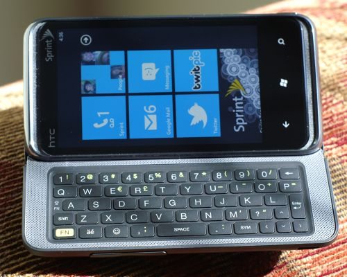
The HTC Arrive is the second landscape QWERTY slider to run Windows Phone 7 (the first was the LG Quantum), but HTC’s first try at this combination of form-factor and OS. It’s also the first CDMA Windows Phone 7 device, so this phone has a lot of “firsts” going for it.
Quick Specs:
- OS: Microsoft Windows Phone 7 (with “NoDo” update)
- Screen: 3.6″ 480×800 capacitive touchscreen
- Processor: 1GHz Snapdragon QSD8650
- Memory: 512 MB ROM, 576 MB RAM, 16 GB eMMC
- Camera: 5MP + 720p Video
- Dimensions: 4.6 x 2.3 x 0.6 inches (118 x 59 x 15.5 mm)
- Weight: 6.5 oz (184 g)
- Battery: 1500mAh Li-Ion
As far as unboxings go, there’s really nothing special about the Arrive. As you can see in the unboxing video below, it’s rather plain packaging and no surprising accessories. The one upside to getting smartphones from Sprint is, as far as I know, they all come with hefty, printed user manuals in the box; everyone else tends to give you a dozen-page startup guide and direct you to their website for a downloadable owner’s manual. If you’re a manual reader like I am, you appreciate the hardcopy.
Hardware
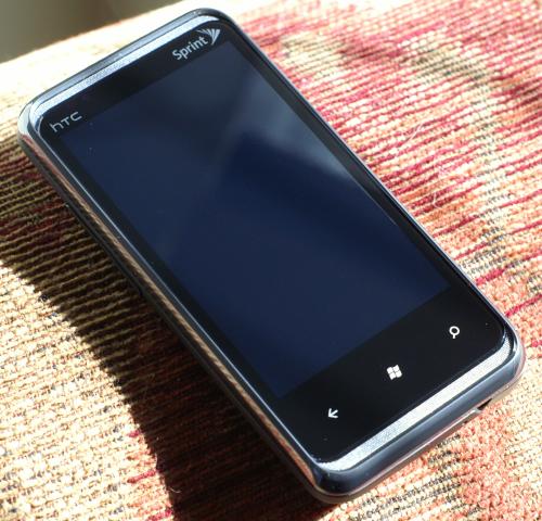
One thing you immediately notice about the Arrive is that it’s heavy. I’m used to a heavy phone — my daily driver is an HTC EVO 4G with an extended (3500mAh) battery, which weighs just under 7 oz. The Arrive, with a standard battery, is 6.5 oz. And it’s not a svelte 6.5 oz., either…this phone is quite thick (0.6 inches), pretty typical of landscape QWERTY sliders. Finally, the USB plug placement (lower left corner) means you can’t easily hold the phone in your left hand while it’s charging.
Thankfully, that pretty much wraps up the negatives on the Arrive’s hardware. I found most other physical features to be fine, if not outstanding.
First, the screen. At an oh-so-typical 800×480 resolution, there’s no delight there, but at just 3.6″ on the diagonal, it provides around 260 pixels per linear inch. That’s not quite what Apple’s Retina Display pulls off, but it’s pretty close to what the human eye can typically discern (300 dpi). Ultimately, though, it’s how it looks, and the Arrive’s display looks great. It has good contrast, excellent color, text is very crisp, and using it is thoroughly enjoyable. Off-axis viewing could be better, but I’ve seen much worse.
Being a QWERTY slider, we have to worry about two additional features: the hinge/slider mechanism and the keyboard. The 5-row keyboard feels terrific. Keys give good tactile feedback without being too stiff. Spacing is good and backlighting is quite even across all the keys. Thankfully, HTC was thoughtful enough to provide two tiny LEDs (just to the left of the A key) to indicate when the Shift and Function keys are active. One niggle is that the backspace key seems too high on the right side, as I instinctively tap where the return key is (which seems like it should be lower). But, I’m sure I’d get used to it. Personally, I’m not crazy about landscape sliders, as it seems like my thumbs have to travel too far to hit the keys in the middle. But, as they go, this is a good one.
The slider and hinge mechanism feels sold. I say “hinge” because, unlike most landscape sliders, this one also has about a tilt of around 27 or 28 degrees above horizontal. As you can see in the hardwar video below, it flips up at the end of its travel. To be honest, I’m conflicted about this tilt-sliding thing. While I want to like it, I find myself constantly making small adjustments while holding it. When I’m looking at the screen, I want it to be perpendicular to my eyes. But when I glance at the keyboard, I want that to be perpendicular, too. And, since they can’t both be at the same time, I’m tilting it back and forth quickly. One benefit of the tilt-slider configuration is that, when you have it open and sitting on a desk or table, the screen is easily visible. So, there’s that…which is nice. But, one complaint: when I slide open the keyboard, I’d assume the phone would become unlocked and ready to go. Nope…you still have to slide up (or, if holding it by the keyboard, slide to the left) the lock screen to be able to use the phone. Not easy to do one-handed.
Sound quality is excellent. The speakers on the Arrive are terrific: loud and clear. With stereo front-facing speakers, watching videos is a pretty decent experience even without headphones. The volume control rocker on the Arrive’s left side is huge and rather easy to hit; so easy, in fact, that I often hit the volume bar picking up the phone. If the screen is on — even locked — at the time, the volume changes. One complaint: even at the lowest volume setting, it’s still pretty loud (not good for some Fruit Ninja after the spouse has fallen asleep).
The camera is decent…probably about average for today’s smartphones. It’s a 5MP still shooter that can also do 720p video, which is fairly typical spec-wise. Here are some sample photos: my daughter eating ice cream in a typically lit shop at night, and an outdoor scene in early evening. While the camera has a lot of features — several scene modes and post-processing effects — perhaps the feature I’m most glad to see is the Macro capability. I was able to focus up to about 2 inches away from the phone, making it much easier to capture small details and text. Even though I’m focusing on hardware in this section, I have to say that there are some annoying bits regarding the camera app’s user interface. For one, it breaks the Windows Phone 7 design standard, eschewing the typical … symbol for menu and uses an icon of a gear in a circle. A small thing, for sure, but surprising on a phone that makes so many sacrifices purely for aesthetic design. A second niggle is that you have to go into the camera settings to change the flash mode (on / off / auto). As I do this a lot when taking pictures, it’s annoying to have to do multiple taps when other phone cameras’ UI allows this simple change with just one. But, hey, at least the Arrive has a dedicated shutter button.
Battery life is terrific. During the two weeks I’ve had the phone, I’ve charged it every other day and only once got a low-battery warning before the end of the second day. Granted, I’ve not been torturing it, but it’s good to see a smartphone that isn’t begging for juice by 5pm. Given the processor and memory in this device, it speaks to Microsoft’s engineering that they’re able to get the OS to sip power the way it does; seems that there are some advantages to a unitasking operating system. The 1GHz Qualcomm Snapdragon processor performs very well, as you can see in the second video above.
One missing feature that was a bit disappointing was the lack of Sprint’s 4G on the Arrive. Without a WiMax radio on board, this phone is limited to 3G (EVDO), which, in my experience, provides 1-3 mbps download speeds. Without 4G, Sprint has a hard time selling video chat, which may explain why the Arrive doesn’t have a front-facing camera.
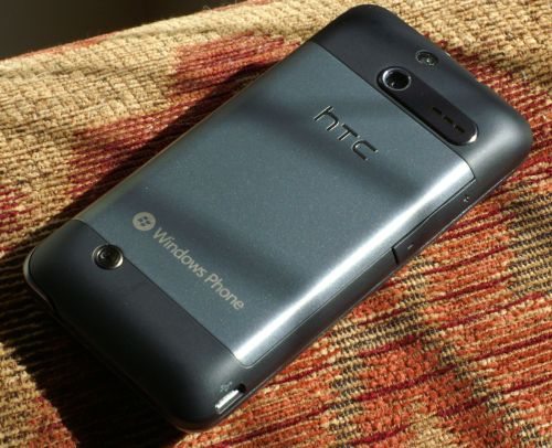
Overall, the Arrive’s hardware is very good. Sure, it’s a little thick, and heavier than I expected, but it’s attractive (the brushed steel back looks especially sharp) and performs very well.
Software
Unless you’ve been living in a cave for the past year or so, you already know that Windows Phone 7 is Microsoft’s replacement for its Windows Mobile handheld/phone operating system. I’m not going to go into the features and pros & cons of the Windows Phone OS, as there are already lots of articles that do that. I’m going to talk about some of the customization HTC and Sprint have done as well as highlight some particularly noteworthy highlights and disappointments. Also, as this phone comes with Microsoft’s latest “NoDo” update, it includes copy/cut-and-paste, which I discuss below as well as improvements to Messaging, Wi-Fi control, Outlook/Email, Facebook syncing, and a few bugfixes. So, with the Arrive, you don’t have to worry whether it’ll get the update, as it will have it out-of-the-box.
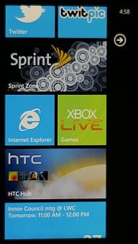
First, an apology. Because Microsoft has not included screenshot capability, nor even allowed third-party devs to make it, I had to resort to getting screenshots the old-fashioned way: with a camera. So, they’re not the best — don’t judge screen quality by these, as it’s much better in person — but you should get the idea as to the general look and feel.
The now-familiar main menu screen, all full of its square and rectangular “tiles”, includes two non-standard tiles: the HTC Hub and the Sprint Hub. The HTC Hub offers some Sense widgets like one would see on HTC’s Android phones as well as links to download some HTC-provided apps, such as a Notes program. Microsoft’s tight reins on OEM customization of the WP7 experience is evident in the rather thin value-add that HTC can offer here.
Similarly, the Sprint hub offers screens with Sprint News (including a My Account portal), Suggested Apps, and Phone Tips and Tricks. Again, there’s nothing revolutionary, but it’s nice to have these carrier-provided things corralled into one area on the phone.
 Personally, and speaking totally from my own preferences, there are some things I really like about Windows Phone 7 and some things that greatly irritate me. First, the good: – In the camera app, switching between video and still is very convenient. – The UI is very fast & responsive, which makes a HUGE difference. – Office, Skydrive, Sharepoint, and Xbox integration are all impressive features included in the cost of the phone; if you’re deeply entrenched in the Microsoft ecosystem, these things can be important. – The Hubs concept works really well. Organizing information and functions into these conceptually sensible cores really does seem to help usability. This photo is one screen from the People hub, showing some Facebook updates.
Now, the not-so-good:
- No way to see picture details in the photo viewer; I found no way to view a photo’s EXIF info on the phone.
No persistent clipboard; when you copy or cut some text, a little clipboard icon appears above the keyboard. When you paste the text by tapping that icon, it disappears,meaning you can’t paste it multiple times without also copying it each time. As people pointed out in the comments, you can swipe sideways to bring back the paste icon if you want to paste the clipboard again.- Rotation frustration; Many things don’t work in either landscape or in portrait orientation, and there doesn’t seem to be any sensible pattern as to what will work in which orientation. For example, screens that only work in landscape include viewing photos (so if the photo you took has a portrait format (tall, not wide), it’s all shrunken down with lots of black on either side…and rotating the phone does nothing…aaagghh!); And, of course, some screens only work in portrait (even if the keyboard is open), such as the main menus and Marketplace app details screens (this is particularly amazing: Main menu is only portrait; tapping the Marketplace hub brings you to another screen that’s only portrait; but, if you tap the Search button, that screen does work in landscape to show you the results of the search; but, tapping on any app takes you to the app details page, which is, again, portrait only. It’s really quite baffling.)
- No Flash in the browser; and here I always thought Microsoft was the anti-Apple.
- Animation gets old quickly; I handed the phone to my wife and, after 30 seconds, she says in an annoyed voice, “do you like these menus flipping around all the time?” No…can’t say I do.
- Miss a menu button in a consistent place; since you have to rely on the … icon to make an appearance in order to get into settings within an app, it’s sometimes hard to anticipate where it might be, meaning the user has to hunt for it or “keep an eye out”.
- Have to touch the top area of the screen to show battery level and wireless signal strength; these are hidden from view by default.
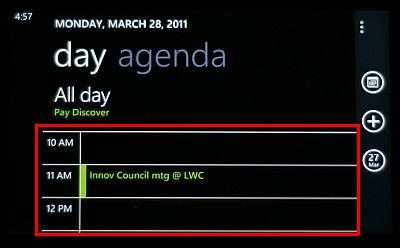 Terrible calendar; many of these issues are annoying, but this one is a definite show-stopper for me. The calendar is absolutely dreadful. As you can see in the screen shot, the entirety of the space where you can actually view and scroll through your appointments (the red box) is only about a third of the entire screen. I can see just 3 hours at a time. Plus, there’s no week view…you can choose among agenda view, day view (shown), and month view (where the text is illegibly small). If I had to use this calendar every day, I’d use the Arrive’s voice search to quickly look up instructions for hari-kiri.
I don’t like being this negative about an entire mobile operating system — I really do believe that consumers are best served by having lots of choices — but Windows Mobile 7 has two big strikes against it in my view. First, it seems like it’s not done. There are so many missing features, oversights, and inconsistencies that you can tell it’s very much a work in progress. Hopefully, that will improve over time. The second issue, however, is possibly more troubling. Microsoft seems to have gone off the scale in sacrificing function for form. For me, the usability limitations of WP7 far exceed the aesthetic enjoyment. But, as they say, beauty is in the eye of the beholder.
Summary
It’s odd, really…the reaction I have to this Arrive is exactly the opposite that I had to the Palm Pre when it first came out. On the Pre, I felt like the OS was genius and the hardware was rubbish. The Arrive is, well, just the reverse: the hardware is generally delightful, but the OS greatly hampers the overall experience (for me). Overall, if you already like Windows Phone 7, you might like this phone very much. If not, and you’re looking for a CDMA phone to try it out on, they might as well have called the Arrive the ‘Obi Wan,’ because it’s your only hope.




Gadgeteer Comment Policy - Please read before commenting
Seems like you nit picked WAY to much. You are suppose to review for the masses. Nobody really cares about looking at the exif info of pictures on your phone. Save that for the desktop. If you spent a little more time with the OS you would know after you paste the text, all you have to do is swipe to the right where the icon sued to be to get the icon back. You can do this cross multiple apps, hubs, etc… Copy text from the web browser and you can paste it in any app on the phone. The rotation and no flash are being fixed in the update coming in the summer. The hiding of the battery and wireless information is better hidden cause it allows for more screen real estate. The calender is fantastic, I don’t understand your problem with the calender software.
I seriously don;t think your reviews should be taken seriously at all.
Apparently the copy/paste is repeatable. There’s a bar that normally has word suggestions while you’re typing. You either touch or swipe it to get the paste to show up again. Apparently is was a programming decision, as an overwhelming majority of copy/pastes involve 1 paste, so you have to take an extra step to repaste.
Not too different from a lame Engadged review, but you’d think that Google would hook you up with the above revelation after 10 seconds.
Thanks for the correction about the paste function; I’ve updated the review to reflect that. But, seriously, if you have to Google to figure out a feature as simple as copy-and-paste, the UI design guy is doing it wrong.
I got the Arrive about a week ago and I really like it. I do hope they fix the screen orientation problem though. I think all screens should work in landscape and portrait, but at least you can open the keyboard and still type in a menu thats in portrait if you like.
A small gripe I have is when looking at apps and under the description where it says “show more” I sometimes have to touch it several times before it shows more. Its the same in some games too like Traffic Cop. Not sure if its my screen or just the way it is?
The volume rocker on the side it a little touchy and the camera button I seem to have to press a little harder to get the camera to start up when the phone is locked.
I like that the battery indicator and such hide, thats fine, I just wish it gave a percentage value to how much battery life is left. Just for quick viewing.
An HDMI port would have been cool. So if I’m at a hotel or some place I can watch Netflix on a big screen TV. I don’t really miss 4G though. I probably would have kept it turned off most of the time unless I was doing something that really needed it (Probably watching Netflix on a big screen TV). 3G seems to be fast enough for most things.
Hopefully they start to do an update cycle thats like the PC, so things can be fixed and added on the fly if needed.
I know it seems like a lot but I don’t think so. I really love the OS and the battery live is good. The gripes mentioned above are tolerable because the phone and OS is so usable and fun. I’ve played around with Android and iphones an I have bigger gripes with them. I’m really looking forward to the next update. I just hope the new multitasking feature doesn’t shorten the battery life. We’ll get flash which will be nice, maybe get some cool flash games, or they’ll add flash games to the Facebook app.
I bought the arrive and have been extremely pleased with it. There are some items that can be annoying, but coming from a person who had an android phone this phone and OS are way better. Hopefully there will be some more landscape enhancements for the OS; the landscape keyboard is mostly only useful in email, texting and browsing. Switching between apps with keyboard open is not ideal.
Overall, if i had the choice i would buy this phone again. my wife liked it so much she got one too (switched from iphone on AT&T finally!)
Just a minor niggle: there is only one speaker on the arrive, and it’s on the back. It sounds like there are two speakers on the face of the device, but it’s all coming out of the single speaker on the back of the phone. Next time you watch a movie or listen to music, try it for yourself. Slide open the phone and notice that there will not be any sound emanating from the screen.
I can appreciate most of you critisims of the OS although I don’t share the same opinion on some of them, but, the calendar comment is a bit harsh. Granted, there is no week view, but if you simply rotate the screen in day view, you do get 7 hours visilbe on the screen.
@PhilR8: Actually, we’re both not exactly correct. There is a speaker on the front above the screen…you can hear it when you’re in a call (the rear speaker isn’t on). But, when listening to media, you’re right…it’s not stereo speakers on the front…all the sound comes out of the speaker on the back near the camera lens.
To everyone who thinks the WP7 stock calendar is fine and dandy, sorry, it’s just not, at least not if you use it a lot. Several features common to most any smartphone platform’s calendaring function are missing, including:
1. Syncing secondary calendars — I have 5 secondary calendars in Google, 2 of them absolutely essential to have with me at all times, and none of them sync to the phone. That’s a massive fail.
2. Fixed set of reminder times — If I want to have a reminder go off 20 minutes before an event, I can’t…WP7 forces me to choose among fixed times, and 20 minutes isn’t one of them. Nor is 45 minutes…or 2 hours. Just pointlessly limiting.
3. Adding attendees is nice! But, when you cancel an event that has attendees, it asks you if you want to send them a note letting them know. If you don’t, what do you do? There’s no “no” button and hitting back takes you back to the event details screen. It seems like there’s no alternative but to go ahead and send the cancellation notice.
4. Repeating event choices — I can’t set an event to recur on the nth weekday of the month. For example, I have a regular meeting on the 1st Tuesday of every month…can’t set that repeating pattern in the calendar, as it’s not an option.
There are more annoyances, such as the number of taps it takes to do anything, but that seems to be a common complaint of nearly all platforms these days. However, the WP7 calendar is especially lacking. If you’re satisfied with it, great! But I’m not…not even close.
All calendars do show and they are color coded. I think that people should explore this phone more before making judgements about what it does or doesn’t do. Also I saw on another site where someone said there is no FM radio but there is it is located in Zune and it is awesome!
I agree 100% with your review. Those are the key points that prompted me to not keep mine. Other than no 4G, No WiFi Hotspot and no Flash (which I already knew weren’t included), the poor calendar made my decision to return it very easy. Microsoft always had excellent calendars on their Windows Mobile devices but for some reason have eliminated the business and professional features and have instead tried to make it look hip and cool for the regular consumer market. The calendar reminds me of the Touchwiz UI on the Samsung Android phones. It looks like something a 5 year old might like, but not a business professional or adult. I was really looking forward to Windows Phone 7, but it looks like it might be several years before I could even look at it again. Great Review! All of the naysayers are Fanboys and simply overlook all of the deficiences of this OS.
@Geeklady: No, secondary calendars (additional calendars within the same account) do not show up. Not only is that my first-hand experience, but it’s also what Microsoft’s own tech support states: http://answers.microsoft.com/en-us/winphone/forum/wp7-sync/secondary-calendar-syncronization/6004e9f6-aa31-4145-9a9d-288c3d020026 Sure, at some point in the near future, the phone may indeed sync secondary calendars, but it doesn’t now, and that’s what I’m basing my review on.
I think you should take into consideration that this is a new OS that Microsoft wrote from the ground up in about a year. the other platforms took a few year to write. google took atleast 3 year with nearly 2 years of launch delays. Apple took just as long to write iOS.
the OS with the present limitations still has more than android and iOS built into it.
office is the biggest.. i can get free stuff to manipulate word and excel docs but the have draw backs. I have manipulated docs and excel files in the past with free software only to find out that the formulas and formatting has been corrupted.
no thanks, i’ll take wp7 limitations over anything on the market today.
Done with contracts. The only contract I sign these days is one I’m getting paid. For $449 dollars it ought to do my laundry and take my dry cleaning to the cleaners. Otherwise Windows 7 HTC Arrive is taking you to the cleaners and frankly, there’s better out there. So tired of junk companies flaunting their junk.
Craig,
Thanks for the review. I agree with most of it.
But I got my phone only a few days ago and I guess the OS has been updated some.
1) Cal function is great. Has most features of Outlook. You should look at it again.
2) It is 4G capable and Sprint forces a “prem data” upgrade for it.
3) The KB slider feels “tough” because it’s not cheaply made.
I’m still learning the phone and the OS, it is a big hill to climb, but so far, so good.
The Arrive is NOT 4G capable. The $10 premium data fee applies to all current Sprint smartphones (except the Replenish), not just 4G devices.
Well, I happen to get one that’s broken and has no back and no screen, it does turn on though so it’s not a total loss. I was just wondering if there was a way to get a cheap back cover and screen replacement.
Dan, I’m guessing your only option is to find one on eBay for parts.