NEWS – Have you ever visited a frustrating website? You know what I mean – the one where the buttons don’t work, hint characters don’t clear from text boxes, tab order doesn’t work and so on? The folks at Bagaar have built a shrine to poor web design with their User Inyerface web page.
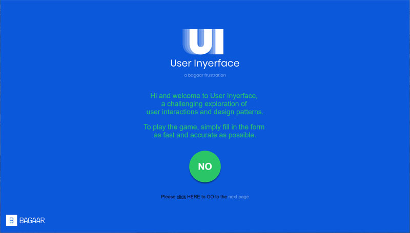
Once you figure out how to begin, the main page opens with the following banner:

Of course, the wording is confusing and the buttons, or more correctly, button and non-highlighted text, are the opposite of what you’d expect. After you accept those terms, you get the following severely messed-up user interface.
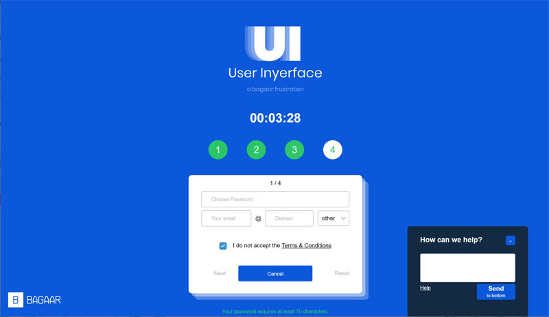
There are fun elements all over the screen. There are missing buttons, cursors that don’t change, useless distractions and so on. I won’t detail them for you and spoil the fun, but suffice it to say that the folks at Bagaar went above and beyond to pay homage to all the frustrations I have ever seen in web design, Especially frustrating fun is the pop-up reminding you that time is ticking!

Be sure to explore all the pages as there are fun elements on every page. Enjoy!

Gerber Gear Suspension 12-in-1 EDC Multi-Plier Multitool with Pocket Knife, Needle Nose Pliers, Wire Cutters and More, Gifts for Men, Camping and Survival, Grey
(as of June 20, 2026 18:48 GMT -05:00 - More infoProduct prices and availability are accurate as of the date/time indicated and are subject to change. Any price and availability information displayed on [relevant Amazon Site(s), as applicable] at the time of purchase will apply to the purchase of this product.)