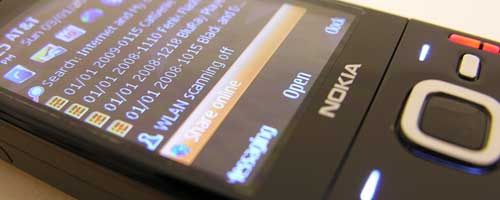
You know how it is when you get a brand new phone, you have to adjust to the location of its buttons, navigation of menus, etc. That’s what I’ve been doing the last couple of days with the Nokia N85. This part will focus on:
- First impressions of the user interface
- Making and receiving calls
- Browsing the web
User Interface
Prior to buying the N85, I had been using the N80 off and on. Even though the N80 is over 3 years old and very chunky in comparison to current phones, I have always enjoyed using it because it just plain works. There is also something about Nokia phones that has always impressed me… they seem to be able to hold a signal better than most other phones.
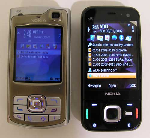
A quick look at these two phones shows that the N85 is a sleeker version, updated with a thinner and shinier body. While I do like the thinner body of the N85, I find myself missing the individual buttons of the N80.
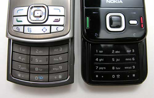
As you can see, the buttons on the N80 are all seperate physical buttons, while most of the buttons on the N85 are not. What’s the big deal? I can’t really put my finger on it (pun intended). I’m probably just being picky as usual, but for me the N85 feels slightly awkward to use. Interacting with the phone feels stiff and not as comfortable as on the N80. The N85 is also a bit ‘creaky and cracky’ when pressing the various buttons.
The Navi wheel on the N85 does have two unique features. One feature is touch sensitive. You can actually turn on a feature that will allow you to slide your thumb around the Silver ‘wheel’ to scroll through menu items. Think iPod nano touch wheel and you get the idea. In reality, the feature isn’t all that great. I turned it off after a day or so playing with it because it acted a sort of hurky jerky.
The other feature of the Navi wheel is the LED that surrounds the center button. You can turn on a breathing feature that will slowly fade the White LED on and off. It’s sort of like the power LEDs on Macbooks. Just a little eye candy…
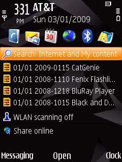
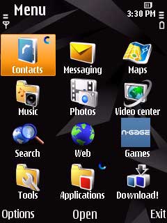
Navigating the interface is not difficult. The main menu is accessed with the dedicated menu button in the bottom Left corner that looks like two planets revolving around each other. Pressing it will present you with one screen of icons in grid view. You can also show these icons in a list, horseshoe or v-shaped list views.
Making and Receiving Calls
There are several ways to initiate a call with the N85. If you have a Bluetooth headset, you can use voice dialing.
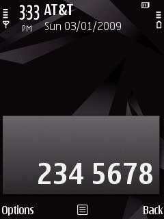
From the home screen, you can just type in the number you wish to dial with the keypad or hold down a number on the keypad if you have 1-touch dialing set up.

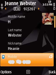
Another way to dial is to look up a number from your contacts list. Go into the contacts application and start typing a name using the keypad and the list will continue to filter as you type. Then you can go into the desired contact and select the number to dial.
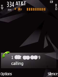
When a call comes in to your phone, you will see the number along with their photo if the person is in your contacts list and has a photo associated with them. You can silence the call and have the option to send a predefined text message to the caller.
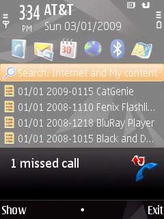
When you miss a call, you’ll see a message on the display and have the ability to see details about the call.
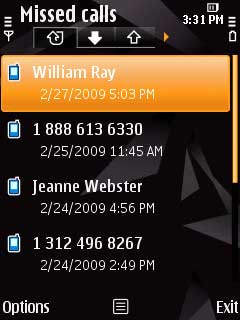
You can also view the call log, which includes incoming, outgoing and missed call lists. Press the Green call button on any of the entries in these lists will dial the number associated with that log item.
Like other Nokia phones that I’ve tested, this one does very well at holding a signal. I haven’t had any dropped calls yet and the audio quality on both sides of conversations is as good as can be expected here (Columbus, Indiana) on the non-3G AT&T network. Am I dissing AT&T? Yeah, a little… 🙂
I did find out that you will want to extend the phone (slide open the keyboard) when you are making or receiving calls with this phone. Calls do not sound as clear (to the other party) when the phone is closed even though I believe that the microphone is built into the bottom edge of the top sliding part of the phone.
Browsing the Web
For the browsing part of this review, I mainly used the built in WiFi because it’s much faster than EDGE speeds.
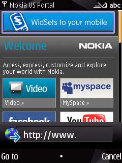
Browsing with the N85 is only a so-so experience for two reasons – text input and screen size. Typing in web address can be really frustrating using the numeric keypad.

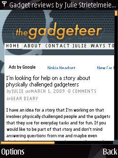
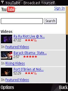
And the small display can be a challenge as well. To see the entire main column of The Gadgeteer, I had to zoom the display to 50% normal size. The image above on the Left is at 100%. The image on the Right is 50%. It’s still readable, but not really comfortable.
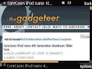
Rotating the display to the landscape orientation does help considerably though.
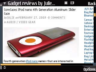
Since the N85 does not have a touchscreen, you use the Navi Wheel to move around a tiny pointer icon to click on links. It’s not hard to use, but if you’ve ever used an iPhone or iPod touch, the N85 will make you feel like you’re trying to surf with your hands tied behind your back.
I would say my main issue with surfing is that I groan every time I have to enter any text such as a user name / password or web address. Using the keypad to enter even a few words gets tedious very quickly for me.
As you noticed from the screen shots shown above, you can watch YouTube videos on the N85 as it has support for Javascript and Flash Lite. When you click a video link, it will load into Real Player. It works pretty well through WiFi.
As a phone, the N85 does a decent job and I don’t have any real complaints. I would like to be able to use voice dialing without a Bluetooth headset though *. As a web surfing device, I wouldn’t use the N85 unless that was the only device I had nearby and I didn’t need to do any intensive surfing.
The next part of my series on the Nokia N85 will focus on:
- Using the camera
- Capturing video
- Listening to audio
- Playing games
* Reader Kenneth Wong pointed out to me that you don’t need a Bluetooth headset to use the voice dialing feature. All you have to do is hold down the Right select button above the Red end key. Thanks Kenneth! 🙂


Gadgeteer Comment Policy - Please read before commenting
Try downloading Opera Mini for a browser – faster, easier and much nicer to use.
Are you hip to Mippin.com?
It’s free, and your site will be rendered for mobile browsing.
http://tinyurl.com/adynr8
@Geakz I’d not heard of it, but I searched on the gadgeteer and found some reviews. Interesting…
Thanks for the great mobile news.
Is the text messaging set up in conversation or standart text form? Please email answer to [email protected]