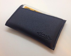
 Minimalist wallets seem to be the rage on the crowdfunding site Kickstarter. You know, those uber-slim, ultra-small wallets that help you carry less in a smaller, lighter-weight package (and avoiding the dreaded Costanza Wallet syndrome). Steven Elliot is no stranger to slim wallet projects, having already successfully run two of them, and his latest Kickstarter campaign, the Dash 3.0 wallet, is nearing the end of its funding period and looks to be a very successful campaign. As a fan of slim wallets myself, I was excited to have been given the opportunity to try out a Dash 3.0 wallet. Gadget on!
Click any image to enlarge.
Background
A while back, Steven Elliot launched his first campaign and the original Dash wallet raised an impressive $64,000+ compared to its $10,000 goal. His next campaign, the Dash 2.0, raised an even more impressive $76,000+ compared to its $10,000 goal. Both campaigns featured thoughtfully-designed minimalist slim wallets. Steven has since created a website, DashWallets.com, to continue to sell his products after the conclusion of their respective Kickstarter campaigns. But not one to curl up and take a nap in his design studio, Steven has improved his Dash wallet design once again, and the Dash 3.0 campaign is in its final few hours as of this writing, and is on track to be as successful as his two previous campaigns.
Options
In the Kickstarter campaign, the Dash 3.0 is available in the following options:
- Materials = Safiano leather or Vegetable Tanned leather
- Colors = Safiano leather in Black, Brown or Navy. Vegetable Tanned leather in Black or Brown.
Packaging
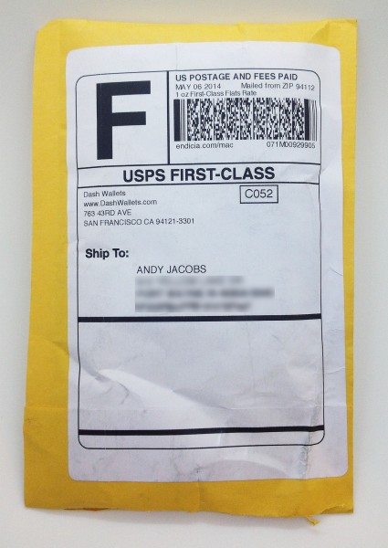
The Dash 3.0 arrived in a standard bubble envelope. Simple, cheap and effective.
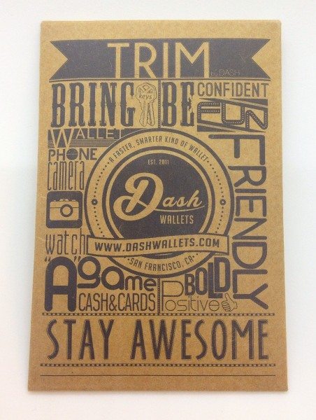
The Dash 3.0 was enclosed in some interior packaging as well, a simple cardboard sleeve with the Dash Wallets logo and some funky artwork on the front of the sleeve…
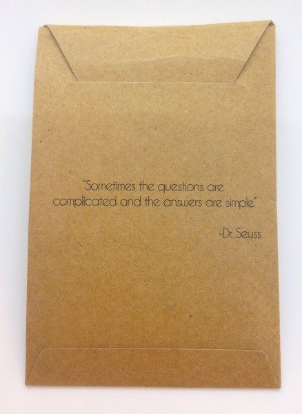
…and on the back of the sleeve, a quote by Dr. Seuss (and who doesn’t love Dr. Seuss?) on simplicity, a nod to the simplicity of the Dash 3.0’s design and how it might just help simplify your life (or a least the stuff you carry in your pockets every day).
Contents
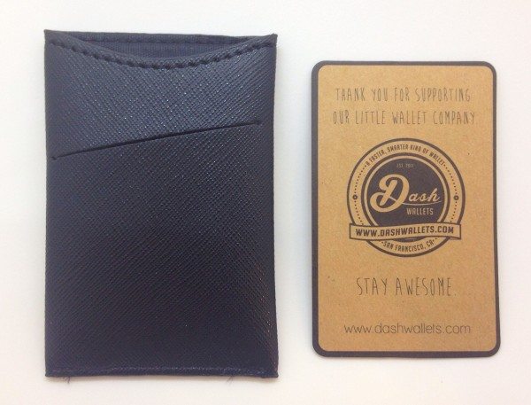
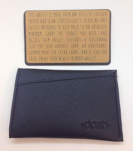
The Dash 3.0 itself contained a credit card-sized cardboard card (yeah, I just typed that), also with the Dash Wallets logo and site URL on one side…
…and on the other side a short description of the Dash 3.0’s construction and features.
Construction
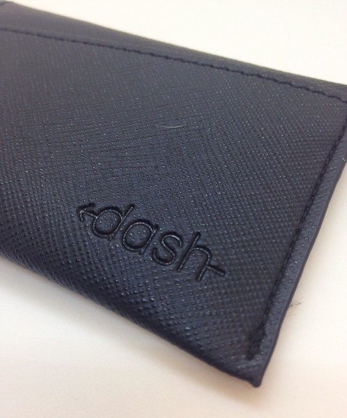
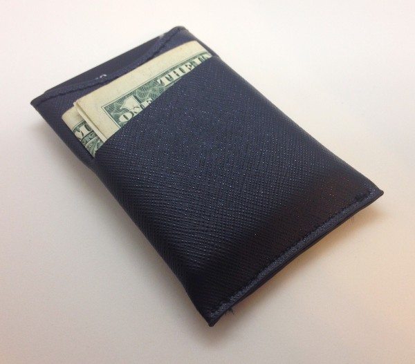
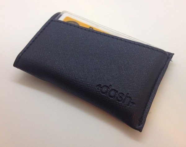
Through the Kickstarter campaign, the Dash 3.0 is available in two materials, Saffiano leather and Vegetable Tanned leather. I was sent a Saffiano leather version in black color for review. I had no idea what Saffiano leather was, so I did some online investigations. Turns out that it is a type of leather that has undergone a stamping process that makes it more scratch and stain resistant. It tends to be used in business bags and briefcases but is also used on handbags, purses and other items. As can be seen in the image above, the surface of the Saffiano leather is somewhat dimpled or dappled in a cross-hatched pattern. To me, it has a bit of a synthetic leather feel (remember pleather?), which is one of the complaints that some people have about it. To be honest, I’d really wanted to try out one of the Vegetable Tanned leather versions, but the Saffiano leather’s thinness and durability grew on me over time.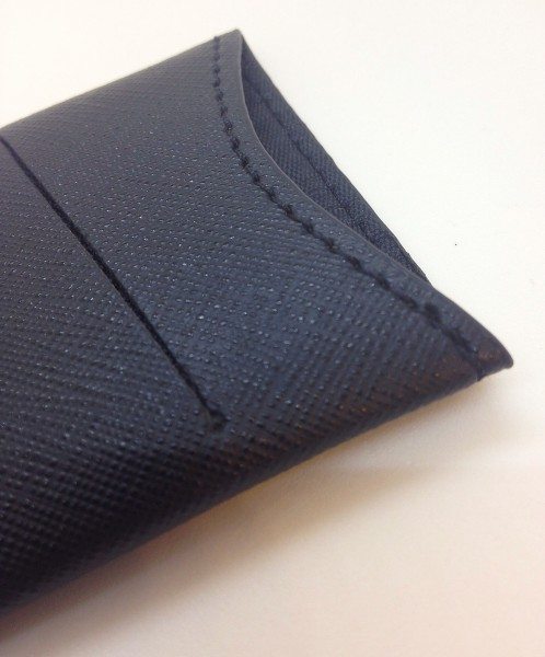
The stitching of the Dash 3.0 was excellent in all locations that I could see. The edges are said to be oil-coated to cut down on fraying of the material. In addition, the rear slot is laser-cut into the leather and had a straight, smooth edge, and also had a small circular cutout at either end to provide stress relief when loading it with cash or cards—a nice touch.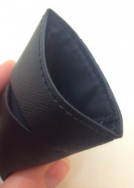
The Dash 3.0’s interior is lined, which is another nice touch, but I wondered how much it might be contributing to the thickness of the wallet. The lining seems thin, so my conclusion was that it was increasing the wallet’s thickness minimally. In addition, I should mention that the Dash 3.0 is constructed from a single piece of leather that is folded and sewn in a way that minimizes the wallet’s bulk while maximizing its carrying capacity.
Features & Functions
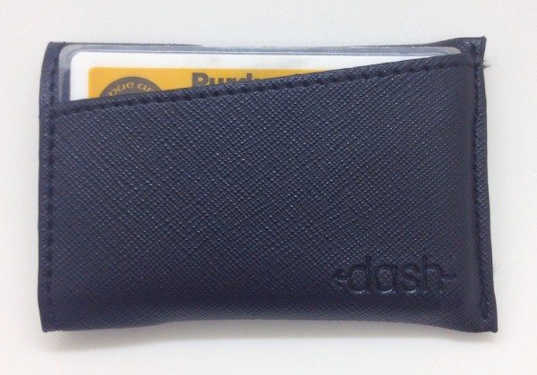
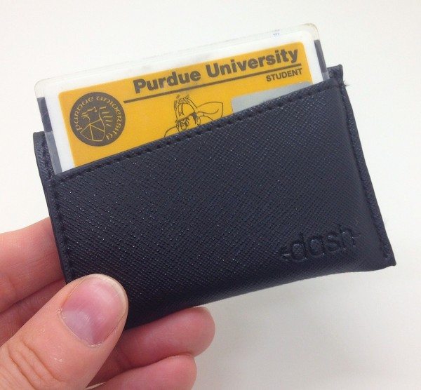
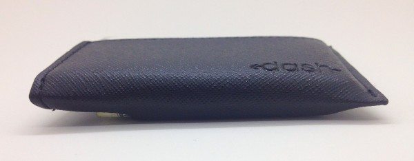
The front of the Dash 3.o has discreet “dash” logo stamped into the lower left corner. It also features a single “horizontal quickdraw” pocket with its opening set at a slight angle, 30 degrees to be precise.
This angled pocket is intended to hold the one card that you most frequently use, like your ID or your main credit card, and as such the slight angle helps expose just a bit of the corner of the card for quick access. And no, I am no longer a student at Purdue University, but I will always be a Boilermaker. 😉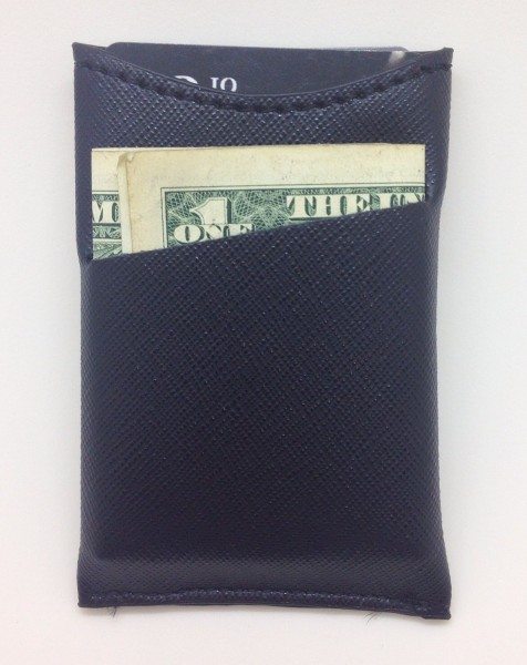
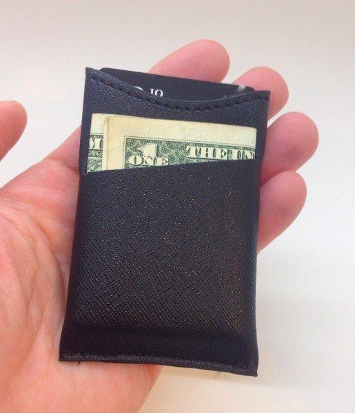
The back of the Dash 3.0 features a vertical pocket that is intended to store cash or additional cards. In keeping with the wallet’s aesthetic and functionality, this pocket’s opening is also again set at that slight 30 degree angle in order to provide just a bit more of the corner of your cash for easier access. The only way to insert cash into this pocket was to fold it into thirds, as folding it in half did not allow the bills to fit.
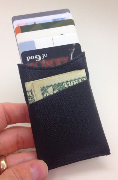
The center of the Dash 3.0 has another vertical pocket, this one with a curved opening on the back side. This pocket is intended to hold additional cards or cash and the slightly curved opening, similar to the other two pockets, exposes the contents just a bit more to provide easier access.
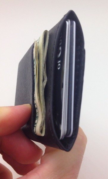
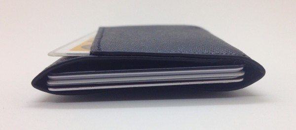
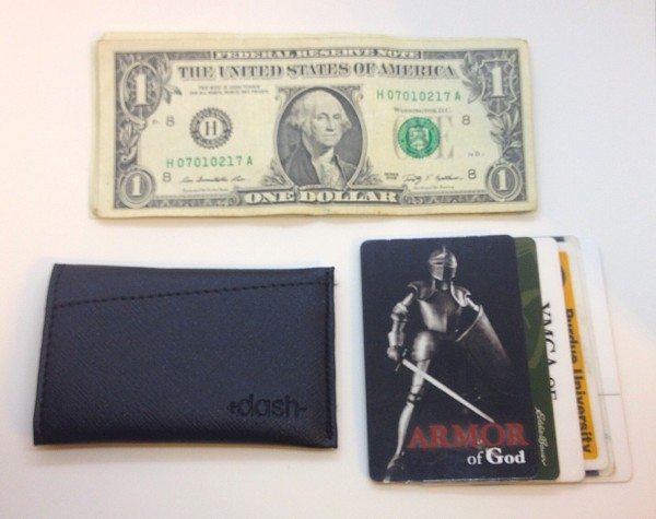
I was able to easily fit six cards in this middle pocket and probably could have fit 2-3 more without over-stuffing it. In fact, the Dash 3.0 Kickstarter page claims that 8-10 cards can fit in here. I also fit five bills into the bill pocket. I probably could have fit a few more, but this would have been pushing it.
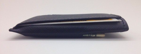
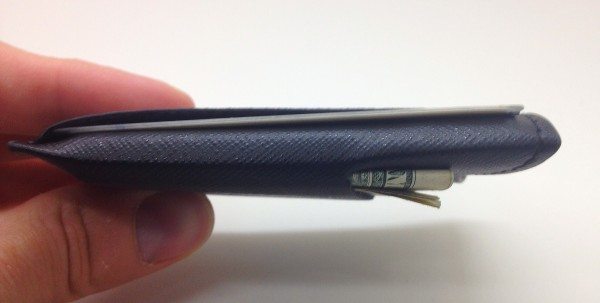
The Dash 3.0 Kickstarter site claims that the wallet by itself is only 3mm thick and weighs less than 0.25 ounces. I’d say that’s about right. The image above and the following three are all of the loaded wallet, and as can been seen, it is really quite thin, even with all of the items I have placed into it.
The thinness of the Dash 3.0 allows it to be used quite readily as a traditional back-pocket wallet, as well as a front-pocket or even shirt-pocket wallet. Though if you do carry it in your back pocket, you may well forget that it’s there. Which could induce one of those, “Where’s my wallet?!” panic attacks before reaching back to assure yourself that it is indeed riding safely yet covertly against your rump.
In addition to the thinness of the Dash 3.0, the overall footprint is quite small as well, not much larger than the footprint of a credit card. This also cuts down on the bulk of the wallet and helps enable it to be a very small package.
Above, an image of the items that I placed into the Dash 3.0. As mentioned above, I could quite easily have fit a few more bills and cards into it without over-stressing it or increasing its bulk to the point where it would become prohibitive to carry. After all, this is intended to be a slim, minimalist wallet, not a traditional bi-fold or tri-fold that you load up with every document in your home.
Conclusion
I really like the Dash 3.0. It is one of the more well-designed and well-constructed minimalist slim wallets that I have tried. The Saffiano leather, despite feeling a bit synthetic, is very durable and scratch resistant and its dappled surface even gives it a bit of additional gripping capability that a standard leather may not provide. Because it is so thin and the design is so well done, it can hold quite a few items of cards and/or cash without becoming over-loaded or over-bulky. And on top of everything else, it is very reasonably priced. In my opinion, the Dash 3.o is easily the best yet of Steven Elliot’s Dash wallet designs and while I continue to use the Dash 3.o, I will also look forward to what he comes up with next. If the Dash 3.0 interests you, link on over to the Dash 3.0 Kickstarter page, but do it quick—as of this writing, the campaign is down to its final 24 hours.
Update 04/18/15
A very nice slim wallet that I break out on occasion when I want to slim down my EDC.
Source: The sample for this review was provided by Dash 3.0 (Kickstarter campaign). Please visit their site for more info.

Gadgeteer Comment Policy - Please read before commenting
I don’t like Dash 3 because I used to own Dash 2. I got a chance to see Dash 3 bin one occasion. It is a plain sleeve and a cut on the side for another slot. Is it considered an innovative deign? I doubt it. I will never buy a Dash again.
The Real Person!
The Real Person!
@Mark – To each their own, but I’m not sure what you are describing. As seen in the pics above, the Dash 3.0 is a single, vertically-oriented pocket, with additional pockets on the outside of either side for quick access.
Is the Dash 3.0 particularly innovative? Maybe not. But I am a fan of its design and construction, which I think they pulled off rather well.
Just an FYI – it is “pleather”. The “saffiano leather” version is just straight-up polyurethane. You understandably don’t know this because it is never mentioned on the kickstarter page, where they brag about it being made from “a single piece of saffiano leather!” – because “made from a single piece of plastic!” just doesn’t have the same ring to it, I suppose. On their website they concede “PU saffiano leather” – but they refuse to admit that “PU” is not “leather”… period.