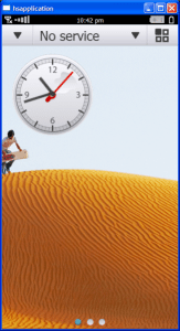
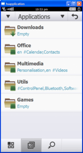
 I saw on Engadget ( Who sourced the link from Electronista ) that Symbain^4 screen shots have been released for the first time, allowing us a glimpse at where this OS is headed. I checked out Electronista’s article and after seeing the screen shots I was checking to make sure this is a recent story. For the reason why, read on and then take a peek for yourself how Symbian^4 is looking…
Eventually I realized this actually is a story from July 16th 2010 and not 2001 as I suspected. The screenshots being enclosed in the classic WindowsXP menubar and borders has something to do with it, I’m sure. But even without the border I thought I was looking at something from 2001. The Symbian^4 UI looks like an early Linux desktop, right down to the KDEesque folders. It’s about as appealing as a concrete bed. Release is sometime next year, and it sure looks like the UI team has their work cut out.
Electronista: Symbian^4’s Home Screen Surfaces, Shows new UI Design

