Program Requirements:
Desktop:
Windows 95 or NT
I’ve heard the saying that imitation is the sincerest form of flattery. If that’s the
case, then Royal must really have a thing for the PalmPilot. Royal who has been selling
low cost organizers and calculators for years has recently introduced a PDA called the
daVinci. This unit is very similar to the PalmPilot. In fact, it actually uses the same
processor (Motorola Dragonball). What’s the biggest difference between the two? The price.
But, some might say that you get what you pay for… Let’s look closer.
Hardware Specs
Processor:
68000-descendant processor running at 16mhz
Operating System:
dV-OS
User Storage Memory:
256k
Display:
160 x 160 pixels
Backlit, (Royalglo) Touch sensitive
Power:
2 x AAA size alkaline batteries
Standard 3v Lithium backup cell protects RAM while changing batteries (CR2032)
Size:
4.75″ x 3.25″ x 0.5″
The Royal daVinci has a black plastic body with a magnetic flip over screen cover. I
showed it to two of my friends. One has the Casio E-10, and the other one owns a PalmPilot
Pro. The first comment from each of them was that it felt cheap. Holding the daVinci in
one hand and a Palm III in the other, I can tell that the Palm III is heavier and feels
smaller (although they are very similar in size). To me, the daVinci feels solidly made
and not creaky. But, there is something about it that just says “I’m an imitation of
the real thing….”
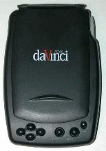
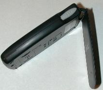
I do like the flip over screen cover. It is held closed with a magnet. There is a hinge
at the top of the cover that allows you to fold it completely under the unit and lie flat
against the back. The underside of this cover also has quick reference guide to the
daVinci Script (graffiti clone) which is a very nice touch.
The front of the unit has for small navigation buttons on left side. These buttons
allow you to move around in screens. Unfortunately, there is no way to assign different
tasks to these buttons. Pressing the buttons while the unit is off does not power it up
either. To the right of these buttons are two other buttons. One launches the FIND feature
and the other displays the TIME. I’m not sure why these two features really warranted
their own dedicated buttons. I would much rather be able to redefine them to my own
liking. The other button is the Power button. This button also doubles as the backlight
button and will activate after holding it down for 2 secs.
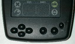
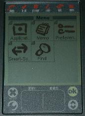
The display is remarkably like the PalmPilot’s. It has the separate pen input area at
the bottom which is separated into two halves. One side for letters and the other for
numbers. There are also two silk-screened buttons (just like the PalmPilot) on either side
of this input area. On the left side is the Cancel and Tools (Menu) buttons and on the
right side is the Ok and Pg Up/Pg Dn buttons. At the top of the display is a silk-screened
menu bar that will let you launch the built-in applications.
The actual visibility of the screen is a little worse than a PalmPilot due to screen
glare problems. I noticed that if I hold my Palm III in front of me and then the daVinci
(both at the same exact angle), I have more trouble reading the daVinci due to the
reflectivity of the screen.
The sensitivity of the digitizer also leaves alot to be desired. The instructions even
say that you are supposed to recalibrate every week. Using daVinci Script (Royal’s answer
to Graffiti), I found that its accuracy was horrible compared to my Palm III. I am very
good at graffiti and since the daVinci Script for the most part isn’t that much different,
I know it wasn’t just me having learning problems. When I would write a letter, it would
sometimes pick a letter that was no where near what it should have been. I also didn’t
like that you had to write the backspace character in the number side of the script area.
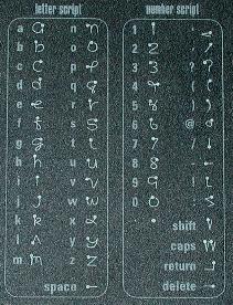
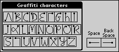
Here’s what the daVinci script is like compared to Graffiti:
| daVinci Script |
Palm Graffiti |
 |
 |
The daVinci’s display does excel in one area over the the PalmPilot though and that is
the backlighting which is probably 10-15% brighter.
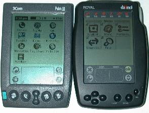
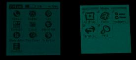
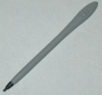
The left side of the daVinci has a recessed contrast wheel. The right side has the
stylus silo. The stylus is a very short (shorter than the PalmPilot’s) plastic stick that
reminds me of a little spoon. Royal was kind enough to include two additional spare styli
with the package. And they are even different colors 🙂 I don’t really care for the
stylus because when you write with it, it feels like it skips across the surface of the
display.

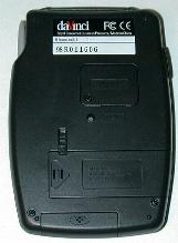
On the backside of the unit is the battery slots. The main slot houses two AAA
batteries. One nice touch is a battery door lock so that you can’t accidentally open it.
There’s also a door for the backup coin cell battery. A screw must first be removed in
order to gain access to the battery. The reset switch is on the back as well and can be
activated with the stylus. At the bottom of the unit is a slide off cover for the
sync port. Royal must be anticipating people loosing this cover as they include a spare.
The speaker is about the same as the PalmPilot. Your only option though is to turn the
system sounds (screen taps) on or off. There are no volume settings. Event alarms all use
the same sound and you can not modify them.
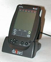
The daVinci comes with a cradle for syncing information to your PC. The cradle is
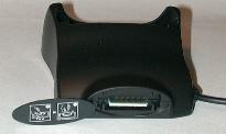
plastic and has a 9pin serial connector at one end. On the back of the cradle is a
removable cover that reveals a connector for the optional keyboard.
Software Specs
The daVinci has several built-in applications. I’ll discuss each one briefly.
Phone is the contacts application where you keep phone
numbers and addresses. You have the following fields that you can enter information into:
Last name (31 chars max)
First name (31 chars max)
Company (48 chars max)
Title (48 chars max)
Home phone (48 chars max)
Work phone (48 chars max)
Fax (48 chars max)
Mobile phone (48 chars max)
Pager (48 chars max)
Email address (63 chars max)
Address (127 chars max)
City (30 chars max)
State (3 chars max)
Zip (12 chars max)
Country (30 chars max)
Four custom fields (127 chars max each)
Note field (1023 chars max)
Each entry can be assigned to a category (you can have up to 15 different categories).
The contacts are displayed in a list view with lettered tabs at the bottom of the
display like a rolodex. The last name and work phone are the default values that are
displayed in this view. You can specify which phone number (home, work, fax, mobile) that
you want to be displayed for each entry. You can page through all your contacts by tapping
on these tabs or by using the hardware up/down buttons.You can also filter the list by
using the category pulldown menu to just show entries in a specified category. By pressing
the Tools silkscreen button, you have options to create, delete, move, copy or edit
entries. Tapping on a entry will bring up all the info on that entry.
The Phone application is quite similar to the Address app on the PalmPilot. Both apps
are equal in their features with neither being the best.
ToDo is the task manager application. You can enter a task
and assign it a 1-5 level priority. You can also assign it a date to be due. Each entry
can also have a note field attached to it and a category (you can have up to 15 different
categories). Tabs at the bottom of the screen allow you to switch between All, Done or To
Be Done pages. You can also sort by date by tapping on the date column.
Unfortunately, when a task is overdue, it isn’t marked in such a way as to get your
attention.
This application is also pretty much the same as that on the PalmPilot. I sort of like
the different views (tabbed screens) on the daVinci more though.
Planner is the datebook application. This is where you add
your meetings and events that you need to be reminded of. Alarms can be set for each
event. The Planner application has four different views. A daily view will list your
events for a specific day. It also has a time bar at the top of the display that is broken
up into squares that are equal to 30min intervals. If an appointment is entered, the
blocks are shaded during the scheduled hours.
A weekly view shows 7 of these time bars on the screen. Each one stands for one day of
the week. A monthly view shows a regular calendar grid for the month with little clock
icons in the days that have appointments entered. The yearly view shows 4 months at a time
with little dots next to days that have an appointment on them.
The Planner app is ok but it is missing one very important feature: Repeating events.
There is no way to add an event that happens every week or once a month. You have to
manually insert every event that you want to keep track of. There also isn’t an easy
way to get to back to TODAY if you are wandering around in the datebook.
Notes is the drawing program. This app will let you draw on
the screen with basic built in tools. These tools include freehand, line, circle, box,
eraser, and reverse image. You can choose from a couple different fill patterns for
the box and circle tools. The freehand tool has the ability to change to different line
widths that can have patterns.
This is a nice basic little application and is something that the PalmPilot or Palm III
for that matter has never had as a built in app.
Calc is a basic 10 function calculator. It doesn’t have any
special functions except square root and percent.
Memo is the memopad application. With this app, you can
create small text files with information in them. These files can then be assigned to a
category. There are two things wrong with this application. The first thing is that
you can only create memos that are a maximum of 1k in size. This is worse than the 4k
limit that PalmPilot users have been complaining about for years. The other problem is
that there are no COPY, CUT or PASTE features that you can use to edit your memos.
Clock is the time application. You use this to set your
current city and time. You can also set a world city for keeping track of time in other
areas. This might be good for someone that travels and wants to know what time it is back
home. You can easily see what time it is by pressing the TIME hardware button on the front
of the daVinci. Each press will toggle through home time and world time.
The only bad thing about this little app is that you can’t customize it to show your
actual city. You have to just pick the city nearest where you live.
Find will allow you to search data through key words or the
date range of the Planner and ToDo data.
SmartSync is the desktop syncing software that comes on 5
floppy disks. This software syncs with the Royal PIM. This PIM just gives you the basics.
You can’t import or export your data and you also can’t sync with third party PIM’s. If
you want this feature, you’ll have to buy another software package. I did figure out
that the PIM saves its data as MS Access format databases so I was able to export my data
from my Palm III desktop into a comma separated file and then import it into MS Access
into the format that the Royal PIM liked. It worked, but it wasn’t the quickest or easiest
method.
I had some trouble with SmartSync. My main gripe is that every time I sync the daVinci
with my desktop PC, I get another copy of my data on the daVinci. So, at this point I have
7 of every one of my contacts in the phone app and 7 of each of my todo’s in the todo app
etc. I’m not sure what is causing this as I did not messed with the default settings in
SmartSync. My other gripe is that there isn’t a button on the cradle that will let you
initiate a sync. You have to turn on the daVinci and navigate to the Sync application and
then tap Ok. This is a pain.
So, what’s the bottom line? Should you buy the daVinci? At $100 it is tempting. The
hardware is ok, the built in apps are also ok. But, if you think you’ll want to be a power
user and learn the daVinci Script and install all kinds of neat little 3rd party apps,
you’ll be disappointed. Although you can install applications, there aren’t any available
yet. Well, there is a sliding puzzle game…wow. If you’re not a power user, and the
features of the built in apps sound ok to you, then I think you’d be better off buying a
cheapo Casio or Royal organizer. Most of them have the same functionality but for even
lower $$’s. If the daVinci looks good to you, I think you’d be better off finding a used
PalmPilot Personal. At least you’d have a ton of third party software available to you,
tons of accessories, 2x the memory, and the ability to upgrade to more memory and the
functionality of a Palm III.
Price: $99.99
Pros:
Low price.
Bright backlighting.
Cons:
Doesn’t come with any third party PIM syncing software.
Can’t add reoccurring events in the Planner application.
Digitizer doesn’t recognize daVinci Script well. Needs calibrating too often.
No button on cradle for syncing.
Gerber Gear 22-47162N Fast Draw Folding Assisted Opening Pocket Knife, Fine Edge, Black
$41.21 (as of January 28, 2026 17:22 GMT -06:00 - More infoProduct prices and availability are accurate as of the date/time indicated and are subject to change. Any price and availability information displayed on [relevant Amazon Site(s), as applicable] at the time of purchase will apply to the purchase of this product.)Gerber Gear EVO Jr. Folding Knife - Serrated Edge [22-41493]
$28.99 (as of January 28, 2026 17:22 GMT -06:00 - More infoProduct prices and availability are accurate as of the date/time indicated and are subject to change. Any price and availability information displayed on [relevant Amazon Site(s), as applicable] at the time of purchase will apply to the purchase of this product.)Product Information
| Price: | $99.99 |
| Manufacturer: | Royal |
| Pros: |
|
| Cons: |
|


Gadgeteer Comment Policy - Please read before commenting
NESSECITO DE UMA ASSISTENCIA TECNICA PARA MEU PALM.
A TAMPA SUPERIOR Q PROTEGE A TELA ESTA QUEBRADA.
NADA MAIS OBRIGADO
Wow, I love reading about these old PDA reviews. Just saw one on eBay for cheap and considered it for a second.
Back in 98/99 I was living in Georgia in the states. I was in highschool but I loved pen computers. (Especially palmtops/mini laptops as I called them.) I considered getting one of these (the Davinci with the folding keyboard) to help keep me organized. I got a Casio Zoomer instead, a PDA from 1993. Worked great but it was big and heavy and ate batteries like there was no tomorrow. Even at 1999 standards, the Zoomer was crazy big.
Anyways, thanks for the article. Sometimes I wish I could go back to 1999 just to browse Office Depot’s selection of PDA’s/HPC’s!