 The iPhone and iPod Touch has made a phenomenal achievement application deployment with the widely successful App Store. Apple’s App Store gave many developers a chance to share their apps with the world. And like all iPhone and iPod Touch users, I too downloaded many apps onto my device to use. Many of them are games but there are some very useful productivity apps among my downloads.
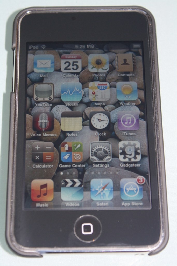
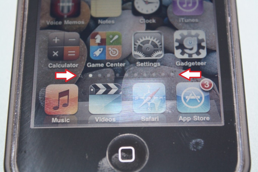
Sorry for the bad pictures but the screen-shot function in OS 4 beta doesn’t work (yet). Click on picture for a larger version of it.
So how did Apple decide to present those apps to us? In a 11 page, 4 x 4 icon grid with additional 4 on the dock. That gave us a total of 180 apps. How did that number come to be? Simple…mathematics. 16 apps on a screen, 11 screens, and 4 on the dock. (16 x 11) + 4 = 180 apps.
But it’s a lot of hard work to look through all 180 apps to find the one that you actually want. We’ve all been there. Flipping through the screens looking for that one app that you want to use at that time. Haven’t you wished that you could organize them all in folders. A folder for games. One for productivity apps. Another for apps that you wish you haven’t bought.
So how did we solve this problem before OS 4? Well some of us just got used to flipping through the screens. Others, like myself, got tired of it and decided to jailbreak my iPod Touch. For those who don’t know, to jailbreak means to free your iPhone or iPod Touch from only using the apps that are approved by Apple only. Those apps that get filtered out by the Apple usually end up being offered by the jailbreak community. One of those apps is called Categories. What Categories does is to allow your jailbroken iPhone and iPod Touch to have the functionality to organize all your apps into categories (or folders). There is no limit on how many folders or on how many apps each folders can hold. At that point I felt freedom from the clutches of Apple. I had a folder for games, productivity, information, network, media, and other. Everything was sorted out and organized the way I wanted. It was PERFECT.
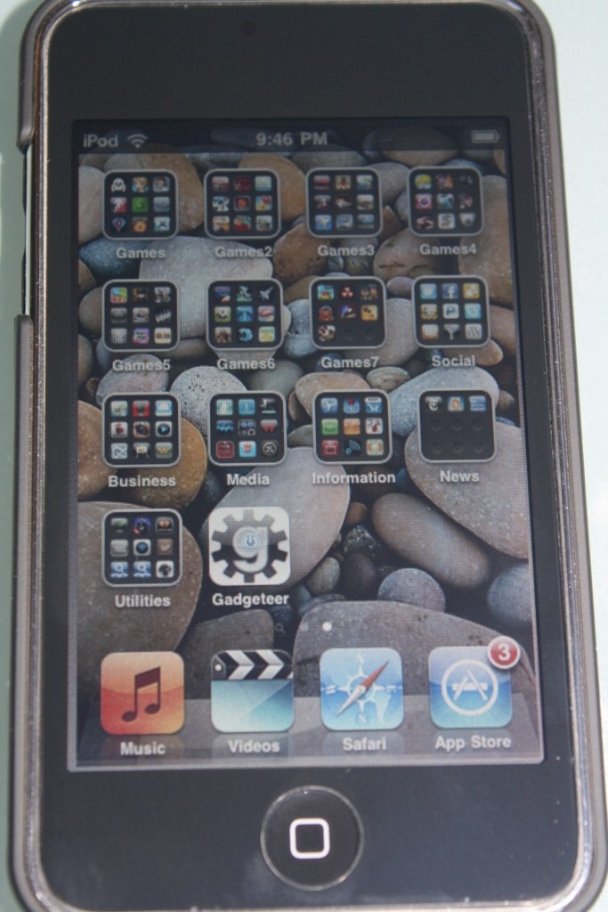

Then along came OS 4 beta. It promised new features and one of them was Folders. I was happy that Apple finally decided to offer that functionality. I loaded up my iPod Touch with the OS 4 beta. Synced all my apps over and started to make folders. To create folders, you just hold down an app (like when you want to delete it), select an app that you want in the folder and drag it to the other app that you want in the same folder. And if it’s a folder that you’re creating then you’re given the choice to name that folder. So I was happily moving my games into the folders until I was stuck. Somehow I couldn’t put any more apps into the folder after my 12th app. I was thinking it might just be a glitch since it was beta. I decided to cold boot my iPod Touch and try again. Same thing. I was confused and searched on Apple’s developer forums. It listed that OS 4 supports 2,160 apps. That’s a lot. But how did they come up with that number? So here’s what I found out. 12 apps per folder. 16 folders per screen. 11 screens in total. 4 folders in dock. (12 x 16 x 11) + (4 x 12) = 2,160 apps. So that’s when I got really disappointed. Only 12 apps per folder? Well I know it’s not a software or hardware problem since the jailbroken iPod Touch running Categories can hold an unlimited amount of apps per folder. So what happened? Why did Apple only limit 12 apps per folder? Sorry, but I have no answer for that. Maybe 12 is their lucky number or something.
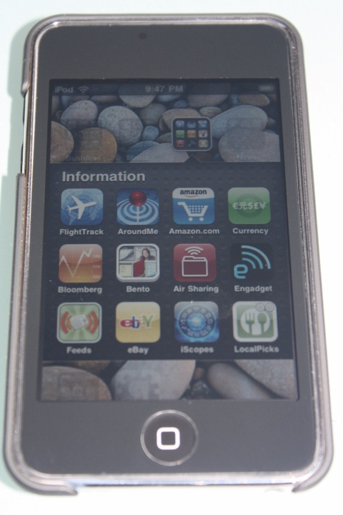
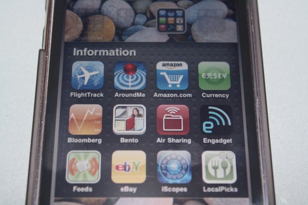
Another thing that I’m disappointed with is how they present the folder icons. It shows the last 9 out of the 12 apps in that folder in mini icons within the folder icon. I understand that Apple probably thought it would be nice for the users to know what’s in the folders. But it pretty much defeats the purpose if we don’t know the other 3 apps in the folder. It would be better if Apple just made the folder icon generic or an option to choose different types of folder icons. That’s what Categories did on the jailbroken version.
So in conclusion: OS 4 beta Folders versus Categories on jailbroken iPod Touch
WINNER : Categories on jailbroken iPod Touch



Gadgeteer Comment Policy - Please read before commenting
One of the only reasons my ipod touch is jailbroken is for Catagories. I was hoping I wouldn’t have to jailbreak my ipod again after 4.0 comes out but based on your review it looks like I’ll be doing it again. Its amazing how much Apple gets praised and damned for its UI’s in the same breath.
@Henry : All I can say is to stay with your jailbroken iPod Touch for now. And let’s just hope Apple improves the “Folder” functionality in OS 4.0
Based on this review, I jailbroke my iPod and added Categories. It lasted for about 15 minutes (the time it took me to set up a couple of categories) before I decided the jailbroken implementation of categories was too much trouble.
Apple’s folders might be limited, but the interface and ease-of-use outstrip the hacked version. For 99% of people (including me!), that’s enough.
I am currently running the 4.0 beta and I must say I really like the folders that Apple introduced. I cam from the JB community and have used Stacks and Categories and I find that Folders work very well. Although you only “see” nine apps in the thumbnail I think that’s fine as it easy to just pop it open to see the other 3. As for only having 12 apps per folder, that really is not a problem for me either. I have 3 games folders, which I was able to label “RPG”, “Shooters” and “Games”…… much easier then flipping through 9 pages of apps….