
The zen of the Palm OS is that it is easy to use, intuitive, and helpful. A key element of this is being able to quickly jot, store, and retrieve notes- but… is your note a memo? A contact? An SMS? How many times have you had to actually (**shudder**) write something down and add it to your Palm later? Splashdata’s Snap solves that.Snap describes itself as “A central place to put all your notes that you want to organize later.” This handy little application offers a simple Memo-like screen with a series of icons running down the side. The idea is that you will write a note and later assign it to an application represented by the icons. Snap will try to figure out what data in the note goes where in the application.
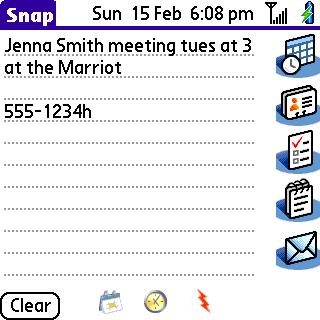
It is mostly intuitive, with only a few things in the User’s Guide that you cannot quickly figure out on your own (like putting codes at the end of phone numbers to categorize them as home, work, etc.). The program is smart enough to guess that ‘tues.’ is the upcoming Tuesday, or that 4 is 4:00- if you told it 4p, it would call it 4:00 pm.
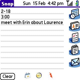
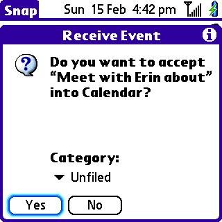
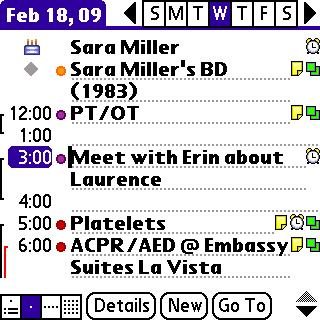
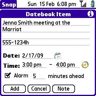
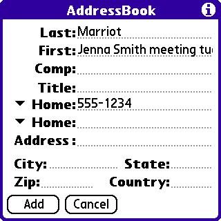
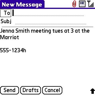
Enter the info, then tap on the application it is going to. Most of the applications have an intermediate screen to let you fine-tune what goes where before you add it to the app. You can cut and paste things from field to field, correct typos, set categories, etc. at this stage. You can also leave the info in the Snap format for later editing.
I found that is was pretty good for sample memos- it did not recognize Omaha as a city, but then, a lot of people can’t. 🙂 When I made a more ‘natural’ memo- as if I were recording data as it happened, it had a harder time making the right guesses. The ‘intermediate screens’ come in handy at times like this.
The good: This is a nice program. It fits the ‘Palm zen’ groove nicely and fills a real need. It is nicely priced at $9.95 (although my copy was a freebie from Handango a while ago), and well-documented.
The bad: I would wish that you could enter several Snap memos and store them for later conversion, but as far as I can tell, you can only do one at a time. The Palm Centro is a bit awkward for text memos- having to switch back and forth between numbers and letters. Sigh… I miss Grafitti 🙁
The ugly: It crashes my Centro. At first, it was resetting while trying to enter the registration code. Later, after entering data, every time I tried to hit the Home key, it would show home, then flick over to Memos. Somehow it remapped the Home/Applications button to Memos, possibly because of another application on board. (I assume the problem is on my end.)


Gadgeteer Comment Policy - Please read before commenting
While I don’t know if the upcoming hardware will support it, I think Snap is halfway to a business card scanner. Here’s hoping SplashData can make the other half work!
Snap seems to be very similar to Slap by HandsHigh Software, that works on my LD. Don’t see much of a difference in functionality….
Did SplashData buy out the software rights?
This is probably the same program as HandsHigh’s Slap. From what I’ve read elsewhere, it even uses the same name for the database.
One question: The worst shortcoming of Slap (which I own the lates version of) is that there is no security prompt for the “Clear” button. I lost a lot of information by inadvertently tapping on that button. Now that’s ugly!
Has this been corrected in the Splashdata version (i.e.: did they add a prompt before the content is wiped)?