The Thrifty Cell Phone watch ($80 and the price keeps dropping) is one of the first viable (i.e. affordable, portable) cell phone watches I’d seen in a while. While not for everyone, the concept offers an easy way to carry a phone without really carrying it. It’s a nifty idea but is not something for everyone due to its screen size and lack of buttons. For example, it is not conducive to OCD texting nor use during driving. But it still has a market audience. This audience was interested enough in it to try it out for a month or so. So if you’re also part of that audience, read on . . .
First, here are the official specs from the Chinavision web site . . .
- Display: 1.3 inch LCD Touchscreen
- Memory: 2GB Internal
- Sim Card Slots: 1
- Sim Card Compatibility: 2G, 2.5G, 2.75G
- GSM Compatibility: 850 / 900 / 1800 / 1900
- GPRS Support: YES
- Bluetooth Profiles: A2DP, AVRCP, Handsfree, Headset, SPP, DUN, OPP, FTP, SAP, FAX, HID
- Call Setting Options: Call Waiting, Caller ID, Call Divert, Call Barring, Auto Redial, Black List
- Messaging Types: SMS (text messaging), MMS (picture, video, and texting messaging), Voicemail (if your cellphone plan supports it)
- Languages: English, French, Spanish, Portuguese, Italian, German, Chinese
- Video Player: Yes
- Audio Player: Yes
- Sound Recorder: Yes
- Viewing and Listening Formats:
– Video Formats: 3GP
– Audio Formats: MP3, MIDI, AMR
– Picture Formats: JPG, GIF
– Ebook Formats: TXT - Built-In MIC: YES
- Still Camera
– Megapixels: 0.3
– Resolution: 640×480, 320×240, 160×120, 128×160
– Capture Format: JPG
– Image Quality (Normal, Low, High)
– Banding: 50Hz, 60Hz - Video Camera
– Resolution: 176×144
– Capture Format: 3GP
– Video Quality (compression): High, Normal, Low
– Banding: 50Hz, 60Hz - Audio Recorder Format: AMR
- Power Source: Rechargeable Li-ion Battery
- Battery Life:
-Talk Time: Approximately 2-4 hours
-Stand By: Approximately 120-150 hours (depending on settings) - Dimensions: Watch Face Only – 50mm (Diameter), 13 mm (Thickness); Strap: 12 segments, each segment approximately 6 mm (length)
- Languages: English, French, Spanish, Portuguese, Italian, German, Chinese
- Manufacturer Ref: FCMMOM4FF3ES
My apologies to anyone who may not be familiar with standard cell phone operations. I am assuming that the reader is somewhat familiar with some of the basic cell phone capabilities that are found out there in the world these days. I actually got a few interesting questions from folks when wearing the watch and have tried to include information that addresses those comments.
The Thrifty Cell Phone (TCP — heh heh) watch runs on the Global System for Mobile Communications — GSM networks. This means it will only work with cell phone carriers that operate on that particular type of network. So if you do not have a carrier and/or are thinking about this phone, be sure to check the carrier’s network type. AT&T, for example, runs over GSM, while Verizon runs over CDMA. If you currently have a GSM phone with an existing Subscriber Identity Module (SIM) card, that card can be transferred over to the TCP watch. That is what I did: I simply transferred my SIM card from my existing NOKIA phone (a GSM from Consumer Cellular which runs atop AT&T) and simply plopped it into the TCP watch.
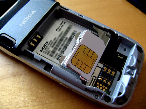
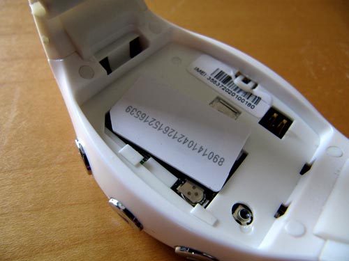
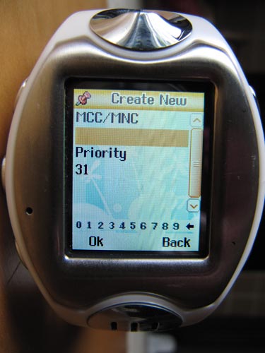
Once the SIM card is installed (it does not come with a SIM card, by the way — you need to supply your own from a GSM service) there is an additional set-up screen available that allows you to fine-tune the network with its particular mobile network values.
Fru Fru Walk Through
Now for the more interesting part.
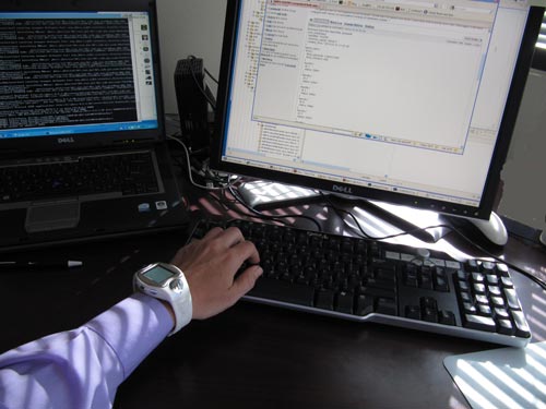
The main chassis of the watch is about 2.5 inches long by 1.5 inches wide. It’s a little chunky but not as much as other cell watches that I’d seen. I gotta say that it looks bigger in the photos than it feels or seems. It also has a comfortable and adjustable band. I can wear the watch all day and not even notice it, and a “day” usually includes banging on a computer keyboard with the wrist poised at unnatural angles, picking a nose surreptitiously, and adjusting eye glasses in a supercilious affectation of intelligence. Ahem. Ok, so this is one of the things to consider about a cell phone watch: how long you can wear it without irritation. The Thrifty Watch worked for me.
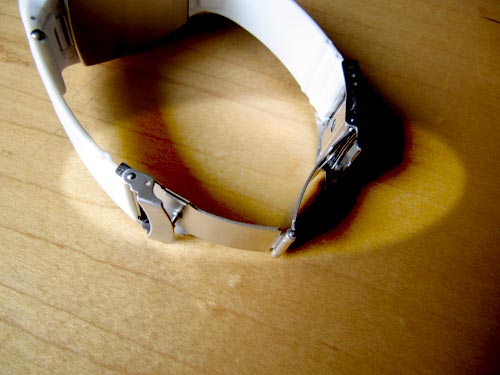
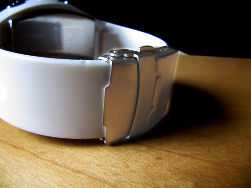
Integrated with the watch band is a removable, telescoping stylus which is used to press various on-screen icons/menu selections (more on the screen in a bit). I’m always intrigued by subtle amenities so I probably spent too much time on this feature, but it is pretty well thought-out, so enjoy . . .
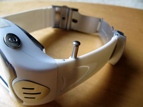
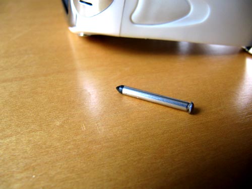
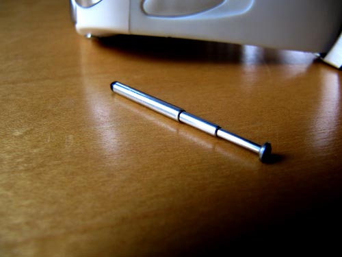
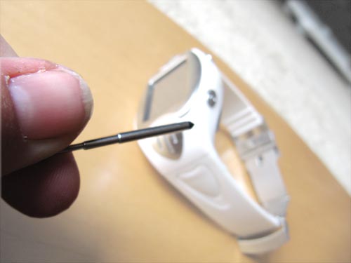
Anyway, back to the chassis. The screen or face is about 1.3 inches long by 1 inch wide, which is actually pretty small. The screen is a touch screen and, when touched, initially shows the current time in a roman numeral face.
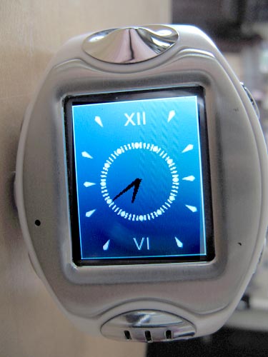
Eh — whatever, I’d give the user a choice of clock faces, but eh whatever.
Touch the screen again and you are put into the main “phone mode” or screen which should look pretty familiar to anyone who has used a cell phone in the past several years. It displays the network status, date time, battery life, and a few touch screen icons.
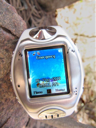
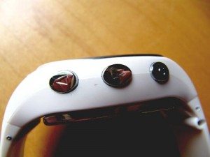
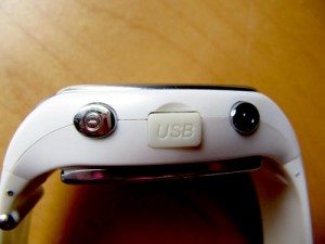
The chassis also contains five buttons and a USB port, all located on the two edges of the watch. Starting on the upper left and moving clockwise, these buttons perform the actions of a) camera mode; b) call log; c) USB port; d) phone book; e) menu; f) MP3 player. The buttons can also be used differently depending on which screen you happen to be in.
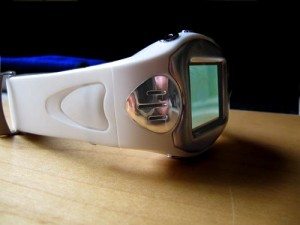
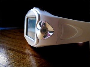
The buttons are large enough to press and easy to find, but it is also easy to forget which button does what in what mode. For example, when a call comes in, I could never remember whether to press the upper right button (the correct button) or the lower right button (the one closest to me at the time). I hung up on several in-coming calls by fumbling to the wrong button. Initially to compensate for this I marked the upper right button with an “A” (for ANSWER) and an “E” (for END) on the lower right button with a permanent ink marker. But those permanent letters rubbed off in a few days. It would be nice, therefore, if such a scheme were etched into the chassis. Another mnemonic to consider is this: to pick UP a phone and answer it, use the UPPER button; to put the phone DOWN to end the call, use the LOWER button. Eh, I’m an eejit.
Overall User Interface Usability
For the most part, the menus were pretty intuitive. There were a few that were totally confusing (for example, the MP3 player used what looked like a set of stacked dice and on-screen graphics to depict various controls, but they didn’t seem to function… beats me).
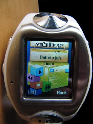
There were also a few screens, most notably in the camera settings menus, that did not seem to function at all, in other words there did not seem to be a way to change the values of various fields such as the resolution. The values were there, but I could not figure out how to change them. Which leads to another point: documentation. While the user manual was well written, it was, I think, much too lacking in its content. This was compensated for by the fact that the UI was fairly intuitive, but some things were still just too obtuse for me. And, this leads to yet another soap-box moment (SBM): there may be too many features that are not needed nor desired in the watch. That is an opinion, of course, but I think that for a phone this small, the user may be fine with reducing the number of features in order to concentrate on functionality and battery life (more on that in a moment).
Placing/Answering General Use
So what about making a call to order a pizza . . . er I mean calling the office to let them know you are walking into another pompous meeting and have no time for trivialities?
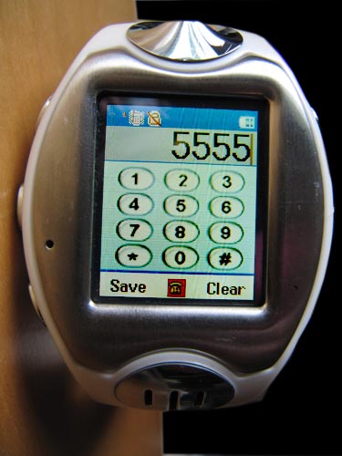
Again, the UI was fairly intuitive for me. I tap the screen once to a) get into watch mode, then once again to b) get into “phone” mode, and then use the stylus (or my thumb if sober) to c) press the little phone icon at the bottom of the screen to pop-up a numeric key pad. I could also press the lower-right button to bring up the phone list and then scroll via stylus (or sober thumb) to the previously saved phone number in question. After a few times of doing this, I tended to automatically reach for the pull-out stylus.
Managing Contacts
As for entering a list of contacts, that was a bit painful. First, I entered a few contacts via the on-board UI with the stylus and found that to be really time-consuming. It also hurt my fingers after a while using the stylus for so long. I then examined the contents of the phone’s memory via Windows 7 default USB interface.
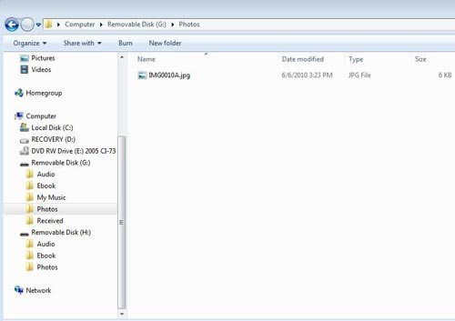
But all that gave me access to was the MP3 and photo folders. I also dug around for on the Internet over the course of several days looking for a compatible PC synchronizing software. The guts of the phone are based on the MT6227 chip and I could not find an authoritative source (read: one that actually worked) for synch software. So right now I only have five or so contacts in the TCPW. I haven’t gotten around to transferring the others.
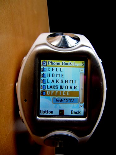
As mentioned, the icons/selections on the touch screen are pretty small, and the glare on the screen is pretty bad outside. So the unit comes with a slide-out telescoping stylus tucked neatly away in the band. This is another major point about these watches: the size of the font and how well you can read it if you have any vision issues. I have presbyopia (ok a fancy word for old dork’s near sightedness) and the watch’s tiny fonts caused me some fat fingering and foul words when I was absent of my readers. One way that I found to compensate for this (partially) was to enter my contacts’ names in capital letters and separated by spaces, similar to the following:
 John Smith           (how a normal person would enter a name)
 J O H N  S M I T H   (how I entered contact names)
Battery Life
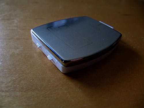
The TCPW comes with two batteries but you can only charge the battery while it is in the watch. So you cannot, for example, charge one battery while using another. This is kind of annoying, but I can live with it. The battery initially lasted about 24 hours and I’ve been able to extend its life to about 2.5 days by letting it charge itself out completely and then re-charging for a few cycles. The USB port through which the charge is applied is also kind of a non-standard size (i.e. it is neither mini nor micro-USB) on the watch side so you’d need a special cable if you wanted to have a charger for both your house and car.
Given the battery life, glare, small font, and difficulty in fumbling with data input, it would be a very cool idea to combine the cell phone feature with an e-ink based watch (see the Seiko E-Ink watch, for example). I would gladly give up touch screen, camera, Bluetooth, and yada yada yada for a simple-to-use and less power-hungry phone watch.
Signal Strength and Reliability
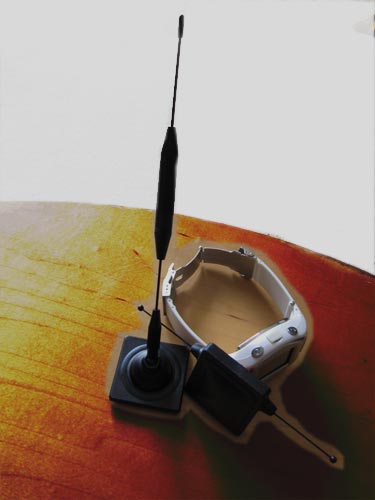
Another aspect of placing a call is the signal strength. I found that in my house and immediate neighborhood (which sit in a valley), I could not get a consistent signal. Even though the TCPW showed as many as three bars at certain times, I could only get the “My Network” and thus a valid signal once in about twenty attempts. At all other times I only get the “Emergency” mode displayed. I also tried using a few cell phone add-on gadgets to attempt to boost the signal, but to no avail. One of these was an internal cell phone antenna, the other an external antenna. Both are passive devices so I didn’t expect much, but thought it was worth a try. For the record, neither one of those devices helped (they also did not help when used with my regular Nokia cell phone in otherwise un-serviceable areas).
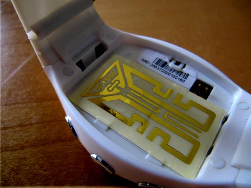
My NOKIA, by the way is able to pick up signals fine in my house and neighborhood. In driving in the mountains, I found a few other spots where the NOKIA could pick up a signal but the TCPW could not.

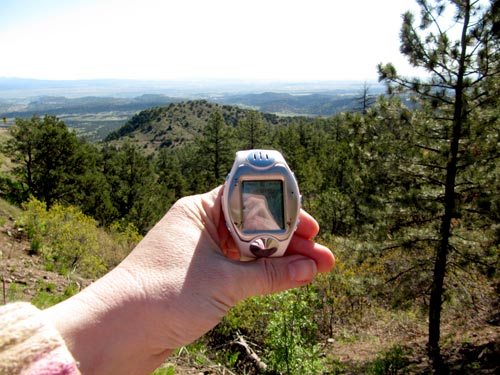
While I still cannot get a signal in my house, I have been able to use the TCPW elsewhere in my town and when I drove up to Denver. I think the signal may have to do with the valleys. I keep my NOKIA in my car for backup in case the TCPW can’t get a signal.
Speaker Strength
As far as audio quality, the voices on the other side (ahem) were clear but I had to hold the speaker up to my ear. The TCPW also comes with a set of headphones and BlueTooth capabilities, though I used neither of those. I did not want to drag other things around and so was able to make do with holding the TCPW up towards my ear. The folks to whom I was talking remarked that the sound quality on their side was excellent.
Other Features
There are a host of other features in the TCPW, but I think most of them are almost moot compared to the importance of the features that I’ve addressed here, namely: comfort; reliability; ease-of-use; and battery life. There is Bluetooth capability, texting, and even a simple e-book (ASCII only) reader. But I don’t need those features. I want a watch that I can make calls on. So I didn’t spend a lot of time looking into these other capabilities. Plus, there wasn’t much documentation available on them anyway.
Summary
In summary, the TCPW is a neat gadget, especially for its price. I found that there are quite a number of people that were really interested in the concept and a few of them opined about the desire for quality over quantity when it came to cramming on extra features. I am happy with its functionality but still wish for a few basic enhancements:
Wish List
- Bigger font
- Fewer flash bang features,
- Use of e-ink (remove need for touch screen)
- More instructions
- Etched-in icons for button mnemonic
- PC sync software
- Mini or micro USB port
- Extra battery port or cradle
- Voice activated
Things to Consider For Your Next Cell Phone Watch Purchase
- Comfort
- Documentation
- Signal
- Type of network
- Managing contacts
- Sound quality
- Battery life
- Glare
- Font size
- Method of data entry
Gerber Gear 22-47162N Fast Draw Folding Assisted Opening Pocket Knife, Fine Edge, Black
(as of February 10, 2026 17:30 GMT -06:00 - More infoProduct prices and availability are accurate as of the date/time indicated and are subject to change. Any price and availability information displayed on [relevant Amazon Site(s), as applicable] at the time of purchase will apply to the purchase of this product.)Gerber Gear EVO Jr. Folding Knife - Serrated Edge [22-41493]
(as of February 10, 2026 17:30 GMT -06:00 - More infoProduct prices and availability are accurate as of the date/time indicated and are subject to change. Any price and availability information displayed on [relevant Amazon Site(s), as applicable] at the time of purchase will apply to the purchase of this product.)Product Information
| Price: | $80 |
| Manufacturer: | Chinavasion |
| Requirements: |
|
| Pros: |
|
| Cons: |
|


Gadgeteer Comment Policy - Please read before commenting
Does it come with a sling for your arm? Its a monster! 🙂
This product somehow reminds me of Knight Rider episodes 🙂
Regarding “European time”: as far as I know, it’s know as the “24-hour clock”, and is worldwide the most used time format. It has nothing to do with Europe.
http://en.wikipedia.org/wiki/24-hour_clock
It also makes sense: a day simply has 24 hours. Why bother splitting it up in two times twelve, and using a two-letter prefix or suffix to correct the missing info about which halve of the day the time applies to? The 24-hour format eventually leads to less confusion because e.g. 15:00 can only mean one time: 3 o’clock in the afternoon. It’s for that reason why the military uses this format. Eventually, I think every county will adapt this format as the default. Just like metrical vs. imperial: only a handful of countries use imperial (the US is of course one of them). The rest of the world uses the metrical system. And again: the military in the US uses the metrical system.
Just my two cents.
By the way, I’ve been looking for a watch like this for some time. Unfortunately, I mostly come to the same conclusion as you: reception, battery life etc. are, at best, average.
DealExtreme has an impressive range of cell phone watches, for extreme low prices. For example:
http://www.dealextreme.com/details.dx/sku.13463
Still, $100 for a “frustrating” watch is still a lot of money.
wait so can u text??