A week with the 8GB Microsoft Zune
Introduction
I got into the MP3 player market a little late. I was in high school during the early years of the digital music revolution, so I couldn’t really afford the players of the time. My very first foray into MP3 hardware was with a very, very poorly made RCA MP3-CD player. I upgraded from that to a Creative Muvo2 with the microdrive ripped out and a 512MB CompactFlash card installed. I never used it much, because the interface was clunky and annoying to use.
Then I got my first iPod. It was like a whole new world had been opened up to me. As unwilling as I am to accept much good coming from our friends in Cupertino, the iPod revolutionized the portable music industry, and I’ll be the first to admit it. I’ve been an iPod owner since September 2004, thanks to freeipods.com sending me a 20GB fourth generation model. I upgraded to a 60GB iPod Photo only six months later and have been using it ever since. Of course, this means that I’m rather tied to the whole iPod dock connector situation, seeing as I own a Sedio car dock, an iLuv i177, two Apple docks, and a plethora of cables.
Microsoft tried (albeit poorly) to get into the disk-based PMP market with their Zune, which turned out to be a bit of a flop. Then they revamped the line, added some flash-based iPod Nano competition, and included a touch interface for navigation and selection.
Does it match up? Can Microsoft convert this die-hard iPod owner to a Zune-carrying audiophile?
To be fair, this answer requires more than a few hours of test time and use. So let’s see what happens if I give this thing a robust seven days of solid use, and leave my iPod alone in its iLuv home.
This is a rather long review. To get to the final conclusion, you can skip all the meat and just read this: Microsoft’s second attempt at an iPod killer comes really, really close, but they committed a few too many fatal mistakes in the development process. If they can work out the kinks with the third generation of this thing (rumored to be coming out relatively soon), it could (ironically) become the OS X of the digital audio player world. It’s pretty much been established that the iPod+iTunes offering from Apple is, indeed, the de facto industry standard in the DAP market. It’s like trying to compete with Windows – you can find a niche and stick with it, and it will get you loyal customers (but not a real leg up in the market as a whole). Hopefully, the Zune will truly accomplish this. It’s getting there, but the software is going to need a complete overhaul before this product makes any real headway.
Now. Onto the details. Another would-be “iPod killer” I’ve had some experience with is the Sansa e200 player, so I’ve added a few comparisons with that, as well.
Where the Zune fits in the market
The Zune truly is a full-fledged competitor to the iPod. For the average user who isn’t particularly tech savvy, the iPod provides an all-in-one solution: hardware, software, and proprietary DRM. A user can be up and running right out of the box, buying music, ripping music, and dumping it onto their new player with minimal effort and fuss. There are plenty of other DAPs on the market, but until the Zune, they were all the same – MTP and MSC support, and Windows Media DRM compatibility.
The Zune line is much like the iPod – there is software for the hardware and, like iTunes, the Zune software will only sync with Zune hardware. Unlike the iPod (and this is where the tiny market share is a disadvantage), the Zune has no real software alternatives. So, since use of the software is inevitable with the purchase of a Zune, I’ll be covering that, as well.
One reason that the iPod immediately became a smash success was due to its excellent firmware (device software). Other DAPs at the time had terrible, clunky, unintuitive interfaces. The iPod showed up and showed us that it was possible to carry around 1,000 songs without spending 1,000 hours trying to figure out how to play them. True to its iPod-killing goal, the Zune’s got pretty slick firmware. And, since the firmware is critical to the usability of the hardware, we’ll be covering that, too.
And, third, the other important component of the Zune solution – the hardware itself. So, let’s get started!
The hardware
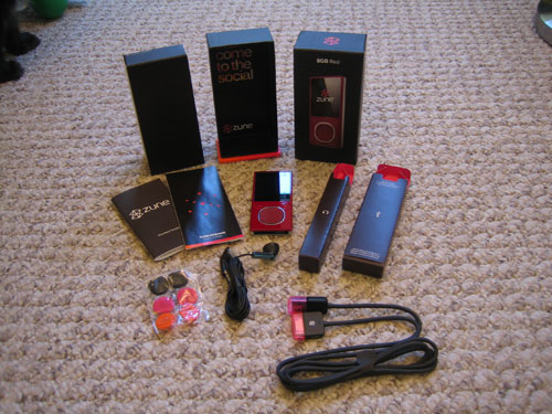
The Zune ships with earbuds, foam pads for the earbuds (in pink, orange, and black), a USB sync cable, a very short manual on how to get started (along with all the appropriate FCC-mandated warnings and information bits), and the Zune itself. No software CD is included. This annoys me a bit – hardware manufacturers are increasingly making a habit of excluding any software with a device or peripheral. While in the case of drivers, you generally want to get the most updated software online, it’s kind of silly that they can’t be bothered to put something in the box. Not only that, but there’s no real help documentation – again, it’s all online now. This is great for most people, but it’s bad for people like my mother, who only got high-speed internet for the first time this past year.
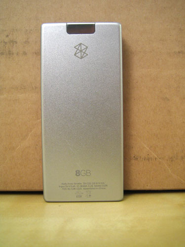
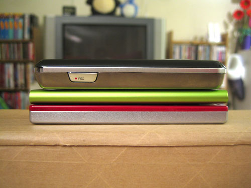
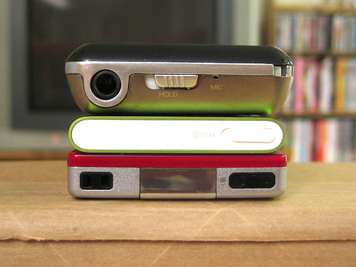
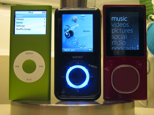
The player itself is slick-looking. It’s not quite as slim as the second-gen iPod Nano, but it comes pretty close. Both are considerably smaller than the Sansa e200, which I’ve pictured for comparison. The backplate is made of a seemingly indestructible brushed aluminum, which is a welcome change from the scratch-prone, mirror finish of the iPod’s backplate. The Zune logo and the player’s storage capacity are engraved on the back, along with basic device information, including the serial number and device FCC ID.
The front is also very attractive. The flash-based Zune (available in 4 and 8 GB capacities) comes in four colors – red, black, olive green, and pink. I’ve seen the green and red models up close, and I now have an 8GB red model. The green faceplate is actually different in tactile feel and appearance compared to the red. My red Zune has a highly polished surface that, while picking up fingerprints and smudges pretty much nonstop, appears to be quite durable. I’ve been carrying this thing with me everywhere for the past week, and there’s not a mark on any part of it.
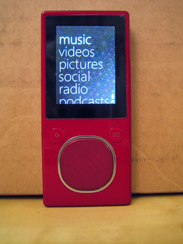
One slightly odd quirk about the hardware – the LCD itself isn’t exactly straight in the device. It angles a little bit – the green one I had (before I exchanged it for the red model) was even more angled. I’m really OCD about such things, so I noticed it right away. I’ve shown others, though, and they think I’m nuts to notice something so inconsequential.
The button interface is a bit different from the iPod’s. Front and center is a well proportioned, four-way D-pad that has button and touch functionality. This is a nice feature – you can disable the touch sensitivity entirely, and the pad still works by clicks rather than finger swipes (slide left and right to scroll items left and right; slide up and down to scroll items up and down; click in the middle to select). On either side of the touchpad are buttons – to the left is the back button; to the right is the play/pause button. The back button more or less functions like the menu button on an iPod – it will take you backwards through the menu structure, and eventually bring you back to the main menu from wherever you are in the interface. The touchpad is very easy to use and has a low learning curve – I was up and running with it after only a few minutes of use. It works through Ziploc bags and thin fabric, but both swipes and button presses are futile when I’m wearing thick knit gloves. This isn’t the end of the world, but it’s a bit annoying.
The top of the player gives us the hold switch and a little plastic loop for attaching (I’m assuming) a neck or wrist strap. I find this amusing – I personally would not risk attaching a $175 device to my wrist – it’s too easy to steal or lose…and I’m pretty sure I’d look ridiculous wearing something like this around my neck. However, to each his own, so you can attach a strap if you want.
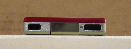
The bottom holds the 3.5mm audio output jack (no video out on the flash-based models!), as well as the proprietary data/sync/power connector. I go back and forth on the viability of these proprietary connections – Sandisk’s Sansa e-series uses one, and of course the iPod has its dock connector. If you want to hook your player up to a car integration system, or an alarm clock, or something else that requires more than just audio, video, and power (e.g. you need data signals as well), then I suppose the dock connector is necessary. The downside is that it locks you into device-specific accessories. I’d love to see an adapter that lets me use my Zune with my iPod hardware, but I doubt it will ever come to fruition. In the meantime, I’ll now be buying Zune docks and cables, along with my collection of iPod-specific accessories.
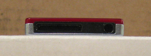
The other angle that I flip-flop on is the placement of that 3.5mm jack. Apple seems to have started the audio-on-the-bottom trend with the first Nano, and it’s influenced the Zune’s hardware. This annoys me a bit. With the audio connection on the top, you have the option of, say, connecting a player to a car dock and still being able to attach a line out or a remote
control receiver to the top jack. When every connection is moved to the bottom, it makes things a bit less flexible. It’s marginally faster to drop my Zune upside-down into my back pocket, but I don’t think that’s good enough reason to put the audio output next to the dock connector on this thing.
What about the inside hardware specs? Overall, they’re pretty impressive. The Zune is equipped with a 1.8″ 240×320 QVGA display, 8GB (or 4GB for the cheaper model) of flash storage space, USB 2.0 (of course), and… 802.11g wireless. Why, might you ask, would one put wifi in an MP3 player? Microsoft has a few things up its sleeves – you can transfer music wirelessly to other Zunes (although the recipient can only play a song three times before it disappears), you can transfer video and pictures, and you can sync wirelessly instead of via USB. We’ll get to that in a minute. The Zune also has a weak FM radio. I’ve never really figured out why someone would want an FM radio in a digital music player. If I’m carrying around several hundred (or thousand) songs, why in the world would I want do deal with the poor audio quality of radio – or the obnoxious commercials? Needless to say, I don’t use this feature much at all.
Like the Nano (and unlike the Sansa), the battery is not user-serviceable. I used to think “oh crap, this is ridiculous, how will we manage with built-in batteries?!”, but the prices have come down so much on flash-based players that you’re more likely to just buy a new player before buying a replacement battery on eBay (which is likely to explode anyhow!). I haven’t
tested the battery to its limits. Rated battery life is at 24 hours, and other reviews have reported about 20 hours of solid use. I left mine uncharged and used it for several days, and it was still going strong. I tend to put my devices on their chargers when I’m not using them, so the battery in my Zune is nearly always charged and ready to go.
The earbuds sound like your standard stock earbuds. I’ve used them some, but I’m rather partial to my Sennhesier MX500s, so I’ve mostly been using those with my Zune. The sync cable comes with snap-on neon pink covers for both ends, which is nice. The 3.5mm jack and the dock port on the Zune were really tight when I first got it, but the dock port seems to have loosened up a bit since I’ve been using it more. One minor annoyance – you have to unplug your headphones before you can pop off the sync cable – they’re too close together on the bottom of the Zune.
For comparison, here’s how the dimensions of the Zune and its screen match up to the competition – a second-gen iPod Nano and a SanDisk Sansa e200:
The verdict? I give it an 8/10. I wish that I could use the buttons with my gloves on (particularly when I’m using it in my car), but it looks sexy, it’s pretty much indestructible (although I did put a screen protector on the LCD), and it’s very easy to use. I love the color, and the screen is beautiful – QVGA resolution on a screen this small means that the individual pixels are tiny, tiny, tiny – so the photographs I use for the menu background look fantastic. When I go back to the low-resolution display on my iPod Photo, I’m starting to realize how obsolete it’s become. However, considering how media-centric this device is (it’s not just for music) I’m really disappointed that there’s no video output on it. I can put movies and digital pictures on it, but I’m limited to the 1.8″ screen – it seems silly to put videos on a device that doesn’t have video output, and adding that functionality would have cost pennies more in the manfuacturing process, I’m sure.
The firmware
Overall, the Zune’s interface is very easy to use. It’s designed around a combination of horizontal and vertical menus. The main menu is a vertical list of options, allowing you to access your media (music, pictures, videos, FM radio, and podcasts), change settings, and read messages from other Zune users (sent via the Zune’s Windows software component). Text in the main menu is large and clear, making it easy to find what you want.
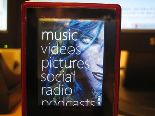
Scrolling through lists throughout the interface is actually kind of fun – if you choose to go the touch (swipe) route, you can coast through lists very quickly. One swipe downward will actually coast for a few seconds after you lift your finger from the touchpad. If you quickly swipe several times in succession, the list coasts faster, with a nice muted clicking noise in the background. Not only that, but an unobtrusive letter appears to the left of a list, showing you where you are alphabetically. This is really handy for very long lists of data. Just touching the touchpad will immediately stop coasting through a list. You can also click up and down for more precise selection – this method will not coast through a list, but the longer you hold down the up or down button, the faster the list scrolls (also handy for flipping through a long list of songs). The whole interface can be managed with one hand quite easily.
Music
This is the main function of the Zune – playing your tunes. When you select the Music menu item, you’re taken a sort of combination interface that uses a row of selections along the top, as well as a vertical list. This sounds funny, but it turns out to be a pretty great interface. With the iPod, you have to select how you want to view your music (album, artist, playlist, etc), and then look at a list of items in that view. This results in going back and forth between menu levels. The Zune’s firmware combines these two levels of the menu into one neat package – across the top, you can click or swipe left and right to select between Artist, Playlist, Song, Genre, and Album views. You don’t have to click the select button (the middle of the touchpad) to switch views – just scrolling left and right will switch for you. Then, you can swipe or click up and down through the list displayed by your selected view, and click the select button to go deeper. At the top of every view is a “shuffle all” selection, if you don’t feel like deciding what to listen to. I never use the shuffle feature – I tend to play music strictly by album – but it’s very easy to access (compared to the iPod’s firmware) if you want it.
Once you select a view for your music, you can scroll down and select a list item. This will bring you to the next menu level – and, again, the previous level (now your list of albums, artists, etc.) will be available in a row across the top. This makes for extremely fast navigation, particularly in the album view. Instead of displaying album names, the row across the top displays the art image for each album.
On that note, the Zune’s music selection interface is very album-centric, in my opinion. Having album art for each album is pretty much mandatory – it makes it much easier to identify albums in a list, and is the only way to quickly identify albums when they are displayed in a row at the top of the screen. Album art can be updated through the Zune software. It can actually be fairly handy – I have all seven Anabolic Frolic Happy 2B Hardcore albums, and the album titles are identical in the list view – the screen’s not wide enough to display more than “Happy 2B Hardcore”. Since each volume of this set has a different-colored album cover, it’s easier to see which album I want to get to when I’m scrolling through the list. In any situation where the data is too wide for the screen, scrolling to that item will cause the data to scroll horizontally (similar to how the iPod manages long names and titles).
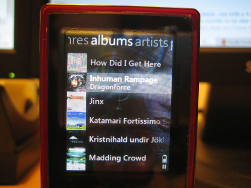
In most views, when you select an item in a list (e.g. an album or an artist or a playlist), you will be presented with the appropriate information, along with some extra options at the top – “Play All” is available in all views except genre. This allows you quickly hit select twice in succession and start playing all the tracks in the selected item. Viewing a playlist, album, or song also gives you the option to wirelessly send it to another Zune. All views also include an “Add to quick list” option. This is a bit like an on-the-go playlist on an iPod…except that you can’t save a quick list on the Zune itself. You can save it once you connect to the Zune software in Windows, but that isn’t as convenient as creating playlists and saving them from the device itself.
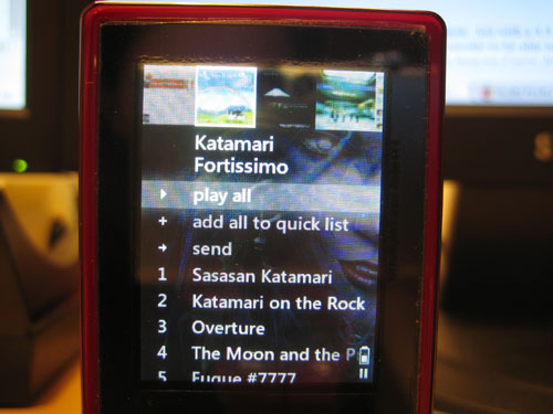
Unlike in the iPod’s firmware, clicking a song with the select button will not start playing it – instead, it will show you the same options – play, send, or add to quick list. You can either hit the select button twice in succession to play a song, or hit the play/pause button. If another song is playing, you’ll have to hit that one twice, too – this has taken a little getting used to compared to the iPod, but once you get the hang of it, it becomes second nature. This is one of the small quirks you’ll find in the Zune’s firmware. If you’re like me and you’ve been exclusively using iPods for several years, you’ll have some habits to break when you encounter the Zune’s firmware.
The biggest missing feature of the Zune is the “View all songs” feature that is present on iPods. I make heavy use of this feature on my iPod Photo, so I notice its absence frequently. When viewing a list of albums under a selected artist, you can select to play all, but there is no quick way to view a list of all the tracks for that artist before selecting a song to play. Once a song is playing (and you’re looking at the Now Playing view), you can click the select button to see a list of options – including “show song list”. This is, however, a rather backward way of doing things. Since my Zune is only 8GB, I’ve instead resorted to making playlists to compensate for this missing feature. However, if this was an 80GB model, I’d have all 800 artists loaded onto the thing – and making 800 playlists just to replace a feature that should already be there is a bit overkill, if you ask me. This is only really an issue for artists that have more than one album – if an artist only has one album, you can just select that album and see the track listing before selecting a song.
The other glaring flaw in the music part of the Zune’s firmware is the absence of gapless playback. My iPod doesn’t support this either, and according to zuneinsider.com, it’s difficult to implement. I find this at least slightly hard to believe, since the open-source Rockbox effort has supported gapless playback with MP3s from the start. Microsoft is planning on including gapless later down the line, but it’s not out yet. Hopefully, if this feature is included with the next hardware revision, it will also be included in a firmware update for older Zunes. This is usually not very noticeable, but it’s extremely annoying in both the aforementioned Anabolic Frolic albums (which are nonstop DJ mixes, so gaps are very obvious), and Hello Nasty by the Beastie Boys, where each song mixes into the next for a second or two.
A slightly less significant issue is that there’s no indicator as to what song is currently playing (when you’re browsing your music). With the iPod, you can navigate back to the currently playing song, click the select button, and go back to the Now Playing view. On the Zune, the only way to get to the Now Playing view is to wait a few seconds for it to pop up, or to hit the back button until you get all the way back to the main menu – hitting Back once more will take you to the Now Playing view.
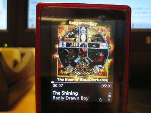
The Now Playing view is a little different from the iPod – instead of showing the album name, the screen is dominated by the album art image. If no album art is available, the menu background is displayed instead. The bottom 20% or so of the screen has a black bar containing the time lapsed/remaining, song title, artist, and icons for battery life, repeat, shuffle, wireless, play/pause, and lock (if the hold switch is enabled). Fortunately, since the screen is such high-resolution (for the physical dimensions), album art looks beautiful. You’ll want to make sure you use high-resolution album art (at least 240×240 pixels). Low-resolution images will be interpolated up to 240×240, and thus look fuzzy and pixelated.
My overall judgement on the music interface is another 8/10. The lack of gapless playback is frustrating, and the fact that I can’t easily view a list of all songs for an artist is annoying. Overall, though, the interface is extremely easy to use, and I’m starting to prefer it to the iPod’s menus. The combination of horizontal and vertical navigation on just about any screen makes flipping through music very fast and efficient. The rest of the interface is a little less critical, in my opinion, so we’ll cover that part a little more succinctly.
Video
The flash-based Zune lineup does support AVI and WMA video playback…but with a 4:3 screen and no video out, I’m not sure how useful it will be. I copied over a DivX-encoded episode of Star Trek: The Next Generation, which was filmed in 4:3. It was a bit of a novelty to be able to watch a TV show on such a tiny device, but its use is limited. 16:9 (or, heaven forbid, 2.39:1 widescreen!) would be impossibly tiny on a 320 pixel-wide display. However, videos from my Canon digital camera copied over without needing conversion, and looked good. This could be handy for showing friends short movie clips (or YouTube videos – I believe there are freeware apps out there for converting FLV to a Zune-compatible format), but overall the video capability is severely crippled by the lack of video out on the hardware itself.
Pictures
Photos (and videos) always display in landscape mode. Pictures can be added through the Zune software, and manging them is a little better than with my iPod photo – you can select specific photos or directories to sync to the Zune. In the Zune firmware, pictures are organized by the same directory names on your computer. You can view photos by their folders or by date added (which would be handy if you stored a lot of images on your Zune). I, for one, have never found much purpose in storing images on a music device. I share my photos through Flickr, and I’ve never been in a situation where I needed to show someone a photo immediately (and not had access to the Internet to do so).
However, one really nice feature of the Zune is the option to customize the background image that displays in every menu screen of the Zune’s firmware. Images look great on the Zune’s screen, so I’ve started keeping a directory of Zune wallpaper synced to my Zune (which at the moment is mostly Harry Potter publicity shots from the fifth movie, plus some of my own graphic work). Other than wallpaper images, though, I’ve not found much use for the Zune’s photo storage capability. It would be nice to see an option in the future to connect to Flickr via the built-in wireless, and view photos directly from the Internet. Now, that would be something worth using.
Podcasts
There’s one tiny problem with me reviewing the podcast abilities of a digital music player – I don’t use podcasts. At all. I’ve yet to find a purpose for them in my life (I prefer reading to listening, personally), so the podcast feature of the Zune sits unused.
“The Social”
The Zune attempts to bring social networking to hardware. You can sign up for a free Zune account online, and send messages to other Zune owners. You can even sync your Zune inbox, so you can read your messages on your Zune. I’m not really sure why I’d want to do this – especially since so few people own Zunes (I only know one person who has one). There is one neat thing that the Zune Social provides – if you register online and sign into your Zune account from the Zune software, the software will report your play habits from both the software and the Zune itself. You can then embed your “Zune card” in your Myspace profile or blog, so others can see a cute little flash animation of what kind of music you like. Zuneinsider.com reported today that a Facebook application is now available to embed your Zune card in your Facebook profile. Joy.
There was something a little more interesting posed by zuneinsider.com the other day – people have found themselves altering their listening habits because the Zune social aspect makes it so public. I used to be in this crowd – listening to whatever was popular with my social group(s). Now, though, I like to think of my Zune card as a little digital bit of me that allows me to try and evangelize others to my awesome music collection. I’m not sure it’s working.
The Zune social aspect is an interesting idea – and it’s certainly one that hasn’t been investigated by Apple for the iPod – but I’m not sure how effective it is. I’m not sure what could make it better or more functional, either. Being able to zip music over to other Zune owners is a good idea, but the jokes about it are founded in truth – if nobody else around you owns a Zune, what’s the point? With Nintendo’s Wii, it’s been so explosively popular that they’ve added social features to it (the survey and mii-voting channels, for instance). With the Zune, unfortunately…not so much.
Firmware Settings
The Zune’s settings are fairly sparse – you can change the FM radio to work in Europe, Japan or the United States. You can toggle shuffling for music and picture playback, and repeat for music. There are options to disable touch navigation, view stats on how much storage space is used and free (and how many songs, pictures, and videos are uploaded), and reset the menu wallpaper to the default. There is no graphic equalizer.
One setting that the Zune (and the Sansa) has that is missing from the iPod is the ability to change the backlight brightness level. I like this option – turning down the backlight saves battery power (and is handy in low-light situations).
On the wireless front, you can turn the wireless on and off, as well as manually sync – when the Zune is plugged into a power source and wireless is enabled, it will auto-sync with the software. When it’s running on battery, you can manually turn on syncing through the Settings menu. You setup syncing through the Zune software – you can only use one wireless profile at a time with the Zune, which is unfortunate – it would be pretty neat to be able to do other things with the wireless at, say, free hotspots. However, for what it does, it’s pretty great. Wireless syncing seems like a one-trick pony at first, but it’s actually pretty dang useful. I can leave my only USB cable in my work bag and just use wireless syncing at home. It’s slower (54Mb/s compared to 480), but it’s been more reliable for me – the Zune disconnects a lot when I’m trying to sync lots of files at once.
The verdict? I give it an 8/10. Again. Things like gapless playback and an “all songs” view for an artist are missing. There’s no graphic equalizer, although I never use the one on my iPod Photo. There are also no additional features – no games, calendar, or clock – which means no sleep or alarm clock functions. Overall, the Zune’s firmware is one of the best I’ve seen in comparison to the iPod’s. It’s easy to learn and easy to use, and the combination horizontal-and-vertical menu interface is pretty great once you realize how useful it is.
The Software
Oh, Microsoft. What in the world were you thinking when you created the Zune software? It’s so, so, so bad. I mean, it’s terrible. I actually dread going back to add more content to my Zune. Once the songs are loaded, the experience is great. Trying to get the songs loaded, on the other hand, is like trying to give a cat a bath – which I’ve done, and it wasn’t pleasant.
Let’s start from the top, shall we?
Windows Media Player 11 is great. I love it. I use it all the time to manage my music (for reference, I have over 8500 MP3s in my collection so far). It’s great for organizing and finding stuff quickly. I still prefer foobar2000 for fast and slick music playback, but WMP11 is pretty great. It’s got an intuitive, fast interface that takes little learning to use.
The Zune software, on the other hand…why Microsoft didn’t just integrate Zune support into a WMP update is beyond me. The software has singlehandedly killed the Zune’s ability to even come close to competing with the iPod. I mean, don’t get me wrong – I hate iTunes. But, since the iPod is so popular, there are lots of alternatives to iTunes. I personally use Red Chair Software’s Anapod Explorer, and I love it. With the Zune, however, the only alternative is a sort of hack to make the Zune work with other software (WMP included), but it’s annoying to use (you have to hack the Zune every time you want to use WMP).
You’re probably starting to think to yourself, What’s so bad about this software? Right from the start, it’s bad. The Zune software requires all the latest Windows updates. This means that I can’t even use it with my work computer, which is managed by corporate IT and doesn’t have all the latest patches. Once you get your machine patched and updated, it takes a little while to actually install the software – it took about ten minutes from start to finish, which seems a little long for a music management application.
Then, when you actually open up the software…it tries – badly – to imitate the horizontal column view of iTunes that I hate so much. Tons of space is wasted on the pretty interface, leaving very little room to display actual music. Microsoft’s gone the way of Apple here and even used embedded text to display everything (unlike WMP11, which uses standard old MS Sans Serif). You’re limited to the three-column display, which shows a list of artists, followed by thumbnail images of each album’s cover, with the list of tracks on the far right. There’s a list view option, but I didn’t like it much – you can’t view just some of the songs in list view; you can only view everything at once.
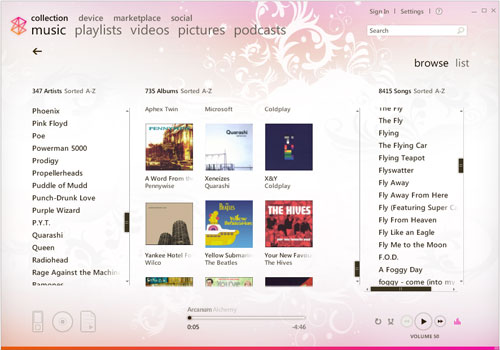
Then, when it comes to actual music organization…
WMP11 is very drag-and-drop friendly. You can drag an image from Amazon directly onto an album to set album art. If a stray MP3 has the wrong tag(s), you can drag it from one album or artist onto another, and it will set the tags for you. It makes organizing music a snap. You can edit all the standard IDv1/v2 tags quite easily.
Unfortunately, the Zune software does pretty much nothing with drag-and-drop. You can drag an artist, album, or song down to the little Zune icon (if the Zune is connected) to sync it, but that’s it. Setting album art is the biggest annoyance – you have to save the album art to your local machine, right-click on an album in the Zune software, click “set album art”, navigate to the image you saved, and select it. I much prefer the extremely fast drag-and-drop method provided by Amazon. Changing album titles is laborious – instead of dragging several songs onto an album at once, I have to edit each one manually.
Dealing with playlists is sort of easy, but sort of a pain. It’s quick to add files to a playlist (either existing lists or through creating a new one), but here’s the kicker – deleting a playlist doesn’t actually delete the playlist file from your computer. I created a playlist of all my Badly Drawn Boy albums (to remedy the aforementioned missing “All songs” option in the firmware), and it didn’t put the songs in the right order. Trying to sort the playlist was proving impossible, so I decided to just delete it and start over. When I went to create a new playlist called “Badly Drawn Boy”, I was told that it already existed. After posting a Zune forum, it turns out the files are still there – you have to manually delete them. Who’s bright idea was that?
Not only that, but when viewing all the tracks for an artist, it doesn’t sort them by album and track number – it just sorts them alphabetically. So, if you want to create a playlist of all the albums for a particular artist, you have to add each album one at a time. You can’t just right-click on the artist and hit “create playlist”. It’s yet another little “quirk” about the Zune software that has proven to be a huge pain in the tushie.
The software’s interface in general seems to put form over function. It’s pretty and there are slick animations and transitions, but it’s slow and hangs frequently on my computer (2.8GHz P4 with 2GB DDR RAM). There is no mini-mode…whereas WMP has three options – skins, compact mode, and the option that minimizes it to a little taskbar application. I haven’t looked at the marketplace at all – the RIAA has done enough to its consumers that I don’t bother buying music anymore, and I refuse to pay for DRMed files, so I haven’t had any experience with the Zune marketplace.
The software is necessary for initial setup, wireless setup, firmware updates, and other settings. Unless you want to hack your Zune every time you sync it in order to use Winamp, MediaMonkey, WMP11, or other software that supports MTP, you also have to use the software to transfer files…which is just really unfortunate. I really, really wish Microsoft would
include Zune support with Windows Media Player, but I’m doubting that’ll ever happen. In the meantime, hopefully Red Chair Software will come out with a Zune software alternative soon.
If you’re interested in buying a Zune, I’d highly recommend downloading the software first and playing around with it. If you own a Zune and are feeling adventurous, you can try zAlternator, along with zAuto Unlocker, which will allow you to transfer media using whatever media software you prefer (including iTunes).
The verdict? I give it a 1/10. Syncing music to the Zune is pretty easy. That’s the only redeeming feature of this software. For actually managing your music, it’s worse than Winamp 3. You’ll probably find yourself using other software to actually manage your music, since the Zune software is more or less only good for getting stuff onto your Zune. One major advantage to the Zune over the iPod in this area, though – you can transfer files off your Zune!! This includes music. Maybe this will be enough to prompt Apple to finally allow iTunes to transfer music off an iPod. Additionally, the Zune software does not default to syncing a connected device with the Zune library (I’ve accidentally cleaned off iPods before due to this obnoxious default in iTunes), and you can manually sync a Zune with the software. However, these small nice bits don’t compensate for the overall utter lack of usability across the entire application.
Conclusion
I like my Zune. A lot. I didn’t think I would, but it’s a pleasure to use. The firmware interface is slick and intuitive, and the hardware is really pretty great. Mine has more or less replaced my iPod for taking my music with me – if I can find a car dock for it that includes an RF remote control, I’ll definitely be getting one. There aren’t many cases or other accessories available for the Zune line, because it’s just not as popular as the iPod. Hopefully this will change with time.
The software is utterly atrocious. I hope that Microsoft realizes that they have something great going with Windows Media Player, and will allow Zune users to use that instead of the crappy software that is currently the only real option. In the meantime, I’m managing all right. Two of my real complaints about the hardware can be fixed with firmware updates – the “All songs” view for an artist, and gapless playback. The lack of video output on the device itself, however, is inexcusable – especially since the flash-based Zunes can play video files.
Overall, this second generation of Microsoft’s digital audio player is a noble and worthy effort. It’s a great device, and I would actually recommend it as a viable alternative to the Apple iPod line.
Replacement Camera A/V Out Digital/Data Interface Cable Compatible for Canon PowerShot/EOS/DSLR Cameras and Camcorders
(as of March 4, 2026 19:04 GMT -06:00 - More infoProduct prices and availability are accurate as of the date/time indicated and are subject to change. Any price and availability information displayed on [relevant Amazon Site(s), as applicable] at the time of purchase will apply to the purchase of this product.)AV A/V TV Cable Cord Lead for Sony CCD-TRV68 CCD-TV98 CCD-TRV108 e CCD-TRV218 e
(as of March 4, 2026 19:04 GMT -06:00 - More infoProduct prices and availability are accurate as of the date/time indicated and are subject to change. Any price and availability information displayed on [relevant Amazon Site(s), as applicable] at the time of purchase will apply to the purchase of this product.)Product Information
| Price: | 199.0 |
| Manufacturer: | Microsoft |
| Requirements: |
|
| Pros: |
|
| Cons: |
|

Gadgeteer Comment Policy - Please read before commenting
What a fantastic review! Thanks for all the effort. We STILL haven’t got the ZUNE in the UK, which is a little annoying, but hopefully when the 3rd Gen Zune arrives, we’ll have the Zune as an option. I’ve got a ZEN:M which is a great wee player (well, not that wee!) but without any doubt, the most annoying thing about it, it the lack of a decent speaker dock. Ipods are overwhelmed, but bugger all for the Zen! Never mind eh!
Chris
Good review, though I disagree with a few of your points.
I used to be exactly like you concerning podcasts as I’m a huge reader but then I discovered the BBC news and that’s a great way to keep abreast of more than our tiny corner of the world. Plus I’m a software developer and there are some great shows out there like Hanselminutes. Oh, and the BBC has some great music shows as podcasts and since we don’t have anything like Pandora for Zune it’s a nice way to discover more indie and unknown bands.
As far as the software we wildly disagree. I dislike WMP and was more than happy to go to the new software. I hope to never have to use WMP again. Sure the software is rough in some places, namely proper metadata editing and not enough video organization, but it’s beautiful, functional and cuts out a lot of cruft that most media management programs have (iTunes in my book is even worse than WMP). My collection is over 12,000 songs.
I wonder if we’re using the same software? When I delete a playlist it prompts me if I want to delete the playlist and it’s gone, as in gone gone, no more file. It gives you two options, to keep the file or delete, just select the second option. It even deletes the playlists folder is no more are in there.
The Marketplace also has straight MP3 files, no DRM included. Not for everything of course but a lot.
As for album art forget dragging & dropping the art, use something like mp3tag which can grab art plus proper tags. I even created a plugin for it that pulls images directly from the Marketplace (you can also use Amazon or Discogs) so you get 800 x 800 art link on how.
I thought the software was very drag & drop heavy, drag to playlists, drag to sync, drag to play, drag to burn, etc.
To return to the main menu quickly on the Zune just press and hold the back button, then it’s a quick back button to get to your now playing.
Anyway, always nice to see some coverage and while we disagree about the software seems we both think it’s a pretty decent little player.
some of the stuff you talk about; cases, car dock, and video output, can be found on zune.net.
First off, I wanna tell you that some of the stuff you said made me laugh so hard, I had to get my brother so I could read it to him.
Why I read this was to see if anybody felt the same way about this doohickey. I just got the exact same 8GB red zune myself for my birthday and you have definitely landed right on the nose. Good job. Really.
*tosses 8 gb zune on floor* Dangit